


Getting started with Krita (3/3)
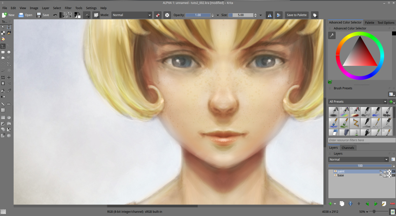
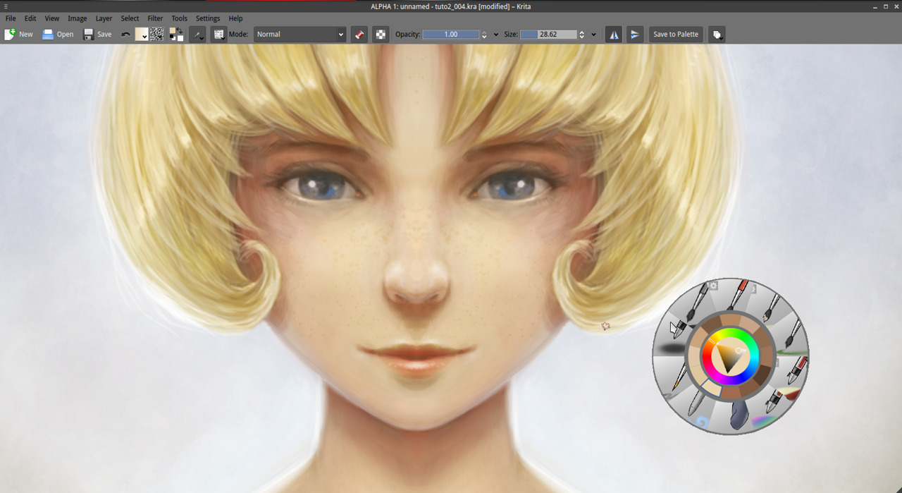
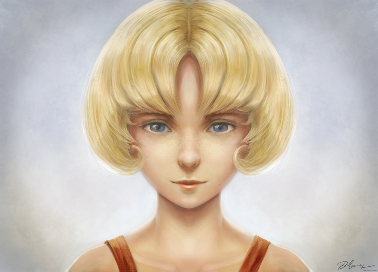 The result of this blog post tutorial exercise over the first part & second part, click to enlarge
"Getting started with Krita" is a tutorial series of three blog post and this one is the third. The tutorials were designed for Krita 2.7 in 2013 + my brushkit V3 . This brush were added in Krita's default brushes after Krita 2.8. Using a newer version of Krita ( eg. 2.9.7 ) you should have everything you need. I updated a bit the tutorial in september 2015. I hope you'll learn something with this series. My goal here is to share the passion I have for digital painting and help new talents to get faster rid of the technical aspect to do the essential : telling stories, sharing beautifull pictures, expressing an artistic soul, etc...
My third and last tutorial of this series cover the last steps necessary to bring the artwork to a 'final'. We'll increase 'a bit' the details.
- Part 1. : black and white : setup and modeling
- Part 2. : colorize : layer stack of blending mode
- Part 3. : finalising : details, and final touch ( you are here )
Let's paint !
Info : I let you the care to save your document often during the process as on the part 1 and 2. By the way, do you know you can save your picture to the Open raster format (.ora ) too and keep your layers and blending modes ? Open raster is slower to save, but offer a good advantage over the Krita document .kra : you can open *.ora with Gimp or Mypaint ; if you need to edit your picture later in one of this software._
1. Open your artwork done on the second part. Set your zoom to 50% and center the artwork into your viewport. Don't forget to activate the mirror mode in the top toolbar as usual.
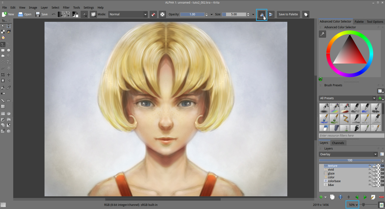
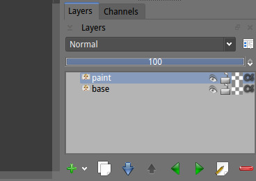
2. Flatten all your layers ( Ctrl+Shift+E ) , name the result 'base' . Then duplicate the layer above and name it 'paint'.
3. We want now to upscale our artwork to the double ( 200% ), to increase the resolution and get more room to add details. Go to the menu Image > Scale to new size (1) . Change the method for width to Percent (2) insert 200% . The lower number 'Height' should follow proportionally. For the interpolation , choose 'Lanczos3' , then press Ok . Let Krita compute...
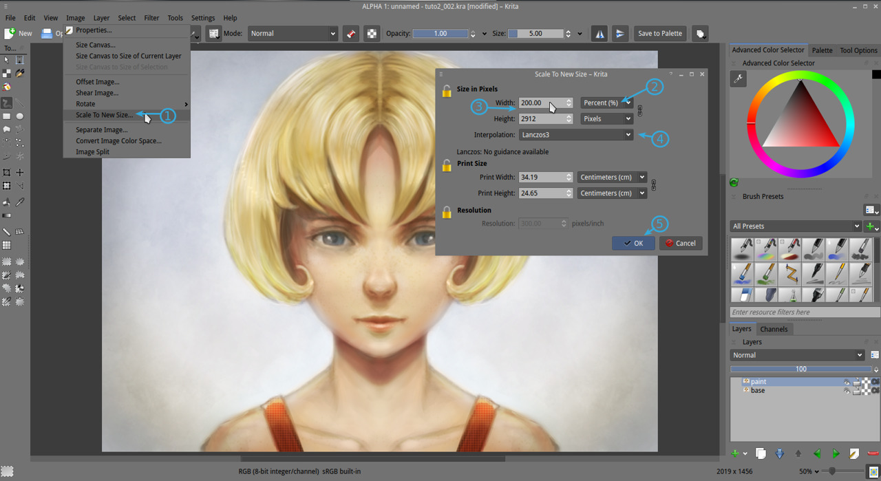
4. The artwork should now appears much more bigger than it was before in the viewport, especially at 50% zoom of the viewport. It should be exactly the double. Keep painting at 50% viewport ; our brushes preset are sort-of optimized for this zoom. The artwork will now use more disk space and resource, but we will use smaller brushes so we wont notice a very big lag. We need this resolution to increase the details and be able to publish it. The minimal resolution to print an artwork is 300ppi. If you zoom out to 33% on a regular 96ppi screen, you should have an idea of the 'real' size of the artwork. If you want to pan your canvas ; hold Spacebar and drag with mouse.
5. Now a little part outdated, coming from 2013. We don't do it this way in 2015. So don't pay attention too much to this screenshot under, this dialog don't exist anymore.
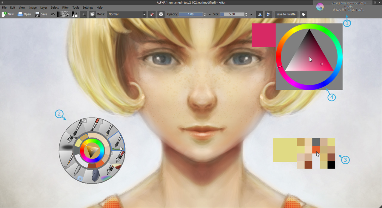
In this step, we will add our favorite brushes to the 'stylus/mouse right-click' palette. Yes, the little palette ring poping-up over the canvas as in 'step 6 (2)' screenshot. The new 2015 way to add brushes to this 'Palette' is much more simplier : in your brush preset docker, right click on the brush you like , and assign them to the tag group 'Favorite Presets'. Done.
6. Ok, our right-click on the canvas "Palette" (2) is setup now, we fed it with 'Favorite Presets' we like. Press Tab to hide all the docker around, and enjoy a larger view port. Press tab again at any moment to exit this mode. Other tool can be found on canvas. The history color pop-up with 'H' key (3) show a color history palette. The color selector with Shift+i (4) can offer more comfort ( because more room, size is bigger than in the right-click palette ) to switch color.
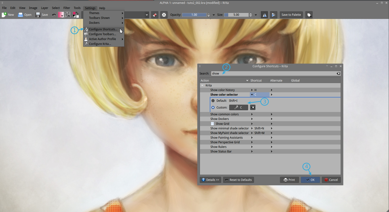
7. If you are not comfortable with using Shift+i ( I'll understand ) go to Settings > Configure shortcut (1) and in the search field enter the keyword 'show' (2) then in 'show color selector' enter the custom shortcut 'C' ( reasign if necessary ) , press OK to accept (4).
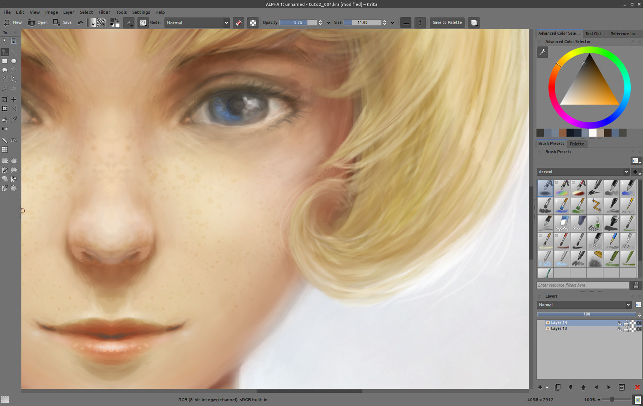
8. Now, you can start a long painting session with all this tools, fullscreen. Here I'll spend around 4 hours on detailing. Paint to sharpen the edges, smooth the surfaces and bring a whole new level of details and ease for your (future potential) spectator to understand volumes and the materials. Use the 'Bristles_hairy' brush with blending mode 'normal' / 'addition' / 'glazing' if you want to darken or brighten the detail. You can paint directly on your 'paint' layer. It's a long step , reviewing zone by zone to adjust or correct and to increase the details. As most of the colors are around , use only the Ctrl+Click color pick on canvas to pick your needed color. Zoom out from time to time to see the overall and turn off and on the visibility of your details layer, to see if you are not destroying the zone instead of making it looking better. In case of accident, you can still remove the details with a soft eraser. That's why I keep two layers, because working on a zone doesn't always result as an improvement, and I have to keep a security to go back at a earlier step. The detailing step is the longest of all the process ; but one of the most relaxing :-)
9. While detailing, I changed the eyes expression a bit ; to test, but I didn't liked it, I also found the whole shading of the face a bit flat, and decided to continue to work on shading it zone by zone, and rework the volumes. I also tested glossy hairs, then erased half the effect to make it more subtle, because it was definitely too artificial. Details is really a part of test and corrections, to improve the artwork. You can even dive to zoom 100% to solve little light as a reflect in the eyes. Here I use 'Airbrush_pressure" with low size to add subtle lines. Also, keep constantly an eye on the overall by zooming out.
10. When you'll start to really have some credibility into your lighting and volumes, you may start to feel a certain discomfort in front of the piece. That's because of a too symmetric drawing. It's too artificial. Time to start to break it ...
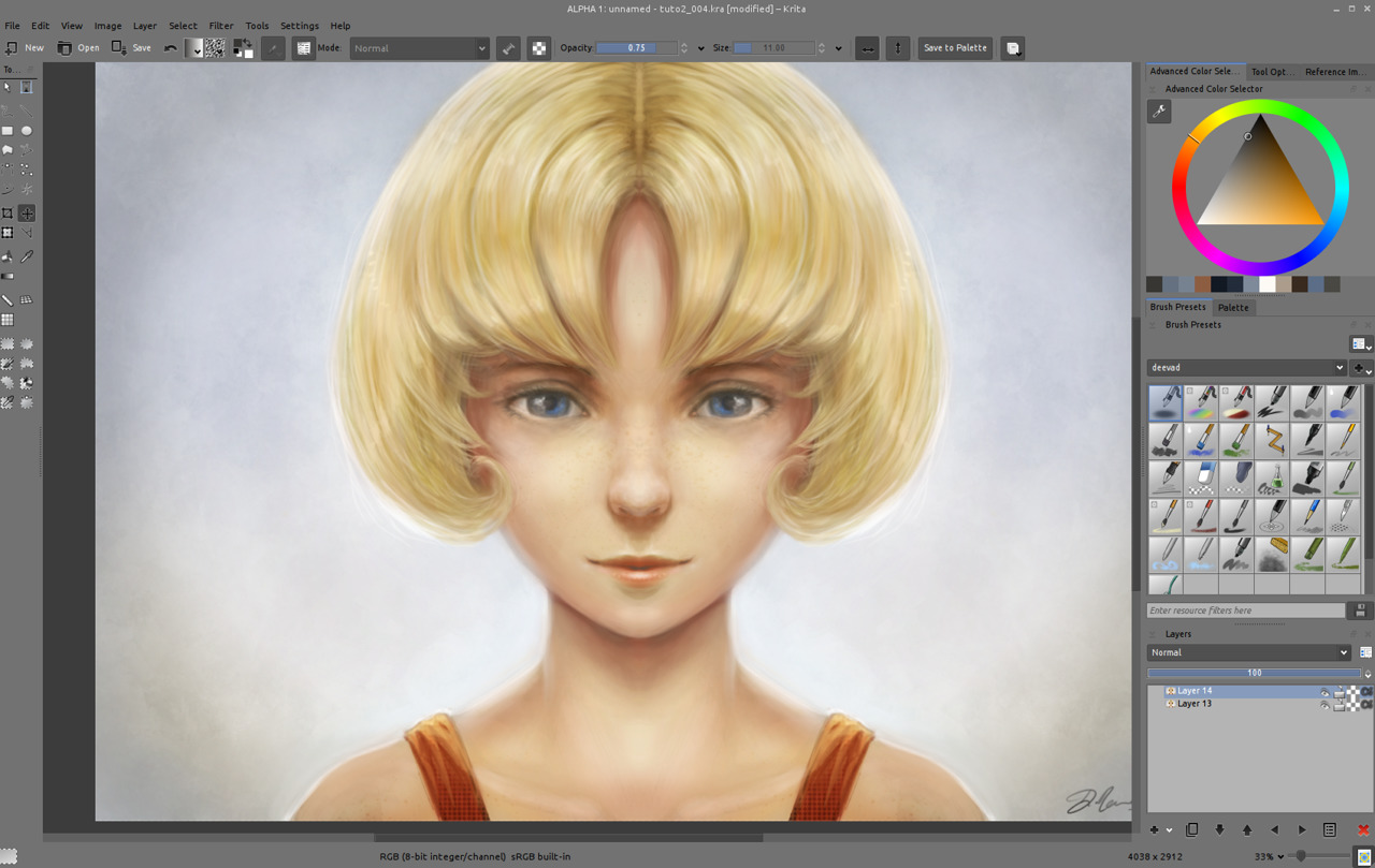
11. To break symmetry , easy enough , just unactivated the mirror icons and fix the eyes with brush manually ; for making the two eyeballs react to the same reflection of a light source ( you see it? the white in the eyes are now not symmetrical and react to a source of light coming from left of the model ) and paint subtle change here and there. Then also sign your artwork. You can now save your final result in a lossless flat format such as *.png and flatten the picture if you want.
_Note: [Jpeg/internet export] If you want to share your result on internet ; I advice going first into File > Create copy from your current image , then scale down your image with Image > Scale to new size and turn the width to a much lower resolution ; for example 720px large. Press ok and save it as JPG with a quality a bit above 90%. Then why not share your image to the world? Ok, probably not this time if it's your first try :-) Maybe soon on the Krita forum art gallery ? http://forum.kde.org/viewforum.php?f=276
This third and last part of this tutorial end here...
All along those 3 past weeks and tutorials I shared with you a path and some of my 'cooking receipt' to make picture. Feel free to experiment around and develop your own ; -there is endless way to make a picture- . I hope this tutorial was a good way to "get started" and make you discover some of the feature of Krita you needed to start to draw and paint with comfort. Keep painting !
Stay tuned for the next series !
A question ?
- Want to share the link of your results ?
- discuss ? use the comments, I'll be around :-)

54 comments
David thank you very much for that tutorials
really good Krita overview for brief start
Thanks so much for these tutorials! (: I love everything you post, David!
I do have this minor issue though, but it bothers me enough that I want to mention it:
Every time I zoom in or out, my lines get blurred. I can draw on, say, 25 percent zoom, but if I zoom in and out again, it will blur. I was recommended to try openGL settings, which I tried playing with under Configure Krita, but it only made performance and zoom more choppy. Any ideas what I could try? I don't have this problem in either MyPaint or Gimp.
This is not really an issue, but do the Krita developers plan on adding 1 bit support for comic artists who want to work in black and white? o: There seems to be an overhaul of brushes coming too, based on the standard you guys are trying to make, so, will inking brushes be included. Thanks for always answering my questions. <3
@Neve : Hi Neve, thanks for the feedback !
Yes, Krita rendering on canvas is not 'sharp' and this is a know bug : https://bugs.kde.org/show_bug.cgi?id=276278 ( demo here : http://bugsfiles.kde.org/attachment.cgi?id=77125 ). I advice you to add your point of view to this bug discution thread, with the zoom factor you practise, screenshot , Krita version and infos on your system. It will help to make this bug report a priority. Here as you can read on the bug report , I have a slighty better result activating 'trilinear' , but nothing crisp as the exellent rendering of Mypaint or Gimp.
About the 1bit support ; I don't know if it's not inside by design or by engine limitation. You should open a 'wish' on the bug tracker. I'm not a line art artist here, so better that the bug thread to be open by someone who knows it.
Here I also study 'Azdrawing' a Japanese effort for drawing line art software, open-source too. http://hp.vector.co.jp/authors/VA033749/linux/azdrawing.html , It's not hard to compile on Ubuntu base ( http://hp.vector.co.jp/authors/VA033749/linux/compile.html ) but defintely needs to get google translation ^ ^ for the page. Rendering is perfect, line smoothing also, and the software very fast. I think you'll find happiness splitting workflow between Azdrawing and Krita.
I might do a blog post soon about compiling/installing Azdrawing. About Ink brushes preset, I think mainly Wolthera work on this on the Krita forum. Feel free to have a look on them , comment and crit. :-)
Thanks for the great effort on sharing some techniques. It's been of great aid to me.
Thank you for the tutorials David. But I need a suggestion for paint something different than portraits. For example (and I know it can be only one way among many) in painting a full body on a canvas that's going to fit an A5 sheet, or a sheet with similar dimension, which size would you use, in pixels? 4000x4000 just for the face and shoulder area imply a very large canvas, maybe too expensive in terms of time and fatigue for my RAM, with a level of detail exaggerated for an A5 sheet. Or am I wrong and just lazy?
@Chris : For an A5 ( if you print at 300dpi ) you probably want to keep only the necessary res to print your artwork ( certainly around something like 2500x2000 ) ; but if you brush preset + your hardware make you more confident at painting at a higher scale ; then getting a higher resolution file is always a benefit. ( ex : one of the illustration should end in a promotionnal poster ; it's good to have a larger file ).
@David Gimp even converts a 15x21 cm sheet to something like 400x500 pixel. A very small canvas. But, after several enlargements I'm working with a 6000x8400 canvas, only two layers, "base" and "details", to let my PC handle the work. And your frottis brushes and airbrushes with HSY, multiply and overlay effects are very useful for not adding other layers to a big file already.
In downscaling the canvas to a smaller pic, that could be attached to a email or printed on a A4 sheet, do you suggest to use still the Lanczos3 method?
@Chris : Hey , Sometime Lanczos3 method is too sharp. Sometime I prefer just bicubic + manual sharpen ( filter ) ; and sometime I even screenshot my artwork to get really what's on the screen about the scaling. But in general, Lanczos3 does a good job.
Thank you, thank you, thank you, I can't thank you enough for these tutorials, after trying a lot, dismissing them and doing them again I think I'm starting to understand the principles on this method (and embracing them), this is my latest effort, I deviated from the strict portrait but i followed the bw, color, multiply, overlay and looong detailing in the final step, it took me so long to get the "overlay" step, so far I'm only using it with shades of gray, but once you get it the boost is awesome, if you watch don't mock me :p http://syringex99.deviantart.com/art/We-Are-Invincible-492498941
@Sergi : Woo ~~ ow .. It looks like you know now how to vivid properly your shades and make your color poping with the 'overlay' pass. I'm proud and happy that my little articles can help ; feel free to transform , alter, and evolve this technic into your very own ; with works ( on details, volumes, anatomy ) you'll be a impressive speedpainter or digital painter ; I can feel it. You already can setup the whole artwork , mass, colors in a pretty fast way etc...
Thank you very much for your useful tutorial.This is my first artwork done by Krita. I would like you to give me some advice and suggestions to make it better.
https://www.facebook.com/yumirinarts/photos/a.1610699085828493.1073741829.1610693459162389/1737147089850358/?type=3&theater
@Yumiko Ikawa Possamai : Thank you Yumiko for sharing your pastel and soft result! ( and for your feedback about this tutorial)
Hey, first i woud say : you draw amazing and I´m sorry for my bad english but my french is not better.
I have a question: How can I print a krita document. All my paintings named at the end (krit. ) Cam you help my? I hope you understand my problem :) thanks
@Alica : Hey, on my Krita, I can Print via the menu , but I use the Linux version. Maybe on your version , you can export a copy as *.png and print this PNG with your image viewer ?
Good luck!
Great tutorial. Well explained and great description. So easy to follow it. Thanks for sharing..
I remember that, everyone learnt more this facile tutorila very easy .
1st tablet project complete :) thanks for the tutorials.
part 1 http://i.imgur.com/u0FC2lh.png
part 2 oops didn't keep one
part 3 http://i.imgur.com/9fXFq6c.jpg
I should've just went with realistic and the eyes are too saturated since I was semi going for anime style.
Also I did cat eyes >.< so she looks semi creepy now.
And I shouldn't have went with blue hair. yeah..lol
I do think I did good on the skin/shading though.
Not sure what's wrong with the torso but there is something wrong with it for sure..I didn't spend as much time on it.
It was still fun and I learned a lot. Now I just have to catch my painting skills up to my drawing skill..
Lovely stuff, David, excellent tutorial, but the link to part 3 is broken. I had to work to reconstruct it by hand, and here's the result so you can fix it in your page 2: http://www.davidrevoy.com/article186/tutorial-getting-started-with-krita-3-3-details-and-final-touch
@Frank freeman : Thank you for helping me to maintain broken links: I rarely test all the link here each month. It should be fixed now!
@dcofjapan : Thank you for sharing screenshots of your artworks!
Really great tutorial - rather hard and very time consuming for a noob like me, but i'm glad i did it! Any way one thing i find particulary hard is achiveing this rough and "paintery" looking strokes when rendering. I tried for some hours but with no success (it always looked very bad), so i moved on with a lot more smooth shading. And it looks "ok" i think, but i would like to learn how to paint something to look more like an actual painting / speed-painting, not like an "photoshoped" illustration.
Any way, here's my result; thanks again, it was a lot of fun!
http://imgur.com/zlVO3jB.jpg
Thanks for the feedback and sharing your result!
Yes, it takes time to get a painterly rendering ; exposing the brush stroke (without smoothing) means also doing very efficient color/value choice and position.
First artworks are indeed very very time consuming. Everything go faster with practise ; that's how automatism muscle works :)
Good luck !
Please tell me how to convert an image from RGB to CMYK in KRITA, thanks. My version is 3.0 portable, windows, 64 bits.
Hey, just go to the top menu ; Image > Convert Image Color Space.
Pick CMYK for the model ; let every other thing default, and press OK. Done!
Thank you! What should I do when I find the color have to be amended after converting?
All paint tools, filters works in CMYK ( using a brush with a color pick on the "color slider" docker, or "specific color selector" , possible to manage the amount of C , M , Y or K separately ; or for filters, using Curve adjustement on target channel )
Should I choose .JPG to export my image before printing after finishing the process of CMYK converting?
It depends what your printer needs. Jpg is a wrong choice in any case. Often PSD . Or tiff. Save a copy for archiving in kra.
File>Export>xxx.psd, if my printer need psd?
After converting my picture to CMYK, how to save it with the resolution of 300DPI? Thanks!
Go into the menu > Image > Scale To New Size , check on the bottom the checkbox 'Adjust print size separately'.
Then enter in resolution ; 300 Pixel/Inch .
The pixel dimension will keep the same ( on top ) , but it will change on the fly the print size , according to the available pixels to create such print density.
Then press OK, and save.
I want to know if the options for those two circled areas are correct.
https://scontent-tpe1-1.xx.fbcdn.net/v/t34.0-12/14344340_1938516206374950_7290022104512556616_n.jpg?oh=741287ce22d92c5eb2b5c8ef031550f3&oe=57D8B006
Thank you!
Yes, they are. ;-)
To explain them:
- Filter (Bicubic) is the choice of a method (algorithm ) if you change Pixel size. Bicubic is ok ( that's why default ) Here I prefer Lanczos3 a bit more sharp when I reduce a picture for the web.
- Constrain proportion let know Krita you always want to change on the width to affect height of the picture with the same ratio. No deformation/streching of the picture.
With the current document, you'll print a 107mm x 150mm artwork at 300ppi.
Thanks for your explanations, those are what I want to know, although I didn't ask. You are very smart and knowing what my questions are. I have been rejected four times by my printer, that is because when I saved my picture after converting, I didn't set the resolution. Finally I know the reason, I am so happy. Enjoy life!
Thank you! I'm glad your printer now accept your files :-)
The length of the girl's neck in my picture is too long, is there any simple way to fix it?
There is only canvas left in my Krita., both two sides are missing, how to restore them?
Thank you!
The length of the girl's neck in my picture is too long, is there any simple way to fix it?
There is only canvas left in my Krita., both two sides are missing, how to restore them?
I need to use the effect of gradient, I don't know if I can find it after restoring the left side tool bar?
Thank you!
To fix proportions, you'll need the 'transform tool'
To restore the dockers around, it's on the top-toolbar, the icon to the extreme right , this one can restore workspaces.
Awesome! I've been drawing digitally for around a year now, and I haven't produced as good a result as I have following your tutorial. It's not the same model you made, but I followed most of the steps right, I think...I tried to make it seem cold, snowy, and ethereal, but I kinda overdid it...This is Tomoe Yukishiro from Rurouni Kenshin, by the way.
https://web.facebook.com/photo.php?fbid=307182216311981&set=pcb.307196762977193&type=3
I really, really want to get into Krita but the main problem that stops me is the fact that the colour wheel is upside down and backwards. I have a certain formula for my colour use and I've found it to be really difficult getting over this hurdle. I use SAI normally, and while I can technically get the same colour wheel set up as SAI, for whatever reason the hues are all the wrong way around.
I know this is such a weird thing to be hung up on but is there anyway for me to modify the wheel? I need to change programs because SAI lacks all the features I need for making comics, like text and line tools.
Hey, the problem in your case is to explain to Krita developers in what the formula of displaying the hue in Krita your way will be more correct.
If it's only compare to SAI, it's not an argument. But if you find good technical reason, and shows how it helps to paint , it might convince the developers responsible for color wheel and color management.
But please elaborate a bit more than "hues are all the wrong".
Thanks for responding, sorry for the vagueness. I don't mean to change the wheel for everyone, but was wondering if there's a way I can configure the wheel myself to change it just for my program. It seems like the way it's set up right now, it makes all the colours really desaturated for me, I usually work with bright colours. Usually right near the circles are and sometimes in it. http://imgur.com/a/sCvLa
What is confusing to me is how the white is all along the top and to the side in Krita. Sai seems to have a lot more bolder colours where as Krita has a lot of very pale colours. Unless I am understanding this all wrong.
Hey,
thanks for your picture. I understand your request better.
yes, this is possible :) do it this way :
http://www.peppercarrot.com/extras/forum/2017-01-04_screenshot_231248_net.jpg
dude wow
Hi David,
I'm new to krita and digital painting; I'd like to share with you my result of the tutorial. I hope you can give me some feedback. Doing digitally painted hair is amazingly more difficult than I always thought :\
Here's my try: https://img00.deviantart.net/a1e8/i/2017/267/d/e/cat_like_by_perrodetindalo-dbogzgw.png
Kind regards and congratulations on your amazing work.
Rodolfo (MX)
This made me incredibly happy! I got a wacom tablet more than 5 years ago but could never quite find a nice program and method to draw digitally, the software I knew about didn't run on Linux and was way to expensive for me. 2 days ago a colleague told me about your tutorials and Krita, and now I've been drawing the whole time. I really like this method of doing gray scale first and colour later because I get overwhelmed when I start with colour immediately.
Thanks a lot!
This is my result:
https://orig00.deviantart.net/32ff/f/2018/068/3/f/practice_001_by_marelth-dc5eqqo.jpg
ok I don't know how to put a link in the comment.
Hey! Soft color and good volume on your artwork ! Thank you for sharing.
(don't worry for the image and the link, I fixed it! You just need to paste a link , if it ends with jpg/png/gif , my website will do the markup automatically )
thank you so much for this tutorial!! For some reason it was easier to follow than any video tutorial I've followed. It took me SO long so I've decided not to follow the third part of the tutorial (also because I quite like the unfinished charm of it) but yeah I'm new to digital art from traditional and am finally proud of something!
https://imgur.com/a/CqQoeVw
Thank you for going threw the whole process, even if this tutorial starts to be outdated a bit.
Impressive result!
Hey David,
thanks for your tutorial. I got my wacom intuos a while ago, because I started handlettering. For that, I downloaded Krita and searched for tutorials and only just found your blog. I just tried this tutorial (but without the mirror tool so my girl turned out quite differently). It's very easy to understand (even for a German).
The only thing i was missing was some information regarding the different settings.. just for unterstanding them rather than just setting it up like you said and not really knowing what I actually did :D I am absolutely new to graphic programs so Ive got a huge lack of knowledge.
anyways, I'd be happy to share my (not yet final) result with you.
http://fav.me/dcvxu9k
I hope you don't mind me asking, but is it better for me to do artworks in CMYK mode from the beginning if I want to print them in the end? I have problem adjusting the colors when I convert it from RGB to CMYK to use it for prints, so I was hopping I could just paint in CMYK and avoid having to convert it before send it to the printer. I don't mind the dull colors from CMYK mode when showing on screen though. I hope you could advise me about this. Thank you.
Hi Aki,
This is a good question. Adjusting colors and getting a predictable result is a very complex topic; especially if you don't own a monitor calibrator hardware and the color profile target of your printer... About the workflow, the two way are valid:
- sRGB from scratch (with soft-proofing) then a final export/remaster/converting to CMYK
- A pure CMYK workflow from scratch.
Here I'm prefering the first one and my main reason is because a lot of features doesn't work well and are harder to predict effect in CMYK (blending modes, filters, gmic). So, in a nutshell, I'm just avoiding the colors out the CMYK gamut while painting; mainly the pure saturated red, green, blue and their direct mixing: rgb magenta, cyan, yellow... In Krita, you can get help to avoid them; you can configure the Advanced Color Selector to show the CMYK color gamut only while painting on a sRGB; that can help to not select hue that can't be printed later. Another good method is to paint in RGB with the 'Soft proofing' activated (in View menu, as far as I remember). You'll get a dynamic preview of the CMYK result and it helps at getting a good feedback on the canvas of what can't be printed, or what renders greyish and what gradients are messy and you can then fix them on the fly so the export/remaster/converting happens to be a smooth step without a lot of things to redo. Of course, this features works perfectly if you have a good monitor calibration hardware with a recent calibration and profile and the CMYK of your printer... This is the accurate way to work.
If you are a bit lost and want to know the fundamental of this topic; study this page from the official documentation: https://docs.krita.org/en/general_concepts/colors/color_managed_workflow.html
I didn't know that blending modes, filters,... work differently in cmyk, so this is a big surprise for me! I've tried both the Advanced Color Selector and the Soft proofing as you've suggested, and they are actually better than a cmyk workflow from scratch! Thank you for a very detailed and helpful reply, I appreciate it!
Wow!
Best drawing I've ever done! Thanks!
Post a reply
The comments on this article are archived and unfortunately not yet connected to a dedicated post on Mastodon. Feel free to continue the discussion on the social media of your choice. Link to this post:You can also quote my account so I'll get a notification.
(eg. @davidrevoy@framapiaf.org on my Mastodon profile.)