


Getting started with Krita (3/3)
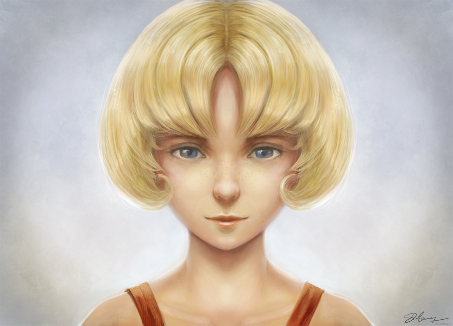 The result of this blog post tutorial exercise over the first part & second part, click to enlarge
"Getting started with Krita" is a tutorial series of three blog post and this one is the third. The tutorials were designed for Krita 2.7 in 2013 + my brushkit V3 . This brush were added in Krita's default brushes after Krita 2.8. Using a newer version of Krita ( eg. 2.9.7 ) you should have everything you need. I updated a bit the tutorial in september 2015. I hope you'll learn something with this series. My goal here is to share the passion I have for digital painting and help new talents to get faster rid of the technical aspect to do the essential : telling stories, sharing beautifull pictures, expressing an artistic soul, etc...
My third and last tutorial of this series cover the last steps necessary to bring the artwork to a 'final'. We'll increase 'a bit' the details.
- Part 1. : black and white : setup and modeling
- Part 2. : colorize : layer stack of blending mode
- Part 3. : finalising : details, and final touch ( you are here )
Let's paint !
Info : I let you the care to save your document often during the process as on the part 1 and 2. By the way, do you know you can save your picture to the Open raster format (.ora ) too and keep your layers and blending modes ? Open raster is slower to save, but offer a good advantage over the Krita document .kra : you can open *.ora with Gimp or Mypaint ; if you need to edit your picture later in one of this software._
1. Open your artwork done on the second part. Set your zoom to 50% and center the artwork into your viewport. Don't forget to activate the mirror mode in the top toolbar as usual.
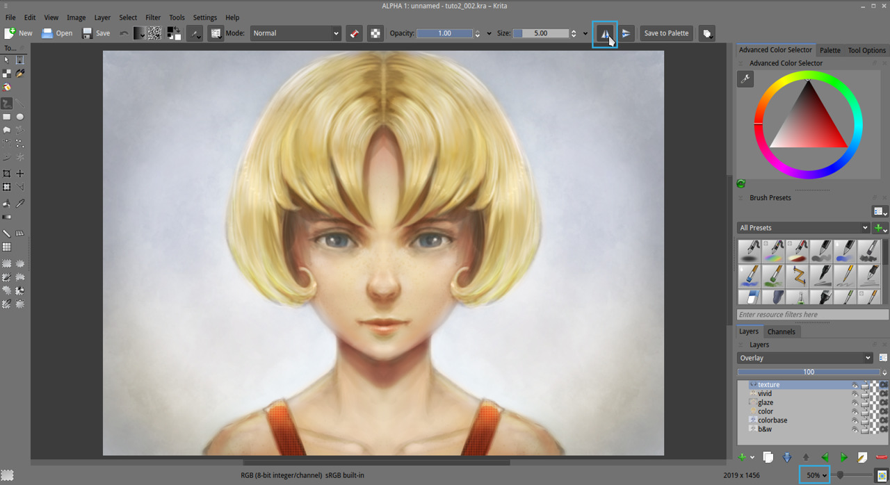
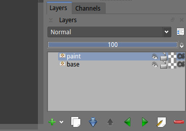
2. Flatten all your layers ( Ctrl+Shift+E ) , name the result 'base' . Then duplicate the layer above and name it 'paint'.
3. We want now to upscale our artwork to the double ( 200% ), to increase the resolution and get more room to add details. Go to the menu Image > Scale to new size (1) . Change the method for width to Percent (2) insert 200% . The lower number 'Height' should follow proportionally. For the interpolation , choose 'Lanczos3' , then press Ok . Let Krita compute...
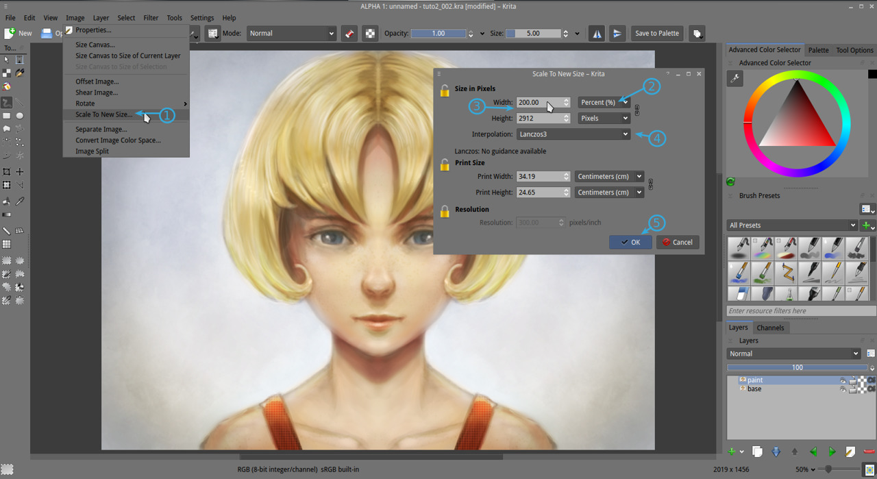
4. The artwork should now appears much more bigger than it was before in the viewport, especially at 50% zoom of the viewport. It should be exactly the double. Keep painting at 50% viewport ; our brushes preset are sort-of optimized for this zoom. The artwork will now use more disk space and resource, but we will use smaller brushes so we wont notice a very big lag. We need this resolution to increase the details and be able to publish it. The minimal resolution to print an artwork is 300ppi. If you zoom out to 33% on a regular 96ppi screen, you should have an idea of the 'real' size of the artwork. If you want to pan your canvas ; hold Spacebar and drag with mouse.
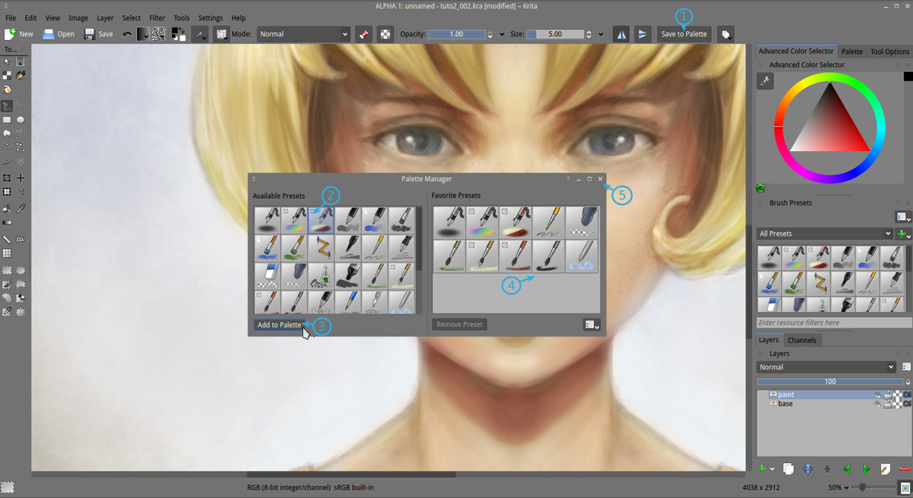
5. Now a little part outdated, coming from 2013. We don't do it this way in 2015. So don't pay attention too much to this screenshot under, this dialog don't exist anymore.
In this step, we will add our favorite brushes to the 'stylus/mouse right-click' palette. Yes, the little palette ring poping-up over the canvas as in 'step 6 (2)' screenshot. The new 2015 way to add brushes to this 'Palette' is much more simplier : in your brush preset docker, right click on the brush you like , and assign them to the tag group 'Favorite Presets'. Done.
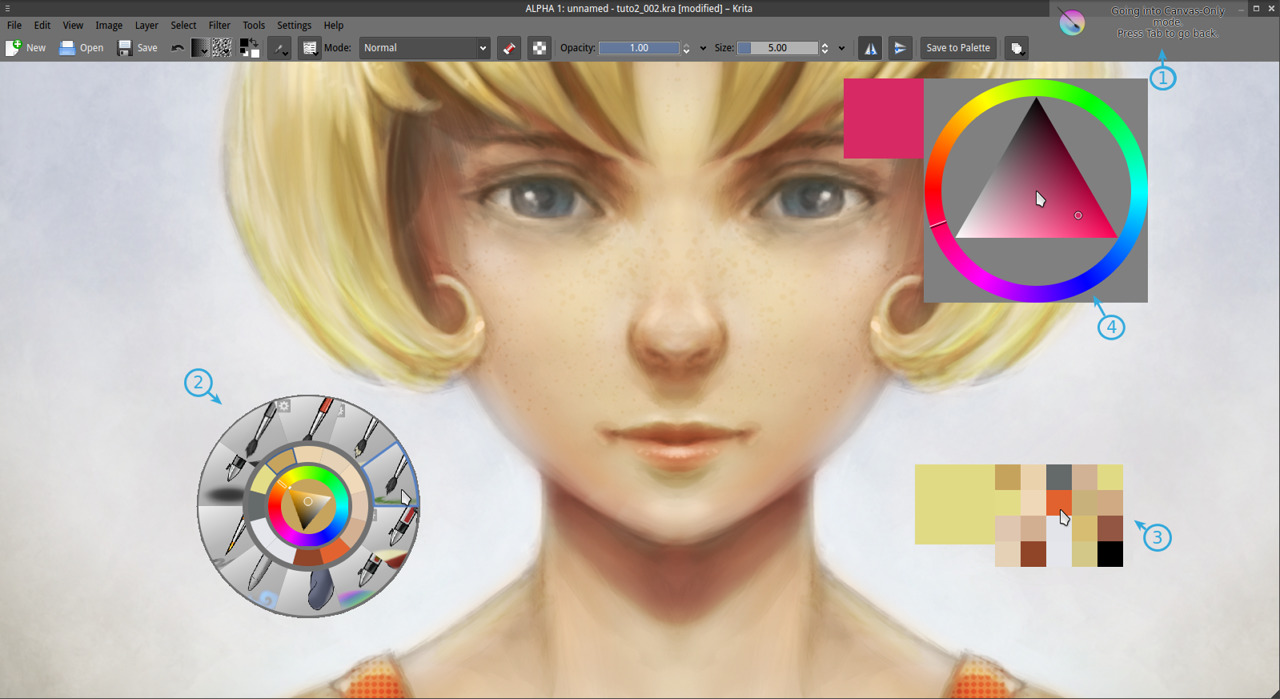
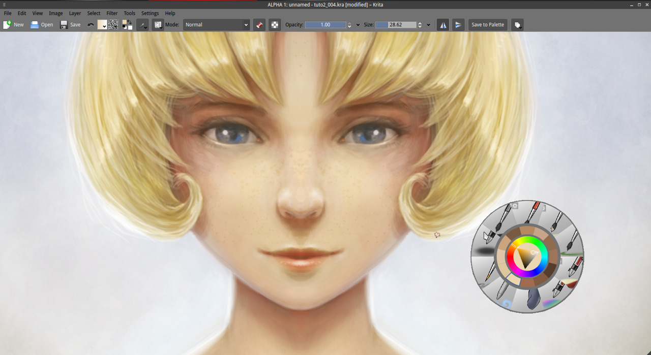
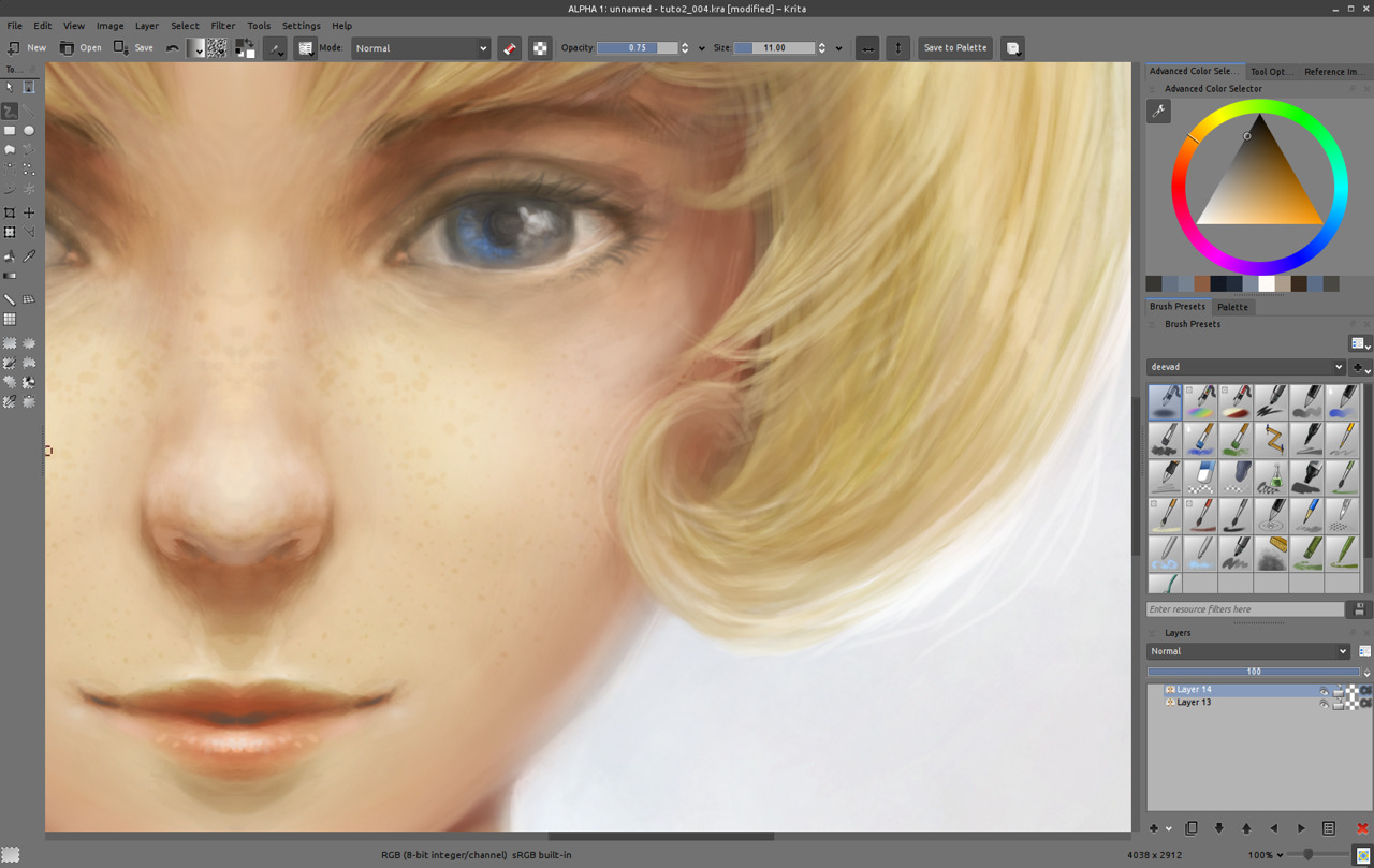
6. Ok, our right-click on the canvas "Palette" (2) is setup now, we fed it with 'Favorite Presets' we like. Press Tab to hide all the docker around, and enjoy a larger view port. Press tab again at any moment to exit this mode. Other tool can be found on canvas. The history color pop-up with 'H' key (3) show a color history palette. The color selector with Shift+i (4) can offer more comfort ( because more room, size is bigger than in the right-click palette ) to switch color.
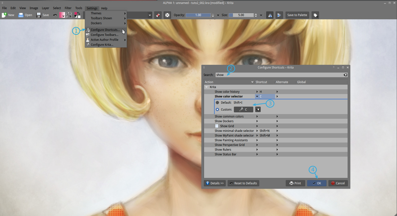
7. If you are not comfortable with using Shift+i ( I'll understand ) go to Settings > Configure shortcut (1) and in the search field enter the keyword 'show' (2) then in 'show color selector' enter the custom shortcut 'C' ( reasign if necessary ) , press OK to accept (4).
8. Now, you can start a long painting session with all this tools, fullscreen. Here I'll spend around 4 hours on detailing. Paint to sharpen the edges, smooth the surfaces and bring a whole new level of details and ease for your (future potential) spectator to understand volumes and the materials. Use the 'Bristles_hairy' brush with blending mode 'normal' / 'addition' / 'glazing' if you want to darken or brighten the detail. You can paint directly on your 'paint' layer. It's a long step , reviewing zone by zone to adjust or correct and to increase the details. As most of the colors are around , use only the Ctrl+Click color pick on canvas to pick your needed color. Zoom out from time to time to see the overall and turn off and on the visibility of your details layer, to see if you are not destroying the zone instead of making it looking better. In case of accident, you can still remove the details with a soft eraser. That's why I keep two layers, because working on a zone doesn't always result as an improvement, and I have to keep a security to go back at a earlier step. The detailing step is the longest of all the process ; but one of the most relaxing :-)
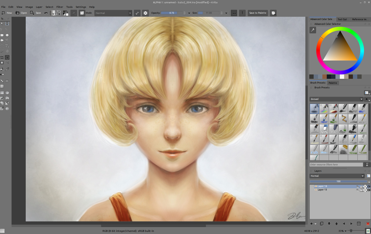
9. While detailing, I changed the eyes expression a bit ; to test, but I didn't liked it, I also found the whole shading of the face a bit flat, and decided to continue to work on shading it zone by zone, and rework the volumes. I also tested glossy hairs, then erased half the effect to make it more subtle, because it was definitely too artificial. Details is really a part of test and corrections, to improve the artwork. You can even dive to zoom 100% to solve little light as a reflect in the eyes. Here I use 'Airbrush_pressure" with low size to add subtle lines. Also, keep constantly an eye on the overall by zooming out.
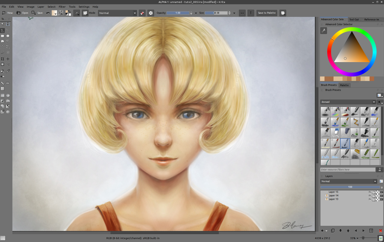
10. When you'll start to really have some credibility into your lighting and volumes, you may start to feel a certain discomfort in front of the piece. That's because of a too symmetric drawing. It's too artificial. Time to start to break it ...
11. To break symmetry , easy enough , just unactivated the mirror icons and fix the eyes with brush manually ; for making the two eyeballs react to the same reflection of a light source ( you see it? the white in the eyes are now not symmetrical and react to a source of light coming from left of the model ) and paint subtle change here and there. Then also sign your artwork. You can now save your final result in a lossless flat format such as *.png and flatten the picture if you want.
_Note: [Jpeg/internet export] If you want to share your result on internet ; I advice going first into File > Create copy from your current image , then scale down your image with Image > Scale to new size and turn the width to a much lower resolution ; for example 720px large. Press ok and save it as JPG with a quality a bit above 90%. Then why not share your image to the world? Ok, probably not this time if it's your first try :-) Maybe soon on the Krita forum art gallery ? http://forum.kde.org/viewforum.php?f=276
This third and last part of this tutorial end here...
All along those 3 past weeks and tutorials I shared with you a path and some of my 'cooking receipt' to make picture. Feel free to experiment around and develop your own ; -there is endless way to make a picture- . I hope this tutorial was a good way to "get started" and make you discover some of the feature of Krita you needed to start to draw and paint with comfort. Keep painting !
Stay tuned for the next series !
A question ?
- Want to share the link of your results ?
- discuss ? use the comments, I'll be around :-)
