


Getting started with Krita (2/3)
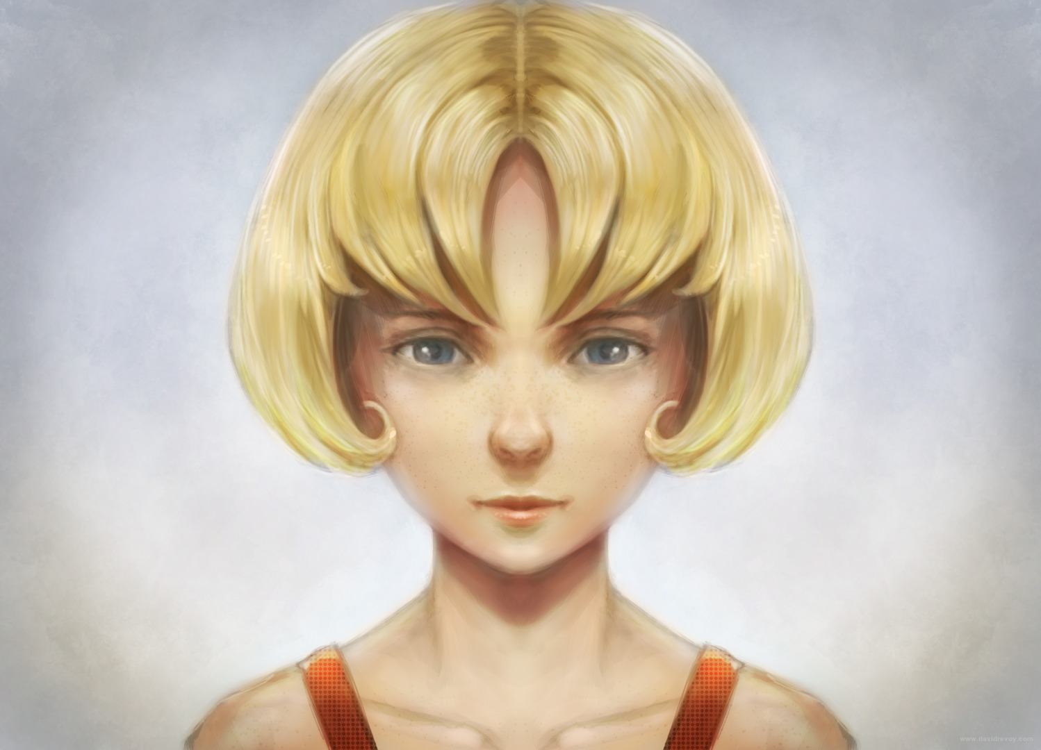 The result of this blog post tutorial exercise over the first part, click to enlarge
"Getting started with Krita" is a tutorial series of three blog post and this one is the second. The tutorials were designed for Krita 2.7 in 2013 + my brushkit V3 . This brush were added in Krita's default brushes after Krita 2.8. Using a newer version of Krita ( eg. 2.9.7 ) you should have everything you need. I updated a bit the tutorial in september 2015. The screenshot are old and won't match your interface, but it's the best I can do at the moment to refresh this three post. My goal here is to share the passion I have for digital painting and help new talents to get faster rid of the technical aspect to do the essential : telling stories, sharing beautifull pictures, expressing an artistic soul, etc...
My second tutorial cover the steps necessary to bring a black and white artwork to the world of colors.
Contents :
- Part 1. : black and white : setup and modeling
- Part 2. : colorize : layer stack of blending mode ( you are here )
- Part 3. : finalising : render, post effect
Let's paint !
Note : I let you the care to save your document often during the process as on the part 1 . I advice the 'Krita document' ( *.kra ) files , but this time , why not using a different saving option? a feature in the menu "File > Save incremental version" is useful to keep track of your 'work in progress' steps. Press it, and check on your disk what this feature does.
Note 2: As usual, click on the pictures to enlarge them.
1. Open your artwork done on the first part. Set your zoom to 50% and center the artwork into your viewport. Don't forget to activate the mirror mode in the top toolbar.
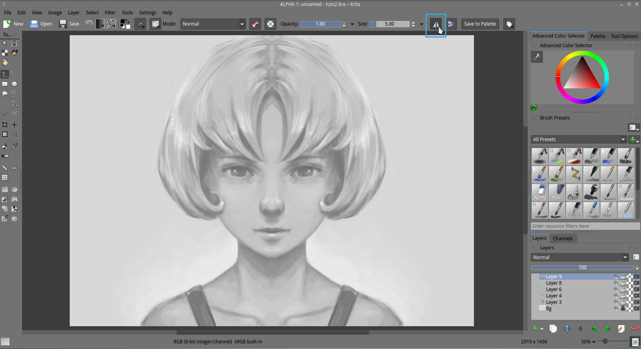
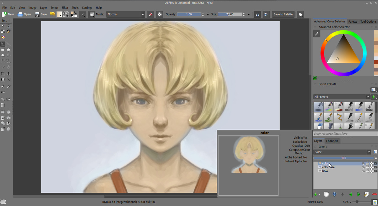
2. Flatten all your layers Ctrl+Shift+E or in menu Layer > Flatten Image , name the result 'b&w' . Duplicate your 'b&w' layer, name it 'colorbase' and call the Hue/Saturation/Windows color filter by pressing Ctrl+U. Check the 'Colorize' box.
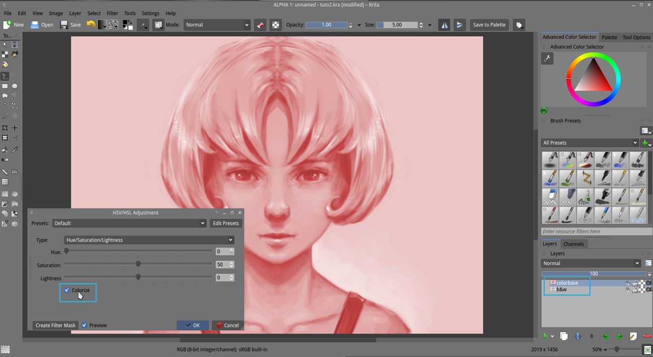
3. With the Hue and Saturation slider, search the main tone of your picture ( don't use the Lightness slider, keep it at 0 ) . Here I want a desaturated blue hue. Then press ok

4. Create a new 'paint layer' above, named 'color' with the blending mode HSY > Color . Take the 'Airbrush_pressure' brush preset. Do a first pass of tinting area of your artwork with pure colors and test around. Fun , right ? on a 'HSY color' blending mode layer, all the stroke affect only the Hue and saturation , not the value. So you can keep your value and paint color without destroying them.
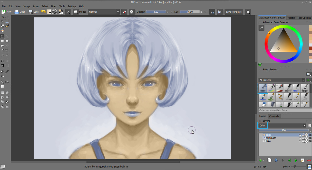
5. Keep painting. Note : the color picker ( hold Control key plus click ) works fine on a Color type of layer , you can use it. Adjust when necessary by removing the color with 'E' the 'eraser mode' to reveal the base color underneath or enrich the range of colors in your artwork by using hue from the Advanced Color Selector. I often restrict myself to unsaturated tones because it's easier to saturate or enrich later. You can see on the screenshot my 'layer preview' ( a dialog who appear on the bottom right, it will appear also for you if you keep stylus over the layer name ). This preview will give you an idea of the painting work I do on it.
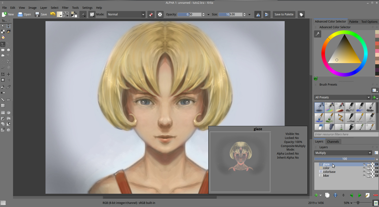
6. Create a new paint layer named 'glaze' and with the blending mode Arithmetic > 'multiply'. We will do now an almost similar pass than a traditional glazing with oil painting . Take again the "Airbrush_pressure" brush preset with mid opacity and glaze the colors, add red in the shade of the skin to flesh the model , make deeper the zone where the skin doesn't reflect light , and let see more the blood color under the skin. Crease also some deeper shade for the hair. Glaze the eyes as if you would perform a make-up on them. Resize your brush if necessary to perform more little details. I don't advice to zoom in. Glaze also the lips as if you were applying lipstick on them. Remember glazing will darken only the colors and so it's important to keep doing it steps by steps, low opacity strokes by low opacity strokes. Glaze the overall artwork till you reach a good aspect ; this include hairs, backgrounds, etc... ( Note : Glazing steps is good to add stain, tatoo, patterns but to keep this tutorial clean and generic, I'll keep my basic character ).
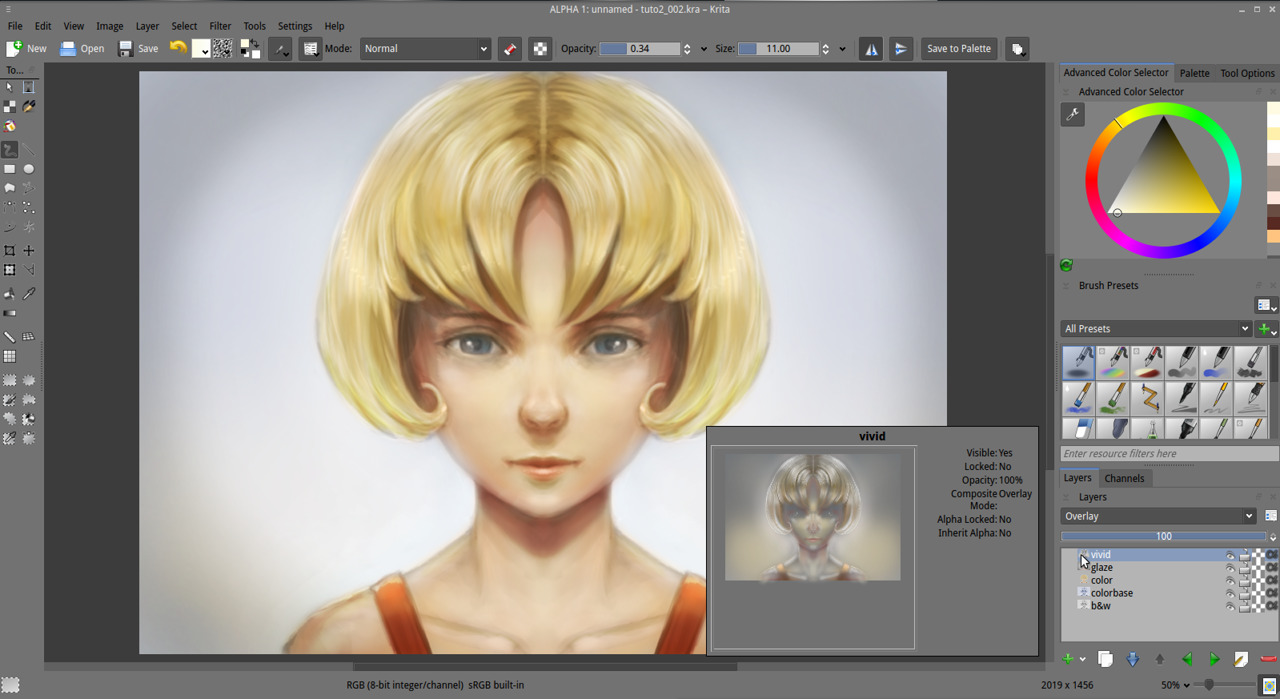
7. Create a new paint layer named 'vivid' and use the blending mode Mix > 'overlay' on it. With a dark airbrush at low opacity , vivid the shadows. It should increase the contrast in those areas, unify the local tones and add saturation. Do the same with a bright color to brighten zone and so, increase the intensity of the lighting. With white , do little and subtle corona of light around your higher values ; such as reflection on the lips, and on the eyes.
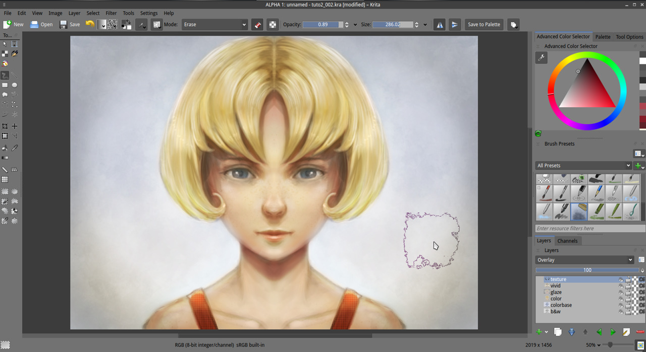
8. Create a new paint layer named 'texture' and use the blending mode Mix > 'overlay' on it also. With a dark grey and a variety of preset who do textures on the canvas as the 'Splat_texture2' or 'Sponge_texture' in the default brushes, we will add a soft texture to part of our artwork. For example, a bit of grain to the skin. Be subtle , the effect should not 'jump' into the eyes, but be a secondary thin effect. If your effect is too strong , erase it.
The colorization setting for our artworks is now done. The goal was to 'sketch' the colors of our artwork. Also, I kept the color choice simple on my example even if it's a bit boring and generic. But i think a tutorial example has to be generic to be enough open to any interpretation. The important is now about what you can do with it. Feel free to test make-up ; tatoo , blue skin , reptilian skin , colored hair , etc... etc.... more material , more lighting situation.
A bit more about the 3 pass, 'color' / 'multiply' / 'overlay' : There is an endless way to digitally colorize a black and white artwork. Here is just a 'cooking' proposition on how those three pass of layer blending mode 'color' / 'multiply' / 'overlay' can work together. They work better if you kept your black and white value bright as we did on the previous tutorial. If you practice them, they become predictable. I hope this visit inside the interface of the powerful options of Krita made you discover new aspect of this software. Options you probably ignored before. Repeat it again till you'll feel more confident with the steps to replicate without this page and express your color tastes with this tool and method. Next part ( to be published ) we will learn the way to push the rendering to a higher definition and correct bugs. Our picture has many issue now , and don't offer many details. By the way, those issues and bugs can have a charm. A 'speed-painting' charm.
A question ? Want to share the link of your results ? discuss ? use the comments, I'll be around :-)
