


Getting started with Krita (2/3)
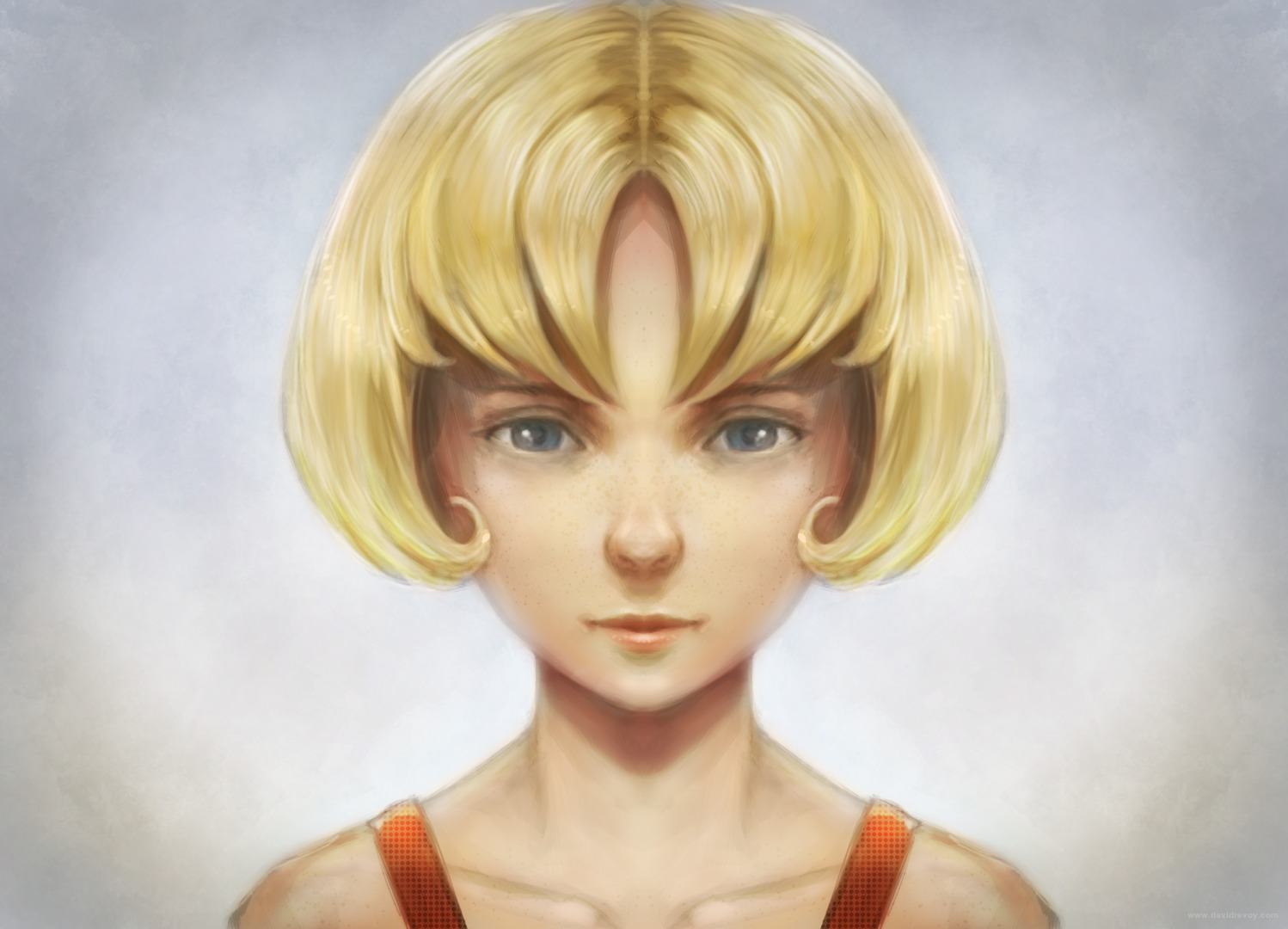 The result of this blog post tutorial exercise over the first part, click to enlarge
"Getting started with Krita" is a tutorial series of three blog post and this one is the second. The tutorials were designed for Krita 2.7 in 2013 + my brushkit V3 . This brush were added in Krita's default brushes after Krita 2.8. Using a newer version of Krita ( eg. 2.9.7 ) you should have everything you need. I updated a bit the tutorial in september 2015. The screenshot are old and won't match your interface, but it's the best I can do at the moment to refresh this three post. My goal here is to share the passion I have for digital painting and help new talents to get faster rid of the technical aspect to do the essential : telling stories, sharing beautifull pictures, expressing an artistic soul, etc...
My second tutorial cover the steps necessary to bring a black and white artwork to the world of colors.
Contents :
- Part 1. : black and white : setup and modeling
- Part 2. : colorize : layer stack of blending mode ( you are here )
- Part 3. : finalising : render, post effect
Let's paint !
Note : I let you the care to save your document often during the process as on the part 1 . I advice the 'Krita document' ( *.kra ) files , but this time , why not using a different saving option? a feature in the menu "File > Save incremental version" is useful to keep track of your 'work in progress' steps. Press it, and check on your disk what this feature does.
Note 2: As usual, click on the pictures to enlarge them.
1. Open your artwork done on the first part. Set your zoom to 50% and center the artwork into your viewport. Don't forget to activate the mirror mode in the top toolbar.
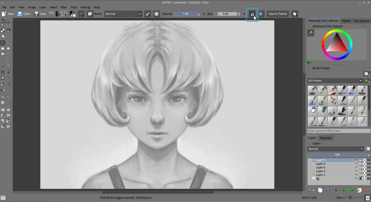
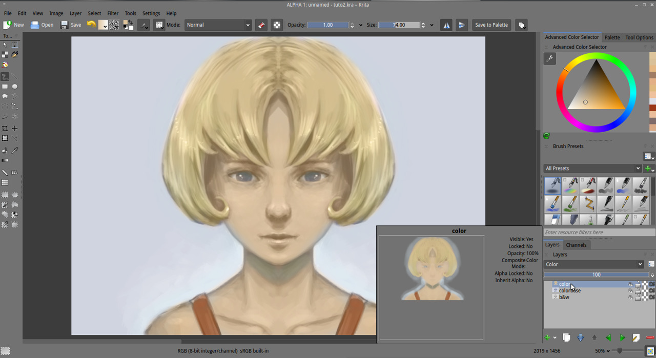
2. Flatten all your layers Ctrl+Shift+E or in menu Layer > Flatten Image , name the result 'b&w' . Duplicate your 'b&w' layer, name it 'colorbase' and call the Hue/Saturation/Windows color filter by pressing Ctrl+U. Check the 'Colorize' box.
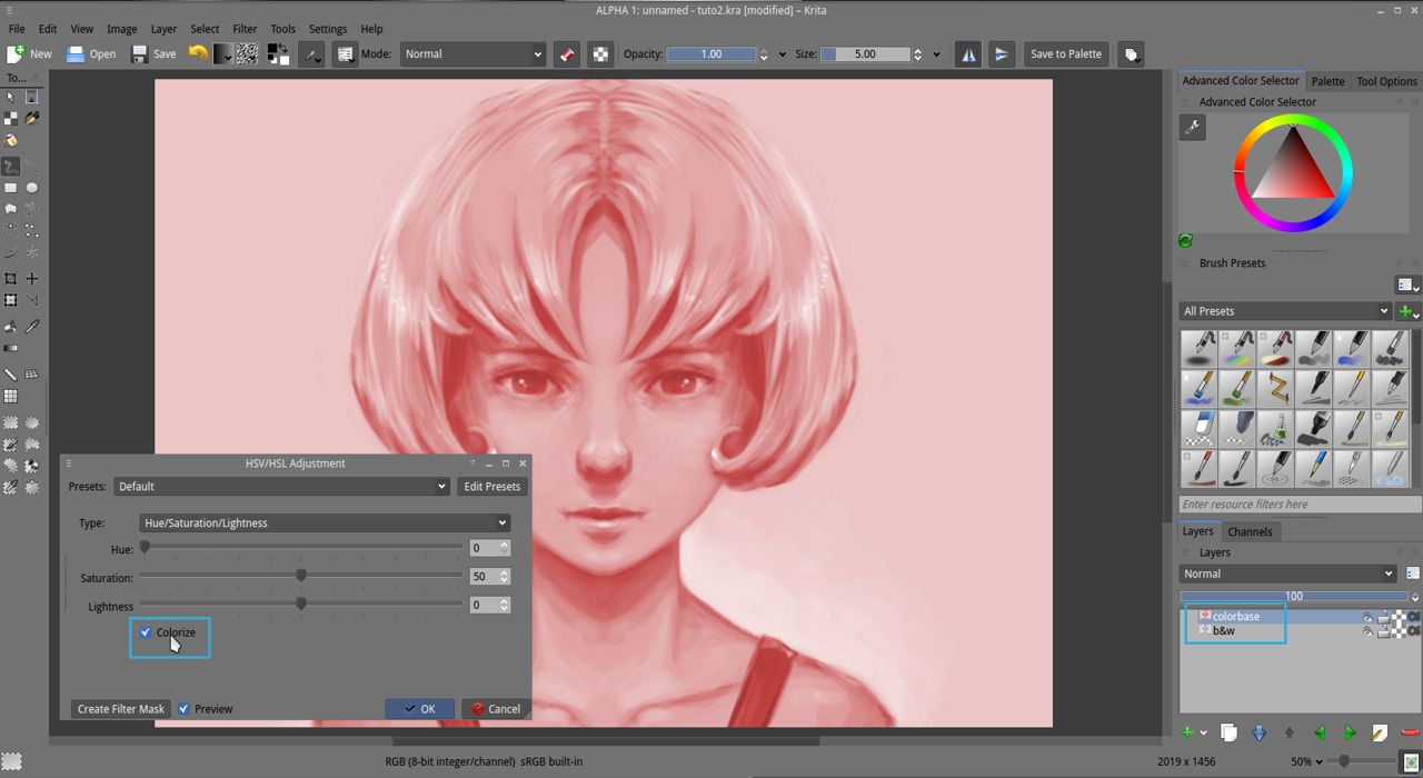
3. With the Hue and Saturation slider, search the main tone of your picture ( don't use the Lightness slider, keep it at 0 ) . Here I want a desaturated blue hue. Then press ok

4. Create a new 'paint layer' above, named 'color' with the blending mode HSY > Color . Take the 'Airbrush_pressure' brush preset. Do a first pass of tinting area of your artwork with pure colors and test around. Fun , right ? on a 'HSY color' blending mode layer, all the stroke affect only the Hue and saturation , not the value. So you can keep your value and paint color without destroying them.
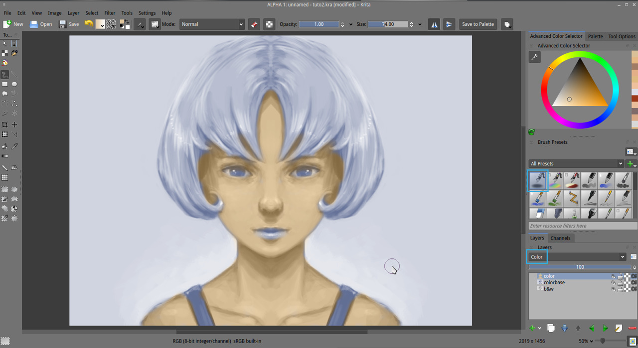
5. Keep painting. Note : the color picker ( hold Control key plus click ) works fine on a Color type of layer , you can use it. Adjust when necessary by removing the color with 'E' the 'eraser mode' to reveal the base color underneath or enrich the range of colors in your artwork by using hue from the Advanced Color Selector. I often restrict myself to unsaturated tones because it's easier to saturate or enrich later. You can see on the screenshot my 'layer preview' ( a dialog who appear on the bottom right, it will appear also for you if you keep stylus over the layer name ). This preview will give you an idea of the painting work I do on it.
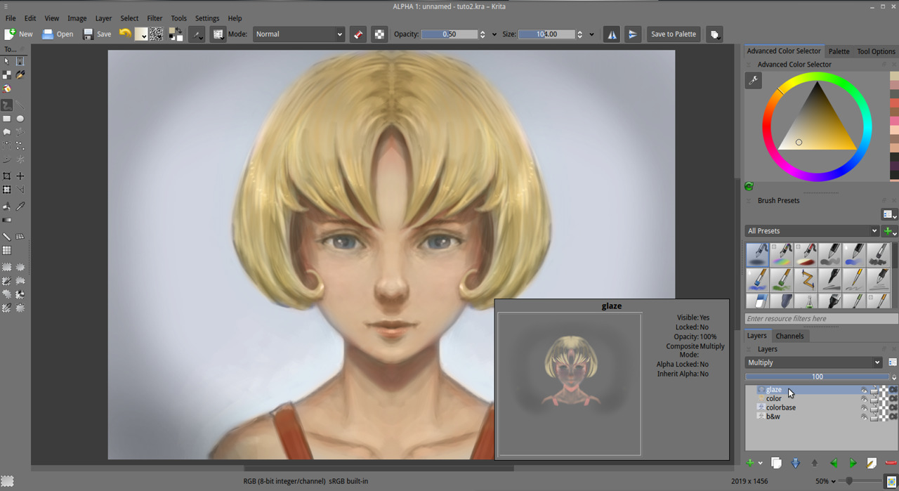
6. Create a new paint layer named 'glaze' and with the blending mode Arithmetic > 'multiply'. We will do now an almost similar pass than a traditional glazing with oil painting . Take again the "Airbrush_pressure" brush preset with mid opacity and glaze the colors, add red in the shade of the skin to flesh the model , make deeper the zone where the skin doesn't reflect light , and let see more the blood color under the skin. Crease also some deeper shade for the hair. Glaze the eyes as if you would perform a make-up on them. Resize your brush if necessary to perform more little details. I don't advice to zoom in. Glaze also the lips as if you were applying lipstick on them. Remember glazing will darken only the colors and so it's important to keep doing it steps by steps, low opacity strokes by low opacity strokes. Glaze the overall artwork till you reach a good aspect ; this include hairs, backgrounds, etc... ( Note : Glazing steps is good to add stain, tatoo, patterns but to keep this tutorial clean and generic, I'll keep my basic character ).
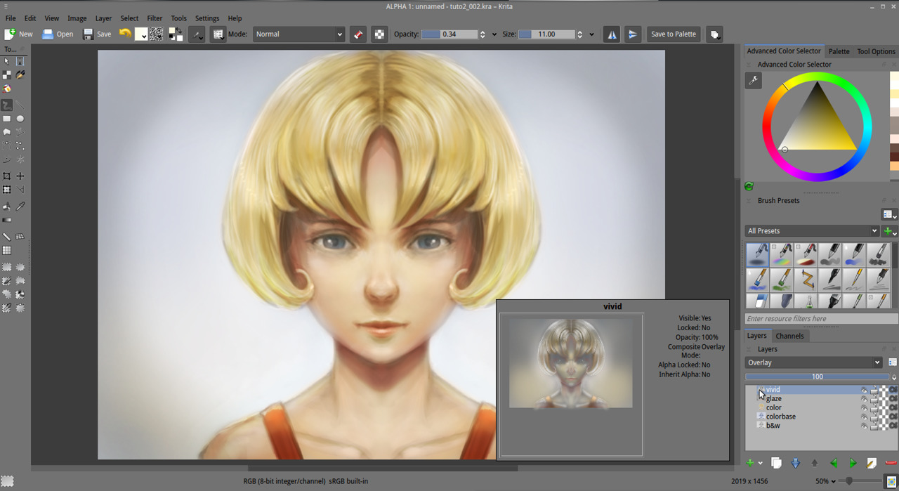
7. Create a new paint layer named 'vivid' and use the blending mode Mix > 'overlay' on it. With a dark airbrush at low opacity , vivid the shadows. It should increase the contrast in those areas, unify the local tones and add saturation. Do the same with a bright color to brighten zone and so, increase the intensity of the lighting. With white , do little and subtle corona of light around your higher values ; such as reflection on the lips, and on the eyes.
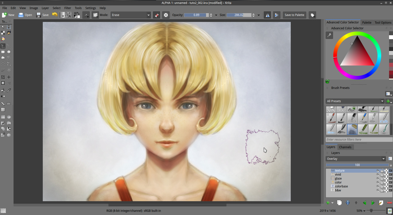
8. Create a new paint layer named 'texture' and use the blending mode Mix > 'overlay' on it also. With a dark grey and a variety of preset who do textures on the canvas as the 'Splat_texture2' or 'Sponge_texture' in the default brushes, we will add a soft texture to part of our artwork. For example, a bit of grain to the skin. Be subtle , the effect should not 'jump' into the eyes, but be a secondary thin effect. If your effect is too strong , erase it.
The colorization setting for our artworks is now done. The goal was to 'sketch' the colors of our artwork. Also, I kept the color choice simple on my example even if it's a bit boring and generic. But i think a tutorial example has to be generic to be enough open to any interpretation. The important is now about what you can do with it. Feel free to test make-up ; tatoo , blue skin , reptilian skin , colored hair , etc... etc.... more material , more lighting situation.
A bit more about the 3 pass, 'color' / 'multiply' / 'overlay' : There is an endless way to digitally colorize a black and white artwork. Here is just a 'cooking' proposition on how those three pass of layer blending mode 'color' / 'multiply' / 'overlay' can work together. They work better if you kept your black and white value bright as we did on the previous tutorial. If you practice them, they become predictable. I hope this visit inside the interface of the powerful options of Krita made you discover new aspect of this software. Options you probably ignored before. Repeat it again till you'll feel more confident with the steps to replicate without this page and express your color tastes with this tool and method. Next part ( to be published ) we will learn the way to push the rendering to a higher definition and correct bugs. Our picture has many issue now , and don't offer many details. By the way, those issues and bugs can have a charm. A 'speed-painting' charm.
A question ? Want to share the link of your results ? discuss ? use the comments, I'll be around :-)

68 comments
this is absolutely awesome!! Thank you for sharing. :))
Great tutorial!
I am Gimp user and want to switch to Krita, and just heard about that HSV blend mode...
This tutorial reminds me that every artist has its own way to paint, especially in digital art. I learn digital painting by trial and error, most of the case without using any tutorial. Usually I paint with less layer as possible, not adding new layer but changing the brush mode, and I think I made a mistake... Your way is more easier... (;_;)
Hell, thats awesome! I knewed about layers blending modes but didn't knew how they work and never studied this question by some reason. But this article ^^ open my eyes. I'm so impressed doing this kind by myself. And now i realised that coloring with help of layers blending modes muc easier and faster, I'd even say a hundried times faster and easier. At least for me)) Thx, David, for this article!
Bonjour David, toujours du bon travail... je viens d'installer Krita (win). En téléchargeant la version krita_x64_2.7.8.13, c'est la version 2.8 pre-alpha qui s'installe... avec tes brushes...
Une question : il y a visiblement la possibilité de choisir la langue de l'interface. Sais tu où on peut télécharger les fichiers de langue ? merci par avance.
Franck B
Paris
@Franck B :
merci! Oui. Pour Windows les dev continuent d amener des modifications car Krita n y est pas stable contrairement a sur Linux. Donc 2.8 et alpha pour dire en cours. Au sujet de la langue, j ignore windows. Sous Linux Krita suit la langue systeme et est traduit a 100% en fr.
@todor @kot-barbos @Mr. Anon : Thanks!
Awesome, cannot wait for the next part.
Very good tutorial. A simple question: starting from a Black and White drawing is your usual main process to get your final illustration ..or not?
I usually start with a simple sketch and then I immediately color and adjust it until I get the final work.
Probably this is a good alternative way ...I need to try :)
@Stramaz : Thanks ! Yes, I often start with black&white sketch and I'm a kind of drawer who can't really keep it 'line art' or black and white ; even with a pen I need to crosshatch some value. I think I really like working values.
Coloring immediately also happen ( more and more ) but I'm still not enough skilled to can manage right value and hue at the same time. My brain often need to split this into two pass.
I don't understand. When I use HSY → Color blend mode, my colors are much brighter than the ones I chose in the Advanced Color Picker.
I think I understand now, you need to have the value already set in the black and white image when you reach this part.
Nice tutorial, but when I'm coloring like this, white becomes blue and black becomes light grey. This confuses me immensely, for example what if i'd want to make a dark haired character but haven't got any black?
@Cestarian : Thx ! for your color invading your whites and blacks ; just paint them with white/or/grey/or/black with a 'color' layer. You can also increase the black value and the white in the 'vivid' pass by painting white or black.
Thanks for your reply, but the problem is occurring when I use the 'color' layer. The darkest color (black) is Light Grey if I use the color layer, but it's perfectly fine black on any other layer.
But I'll go with your suggestion to increase the darkness in the vivid pass. Worst case scenario I'll end up with a grey haired character, practice is practice after all.
@Cestarian : Yes, it can take a bit of time before getting predictable effects. My technic is based on what I used to do when painting with traditionnal media. This is the 'grisaille' oil technic ; more infos about it in this lovely video : http://youtu.be/vK9KVRH3Qm4 ; I do :
- black and white pass ( part 1 ) to get a grisaille
- Color layer ( start of part 2 ) to get dead colors
- Multiply layer ( mid part 2 ) to do the glazing
- Overlay ... this part is not in oil painting , but I use it just to reinforce the local contrast and boost/vivid colors.
Thanks for the video, it was hard for a n00b like me to keep up with it though, but watching it I now better understand the thought process behind what I was doing in part 1 of the tutorial, so it helped :)
One thing I always have problems with though is selecting the colors for the skin, and sometimes the hair can be a bit tricky too.
When it comes to the skin, in this tutorial I tried to find my own skin color which turned out questionably well, but before when I drew some portraits as an exercise, I found a random picture from my wallpapers folder which had a skin-tone that I liked and picked out the skin color, then copied it to my painting program.
Do you have any tips or know about convenient tutorials about that? You seem to be really good at it.
@Cestarian : Thanks for your comments about my skin tones. I'm constantly working on it; and when I see work of masters ; I feel I still have to study a lot. As far as I understand it ; it's important to approach skin not as a surface , but as a 'full' material. Bones, blood, skin thickness, nerves ; all of this impact on the final color selected for the skin. Mixing this with shading of the scene, and tones of the ambiant ; and it's probably one of the most difficult material to render.
Some easy and constant tips :
- Shadows are often reddish and saturated ; no light impacting on the surface make it easier to see trought it ( and reveal blood tint )
- Greasy part tend to reflect more light than other parts and shine
- Part with small hairs can catch environment light ; like the bright blue of a sky
A good start to learn 2D material rules is on this tutorial : http://androidarts.com/art_tut.htm , one of my favorite tutorial.
Thanks a lot! those are some nice tips and a great tutorial! (Ironically, I saw a link to that tutorial on the Krita forums just yesterday but never opened it, what a shame it would have been to miss out on that gold mine!)
Not only are you one of the artists that inspired me from the start, but you've also helped me immensely in the process of getting started as an artist with your tutorials and replies ^_^ (And I've still got a few of your tutorials in queue, like the Chaos & Evolutions one which is currently next in line)
I'll be keeping an eye out for your stuff of course, and you may see more of my comments around here and there. When I'm starting to think that I'm getting pretty decent at art, I'll make sure to let you know as one of the people that helped me (directly even) to get there.
@Cestarian : That's nice ! Thank you, and again I wish you to find all the time and patience necessary to train your art. A last link about a 10 year old tutorial from a master , I learned a lot with this one : http://www.androidblues.com/JealousyStepbystep/jealousystep.html :-)
Thanks :)
That one was nice and short, I learned a few things about how to work with lighting. Highlighting in particular from that one.
I feel that I can probably learn more from it later though when I've learned more than I have now. Luckily I write down all the tutorials I go through in my DA journals so I can dig them up later to re-visit. I should keep them in a single list though.
I do this because since I'm learning, and trying to do it fast (even if I'm patient enough to take my time of course, I don't rush even if I'm in a hurry, and since I got a tablet I've progressed slowly but read and watched a lot of tutorials and don't allow it to drag me down, I know it's just temporary.) Once I've had some decent success and can draw at least half decently, I'd like to set up a guide designed to take people step by step from being "bad" at drawing up to the level I'll be at in as short amount of time as humanly possible, simply by pointing them towards the right tutorials and what order to follow them in. I'm hoping it'll be good enough to help people to go from "no/low" skill to "mediocre/half-decent/above-avg" or better skill level in a matter of months. Preferably just one month really, but that's super optimistic. However that's one of my side-goals, even if it's not exactly my true motivation & ambition ;) some of your tutorials are bound to be there (the tablet calibration one is worth it's bytes in gold for example, and the open-source by choice article is something I think most people should read to be more informed on the software-side of things)
@Cestarian : Nice you keep a journal of it. It's really precious , I'm curious what type of tutorial is the more useful when starting.
Long Post Ahead (my bad wall'o-text habit is showing, but I guess "what type of tutorial is most useful" is a complicated subject)
Well, I guess since I'm a beginner that makes me ideal to ask, but since I haven't learned all too much yet it may be a bit too soon to ask.
In general though, you can divide beginners into 3 categories
1: Traditional Art Beginners (Most/all people start here, I started here even if I got a tablet after only 3 days)
2: Digital Art Converts (People who are lucky enough to already be good at traditional art, but completely new to tablet drawing)
3: Digital Art Beginners (People at my stage; Total n00bs that are starting out on digital art, the rare "Pure Digital Artist" type)
What kind of tutorial is ideal depends most importantly on what the artist wants to do, but secondly on what category he falls into.
Usually what they want to do can be divided into 3 categaries as well. (Ignoring the differences between "Painters" and "Drawers", for me I actually want to combine both painting and drawing techniques, like one of my other favorite artists; Elsevilla)
1: Human(oid) figures & Portraits
2: Inhuman figures (Monsters/Animals)
3: Environments
I guess there are many more subcategories to each, but for example if someone wants to be good at drawing objects (like trees, spheres, tables) he falls under environments.
Most artists will want to do all 3, but they have to start at just one of those, the one that's most important to me. For me out of what I listed I'm artist category 3 and focus category 1.
You can keep these in mind when making tutorials (what types of users would you like to help)
Then theres different kinds of tutorials. General and Specific. The one we've got here is very specific to digital art and coloring/shading/highlighting previously drawn objects, then inbetween the lines the reader can learn some things about drawing portraits even if you didn't actually explain much about it (i.e. this tutorial assumes that the artist is already at an intermediate level in portrait drawing)
However the beauty of it is that since it focuses the most on workflow and on coloring/shading, it can actually be applied to any drawing. This tutorial is as much gold as the reader can make it out to be I guess, largely because it's lacking in detailed explanation (it takes reader maturity and attentiveness to learn a lot from this tutorial)
This tutorial was useful to me, but I feel that due to the lack of explanation it's both hard for me to follow and for less patient newcomers, it could even be impossible to follow. However that is fine because this tutorial (I assume) was aimed at intermediate artists rather than novices. However for an example of the areas where I failed, My version of the picture looks like an asian adult woman rather than a young european girl, the hair is a gooey mess, the shading looks hideous, the lips are not pretty and I haven't finished the coloring part (face looks like clay) deciding that I'll return to this tutorial later when I'm more used to the tablet. My picture looks downright creepy, but I learned a lot from you about drawing realistic looking eyeballs. However, since the eyeballs are the only thing in the image that looks good, the rest looks downright creepy.
I keep my tutorials documented in my deviantart daily journals, both the previously seen and the queued. You can see them here http://cestarian.deviantart.com/journal/?catpath=/
I don't comment much on them though, except the ones I've figured out by now were particularly useless.
Let me count up here which ones of the ones that are in the seen list at this moment (up to 20) I find the most golden.
7 & 9 (Good basic concepts to know about)
8 (Real gold for a beginner who wants to go straight to pose design; stickman skeleton make for decent training wheels)
13 (Just some general info that's good to have about tablet usage)
15 (Concept that all you really need to think about when painting is light and shadow; a bit advanced for me though, but I keep it at the back of my head)
18 (This goes beyond gold; It's a diamond for a beginner of any art style I believe)
19 (Yes, you! this is something that 13 didn't cover, but is absolutely essential; No wonder it was so hard to use the tablet. I followed this here tutorial without actually calibrating my tablet, looking back that's just pure hell, nothing comes out right)
there's also something I forgot to add to the list the other day; but am adding to todays journal, that's Alphonso Dunn's 5 stages tutorial
http://www.youtube.com/watch?v=HzydK56tr9U
and ways to draw faster (which really doesn't teach you anything about drawing faster, but perspective and proportions)
http://www.youtube.com/watch?v=aLxJItMVvf8
When you break things down, what I personally find most useful are the tutorials that teach me the fundamentals and barebone basics, but teach them WELL. And there's nothing I love more than cheap tricks (for example, the mirroring function in Krita which allows me to get away with drawing half a picture instead of a full picture, or how to draw a box (i.e. draw 2 square shapes overlapping with each other, then connect the corners)
So yeah, any tutorial that covers the basic basics of all basics is a good tutorial. this may include but is not limited to
Techniques (<- Tips and Tricks, for example rotating the canvas, your tablet ergonomics tutorial, how to hold a pen, how to determine where light hits, etc)
Workflow (this tutorial was great for that, but everyone eventually finds their own workflow I guess)
Drawing general objects & shapes (Like the "how to draw" that tells me to draw endless cylinders and spines which automatically imprints some basic technique in my head)
Drawing specific objects in non-specific shapes/angles (Head, hair, HANDS & FEET!!!, female/male body overall)
Shading/Highlighting (You go a bit into that in this tutorial, but not in detail, then there's cel and soft shading and whatnot to think about)
General software usage (Keyboard shortcuts, Keyboard shortcuts, Keyboard shortcuts, functions like layers, brushes, selecting a resolution(thanks!), etc)
Specific tool usage (in software, for example selecting the right brush, the right filter, creating brushes, using patterns, using layers, etc)
Yeah, there's just a lot to art. Lot of content to cover, and it would probably take years for one person to cover it all. But when it comes down to it, I think the very best tutorials come from skilled artists teaching everything they know in detail about the thing they think they're best at and enjoy doing the most.
So when making a tutorial you could just pick an area that you yourself think you excel in (no one would know better than you yourself what you excel at), think about it real heard and break it down into details, then make a tutorial explaining these details as well as possible in as few words as possible, but the really hard part about making a good tutorial is while still using few words; make it easy to follow for a novice.
This here tutorial is hard for a novice to follow, could be impossible. for some. Calibrating the stylus tutorial is perfect for a novice to follow (you even go into details) tutorials that don't require great skill.
Explaining how to do that is hard, I don't even know. When I make tutorials they're usually very easy to follow, but super long too (walls of text)
If you want to apply some video-game logic to making a good tutorial, watch this.
http://www.youtube.com/watch?v=BCPcn-Q5nKE
I'm sorry; I'm going into more detail.
Basically, a good tutorial is gradual, to make it good you must start at an elementary school level stuff. For example, how to draw a sphere, cylinder or box (for drawing) how to color an area with a single color (not worrying about shading or highlights, like this one does)
I'm sure you understand what I mean by now :P (Sorry for talking in circles like that)
The basics are
"As few words as possible, but as many details as possible" (One way to do this is to make a tutorial with minimalistic explanations with links to heavier, detailed explanations about every single thing being taught in it + a foreword that says "avoid reading the detailed information links until after you finish the tutorial" by minimalistic explanation I really mean 'why' so for example the foreword should also include "Because: if you stop to read too often you'll lose your flow and have to warm up again" or something like that.)
"Start at as low/easy a level as possible" (Like drawing stick figures or simple shapes like boxes or circles)
"More action, less text" (Keep people engaged in the tutorial so they don't have to take long breaks to read and lose their flow, this here tutorial is a perfect example of doing it right, however the drawing in your example is pretty much too complicated for a beginner, i.e. he needs to already have a good enough understanding of fundamental basics to know how to draw a portrait and all the elements of it (shape the eyes, draw the hair, proportions, etc) to be able to progress through it)
If you want to cover advanced topics in tutorials (like right here, coloring + shading is pretty advanced, perspective is advanced too) it's a good idea to make a series of tutorials starting at something so easy a child could do it, that eventually leads to an advanced technique. Like shading with colors rather than b&w transparent brushes level of advanced technique.
I think the most perfect example of a good art tutorial for a beginner is this (1-4 at least, haven't followed the rest)
http://www.youtube.com/watch?v=h-fx2ptnFKY&list=PLAfY_yXJX0MTHW_1ndr95y8uQ8vkHcYKr&index=1
There's a lot more to say, but I'll lay off, you get the picture or at least what to think about when making a tutorial by now.
TL;DR:
Short answer to your question is:
The most useful tutorials for a beginner are the ones that teach the barebone basic fundamentals of things (absolute novice level stuff), like drawing simple shapes, applying colors to lineart, how to hold a stylus, making a light source and determining where it hits, applying shading to the image after that, the most basic techniques out there (like drawing a "crosshair" and turning it into a head, or shaping the hips of a female) it's the tutorials that teach you how to actually draw (assuming the most you can do at the start is read and write), concepts and how to make use of these concepts/applying them to your images (like shading or coloring techniques, perspective, proportion, etc) however, to make those tutorials interesting it's important to wave a carrot into the readers face. For example if you're a skilled artist (You are.) you can flash a nice picture you made and say "this is one of my pictures, and I would like to teach you about this technique and that concept" or like the "how to draw" guy did (in video 3 I think) teach super basic stuff, and then draw something cool with only the things he's taught so far, however my opinion, that one is a bit late showing off what this tutorial will teach you how to do (this here tutorial does it well, flashing the finished image into the readers face on the first page), but better late than never.
@Cestarian : Hey, Thanks for the long break-up !
You really spent time on it, and your links and documentations are a really clean feedback, giving me a better idea of some basics skill I never covered in my drawing/tutorial arts.
All of this will help me to improve my next tutorials.
I really liked "More action, less text" , "Start at as low/easy a level as possible" ; I really think my tutorial collection is still missing this sort of essential skill ; a sort of big first 'to-do' , or from-scrash.
Also, I realize my " Getting started with Krita" is targeted to user not really beginner with drawing.
So, I'll think about it, it might take me time to do ( I'm working right now on a movie , plus I'm learning & training for new drawing technics because my taste had evolved with time but my technic not really ).
Awesome! Glad to have been of help :)
Just remember to place the carrots too!
I look forward to your movie :)
Obrigado pelo tutorial e parabéns pelos lindo e inspirador trabalho. Esse foi meu resultado. não muito bom , mas vou aprendendo xD
http://imgr.co/cache/img/0fb9a102bc5d07f142e7382d951599ef.jpg
Thanks so much for this tutorial, David! I am new to digital art, and was overwhelmed by Krita, but really wanted to use it, and now I can. Additionally, you taught me art techniques that I have never come across, since I draw for the fun of it, and haven't trained in school or professionally. What a bonus! The b&w/color layer techniques will be great to experiment with, since I've found myself drawing then coloring, becoming dissatisfied with the color and losing the drawing a bit without being able to recreate it to my satisfaction. This will save the drawing (from me! hehehe), and will give me room to play with colors. Thank you for the time and effort you put into this. It's a gem and your picture is very pretty already:) Looking forward to Part 3!
@Lizzy : Many thanks for your very positive feedback ; it encourages me a lot to continue to publish free tutorials.
This didn't help at all. I'm sorry but I'm new to Krita and I don't know where you find the blending mode and the brush you used etc. And nothing happens with the color layer when I color
@Couchpotatoe : sorry to hear about this. This tutorial was done years ago on 2.7 , 2.9 is different. If you follow the steps and the screenshot from part 1 , then part 2 it should help.
Wow!! Great idea. It's very hopeful. I appreciate your work. Thanks for sharing.
Hey David , your artist style is very perfect. Thanks for sharinh such nice art tutorial with us.
Hi, I really like this artistic tutorial series. But it seems the link to 3rd part isn't working. can you see to it?
Thanks
P.S- I need a tablet to draw, mouse doesn't work well here
Hi David.Thanks a lot for this great tutorial.I've learned a lot and it's made me feel much more confident about digital painting. But I have a little problem.When I work on the 'color' layer above the 'colorbase' one,I select a hue but when I paint it over it's much lighter than what I chose.This happens with all brushes,not just with the Airbrush.I checked for any mistakes in my blending modes or layer order but everything is just as you explained.In the layer preview the hue is right but it seems like the problem is in the way the layers interact.If you know what the problem is, please tell me. Thank you!
EDIT: Apparently this happens when I use darker hues since when I used lighter ones (light skin,blond hair) it seems to work fine.
@PR : Hi! The 'Color' blending mode only affect the Saturation and Chroma ; not the Luminance of the picture. So the brightness of your color pass depends only if the value of grey ( Luminance ) was setup more or less right. Maybe your grey pass was too bright?
[edit] oh, I just read now your second message. Yes about dark colors: they contain a lot of grey/black and this one just make colors a bit greyish and not too saturated.
Good luck!
The 'ctrl+U' doesn't work to bring up the hue saturation window. How do we get that window to pop up?
Oh, it sounds like a bug , or custom shortcut layout.
The filter is in Filter > Adjust :
http://www.peppercarrot.com/extras/forum/2016-11-24_Selection_001.jpg
There are some things that aren't working anymore and I decided to make a list just in case users are confused. For new users using Krita 3.0, there's a chance you won't be able to
1.) use ctrl + U for saturation window. Simply go to Filter at top of program
> 'HSY color' blending mode layer, all the stroke affect only the Hue and saturation , not the value. So you can keep your value and paint color without destroying them.
This part right here is actually very unclear. Since in 3.0. our new paint colors are not blending with the colorize layer. As a result, many readers may be stuck by this tutorial depending on how well they know their way around the software, and/or if they're looking for different techniques to improve their work such as I.
Thanks for the list. 3.1 is coming soon ; did you tried the last beta ? https://krita.org/en/item/krita-3-1-beta-4-released/
Hey yeah I did. After playing around with it and watching your recent tutorial I was able to find what you spoke of...the recent tutorial you made this year was beneficial. Other wise, I would have been lost. =D This goes for my other comment as well. Thank you.
Another thing I noticed is that when using 'color', if we create a new paint layer, the colors won't blend with the previous layer. So we have to remain on the same layer to do 'color' and 'over lay' with the new 3.0 Krita.
Oh, this is a very big bug. I didn't knew this one, it never happened on my Linux install since I started to use Krita 6 years ago.
Can you report it?
Yeah I can totally report it. I had no idea it was a bug. =0
Do you have a youtube tutorial on this....I think I'll do better with a video instead of reading.
hey david...this is an amazing tutorial...i am beginner to digital painting,,so i couldn't figure out some basic problems .whenever i saw your tutorial on your blog and on youtube i always see whenever you fill any color it makes very precisely outlined object.for example when you paint the hair it is only for background but when i paint it also painted some portion of background.i know this is an absurd question but i just want to know....and thanks for your tut.
Thank you Chetan!
The secret is just to keep things on separate layer ; so the line keep in foreground , and color in background.
thanks for the feedback!
-please email corresponding responses-
Hi, I'm at step 4 of part 2 when you create a paint layer to start using the airbrush pressure tool. Well, I was wondering why I can't use white because it turns the affected areas gray? Same thing for black, the picture I was working on needs white, but it shows up as gray on the color layer yet on the preview I can see the white color. Please help.
"Color layer" only affect colors. So white, grey or black are considered as non existing hue ; they turn the color to the value only ; can be all the shade of grey :)
Hi David!
Thank you for your tutorial and the time you spend with greenhorns like me :) The subtle tone, great detail and the mood in your art really is encouraging to practise digital skills!
I am about to finish the second part of your tutorial and noticed (no surprise) some problems.
Would you be so kind and give me a hint on two topics:
1. The hair detail - at the end of your job I can see them clearly - on my attempt there's a helmet instead of hair? Which step of the job I need to improve?
2. Blurred picture - I used wide strokes (esp. for the hair), so is it a matter of narrow strokes to make it sharp or something else?
If you can help, it would be great.
Here's the result I reached:
https://drive.google.com/open?id=0B9bFmKUKDfjbUXdkZTlSY1hsNDg
Thank you!
merci enormement pour votre tuto! j'ai encore beaucoup a amelioré mais je suis deja mieux qu'hier et c'est TRES motivant! ...j'aurais bien aimé partager mon petit travail mais je ne vois pas comment transfomer mon image en URL je ne m'y connais pas vraiment en ordinateur! Continue d'inspirer les autres et tes dessins tout simplement genial!
Alors alors, me revoilà face à un autre problème. Comme vous voyez, les couleurs que j'applique ont très peu de contraste et sont extrêmement pâles ... Ce qui fait que j'ai abandonner l'idée de colorer les cheveux en noir (ou quelconque couleurs plus foncé que blond). Je n'arrive pas à donner un aspect de rouge plus foncé pour la robe aussi. Bref, avec cette méthode de faire tout en noir et blanc pour ajouter la couleur, il semblerait qu'utiliser le noir et le blanc ou quoi que se soit de trop foncé ou de trop clair est hors de question et impossible. Comment puis-je faire face à ce problème?
(L'image se trouve dans le lien suivant.)
https://drive.google.com/file/d/0B_e4SnkEiT63c3o5UjV0eDhRSFU/view?usp=sharing
C'est un problème classique, le dessin en gamme de gris ( grisaille) à toujours des problèmes de valeurs de gris: il est difficile de selectionner le gris parfait l'hors du modelage des formes pour rendre un rouge sombre, un bleu bien foncé ou un noir brillant. Cela demande des ajustements. D'où mon idée dans ce tutoriel d'appliquer des passes de calques en multiply/produit qui aideront à assombrir et densifier des teintes ; ainsi qu'une passe en "overlay" qui elle peut facilement corriger des problèmes de contraste ou de teinte un peu fade. C'est faire un peu le DJ des couleurs :-)
Bonjour, tout d'abord, merci pour ce tutoriel, je viens de télécharger krita et ça m'aide beaucoup :D!
mais il y a quelque chose qui me pose des problèmes, quand je passe un calque en mode HSY---> Color et que j'utilise du noir ou du blanc, je vois apparaître du bleu à la place! je ne sais pas trop quel est le problème ou si quelqu'un l'a déjà posé, mais j'espère obtenir de l'aide!
merci! :)
Bonjour,
Si le dessin est coloré en orange, et qu'un trait en noir et blanc est fait sur ce genre de calque ; le trait en gris sera interprété par le cerveau comme un trait bleu pour compenser le trop plein de ton chaud. Avec un écran non calibré ( souvent à la lumière bleuté dans le commerce ) l'effet peut paraître d'avantage plus fort. Je démontre cet effet dans Chaos&Evolution vers 45min dans la video : https://www.youtube.com/watch?v=WOcvarqm4G0
Hi David,
Just wanted to say thank you for this tutorial series! I got stuck somewhere in the first part trying to fix the shadows and highlights, it's too hard for me too 3d model? (not sure it's the right term). Anyway, continued here just to try how the coloring process goes and just continued with what I had and basically just had fun adding splat textures. Here's my result https://drive.google.com/file/d/0B5WIUSqAYQgMZ0pvVXJYbU9UbVU/view. Thanks!
Hey ! Thanks for sharing your result and a nice word about the tutorial.
Yes, the part with modeling in black&white always need practise to get used and find a predictible result with colors. It's often a common trap to not contrast too much this step, or leave too much white , black ; or group all values of grey in the center ( 50% grey ). One key for good contrast, is to setup a "bed" for the illustration in low or high grey ; and choose an accent in the opposite direction. (eg. bright focus point on a overall dark grey artwork ). All my encouragements to continue and experiment !
I did not think you would actually reply, that's really nice of you :) Thank you for the tip, I would definitely practice more on that skill. Any chance you have a good resource for this? A book to recommend or perhaps a tutorial of yours? That would really help. Thanks you again :D
I have a tutorial in my notes, never published about "values". It's probably time soon to rewrite it and make a blog post with the notes.
The best book I saw talking about it were the "Color and Light" of James Gurney.
Also, about this type of workflow check http://www.androidblues.com/JealousyStepbystep/jealousystep.html ; it's an old tutorial ; probably published before 2004.
It's were I learnt this type of grey to color technique.
Good luck
These are great, salamat!
Beautiful work, amazing tutorial.
I'm just not getting it, at....step 5 or 6. I get stuck with a skin tone way too dark.
This was awesome! I would never expect the coloring of the painting to work like this. i find myself extremely struggling with proper color selection in each step. Also i accidentally worked in normal mode when i was supposed to be in multiply, i changed it to it afterwards but i feel there was definitely space to make thing better. Also i manage to loose details where i should enhanced them and vice versa. In the end i ended with more of "astar seran lighting" instead of your pure holy mystical divine lighting:) Thank your for a great lesson and whole this technique
My attempt:
https://imgur.com/HK53vqs
Also i should probably start painting on different monitor, my gaming high-framerate older TN panel has terrible washed out colors :/
i got it, forget to add last texture step...
https://imgur.com/YryfMWJ
Congratz for ending the tutorial! 👍
(oh, my bad, it's part 2 of 3, hihi)
Bonjour,
Merci beaucoup pour ce tutorial c'est vraiment top cette méthode étape par étape bien détaillée.
Je partage mon tout premier paint : https://imgur.com/RBZrStQ
Je suis débutant en digital painting et dessin tout court depuis 15 jours du coup je suis preneur de toute remarque et astuces ^^
Merci, et un gros bravo pour ce tout premier canvas.
Pour des remarques, le mieux est d'avancer; surtout dans les débuts et peindre se qu'il vous fait plaisir sans trop chercher à corriger.
La precision du dessin, des volumes, des rendu des matériaux et de la lumière viennent en faisant; et c'est motivant de voir les progrès en regardant dix dessins en arrière.
Bonne continuation!
Post a reply
The comments on this article are archived and unfortunately not yet connected to a dedicated post on Mastodon. Feel free to continue the discussion on the social media of your choice. Link to this post:You can also quote my account so I'll get a notification.
(eg. @davidrevoy@framapiaf.org on my Mastodon profile.)