


Production report: episode 31
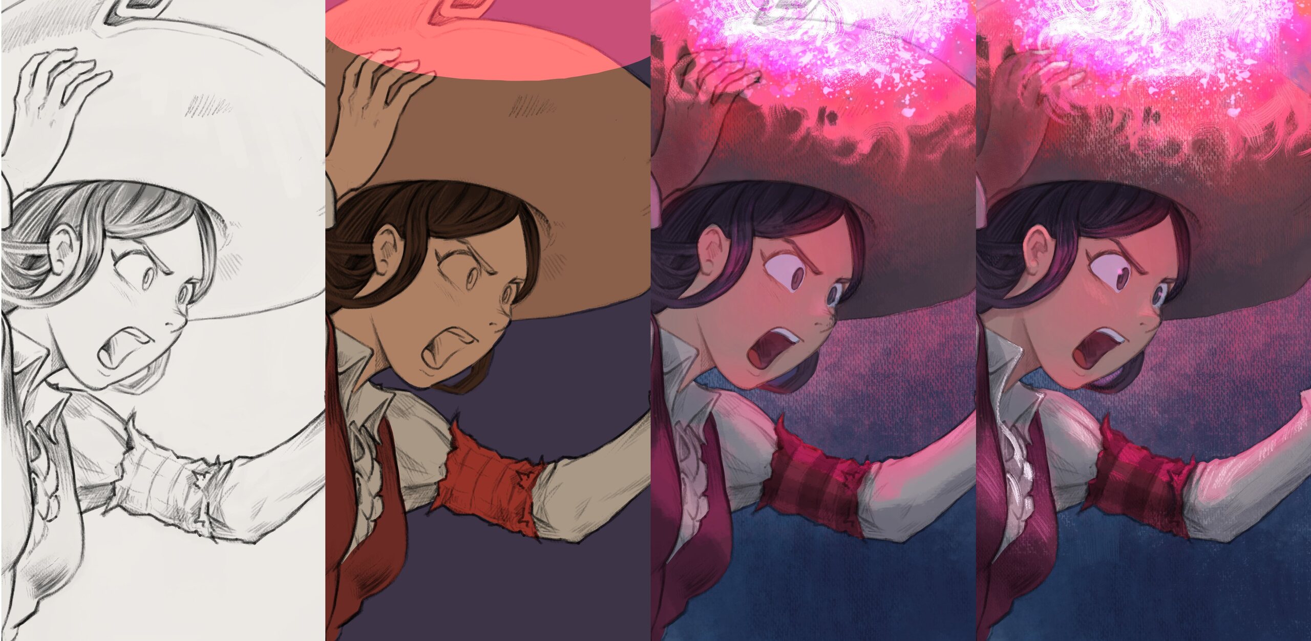
Table of Contents
Slowly but surely and in the background of the book-publishing project I've been working on new episode of Pepper&Carrot. Here is a report about that.
The challenge
You might be aware of this, but I'm using Pepper&Carrot episodes as an opportunity to push forward both my art techniques and my tools.
My first challenge was to upgrade my page format to 4K resolution, a significant upgrade from the first episode, which was around A4 size at 300ppi (2481x3503 pixels).
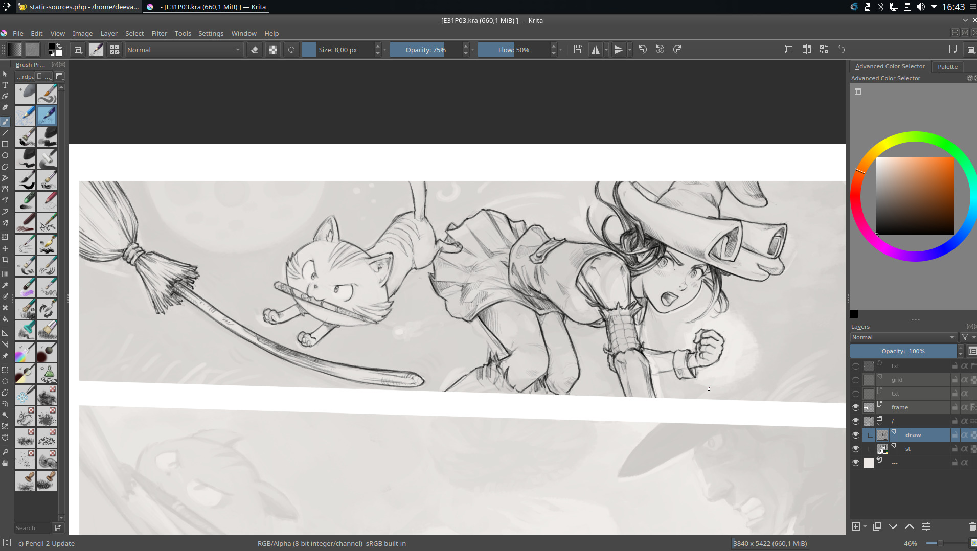
My second challenge was to ensure that the episode's style matched that of my recent illustrations. Lately, I've developed a fondness for creating artworks with a canvas-like texture. To achieve this effect in Krita, I've developed a new set of brush presets. You can download this new brushes here .

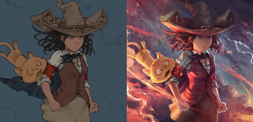
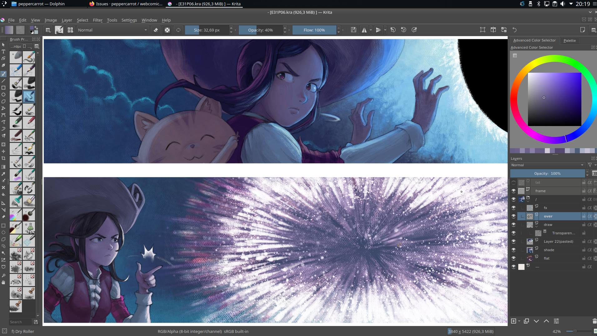
A close-up on "Black Hole" (illustration here)
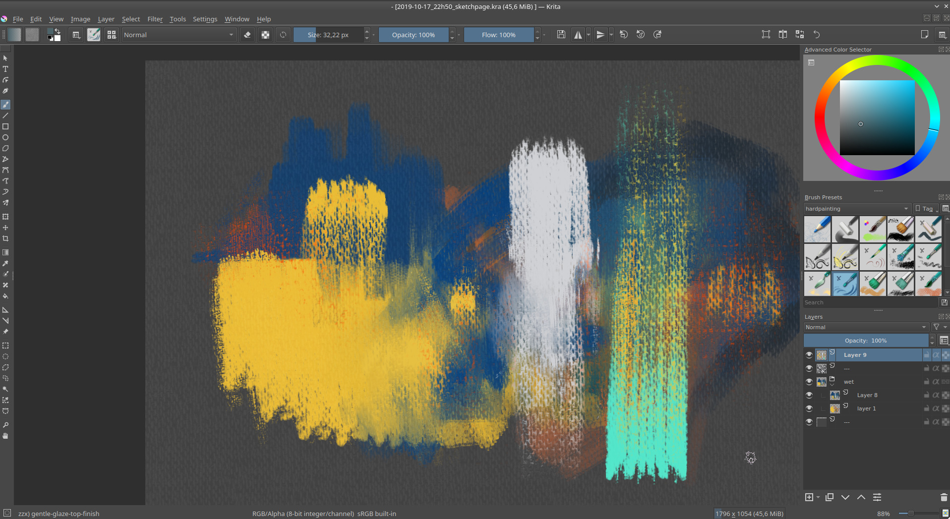
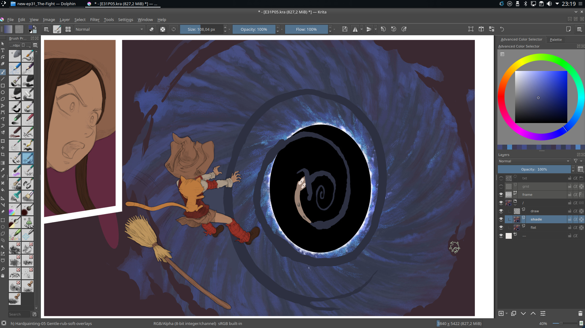
A screenshot of Krita while testing my new brush effects
Drawing training
I also spent many hours doing exercises and tests. I trained the fundamentals; anatomy, gesture, perspective, facial expressions... That was essential to survive all the frustration I gathered while working on the book project. I learned a lot and I felt the upgrade when I made a week of signing sessions in Paris at the end of November. Here are visual from this period:

I made a sketchbook I named "Testing" during this period.
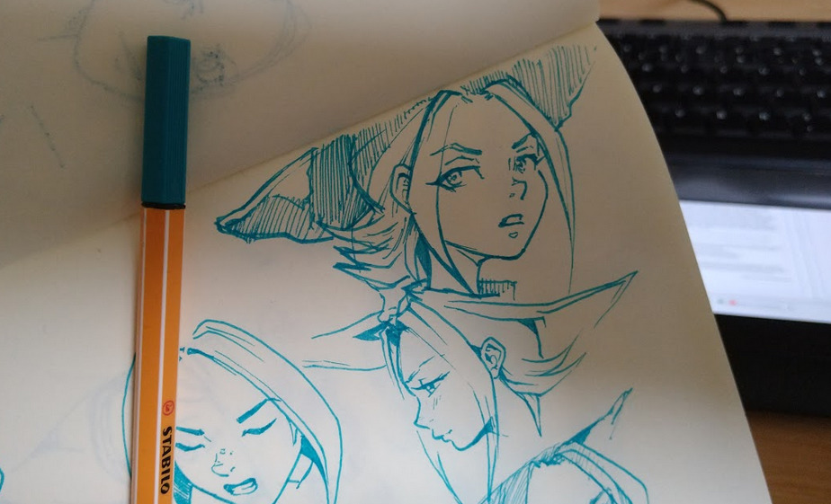
Inside testing, I experiment drawing with ink directly a lot.
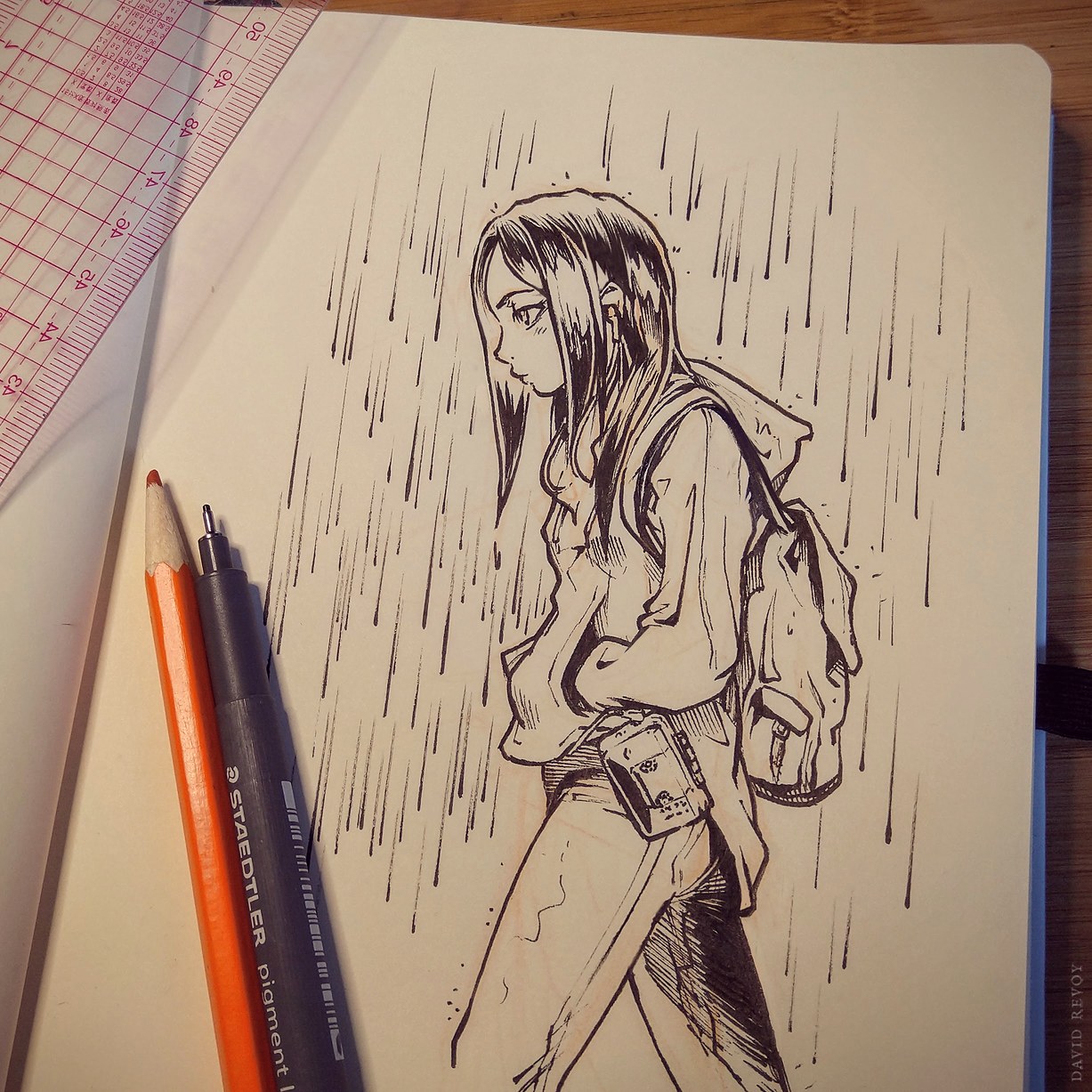
... or over a minimal sketch.
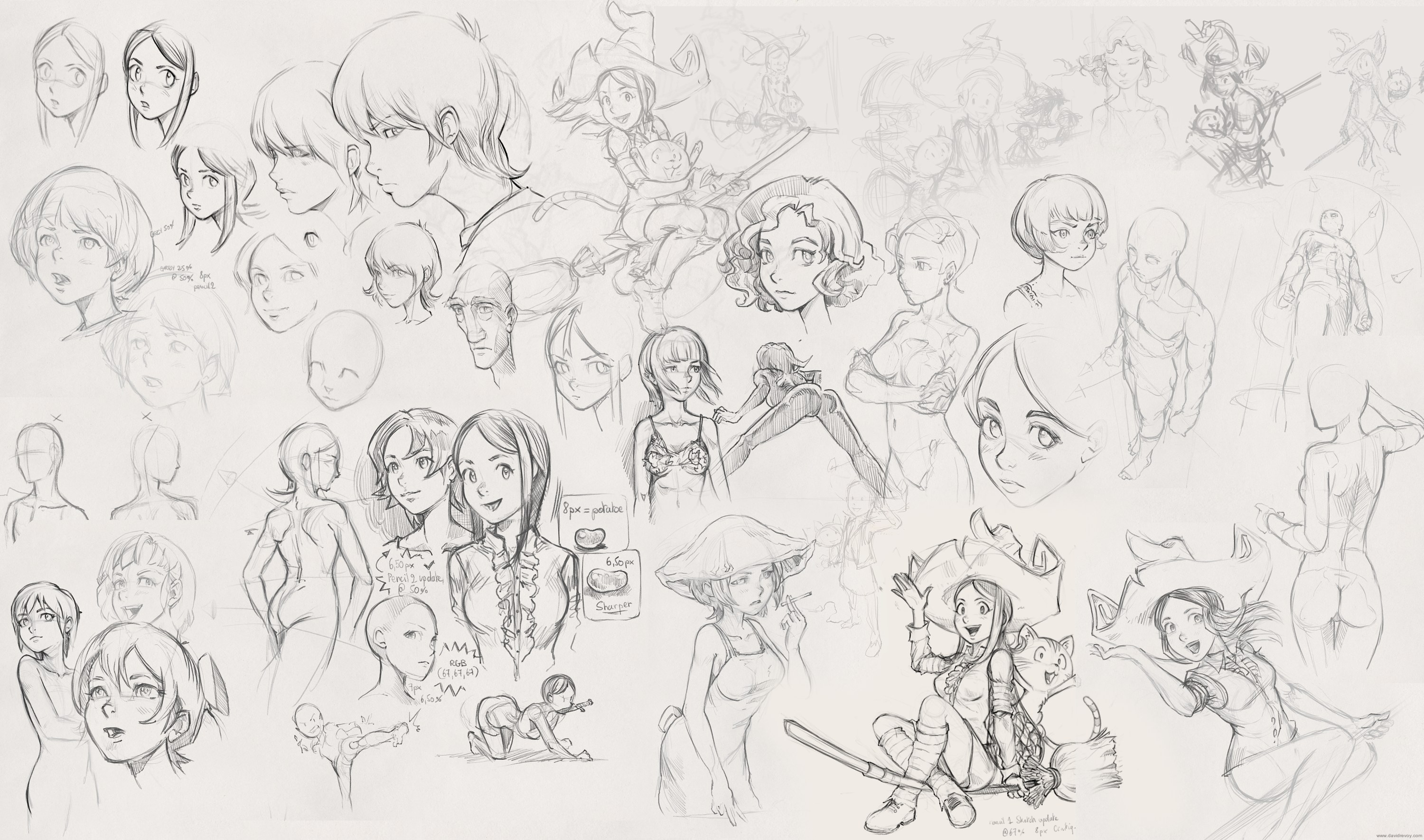
I did the same with Krita and my Cintiq13HD.
Writing and storyboard
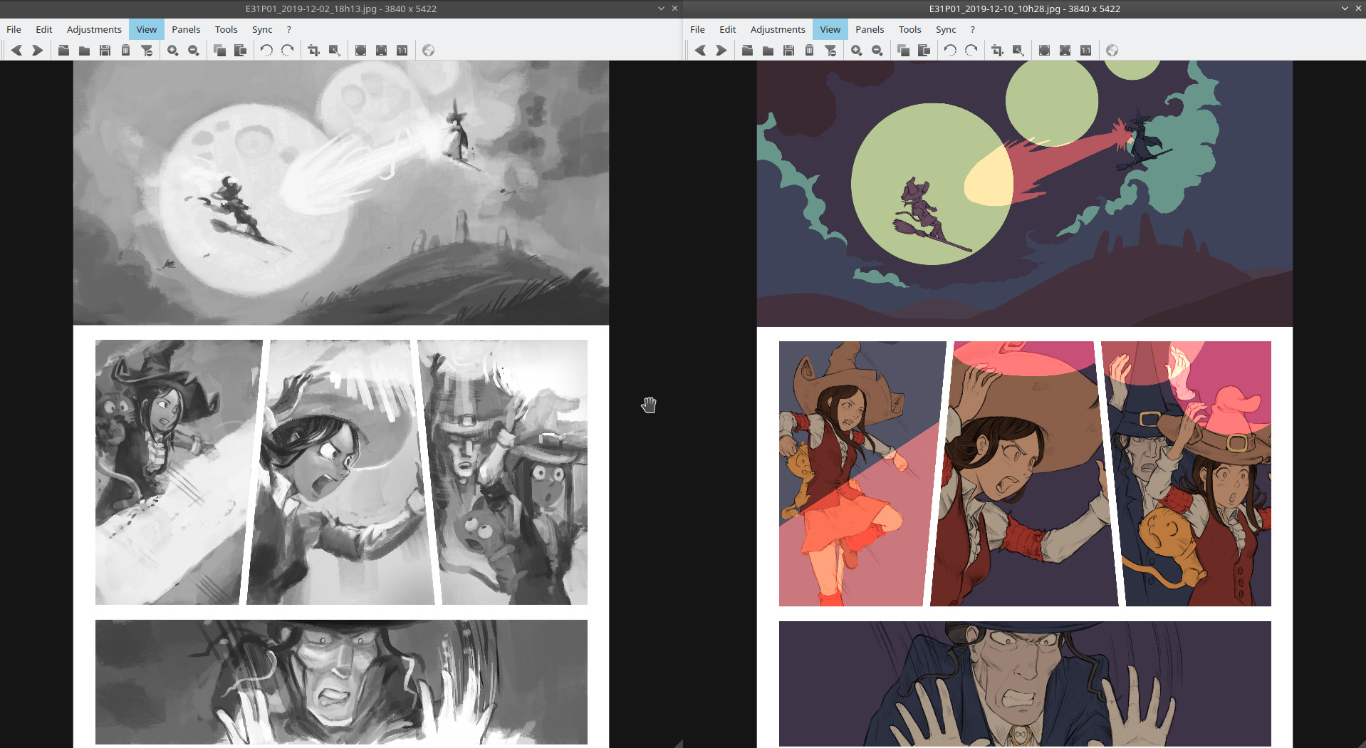
The story is born from many different thumbnails from my sketchbook; the main one driving my inspiration was clearly this doodle:
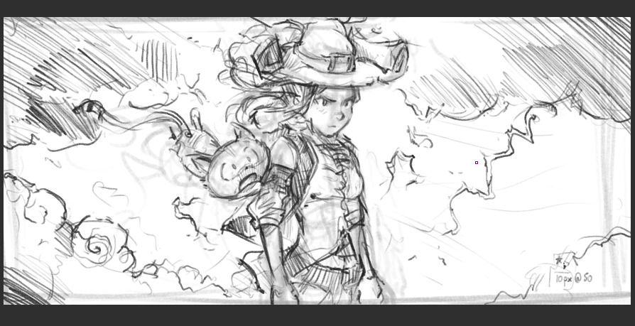
A quick thumbnail from June, source of inspiration for Episode 31...
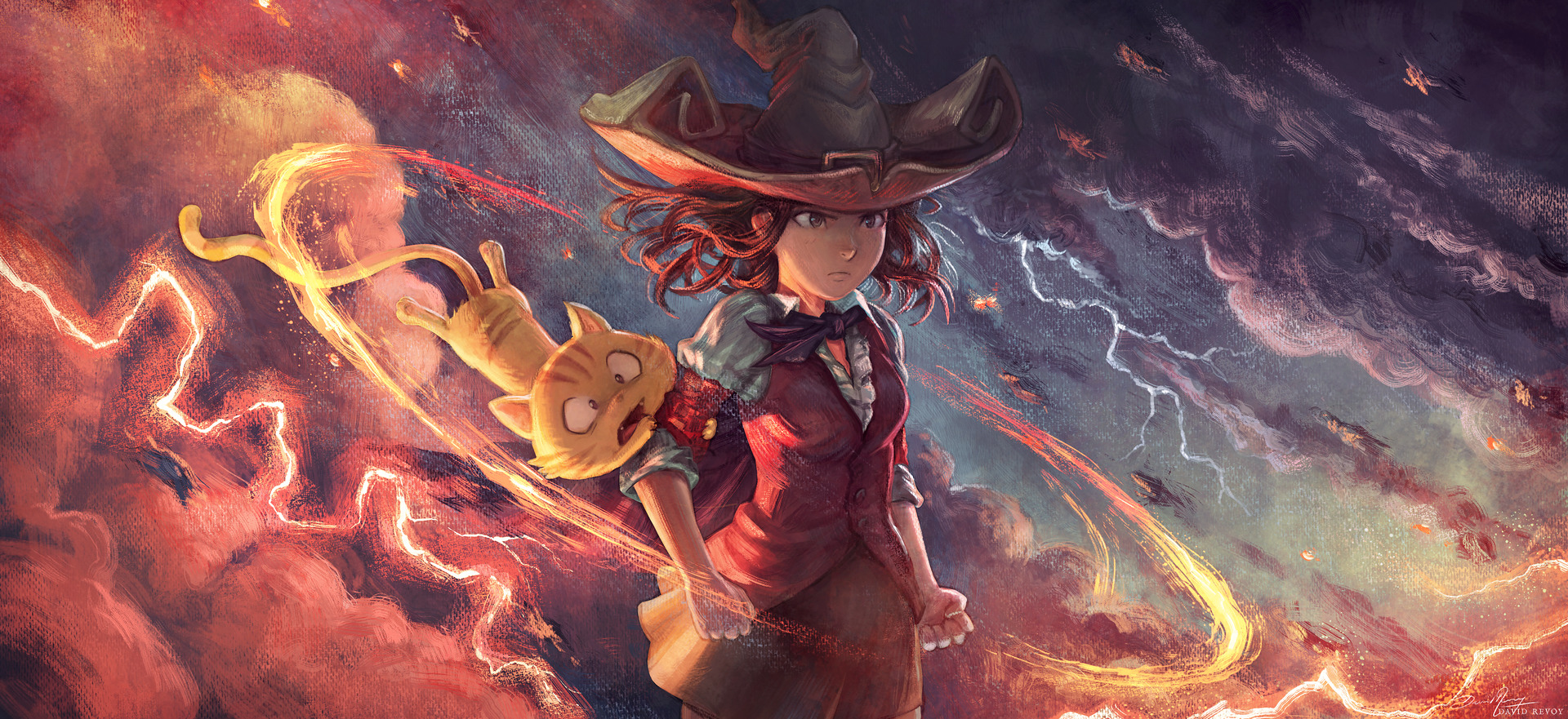
Same doodle with full rendering, for testing (illustration here)
I wrote the main story inside a text-editor to get an idea of the spine of the story but quickly, I felt I had to experiment with my ideas directly on a storyboard because episode 31 has a long fight scene and it was nearly impossible to just "write it down". I took a brush and started to speedpaint in black and white the episode as I did in my long video tutorial "a comic page from A to Z with Krita".
One of my surprises was how quicker I was and how my speedpainting of characters improved. I also experimented with the language: I wrote the episode in French and added subtitles in English under each speech bubble so I was able to keep in the loop the non-French proofreaders. I worked also on making more automation tools for the beta-testing to share a rendering of the version while I'm making changes, daily. This whole process allowed me to play more with the layout of the page during the process and interact more with the proofreaders of Pepper&Carrot on a thread of the Gitlab instance of Framasoft: Framagit (A big thanks to the small team which help me a lot for feedback and improvements!).
Black and white speedpainting blended well with the borderless white panel and working on them with Krita for the art and Inkscape for the text felt less difficult than in my previous episodes over these gray values. I had a very good creative time.
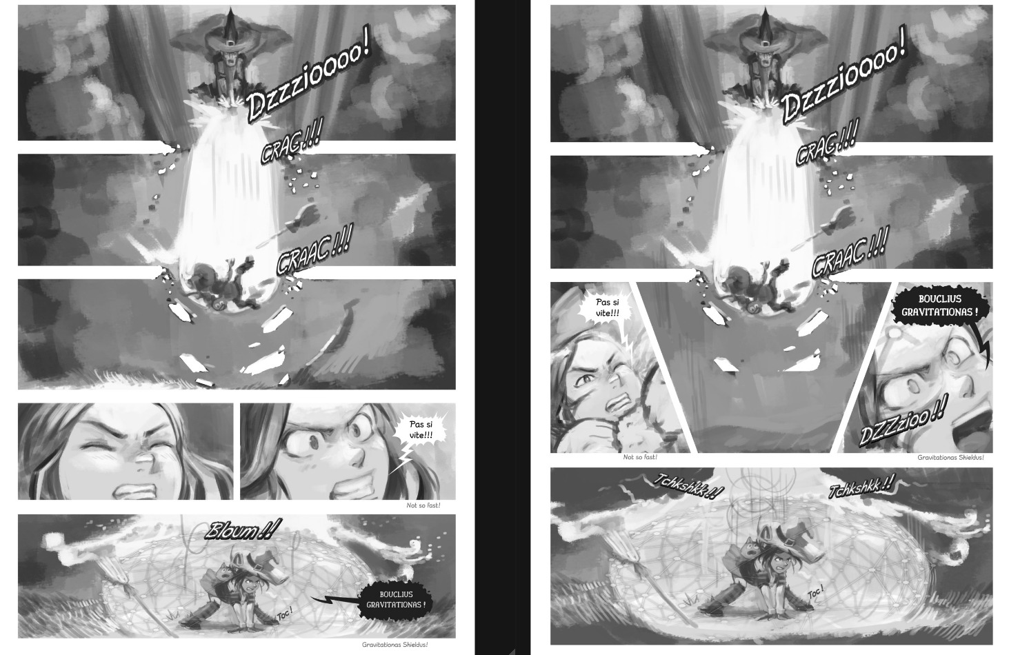
How a page layout evolved while proofreading
Workflow
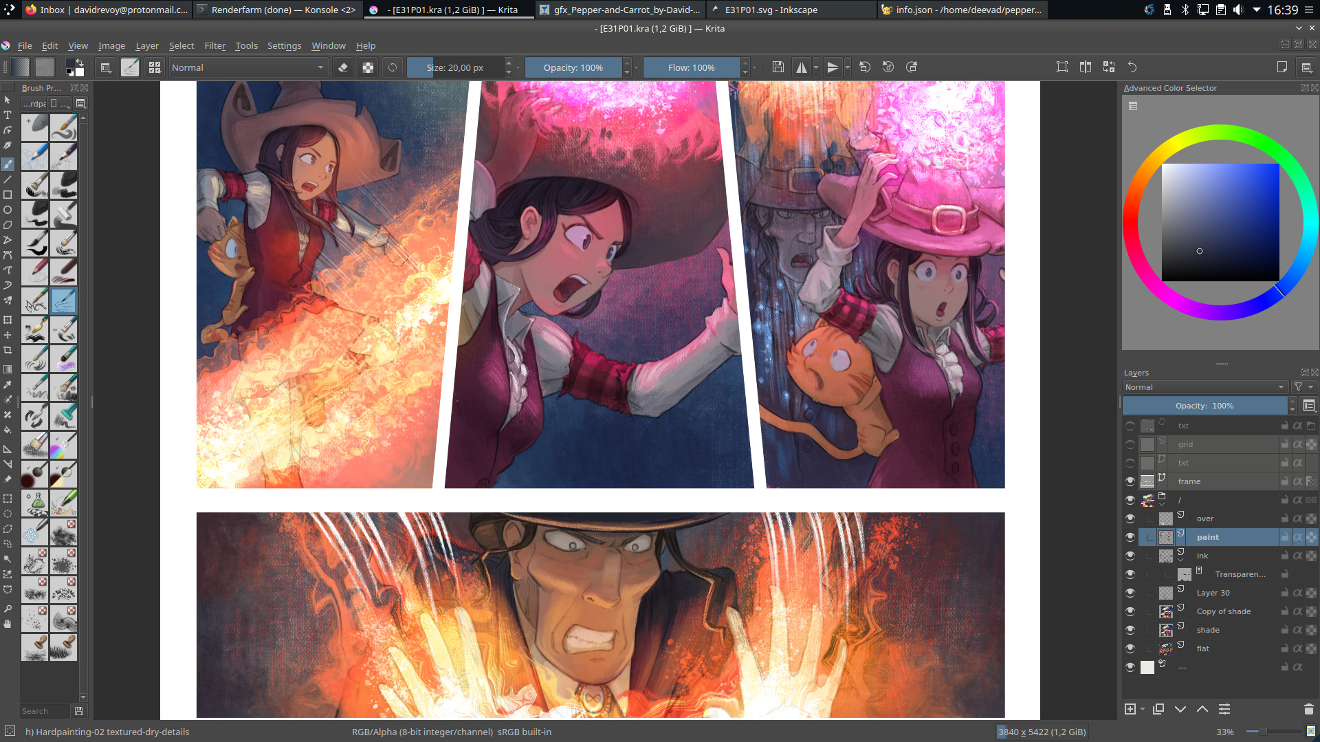
I wasn't really confident enough to just reuse my black and white speedpaintings and use a grayscale to color workflow on them. So my action plan was to consider this time the storyboard as an underlying sketch and redraw the artwork over it, flatten the colors, then shade the result with my brushes. In short here is a quick test illustration with Schichimi that shows the main steps for making my pages (the steps where I can pause the page and switch to the next one).
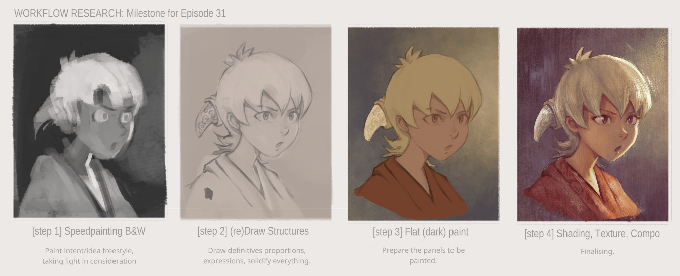
click to enlarge
Drawing
The process was "fine but long" using my Cintiq13HD. I did not target a clean "inking" rendering (with sharp full black lines) but I preferred detailed pencil drawings that describe all the volumes in the most correct way I could. It asked for quite a time budget to do that, but I could fix many facial expressions, poses, proportions on the way. The process was basic: I reduced the layer opacity of the speedpainting to around 16%, I created a layer on the top and drew on it.
One of the drawbacks of this step is that while I was focused on each panel to solidify the correctness of the art, I also felt like I lost a certain energy in the artwork that the storyboard had... It's probably something related to the "Classic Art VS Life" described with success by Scott McCloud in his book "Making Comics" which I highly recommend. (sample of his work on the topic on this article). I'll take notes about that for episode 32.
A screenshot during the (re)drawing process
Color Flat
My friend the Krita colorize-mask feature had poor results with my pencil artworks: the noise texture built into my lines made a lot of artifacts; the result was "good but not great" and required a lot of manual fixing. Too bad, colorize-mask can speed up this boring task by almost two or three times when the art is compatible with it.
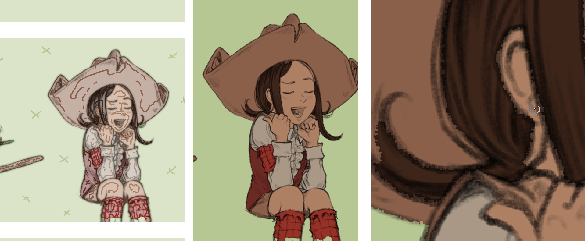
Colorize-mask markups on left, rendering on middle, close-up on right
So, I flattened my colors manually with a brush. As a helper for color consistency across the panels, I was happy to discover a Krita plugin that revived the old reference docker but improved. I could load on it a palette I made with my background key colors and characters. (this docker does auto-picking of color when clicking on it which is very convenient). Very good plugin, thanks Antoine Roux for it!

Reference plugin on left with my custom palette.
When I compare the storyboard to the current state of the drawings, it looks synthetic and cold due to the detailed drawings and big area of flat colors...
A comparison of the storyboard VS redraw+flat color
Shading
So, I decided to follow the shading approach I had tested in my rendering illustration. The process involved selecting each color island with the magic wand tool, and then painting them one by one. At a certain point, I would paint over all of them, merge the drawing into the shaded areas, and then paint over the result.
This was a time-consuming process, but it allowed me to achieve the desired effect.
A screenshot of a page with color-flat
The same screenshot with the rendering
Screenshot while painting over
Screenshot while painting over
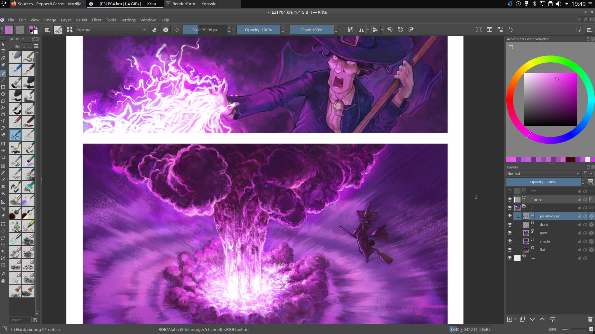
Screenshot while painting over
Post-mortem
Producing this episode was a really tedious and lengthy process.
The 4K format, the canvas texture, and the precise redrawing all contributed to a sense of discipline and attention to detail, but ultimately, I think I took it too far. By being too step-by-step and meticulous, I inadvertently introduced a stiffness and rigidity to the final product, which is ironic given that I was aiming for a more organic and artistic look with the canvas and painterly rendering.
This is something that becomes apparent when comparing the sketch to the final version. While I've vowed not to revisit this workflow again, I still appreciate the canvas texture and feel that some panels in this episode are truly of exceptional quality in my production.
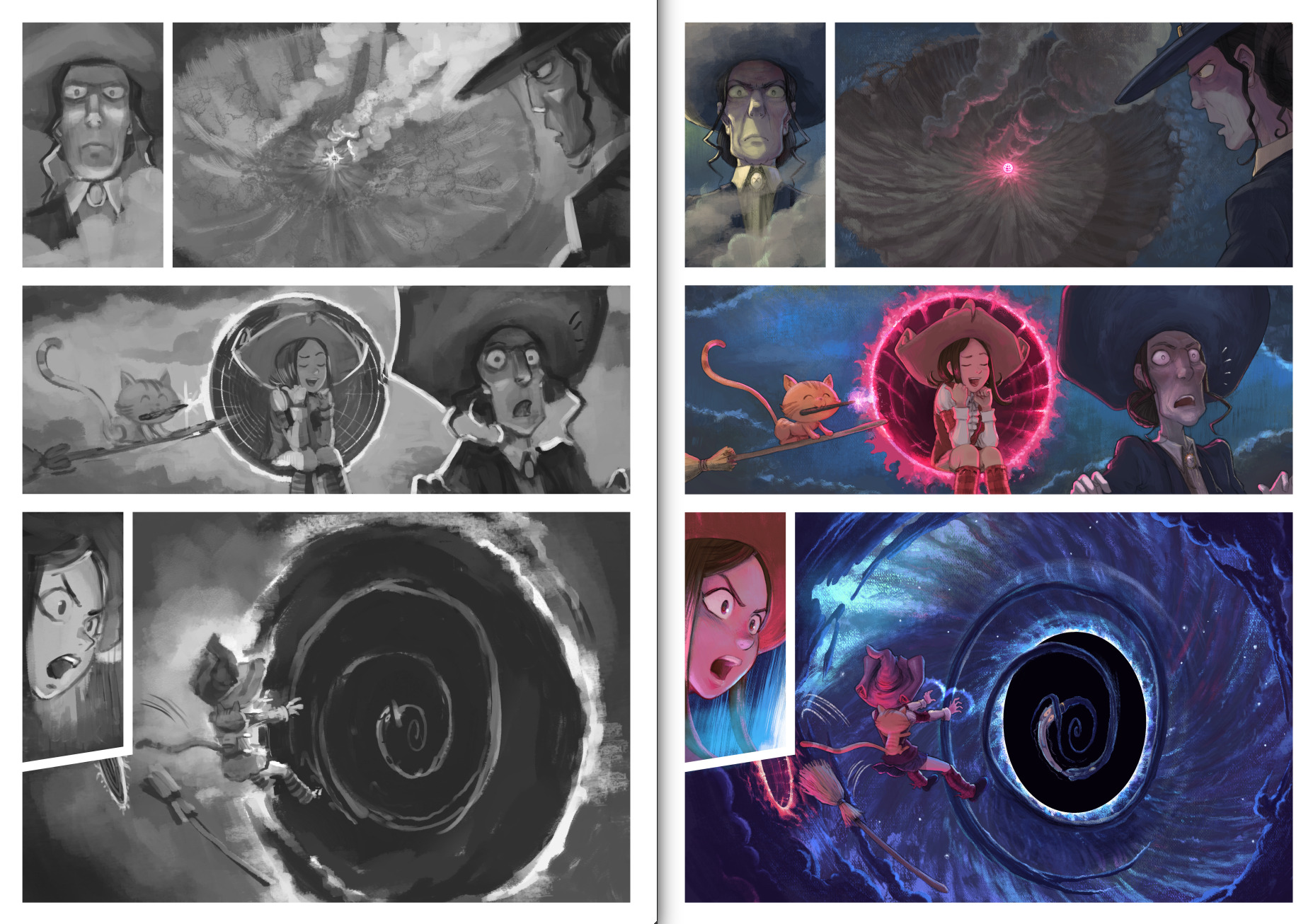
The sketch VS The Final
Thanks to Quetzal2 for the English improvements and corrections

15 comments
Nice to see things develop and improve!
I really love the illustrations. They are incredible. The sketchbook-rain one left me speechless. I think this one left a bigger impression on me, because I haven't seen it before, and because of the change of style and tools. Wow.
Great doodling sketchbook :) Do you have an "Unstable" one too? ;)
This insight into your workflow and seeing these results are a huge motivation and source of knowledge for me.
Thank you.
Do you ever find yourself thinking that drawing her would sometimes be less awkward if you didn't decide that she was 14? I mean, the occasional very short skirts, the rather busty last picture in this post, the magic contest... just saying.
14 years old is when the series starts. She is now 18 years old on episode 31.
Thanks!
I think the move to try to get that more classic canvas texture is a really cool one. I really love that less sterile feel of it and it really goes with your way of working. It is way less sterile than the more classic paper comics (Asterix etc) even though this is digital. I can imagine though with all the possibilities you have now it may be a challenge to stop polishing your work, to preserve the rough edges.
On that note, why did you move to the higher resolution and as you mention it brings new challenges, what are these? Is it just harder on your hardware, is it harder to stop polishing (because you can now work in finer detail) or is there something else? And the higher resolution, is it because you expect it to work better in print (for the next physical book)?
Always interesting to see the kind of work that goes into creating something (which is what I like about supporting Patreon too) and also cool to see how much your feedback support the software development too.
Thank you for your nice words Vinay and your continuous support too.
I upgraded to 4K for multiple reasons: the first one is linked to the canvas effect itself; if you click on the first screenshot on the top of this article; you'll see the detail of the canvas on the close-up of the artwork "Black-hole". To get this canvas effect; I need more resolution. It is like if I traded "the pixels unit" to "a canvas unit" (a cell/comb mini area of the canvas texture). The paradox here is while I increase the resolution of the artwork, I also have less details to paint (because the size of the 'canvas unit' is actually larger than what pixels were before). If I work at smaller resolution like before with my new brushes; the stroke of painting (and 'hair' of brush) quickly merge together and transformed into pixels blur and I'm stuck for the details between pixel art or painting a soup of blur. With this resolution, I can still see all the painted strokes and get something more organic at a high zoom level (more than a grid of pixel). When I publish the artwork on internet at a lower size; I don't have to use any sharpen filter anymore to build fake details: I have this natural noise that produce crunchy details for me (thanks to improvements on Imagemagick, they have now better anti-moire and better details when reducing artworks than ever).
For the other reasons; I just saw all TV set going 4KUHD and while working on giant artwork for Contributopia I saw my computer with Krita 4.2x was handling the files without much trouble. The developpers probably optimised things very well so with the same hardware I can actually do more without a lot of impact.
I don't think it will get an influence on how I print the art for the book. The target printer are still 300ppi so around 2400x3200px large for a big book. But downscaling my artworks will be more detailed. That's a good way to prepare the future too ^__^
Hello David. I tried to install the reference docker plugin. I don't usually use code, so I couldn't install it completely, how did you install it? Sorry for my english
Hi, the install instructions are detailed on the frontpage here: https://github.com/antoine-roux/krita-plugin-reference ; but it might be also coming from your Krita instalation. Hard to say. What version of Krita and operating system are you using? What part of the README was hard for you?
Note that after installing, you need to activate the docker via the settings > Python plugin manager. This is a checkbox to activate in front of the plugin's name. When you'll do that; restart Krita and the docker will be among other dockers "Reference docker". I hope it will help!
J'ai commencé à utilisé Krita il n'y a pas si longtemps, et j'ai découvert tes tutoriels dabord et ton travail par la suite. Je trouve que ce que tu fais est très cool, aussi bien la BD que la démarche. Je vais essayer de davantage suivre ce que tu fais, et de soutenir ton travail dans la mesure de mes moyens. Bon courage pour tes prochains épisodes !
Un grand merci Doudoulolita!
Is that Carrot who used your sketchbook as a portal and sneaked into our world? :)))
needs moar jpeg.
Beautiful stuff! Can't wait to see what you put up next.
It's interesting that you do a b&w study, and then fill out lines after. I can't even imagine what my values are until I have the sketch out!
Did you do that line variations traditionally with just fineliners/markers? if so, how did you do it? People say to go over with different sizes or overlap the strokes but that is usually hard for me.
Hi, I drew them with the tablet; using the pencil preset I share with my latest brush pack for Krita. I guess my hand got more and more auto-stabilized with years of practise; I'm less and less thinking about the line weight, thickness, making it single stroke and the line dynamism; but more and more I'm focusing on the volume underneath and the light/material it depicts. I try to magnet it to the 3D shapes. That might be a key to encode more useful information in those lines for the audience rather than taking care of a pleasant and clean set of graphical 2D spline/curve but it also requires all attention, focus and imagination while drawing. I'm still exploring a lot in this area, thank you for your comment about it.
Post a reply
The comments on this article are archived and unfortunately not yet connected to a dedicated post on Mastodon. Feel free to continue the discussion on the social media of your choice. Link to this post:You can also quote my account so I'll get a notification.
(eg. @davidrevoy@framapiaf.org on my Mastodon profile.)