


Production report: episode 31
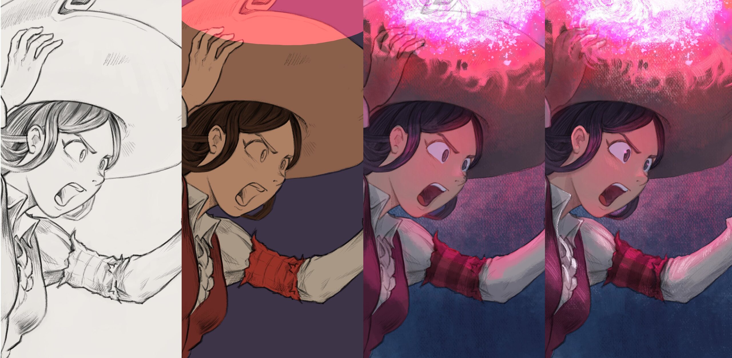
Table of Contents
Slowly but surely and in the background of the book-publishing project I've been working on new episode of Pepper&Carrot. Here is a report about that.
The challenge
You might be aware of this, but I'm using Pepper&Carrot episodes as an opportunity to push forward both my art techniques and my tools.
My first challenge was to upgrade my page format to 4K resolution, a significant upgrade from the first episode, which was around A4 size at 300ppi (2481x3503 pixels).
My second challenge was to ensure that the episode's style matched that of my recent illustrations. Lately, I've developed a fondness for creating artworks with a canvas-like texture. To achieve this effect in Krita, I've developed a new set of brush presets. You can download this new brushes here .

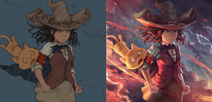
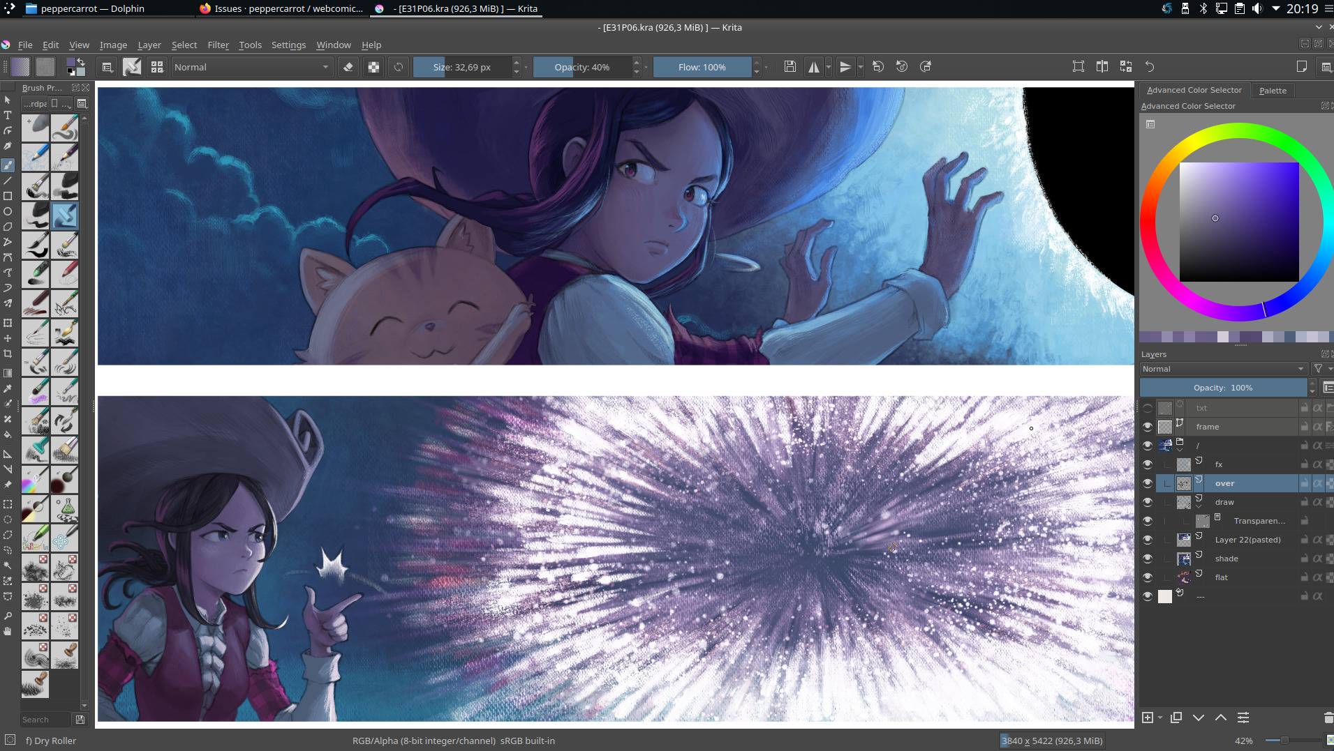
A close-up on "Black Hole" (illustration here)
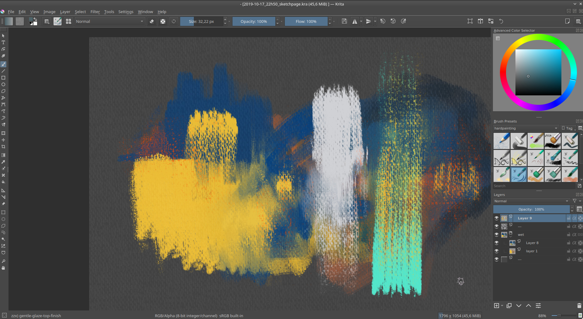
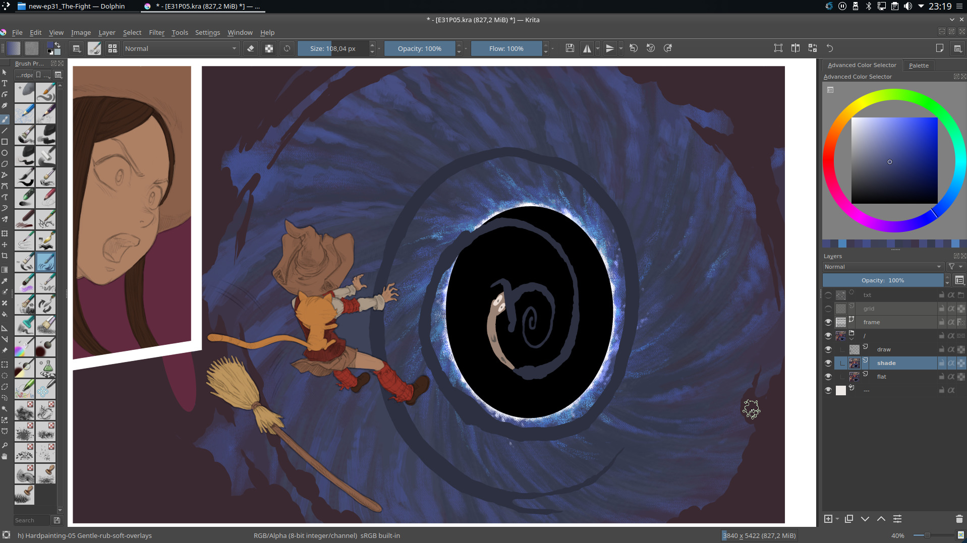
A screenshot of Krita while testing my new brush effects
Drawing training
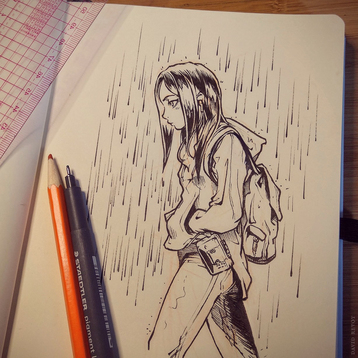
I also spent many hours doing exercises and tests. I trained the fundamentals; anatomy, gesture, perspective, facial expressions... That was essential to survive all the frustration I gathered while working on the book project. I learned a lot and I felt the upgrade when I made a week of signing sessions in Paris at the end of November. Here are visual from this period:

I made a sketchbook I named "Testing" during this period.
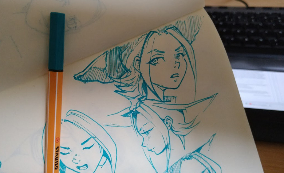
Inside testing, I experiment drawing with ink directly a lot.
... or over a minimal sketch.
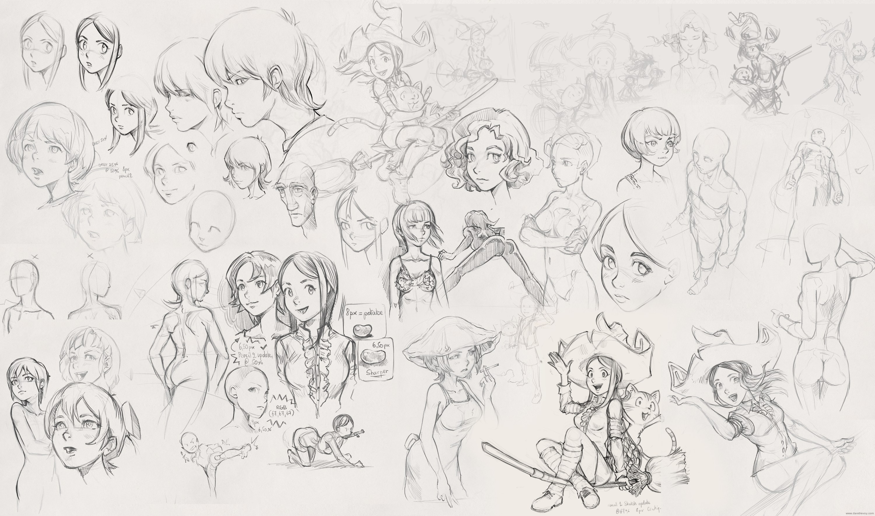
I did the same with Krita and my Cintiq13HD.
Writing and storyboard
The story is born from many different thumbnails from my sketchbook; the main one driving my inspiration was clearly this doodle:
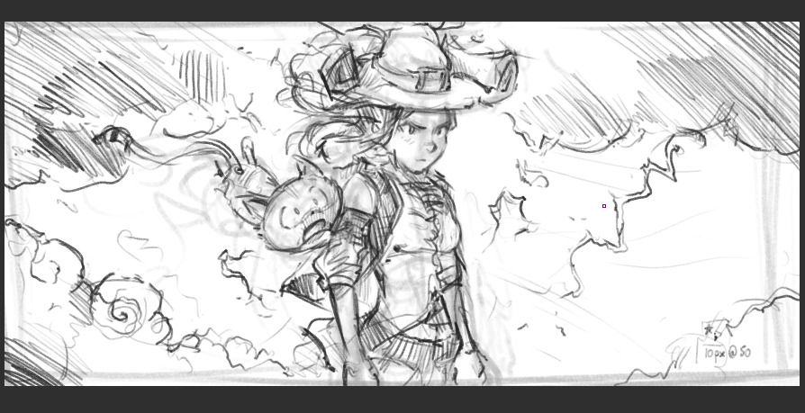
A quick thumbnail from June, source of inspiration for Episode 31...
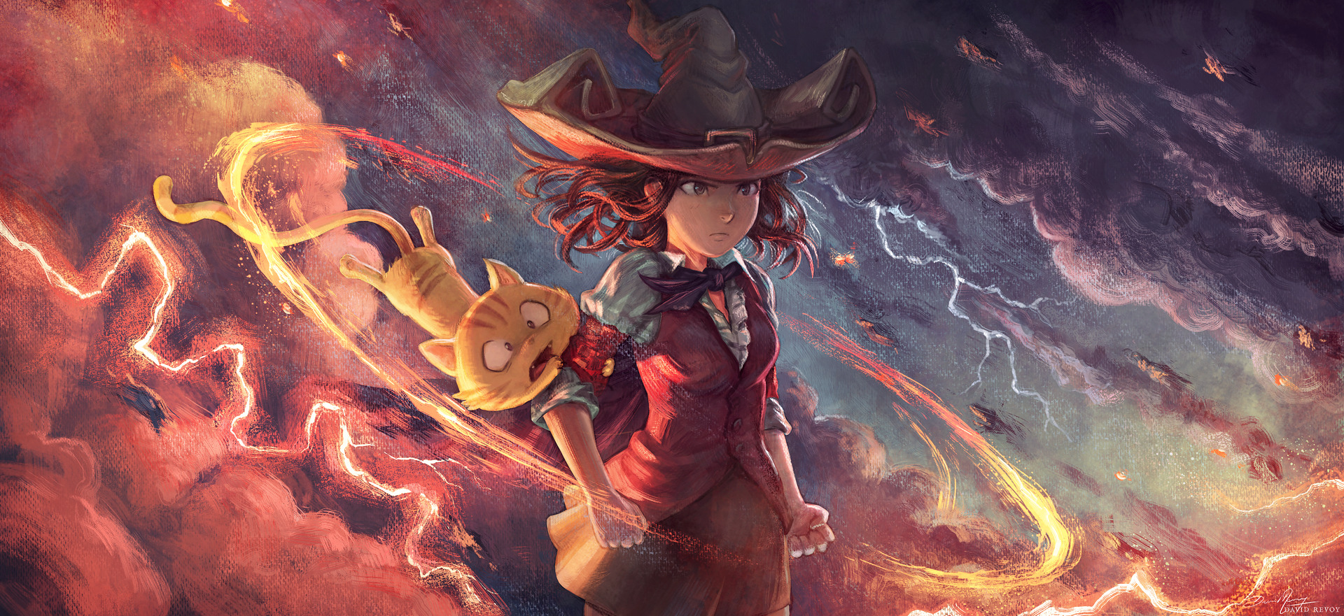
Same doodle with full rendering, for testing (illustration here)
I wrote the main story inside a text-editor to get an idea of the spine of the story but quickly, I felt I had to experiment with my ideas directly on a storyboard because episode 31 has a long fight scene and it was nearly impossible to just "write it down". I took a brush and started to speedpaint in black and white the episode as I did in my long video tutorial "a comic page from A to Z with Krita".
One of my surprises was how quicker I was and how my speedpainting of characters improved. I also experimented with the language: I wrote the episode in French and added subtitles in English under each speech bubble so I was able to keep in the loop the non-French proofreaders. I worked also on making more automation tools for the beta-testing to share a rendering of the version while I'm making changes, daily. This whole process allowed me to play more with the layout of the page during the process and interact more with the proofreaders of Pepper&Carrot on a thread of the Gitlab instance of Framasoft: Framagit (A big thanks to the small team which help me a lot for feedback and improvements!).
Black and white speedpainting blended well with the borderless white panel and working on them with Krita for the art and Inkscape for the text felt less difficult than in my previous episodes over these gray values. I had a very good creative time.
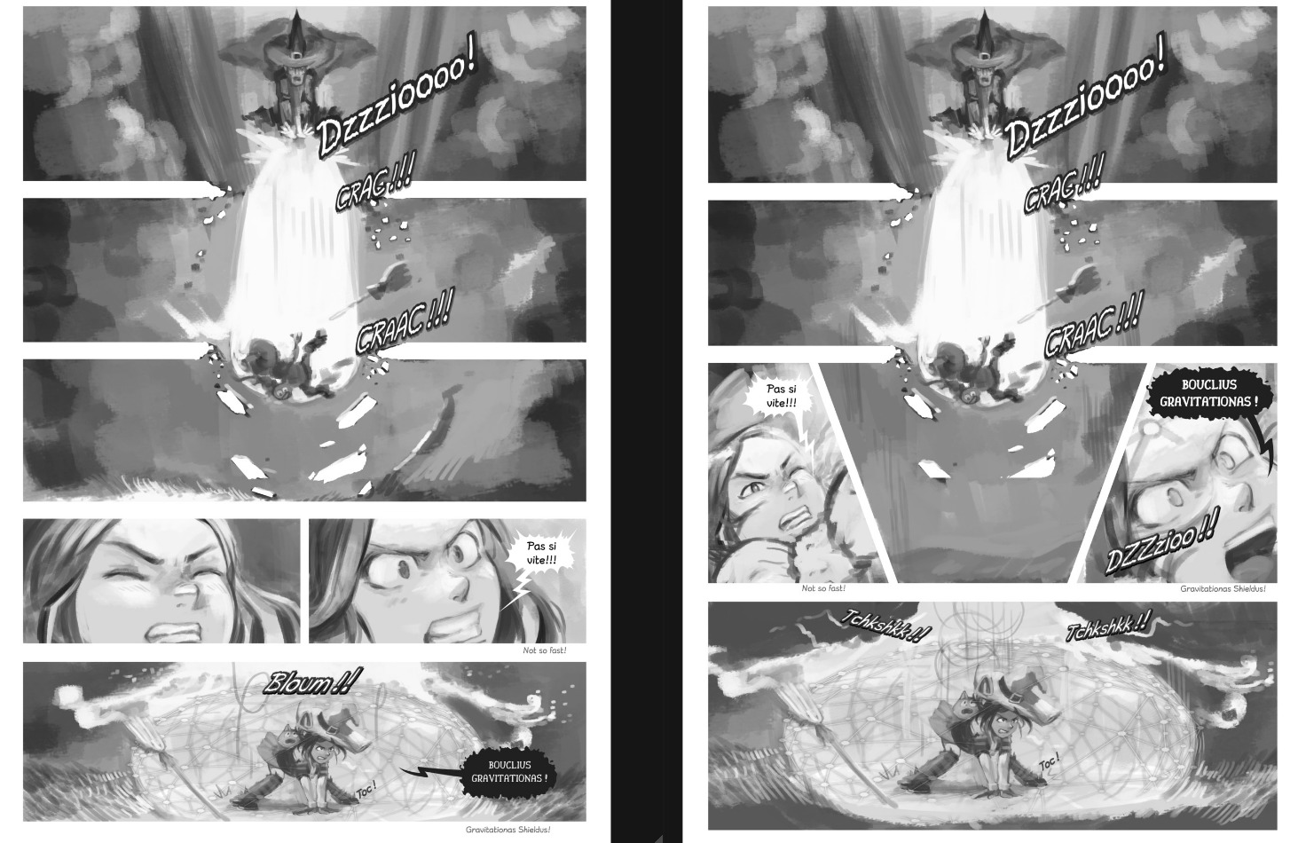
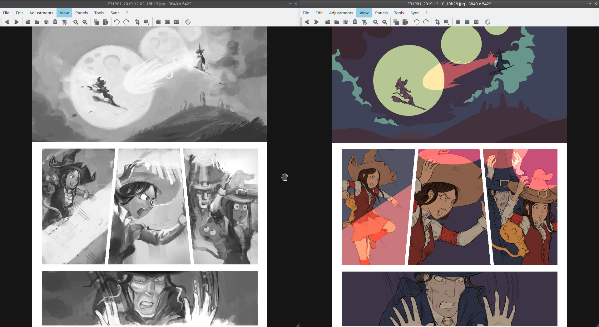
How a page layout evolved while proofreading
Workflow
I wasn't really confident enough to just reuse my black and white speedpaintings and use a grayscale to color workflow on them. So my action plan was to consider this time the storyboard as an underlying sketch and redraw the artwork over it, flatten the colors, then shade the result with my brushes. In short here is a quick test illustration with Schichimi that shows the main steps for making my pages (the steps where I can pause the page and switch to the next one).
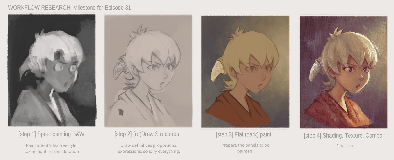
click to enlarge
Drawing
The process was "fine but long" using my Cintiq13HD. I did not target a clean "inking" rendering (with sharp full black lines) but I preferred detailed pencil drawings that describe all the volumes in the most correct way I could. It asked for quite a time budget to do that, but I could fix many facial expressions, poses, proportions on the way. The process was basic: I reduced the layer opacity of the speedpainting to around 16%, I created a layer on the top and drew on it.
One of the drawbacks of this step is that while I was focused on each panel to solidify the correctness of the art, I also felt like I lost a certain energy in the artwork that the storyboard had... It's probably something related to the "Classic Art VS Life" described with success by Scott McCloud in his book "Making Comics" which I highly recommend. (sample of his work on the topic on this article). I'll take notes about that for episode 32.
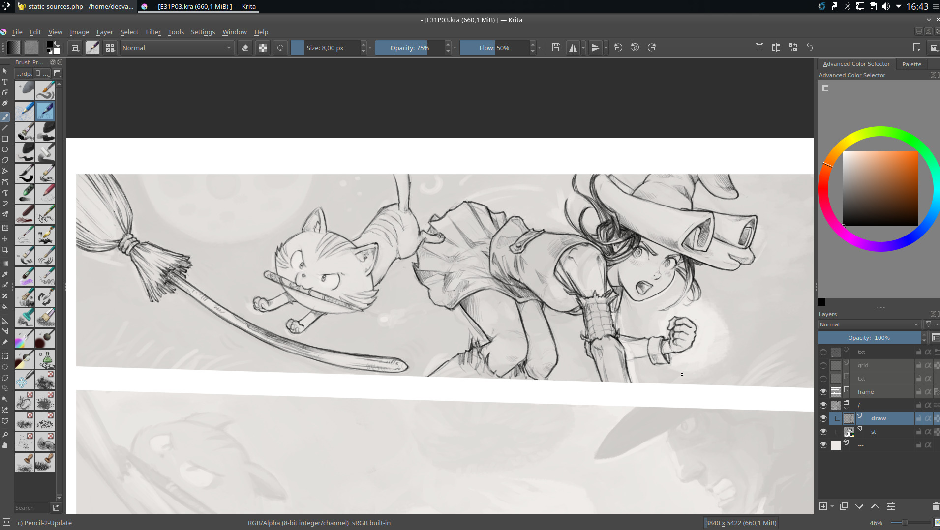
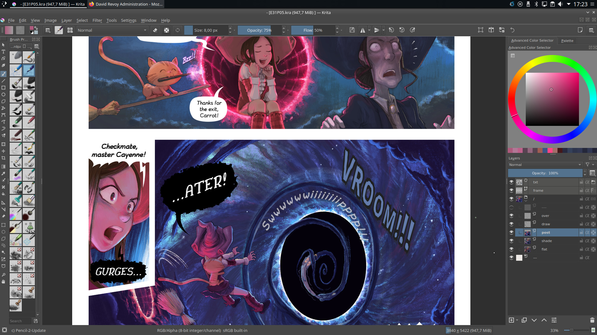
A screenshot during the (re)drawing process
Color Flat
My friend the Krita colorize-mask feature had poor results with my pencil artworks: the noise texture built into my lines made a lot of artifacts; the result was "good but not great" and required a lot of manual fixing. Too bad, colorize-mask can speed up this boring task by almost two or three times when the art is compatible with it.
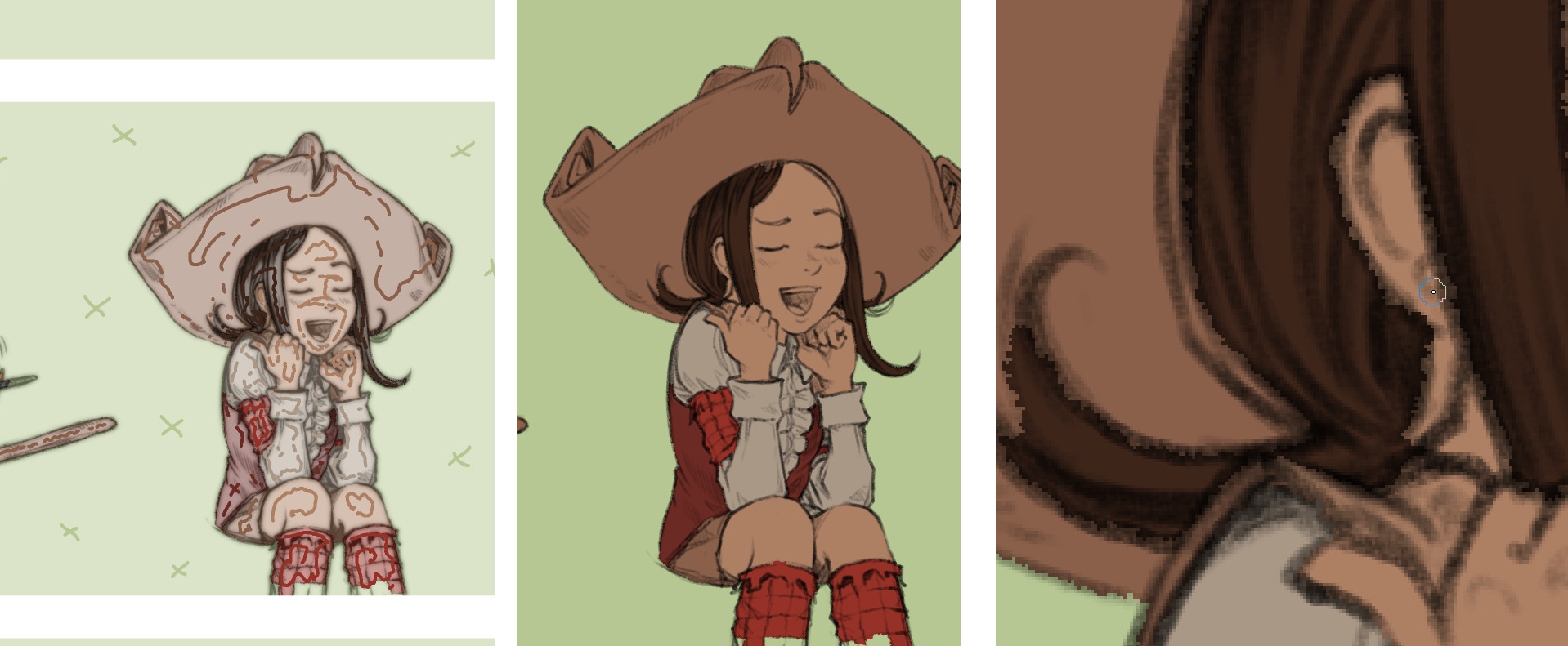
Colorize-mask markups on left, rendering on middle, close-up on right
So, I flattened my colors manually with a brush. As a helper for color consistency across the panels, I was happy to discover a Krita plugin that revived the old reference docker but improved. I could load on it a palette I made with my background key colors and characters. (this docker does auto-picking of color when clicking on it which is very convenient). Very good plugin, thanks Antoine Roux for it!

Reference plugin on left with my custom palette.
When I compare the storyboard to the current state of the drawings, it looks synthetic and cold due to the detailed drawings and big area of flat colors...
A comparison of the storyboard VS redraw+flat color
Shading
So, I decided to follow the shading approach I had tested in my rendering illustration. The process involved selecting each color island with the magic wand tool, and then painting them one by one. At a certain point, I would paint over all of them, merge the drawing into the shaded areas, and then paint over the result.
This was a time-consuming process, but it allowed me to achieve the desired effect.
A screenshot of a page with color-flat
The same screenshot with the rendering
Screenshot while painting over
Screenshot while painting over
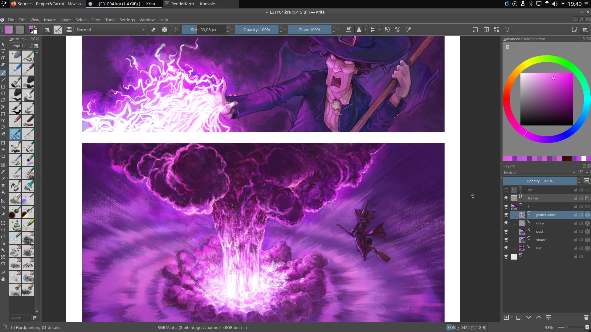
Screenshot while painting over
Post-mortem
Producing this episode was a really tedious and lengthy process.
The 4K format, the canvas texture, and the precise redrawing all contributed to a sense of discipline and attention to detail, but ultimately, I think I took it too far. By being too step-by-step and meticulous, I inadvertently introduced a stiffness and rigidity to the final product, which is ironic given that I was aiming for a more organic and artistic look with the canvas and painterly rendering.
This is something that becomes apparent when comparing the sketch to the final version. While I've vowed not to revisit this workflow again, I still appreciate the canvas texture and feel that some panels in this episode are truly of exceptional quality in my production.
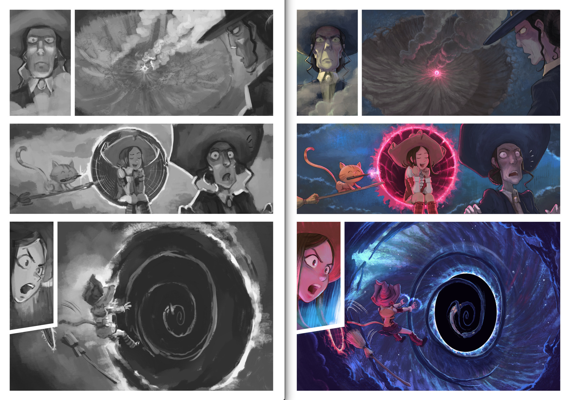
The sketch VS The Final
Thanks to Quetzal2 for the English improvements and corrections
