


Episode 29 Production Report (part3)
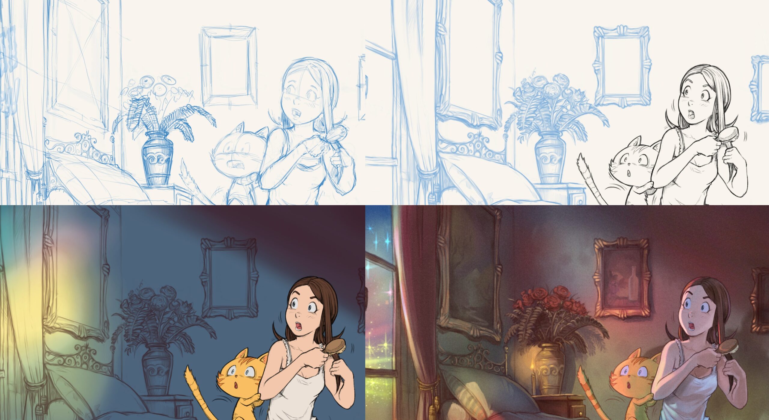
Table of Contents
- Colored thumbnails
- Colorize mask: mini palette ref and green screen
- A better layer stack
- Painting over 3D mockup for backgrounds
- 2D background painting
- Shading
- Conclusion
Thank you very much for all the feedback after the release of Pepper&Carrot episode 29 last week. Here is the third and last part of the making-of episode 29. It's a sort of production diary with my notes (it help myself to re-read them years later) and also adressed to the one who want to take the same way than me or for the curious wanting to see how the things are done in backstage. On the previous part 2 of the making of episode 29, I explained my workflow for the line-art but nothing about coloring the episode. So, this third and final part will be about coloring and shading.
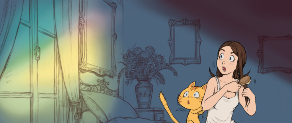
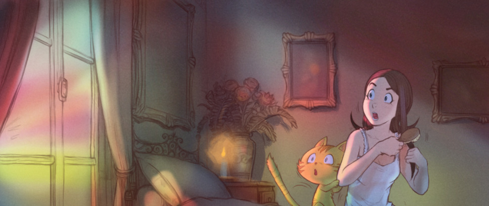
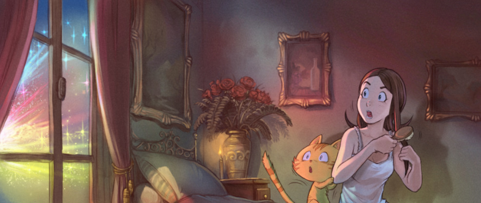
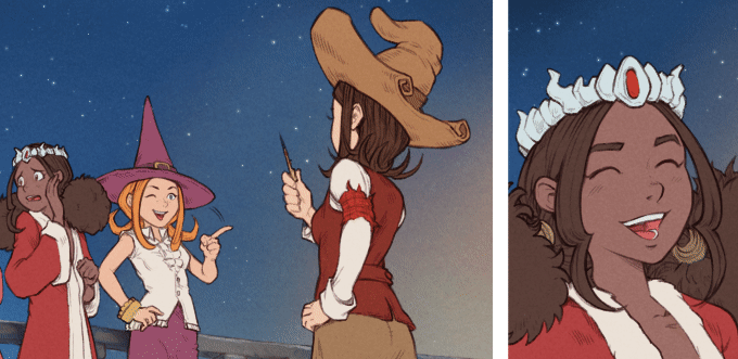
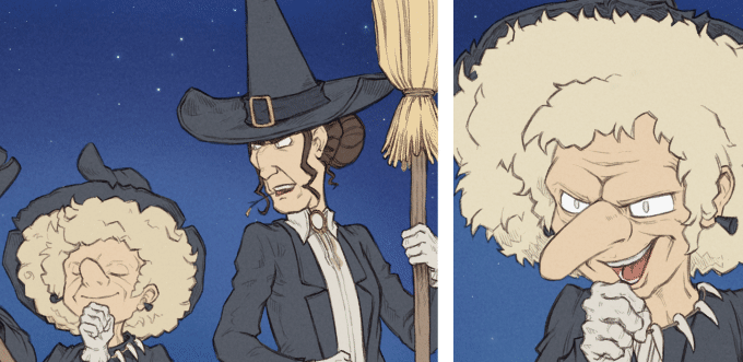
Colored thumbnails
I had no idea where to start coloring the episode. What would be the color of the monster? what would be the color of his dimension? So, I opted for painting a quick thumbnails like you can see under and test variations on the first panel. That process is something I usually did when art-directing a game or short movie. I always thought this was unecessary extra-work for coloring a comic. But having this tiny thumbnails really helped later to color very quickly with confidence the final page. I had a art-direction for the color of the full-scene. So this colored thumbnails workflow saved time and provided me a very satisfying experience, I'll repeat doing this for sure on future episodes.

Color research for the other world
Screenshot while applying the color research
Colorize mask: mini palette ref and green screen
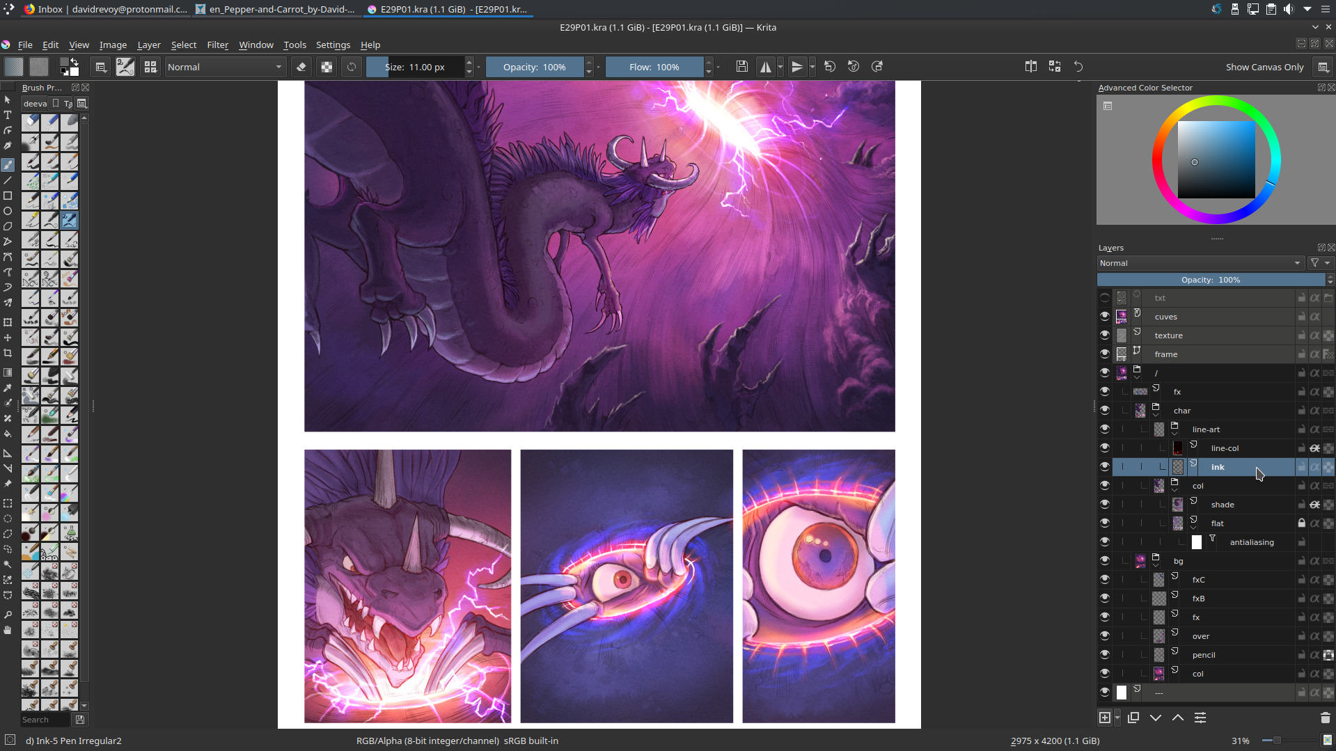
To prepare my pages (flat colors), I used the Colorize Mask feature of Krita (I published a video tutorial last month about it). Everything went fine but after the two first pages; I saw it was necessary to use a system to keep a consistency between the colors of all the characters accross all the pages. So I decided to paint on a tiny PNG a color reference and insert it in all my pages as a Image Reference using the Reference Tool. So I could pick from this tiny picture the color and apply my markers on the picture. It was a bit hard to move the reference palette while being zooming in panel after panel. For sure, it would have been better if the Reference Images could have been 'pinned' at an absolute position on my canvas (a corner). I'll try to report that feature request soon.
For the transparency color, I used a pure RGB green in the same spirit of 'green screen' in video production. It worked as expected and flatting the color took me a couple of days for 8 pages this way.
Colorize mask 'markers'
Colorize mask 'markers'
Colorize mask rendered
A better layer stack
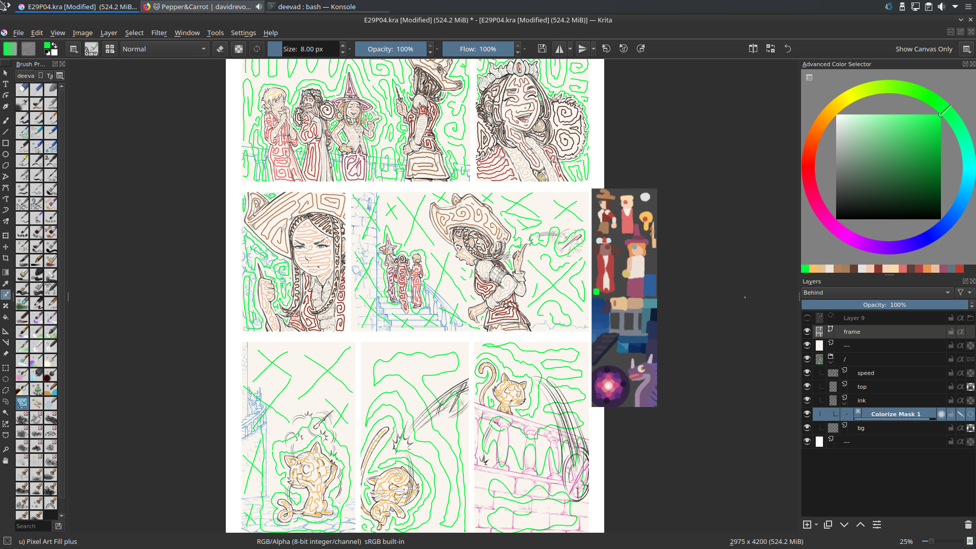
For episode 29, I decided to use a non-destructive workflow and keep a clean layer stack all along the process. So, as I started to get quickly dozens of layers in my way during the process, I had to organize them and give them names easy and quick to type and re-read. I came up with this:
A typical layer stack
The top layers (colored in grey with a right click on them) are the helpers:
- txt: A file layer of the inkscape texts, to see the content of speechbubbles
- texture: one of my subtle texture in SoftLight(SVG) blending mode.
- frame: a vector layer with white border-less squares to draw my panels layout
Under them, I have the artwork fully grouped under a layer name / (the symbol of the root of the system) and a consistent white background at the bottom named ---. The artworks are split into two subgroups: char (characters) and bg (backgrounds). Character group has a line-art subgroup with in it the ink (inking) and a layer line-col to colorize the inking when necessary. Another subgroup is col (coloring) with the flat island of color dynamically anti-aliased with a filter layer 'Blur' of 1x1px named antialiasing and a shading layer as in my tutorial about shading.
Was it necessary? Yes, the flexibility of this stack once in production was lovely but I admit it was a bit overkill. I probably wanted to test the full non-destructive workflow too much. For future episode I'll probably keep something similar but with less layers. For example, I think I'll keep the backgrounds (bg) flat and not as a group. Also, the colored flat islands for characters doesn't really need a dynamic antialiasing; I thought it would help at replacing a color or selecting an area later; but once the color flatting is done I rarely came back to edit it. So, keeping this as non-destructive was actually more 'in my way' than helping. I could also probably colorize my inking directly (protecting the alpha of a single 'ink' layer on top) without needing a nested (line-art(line-col+ink)) because once the inking was done; I rarely came back also to redraw it... So, all in all I'll keep same structure, naming but I'll also try to simplify it next time quite a lot.
You can download the sources pages (471MB) and spy the structure. This episode is certainly one of my cleanest Pepper&Carrot episode in term of layer stack.
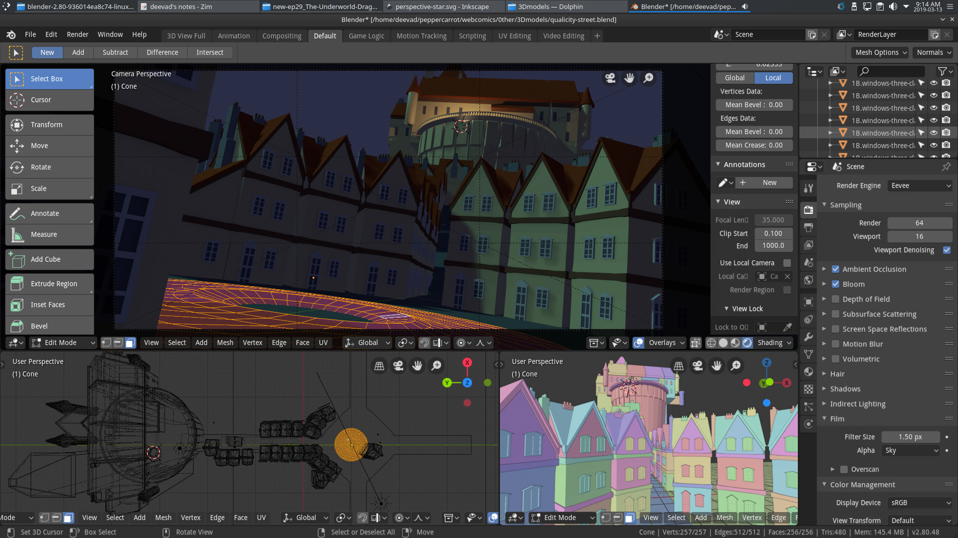
Painting over 3D mockup for backgrounds
Well, no surprise this part worked perfectly. As you probably know, I'm a specialist of that since decades (I even published a Dvd tutorial about it in 2011, "Blend&Paint" for the Blender Institute) but nowadays with Blender 2.8 and Eevee the work on the 3D part became even quicker and also funnier.
I have to note few things that worked pretty well. For example; rendering the 'world' (sky) with a flat color directly out of Blender was easier to select them later in Krita and split to another layer to paint skies separately. Also, I don't regret to have not textured the 3D buildings, painting the textures of stones and tiles of the roof in Krita is what 'broke' the artificial 3D aspect of the Eevee rendering and made the artwork look a bit more like a painting. I'll keep that for future episodes. It even gives me ideas of more complex and detailed environments.
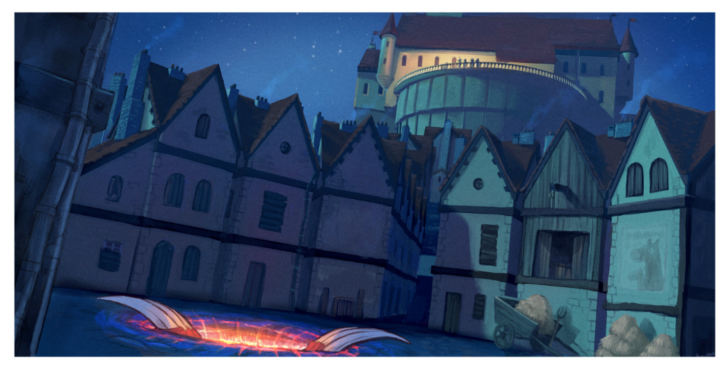
The final panel
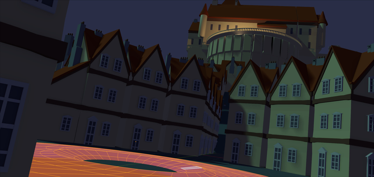
The 3D rendered (Blender 3D, Eevee)
Blender 2.8 in action
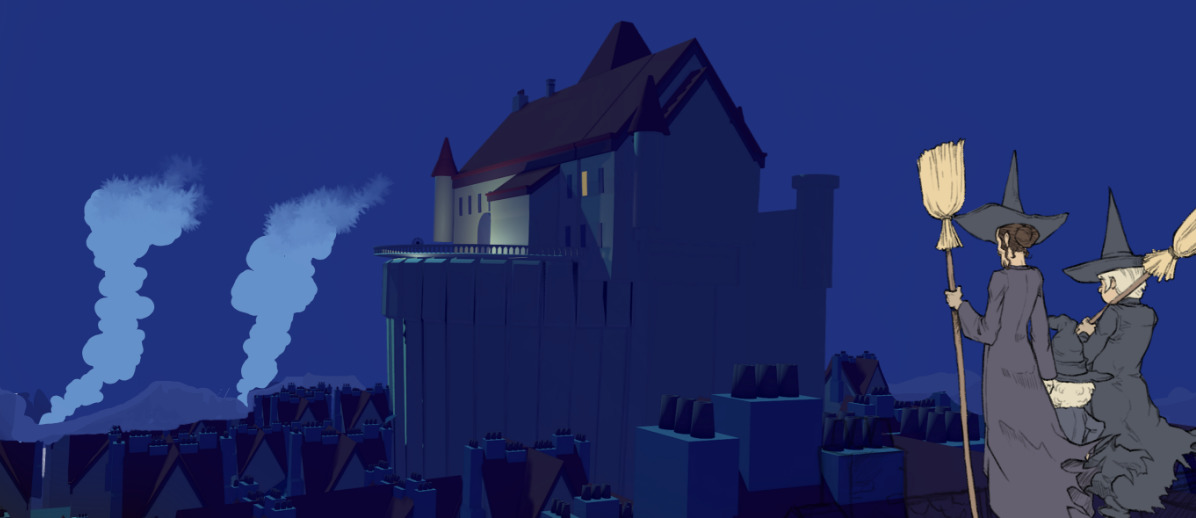
The 3D in background with quick notes (smoke) with the flat non-shaded characters
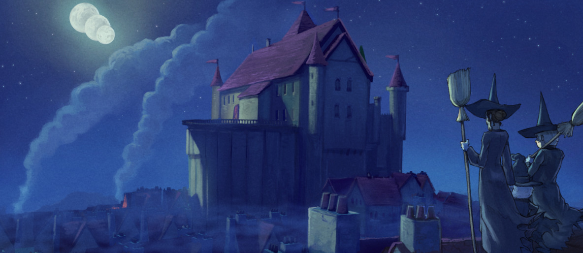
Same panel with paint-over for the 3D, and shading for characters

screenshot of the result, comparison
2D background painting
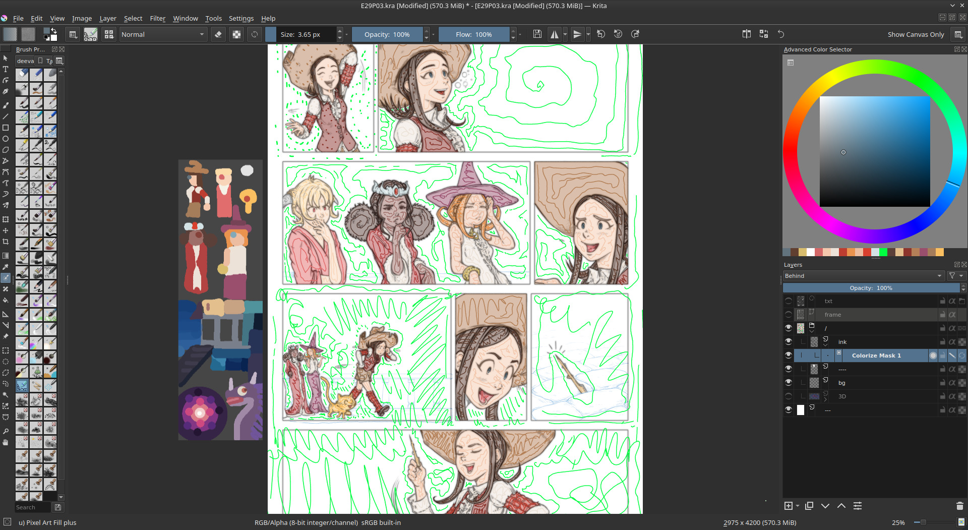
I also had many panels with background totally hand-drawn. The good idea I had was to split them directly at the line-art step, while drawing. I drew all of them in blue with a soft edge brush while the character had line-art in black. Then I airbrushed all of them under the line (line recolored into a half transparent brown), and added two more pass: one to block the color under; one to paint over to add hightlight and details. You can also note how it followed the steps for the workflow on the character (line-art, flat color, large shading, detail shading).
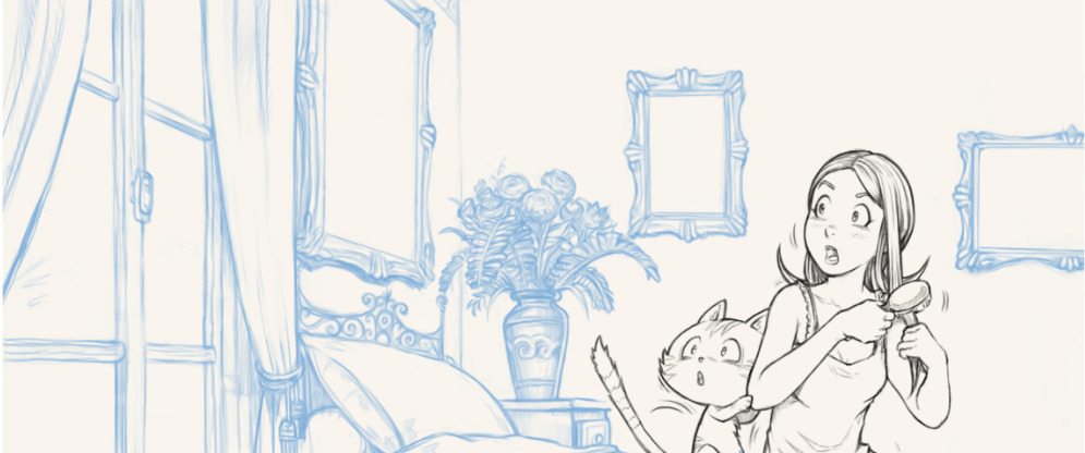
Step 1, line-art: backgrounds are penciled separately with blue.
Step 2, airbrush: adding the main color palette and light source.
Step 3, paint-under the line with a large brush.
Step 4, paint-over the lasagna stack of layers for the highlight and details.
Shading
The shading was a hyper-quick step and super flexible. Ideal when approaching the deadline. My hard-light blending mode single shading layer method revealed to be super effective even with the complex light of fireworks, fire, blue moon and pink dimension. I could really color flat my characters with their same base 'albedo' color for the flatting part and really influence later the color with the shading layer, even when changing a dark base color to a bright yellow. This method proofed to be rock-solid and it was easy for me to airbrush the big ideas and art-direction and then do a longer step of cleaning-up and adding edges and other minor sources of lights to detail the characters and their texture even more.
(animation) Shading on/off: extreme light setup.
(animation) Shading on/off: consistency on characters during dialogues.
(animation) Shading on/off: consistency on characters during dialogues.
Conclusion
All in all, a lot of research have been done on the way to produce episode 29 but I think all this time was really well invested: it was one of the rare production cycle where I didn't had to skip sleeping during a couple of night before the release to find "the missing 80 hours". The management of my time on the production was constant, linear and predictable. I could say: "by tomorrow I'll finish this pages" and it was done. This linearity really change my way to manage my stress during production. I can't say this is a quick workflow; it is probably not, but the result was up to my expectation and it improved my daily life because I could predict production time and this aspect is golden.
What's next? Optimisation, compression; for episode 30 I'll try to remove what was unecessary while keeping the best part of this workflow. I want: more 'life' in my inking and more painterly background. The result of episode 29 was a bit too industrial for my taste. I feel it's a necessity that creators like me move away as far as possible of all style that can be easily emulated in (a near?) future by computer graphics, deep learning and IA. I'm thinking about 3D and modern anime style. I have feelings that "sketchy and painterly" will be even more precious in the future industry; and even more if they reveal a solid experience of fundamentals underneath: anatomy, proportion, perspective, composition, color, etc... I must follow that intuition and learn to be a little bit less scholar and clean. This will be interesting. ;-)
Thank you for reading!

16 comments
It's a great idea to let the reference be pinned to the canvas on absolute value with no relation to current zoom and rotation of the painting. Instead of reference tool I just open my them as new document with the option 'always on top' checked which basically is nearly the same thing but it would be more convenient to have it as a tool.
Thanks for the post by the way. Always pleasure to read :)
Why don't you make a webtoons account. I am sure people would love it. If you want I can made an account for you on these online comic sites, but I would prefer that you would do it yourself. I don't want to take credit for all your hard work.
I can give you a list of all the sites for online comic if you want me to. You might not get a Million views but still its free advertisement.
Hi, I have to do probably an article about Tapas and Webtoons, it is a recuring question.
In short; I studied, I can't ; because of license. This publishers (this plateforms are comic book publishers) needs to deal directly with a unique author being in full ownership of their creation; they need this to override their right when signing in the conditions and republish their content in a commercial way in case of success. Pepper&Carrot could be compatible if this websites would provide me the assurance of also posting the credits of the creative commons license each time they re-use the artworks or plan to do it. But in their terms, they don't. They can use it as they like. And even a corrector who changed a single letter in a episode could attack me in front of tribunal if I put a page of Pepper&Carrot with their work on this platform and they start to do that. Also, you can't repost Pepper&Carrot on it for same reason; not because you aren't the owner; but because you'll be responsible if the platform infriges the right of someone in the CC. The terms and conditions of this website are pretty awful I have to say... Artist on it are basicaly slaves that provide their work for free to a publisher including their right... That's worst than Facebook or Twitter terms as far as I know.
But! The smallest thing I can try is: posting on their platform a single comic I made alone or muted episodes that require only graphics just to get an online presence on it if poeple search for Pepper&Carrot. If they allows link to external on comic; I can also probably try to post only the cover of the episode and link it to the Pepper&Carrot website. But if not, I'll have to skip this services.
Thank you!
I love to read online comics to get new ideas ,I think it awful, meaning you make such great comics and there are people who would love to read them but, Again I can see your point, and don't forget to give a link for your website , To be honest there are not may comic book artist left like you, and most of the big names are NSFW. So rely hope that you succeed so others can follow.
A big big thank you for your encouragement!
Merci! This great report with much helpful detail and many good trick. Very fun read it and love learn about produce comics. Merci for your time write this. I remember Blend & Paint DVD too, also try convince my friend buy it year 2012, but not know you create it, very cool.
Small thumbnail picture for try color is great idea. Long time I use that idea for set up scene/object position and quick try different designs, action but never use it for help select color.
C'est impressionant ce que vous faites ! Ce serait bien que vous ferez une vidéo sur l'utilisation de BLENDER ! Perso ,je l'ai aux ordis du collège et je n'y comprend rien! Quelle ordi utilisez vous avec votre tablette graphique pour dessiner ? merci d'avance!Votre BD est trop bien (°0°)!
Bonjour! Merci pour le petit mot; oui Blender est un logiciel qui demande un apprentissage. Les vidéos, c'est bien (je pense que beaucoups d'autre sur Youtube en font des très bien sur Blender).
Mon ordinateur est un Dell Vostro qui a 8 ans; icore7 2,3Ghz avec 16GB de Ram et une carte graphique moyenne Nvidia; je l'utilise avec un système Kubuntu 18.04 (Linux). Ma tablette graphique est une Cintiq13HD.
Merci pour le mot sympa sur Pepper&Carrot!
MEEEEEEEEEEEEERCI!!!!
This (and parts 1 and 2), were extremely fascinating to read. I really love seeing the process explained like this. Thanks for doing everything that you do! :)
coucou j'ai beaucoup ta BD je suis la fille de quelqu'un avec qui tu as échangé.
Merci d'être passé par là et d'avoir laissé un petit mot sympa!
hi david.. is there a tutorial or sometgung that explain more a bit in detail how to use blender ir way like that to make backgrounds like this?? and how to add it in the comic panels??!
and thanks for all ur tutorials
Hey, I made that in the past (10 years ago) it was a DVD for the Blender Foundation named 'blend&paint' ; it was release under Creative Commons attribution, so it's easy to find copies here and there over the web. I'm not hosting a version on my channel because it is based on a very old version of Blender and use Gimp and Mypaint. You can watch it here in full: https://www.youtube.com/playlist?list=PL15267C3D29F5CC83 It might give you a big idea of the workflow. But I'll note the idea to update this for my future videos.
Sweethome 3D (GPL) allows really fast perspective references. It's designed to let you turn a conceptual floorplan into a 3D-rendered room in a few clicks, and figure out if your furniture will fit. You mark the corner points and it will auto-complete walls and floors (you can change the default wall height, or change the colour or pattern of all the wall in a room at once; slanted ceilings and curved walls are possible). There are drag-and-drop doors and windows and furnishings, including some geometric solids, stairs, outdoor plants (good enough if out-of-focus), and human figures. All of these are called "Furniture", and many of them are third-party and under assorted open licenses. Rightclick>"Modify Furniture" can change colours and overall proportions.
Sweethome does quite decent renders, with easy-to-apply light sources, and it will also import from / export to Blender for tweaking. It's a lot more useful than it looks, and much faster and easier to learn than Blender, since it is much more specialized. You can learn to use it really well in a few hours, and make a room in a few minutes.
It also has posable figures, like digital lay figures; one female (in default high heels!), one male, and one a 3D model of the traditional wooden lay figure. The figures can't be re-proportioned yet, except rough overall dimensions, but maybe soon. The third-party non-posable prefab figures are problematic, the female ones are creepily sexualized, and the racialization is also bad. The figures currently seems a lot less useful to artists than the procedural architecture, but might be good for large-scale gestures.
Post a reply
The comments on this article are archived and unfortunately not yet connected to a dedicated post on Mastodon. Feel free to continue the discussion on the social media of your choice. Link to this post:You can also quote my account so I'll get a notification.
(eg. @davidrevoy@framapiaf.org on my Mastodon profile.)