


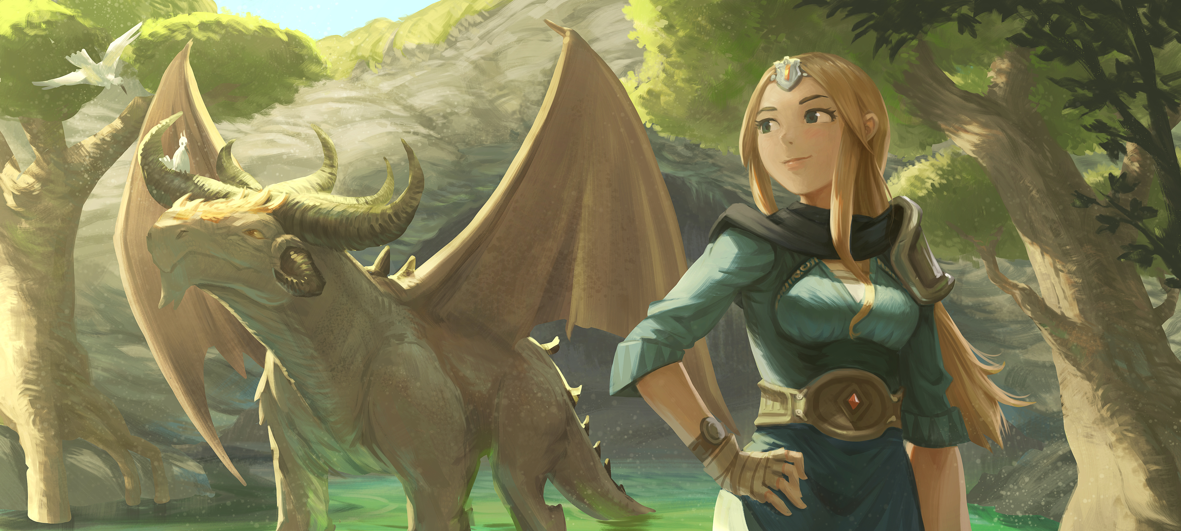
Introduce the Dragon to the Outside World
Hey, I'm continuing the experimentation around this two characters. I also start to like these two, they also let me express a visual metaphor of what I'm living. Maybe I'm finding a simpler form of storytelling.
On a technical point of view, they are super challenging with their difference of size. Thanks to the blond sorceress, I can train expression, pose and anatomy. Thanks to the scene with the Dragon, I can train perspective, shot, composition, more material and background interaction.
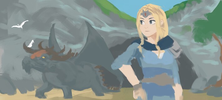
The original 'direct painting' fail
But I failed when I first started this test. I tried to start "direct painting". It means I tried to bypass the thumbnail, the sketch and went directly at painting shapes with a brush to get done the color flat. Maybe I was a bit too bold about it because I quickly reach a dead-end. One advantage: I could quickly set the general idea of the scene and it was readable. On the downside, I really had poor shapes, flat perspective and fixing a start-up like that felt immediately that I'll need hours and hours to adjust all the shapes into something better.
So I started over.
I went back to 1.Sketch, 2.Color Flat, 3.Shading, 4.Paint-Over. Discipline.
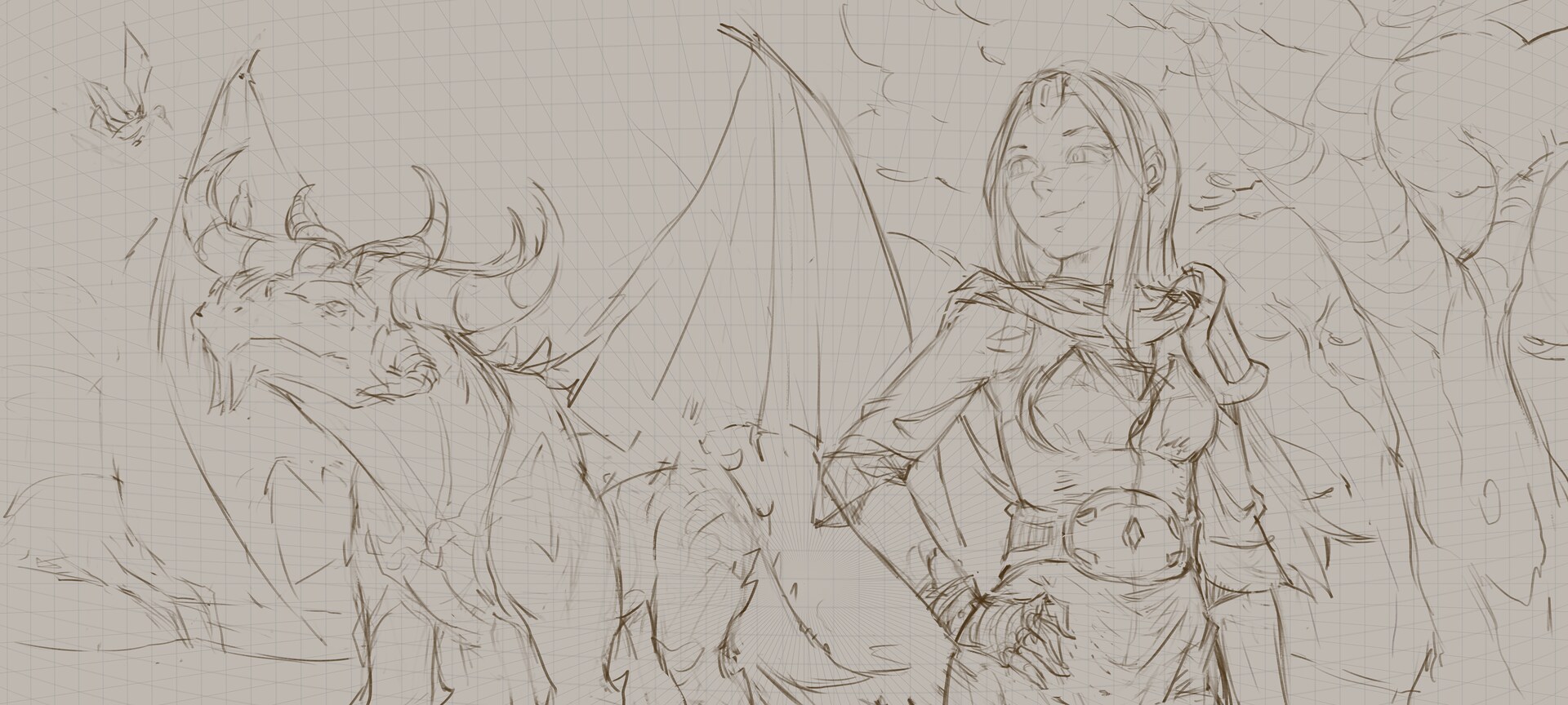
1. Sketch
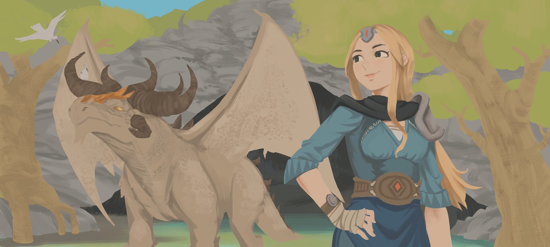
2. Color Flat

3. Shading

4. Paint-Over and adjustments
I also posted on the way a feature request on Krita artist for better Quick Clipping Group on Krita. It will be more constructive than what I wrote on the last blog post where I complained about the usability of the group in Krita.
This time, I also decided to not flat all the layer stack after the shading was done. I also tested a big change: using a single layer for the shading as I did for some episodes of Pepper&Carrot. The illustration had 6 top level groups (more than for other this time), and I couldn't imagine managing three layers for the shading only per groups. I went to the 'Hard Light' blending mode, and I found new tips to keep a global mood on the piece without having to rely on a top 'paint-over' paint layer or a projection to do my color adjustments.
It's too bad I spent way too much time on this one. Definitely not yet a suitable workflow for comic and a Pepper&Carrot episode. So, I have to continue to explore to find where I crunch things down or not. My dragon instinct will guide me, I'm trying to not overthink it and I'll just follow two never-failing partners: curiosity and fun.

6 comments
Wow, I can really "feel" this one. Suddenly the dragon is like a young pet who has just discovered something it enjoys and really seems to be soaking in the sunlight. The sorceress looks confident and loving, happy to have helped a friend out and proud to see it stand on it's own. The perspective is great and the light really works. Curious about that mesh in the sketch. Mind you I have never had formal training, I just always liked to draw things. But to me the drawing looks as if the horizon is somewhere at the height of the sorceress' belt. However, the mesh seems to have the horizon much higher. Am I seeing this wrong and if not, how has the mesh contributed to your work? This is not critique by any means as the final work looks really good. I am not super sure about her left arm, but not sure implies that it could very well be proportioned properly. Again, I really really love this scene!
It is VERY nice !
It's fun to follow the story of these new recurring characters and image what they're talking about. Seeing them appear in Pepper&Carrot, even just as a background Easter Eggs, would be even funnier. But it's nice too if you want to keep them as training practice.
C'est amusant de suivre l'histoire de ces nouveaux personnages récurrents et imaginer de quoi ils parlent. Les voir apparaître dans Pepper&Carrot, même uniquement en tant qu'Easter Eggs en arrière-plan, serait encore plus drôles. Mais c'est bien aussi de les garder comme sujet d'entraînement.
The experimental directions you've been taking recently, the flat initial colouring and layer grouping and shading, remind me of the newer functionality in Blender Greasepencil, 2-D art on layers in 3-space. I don't know if you've used it recently. It's really not as painterly as Krita, but it's slick at flat-colouring sketches, and lighting spatially-grouped layers. Shifting a scene's perspective and light sources is obviously really fast, which makes background elements more reusable, and you can mesh-distort a sketch. The import-export tools have gotten a lot better, too. Doing, say, overpainting in Greasepencil would not work, but I'm guessing that it's the more mechanical portions of your workflow you are hoping to speed up?
I just wanted to say that this looks so incredible that it inspired me. Thanks David!
🤩 Thanks!
Post a reply
The comments on this article are archived and unfortunately not yet connected to a dedicated post on Mastodon. Feel free to continue the discussion on the social media of your choice. Link to this post:You can also quote my account so I'll get a notification.
(eg. @davidrevoy@framapiaf.org on my Mastodon profile.)