


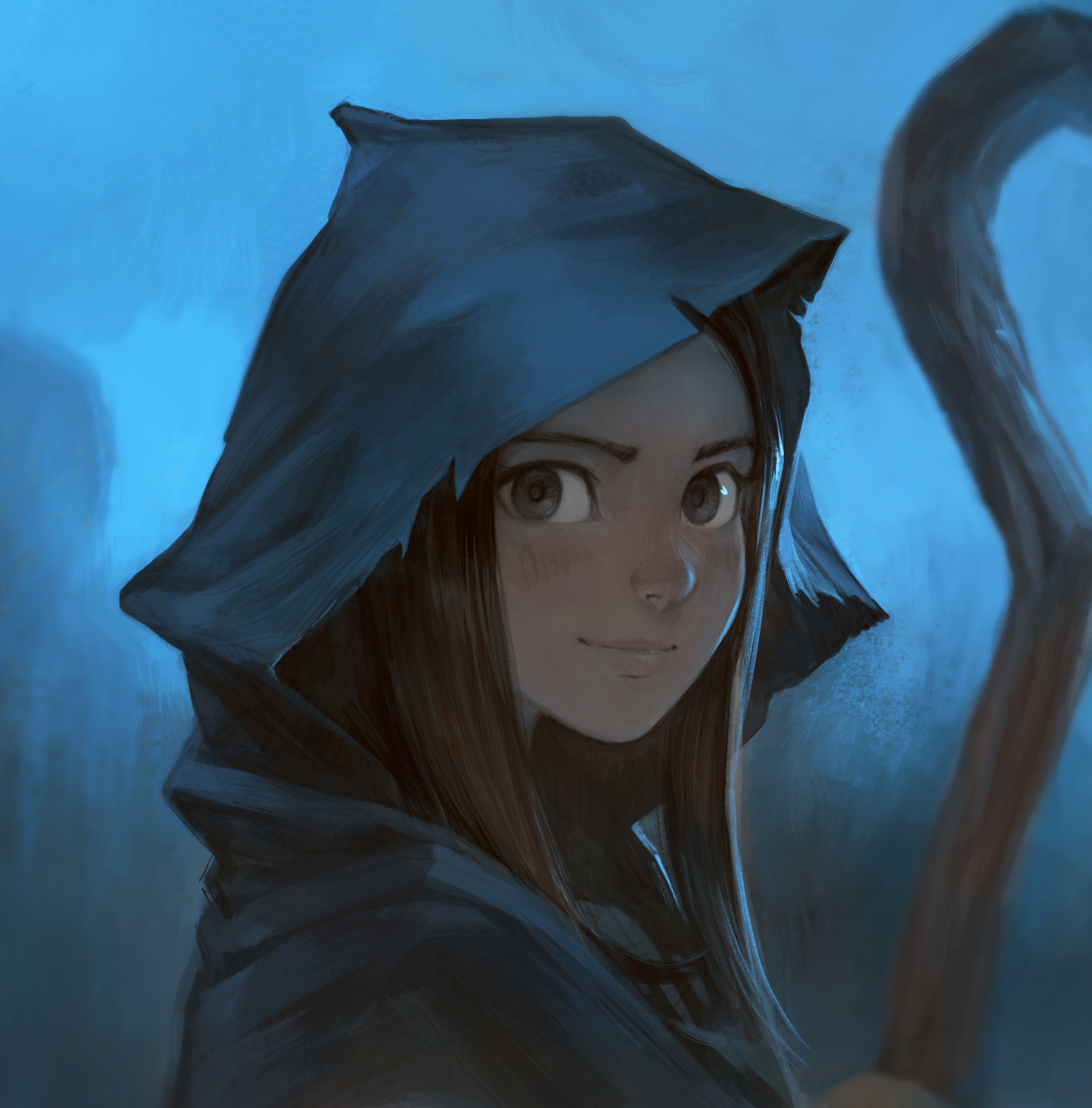
Mysterious
Here is one of the result of the graphical explorations I'm doing right now on the future episode 33 of Pepper&Carrot. To understand what I'm training, I'll try to elaborate more under.
Drawing:
I favor now accuracy of volumes over beauty of the lines. The preparatory sketch for this style disappears totally anyway under the next steps. I switched to a low opacity thin brush preset very similar to a 4H pencil to slice volumes with more accuracy. My large IntuosXL and the QuadHD monitor mix perfectly for that. I enjoy sketching with it. I'm still trying to see how I can simplify this step further by drawing only the main volumes and big shapes (and not an early rendition of the artwork). it can save probably dozens of minute per panels.
Values:
On the previous episode, I used a grayscale to color workflow (but I kept a visible line-art). While working on the last pages of episode 32 I started to evacuate the line-art (and rebuilt it later on the top). For this episode, I'll probably try to melt it as far as I can. It has a lot of advantage: motion blurs, easier fog rendering, better way to suggest things rather than depicting all of them. That's why I try to understand better what's appealing for my taste of values and how to cut shapes. I try to train that while maximize the simplicity of single brush strokes at this step to keep expression on how my brushes describes the volumes and keep the human gesture presence as much as possible. I'm also working a lot on getting richer subtle variation of tones in the low values. This is by far the most time-consuming step in the process; but also the one where I have the most of energy to lift a big amount of work. I plan to get the beta-ready for translator after this step will be done on all panels.
Colors:
The workflow of recoloring gray artworks values is still too random for my taste... So, coloring is the step where I explored the most recently. I ran a lot of test and explored many receipes, blending-modes and HSY/HSV/HSL color models. I still see other artists around having a lot of paint-over work after the recoloring of their grayscale values. That was also the case for myself (and still is). Paint-over is always a sign that's the workflow wasn't really a success. With enough time I can paint over a photo of a piece of Pizza and make it looks like an portrait of a gracious elf. But on a webcomic workflow getting a lot of paint-over is a no go. Add only a single hour of paint-over in your workflow across 35 panels and it's an additional full week of not-fun-cleaning-work per episode... That's why the challenge for me is to get the transition from grayscale to color as 1:1 as possible. But I have my ideas on how to get closer to this type of efficiency even if; so far on my tests it is still too random for my taste. It will work perfectly for a type of artwork and fail totally for another lighting situation. I still have so much to learn to harmonize my values and coloring step... I'll probably need more trial and errors to sync that.
That's all! Thank you for reading!
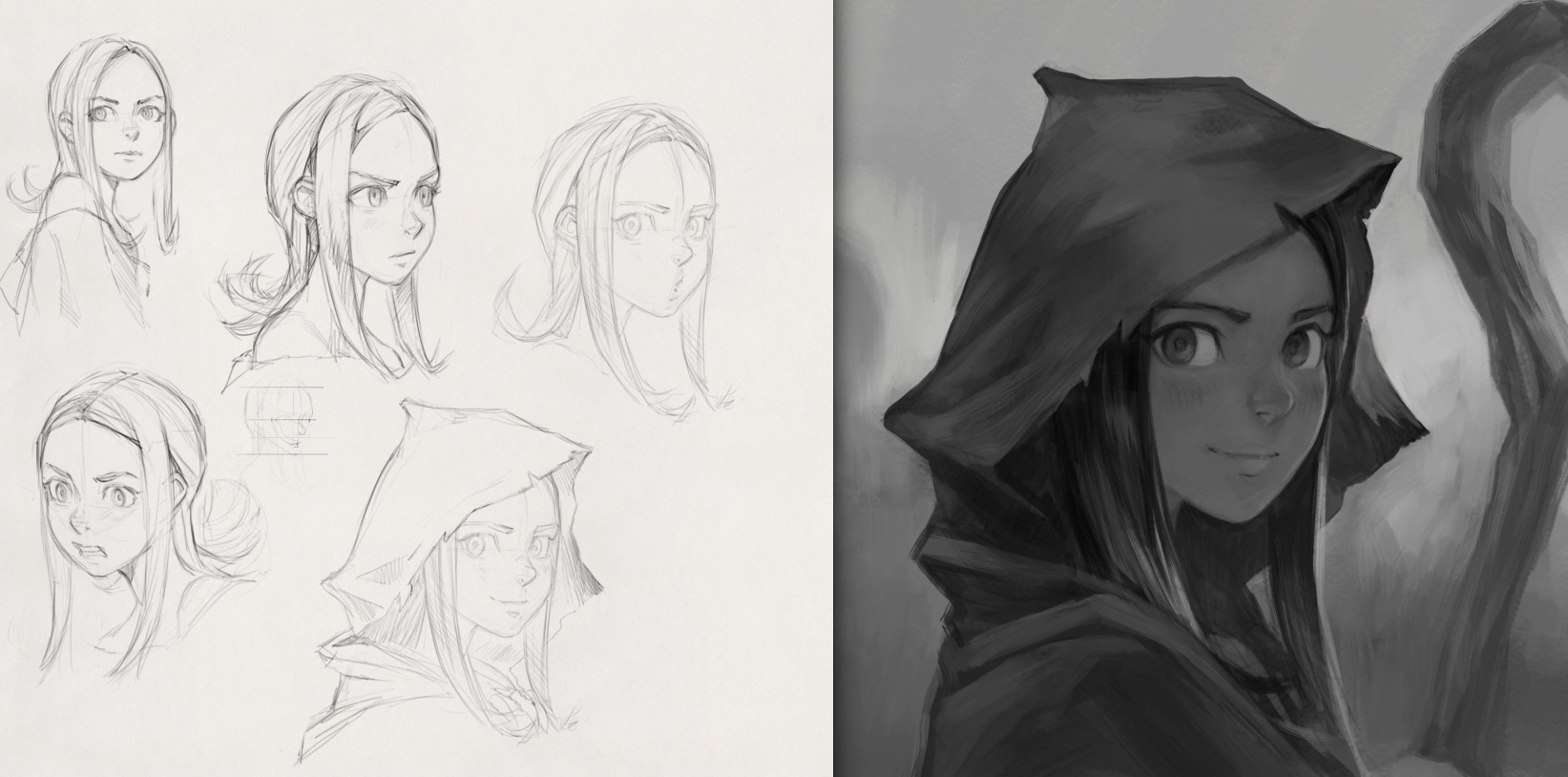
Drawing with thin digital pencil (left) and grayscale value step (right)
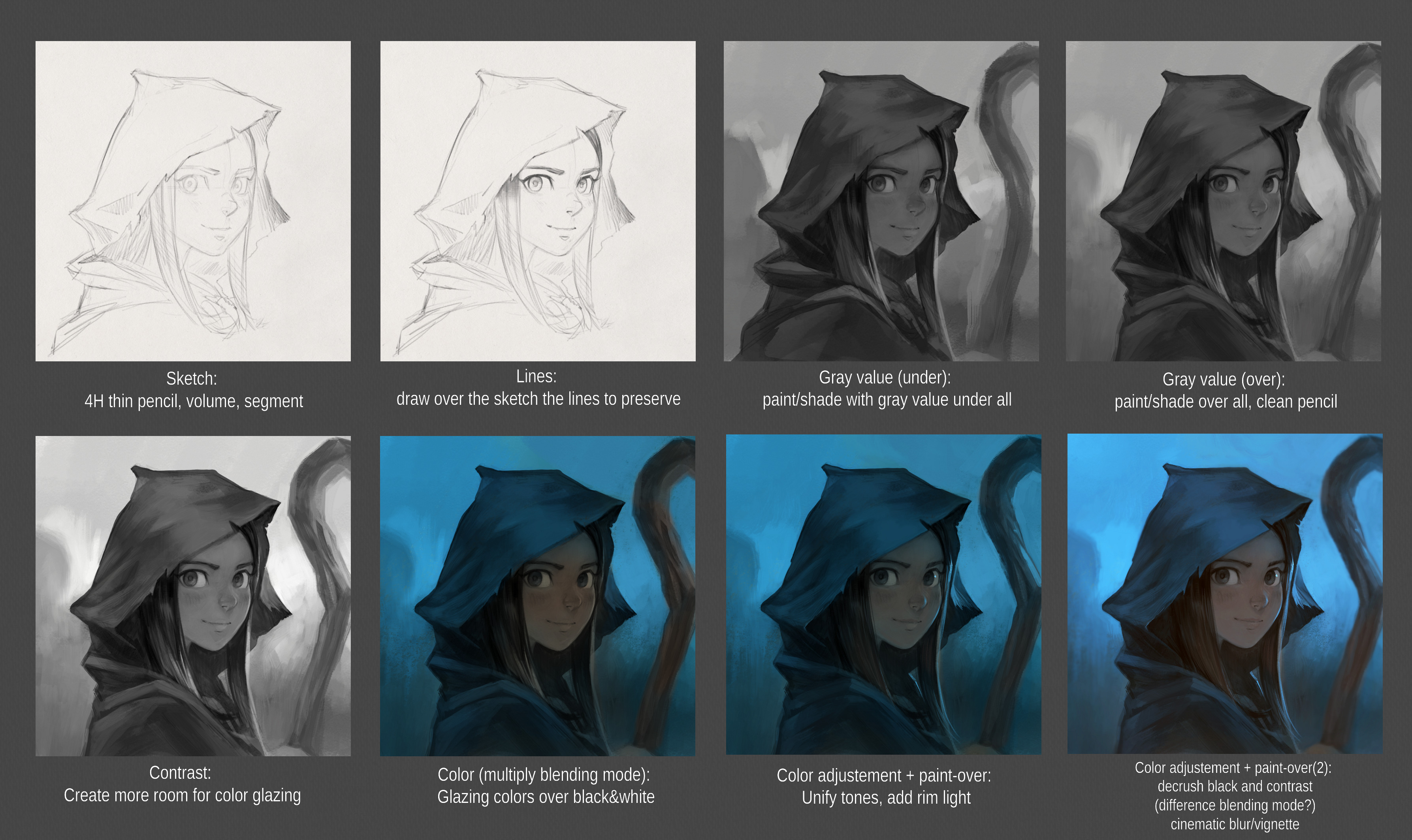
[update] Quick notes about the process (click to enlarge)

9 comments
A beautiful artwork :) It took me a while to figure out it was pepper. It's probably because she's not wearing her usual outfit. Also her eyes seem a little brighter than usual in this pick (perhaps a shade of green?), but it might be a trick of the light.
Great work!
There is the 'deoldify' AI-based code to colorise black&white photographs and it did a somewhat decent job to guess colours here:
https://www.zq1.de/~bernhard/images/davidrevoy/pepper-25.jpg
Takes around 0.4 seconds for this image on our fast Nvidia GPU. Surely it is not perfect, but could it save some of those boring minutes of coloring?
Maybe one could even re-train the neuronal network to better match intended coloring, but that seems rather advanced.
This is very impressive.
Very interesting, thank you for sharing Bernhard, I tried to isolate the color info ( https://www.peppercarrot.com/extras/temp/2020-04-23_screenshot_162802_net.jpg ) and this type of coloring might still be not a big gain of time compare to the proposal of color it does. But I'll keep an eye on that; you are right, with a correct training and good database (might need to be custom per artist); it could be a very smart method of saving production time :-)
Thank you!
I have a perhaps silly question: When you write the sketch was done with a 4H pencil, do you mean literally a pencil (whose sketch you scanned), or is that a name of a tool in the software you use in order to draw?
Not a silly question at all @Pip; that was silly on my side to use this terminology to describe the feeling of my digital brush preset with a real naming standard of pencil. The preset is this one https://www.davidrevoy.com/data/images/blog/2019/krita4extrasbrushes/c-_pencil-1_sketch-update.jpg from my latest brushes with more opacity. It makes the line very bright gray even with black selected. It gives me this feeling of drawing with a 4H pencil.
Beatiful!
David, very nice artwork!
Post a reply
The comments on this article are archived and unfortunately not yet connected to a dedicated post on Mastodon. Feel free to continue the discussion on the social media of your choice. Link to this post:You can also quote my account so I'll get a notification.
(eg. @davidrevoy@framapiaf.org on my Mastodon profile.)