


Production report: New website for Pepper&Carrot
After a big month of hard work, I'm happy to release today the new website for Pepper&Carrot! Here is a list of the fix, improvements, and what's new:
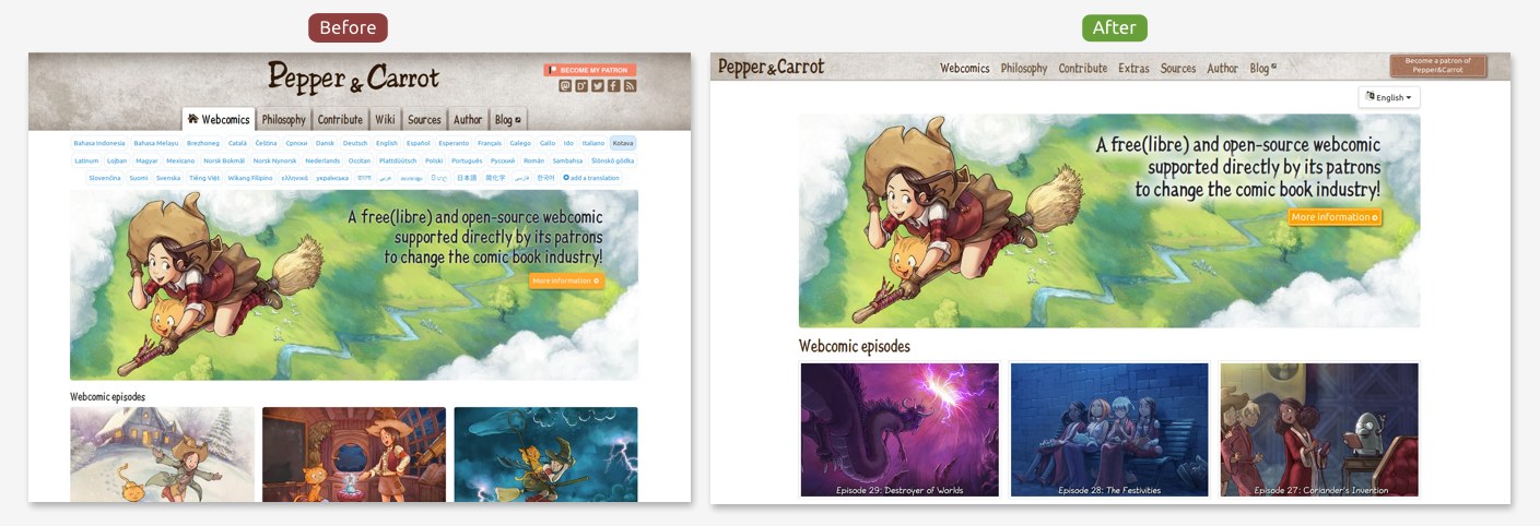
1. More compact and cleaner:
The new website has less buttons on the way and more room for the content. It is now also possible to share the homepage in a target language. Eg: sharing English https://www.peppercarrot.com/en/ or French: https://www.peppercarrot.com/fr/ .
2. Better language menu
The 47 translations of Pepper&Carrot are now listed under a single button. A percentage indicator will show you how much complete the translation is. If you move the mouse hover a language, a tool tip will show you more data about what is missing. Full translation receives a little yellow star for the quality of the maintainance.
![]()
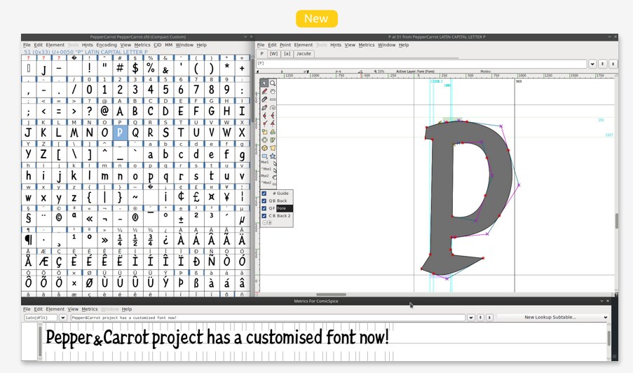
3. I created a new font
For a better appearance, I decided to use a font hand-drawn like in old books. But none of them were available under Free/Libre license; so I decided to fork my existing "ComicSpice" font with the software FontForge and redesign the letters to give them a "Pepper&Carrot" vibe. The resulting font is named Pepper&Carrot (sources here) and has all latin-extended and vietnamese accents.
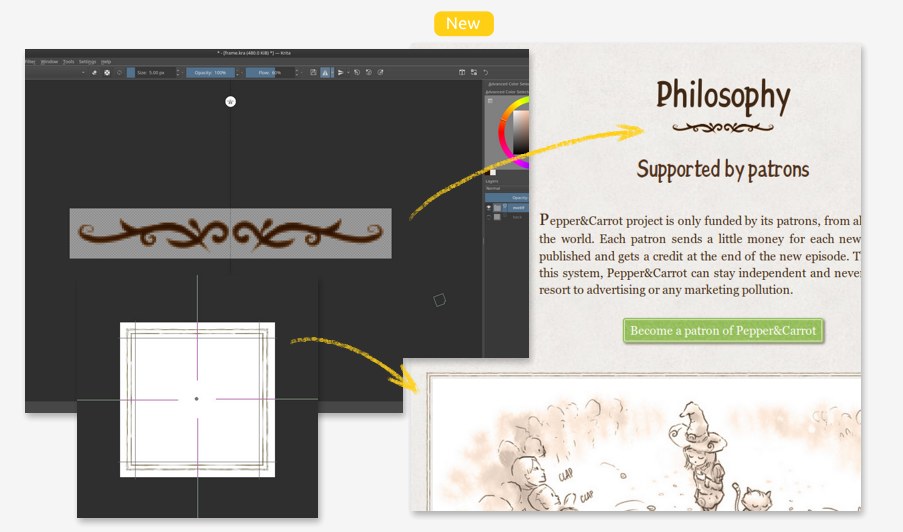
4. Disgusted by the flat colored web fashion
Nowadays, nearly all apps, website, software design comes from the taste of Google, Apple, Twitter, (etc...). I start to dislike this style as much as I dislike the idea that a little group of designer rules the taste of the web. I discovered in CSS3 many tools to add enluminures, non regular borders and frame using bitmap, and paper grain. Doing rich decoration is less easy and takes more time than applying a dull background-color and a border-radius but I think it really improves the experience. Especially in a time where tablets, monitors have a lot of resolution. Krita tools like rulers, symmetry tools, multi-brush, warp-around mode were so precious to design the 'sprite' bitmap I needed. I could this way invent a "modern Grimoire" theming to Pepper&Carrot website.
5. A new theme for the wiki:
The wiki contains a lot of hidden treasures and really worth a read for the pure entertainement. With the new theme it is now a pleasure to read it. Also, all illustrations of the wiki have moved to the source page 'misc' category.

6. Fully responsive
The redesign of the website was thought for small devices and tablets in mind. It is now easier than ever to read Pepper&Carrot on a pad, a smartphone, a TV, (a toaster?) or on a connected e-reader.

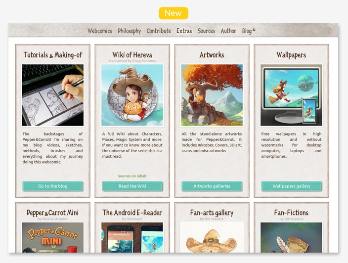
7. New "Extras" menu
I'm not only publishing webcomics; I'm also publishing a lot of extras and bonuses: wallpapers, tutorials, brushes, artworks with Krita source files... A lot of cool contributions also extend greatly the universe of Pepper&Carrot: Pepper&Carrot Mini, the Wiki, the Fan-Fictions, the Fan-Arts... All of this was really hard to find in the past. Now, it is all linked under a single quick menu.
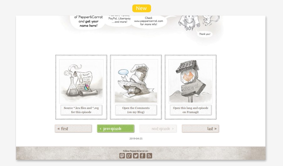
8. Improved footer of the webcomic episodes:
You'll find now a navigation with brighter buttons to quickly read the next episode but also big buttons to access the sources of the episode, comment or directly access to the SVG of the episode on Framagit.
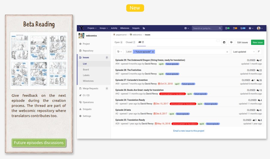
9. New way to contribute: Beta-reading
Well, this is not 'so new' because it is something I ran since probably 2 year now but it was only known by the translators and contributors who were familiar with our collaborative Framagit tool. Now it is easier to find in the Contribute menu. You'll need only a Framagit account to interact on this thread as you would do for a forum. (note: nothing started for episode 30 yet, but maybe I'll start a thread in the coming weeks).
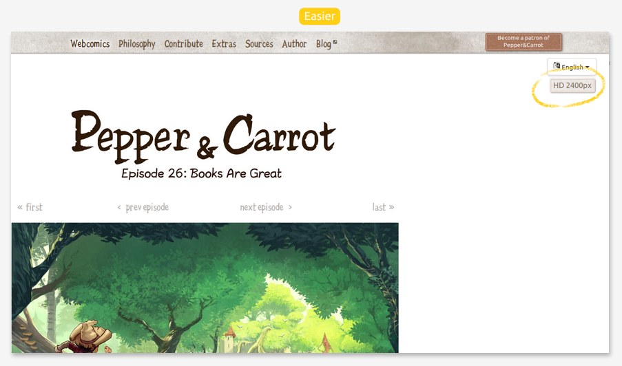
10. Easier HD button for Retina and 4K display
If you have a high definition monitor; you'll probably enjoy reading Pepper&Carrot into a 2400pixels wide resolution! Just click the button and the episodes will switch to hi-resolution. (click again on it to turn it off). As far as I know, Pepper&Carrot is still the only webcomics on the www being high-resolution! On the downside, it will cost you a bit of patience because the page are heavier to load via Internet.
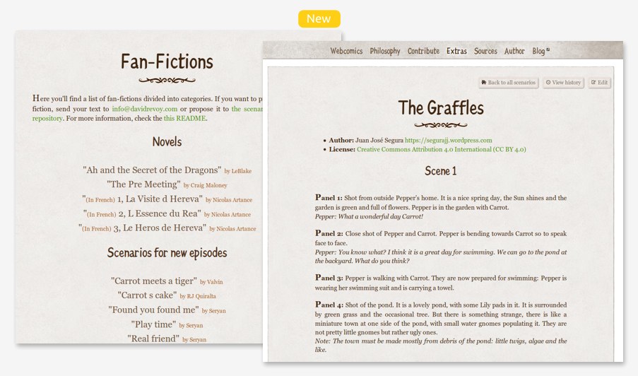
11. Refactored Fan-Fictions, and three novels available to read
I received many scenarios, fan-fictions and texts (under CC-By license) and I stored them during my journey on a git repository... but I never had really the time to link them to the website. Now all fan-fictions are hosted, themed, and ready to read but also ready to receive corrections. You can also propose new fan-fictions. And big bonus for the French readers; the three novels wrote by Nicolas Artances about Pepper's adventure in Hereva are now available and it is a read I recommend if you like the universe and the humor of Pepper&Carrot.
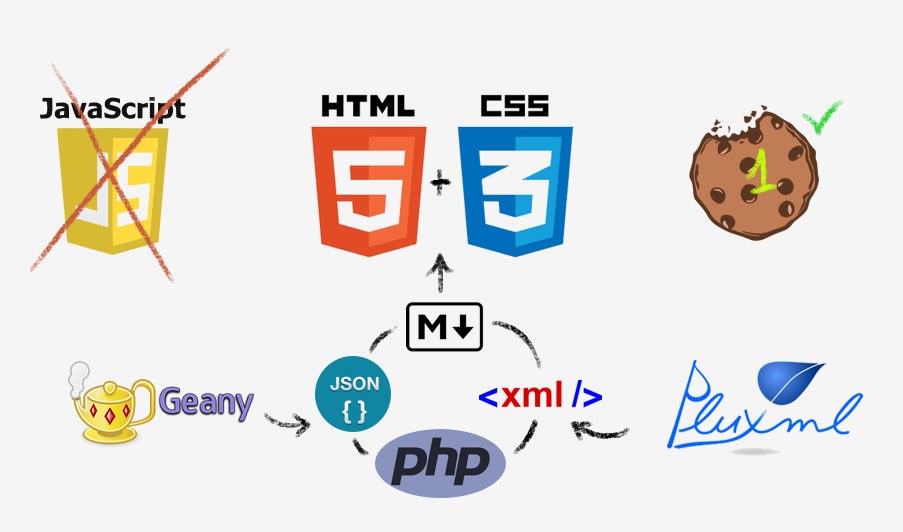
12. Under the hood
For this redesign; I only did incremental changes (all visible on Framagit) over the old base and I still use the lightweight CMS PluXML, PluCSS and the multilingue plugin. I still write only Php, Html and Css using my favorite editor on GNU/Linux Geany. I also use Markdown, Json and Xml for data. I use only a single cookie to store the favorite lang for a couple of week (so I don't need to tell with a toolbar 'do you accept cookie' because this usage is ok) and I don't use Javascript because I don't like writing it and I'm really "old school" for my websites. You'll find no Google analytic, no bad tracking social-media buttons, and no adv. Your privacy and security is safe while browsing Pepper&Carrot.
Conclusion:
I'm really happy this is done now. It also prepares the place for a future big news. Unfortunately, I choosed on Pepper&Carrot to receive support only when I release a new episode; so I funded the time of this refactoring only with Freelance work. I guess that's the price of independance...
That's why I sincerly hope you'll like all the effort I put into this new website ;-)
https://www.peppercarrot.com/

23 comments
This looks awesome! Thank you for putting in the hard work to make this an excellent experience.
Wow nice report. And the new website designs are wonderful. I share the sentiment about keeping tracking off. Thanks for sharing the process
Great work and lots of effort! What a delightful update!
Is Risque not going to be used as a font moving forward? Does the Pepper&Carrot font replace it?
Hey, no worry :) Risque font is a SIL open font; and still part of the 'latin' font folder of Pepper&Carrot. I think only the Esperanto translators use it to write the translation of the title (like here: https://www.peppercarrot.com/eo/article451/episode-27-coriander-s-invention ). No reason to remove it or replace it (exept if I had feedback it become unused). The Pepper&Carrot font is more condensed and has a less spiky (and goofy :P ) feeling than Risque imo. While it also has this little irregularities and still kerning issues that make it not a too serious font. It will be improved on the way. I remember when I adopted the main font of the project; 'Lavi'. Now this one really evolved. I'll try to move Pepper&Carrot font to Latin folder of webcomics/font soon.
Thank you :)
Thank you! ;-)
Thank you Craig for the comment (and for the wiki! I really enjoyed re-reading it while doing this redesign.)
It all looks really cool!
Are you going to change the font of the comic or just the website?
Thanks!
I'll keep 'Lavi' font for the comic, but after the creation of this new font I also took a bit more skill with drawing letters with FontForge; so I'll probably try to bring a bit more personnality to 'Lavi' I think on the way (a process I already started, I changed a lot of letters).
This is all good stuff. Perhaps the translation button should be placed on the left side inlined with the hd button, which would be on the right side, in order to save a bit of vertical space. Keep up the good work!
Hey! Thank you.
Unfortunately; my CSS-only constrain (only way to make this language drop-down button without Javascript) require to sort of occupy a full line on the page. So, I can't really put another button aside to it. That would be cool! (and I tried). Maybe my CSS skill is not enough good to do it? I'll try to ask around to expert.
I must say, your efforts with open source inspire me to do the same. So far this is working out great! Just recently updated my website to use only open source fonts, using only open content, mostly produced by myself. Coding everything myself as well (I do not use a CMS) and adapting for small mobile devices was a challenge, but made it work with a collapsable menu.
Keep up your your good work and show the world that open source is as good, or even better as proprietary stuff!
And best of all, You gave the world Pepper & Carrot! Always great fun to read!
Thank you!
Thank you Ferdinand!
Maybe you can put the `.moka` button before `label[for="langmenu"]` and give them a `display: inline-block;`
https://framapic.org/2GGluq5OzVjA/uZ9esn6w2sUp.gif
:O :O :O
Thank you for passing by here and giving a full solution. :-)
I'll apply it tomorrow for sure!
I use ComicSpice in three episodes and like it. It use less space in comic, more space for background picture.
Please tell more about your freelance work: how much cost and time for work (put link in this web site?). May be some of fans want hire you for work. I think about hire you for future art project when I ready.
Nice website revamp, and as someone with passion towards typography, I adore ComicSpice design and Pepper&Carrot just continuing the good things with a more refined look.
Hello,
as a developer, typography lover and css enthusiast, I appreciate the hard work involved in this rewrite and I must say that the result is simply stunning!
For the ornaments (cul-de-lampe), couldn't you use vector files instead of the bitmap ones?
Here is an example : https://codepen.io/ntoniazzi/pen/ydBpeN
Thank you for your inspiring work!
Awesome new website design
Great job!
;)
Making them SVG is a good idea :) I guess going bitmap was the easy way to try 4 or 5 design and draw them from scratch with live symmetry tools ; the flexibility of editing with Inkscape is way more rigid compare to drawing it with Krita. Now the design is done, redrawing them in SVG makes sens for a future enhancement. I'll write it in a TODO.
Hi Châu! Thank you and sorry for late reply from 10 days ago, I missed the notification I think.
About the Freelance works, I was lucky enough to get two good proposal from one lovely association, Framasoft and from Purism. Both work sponsors me to produce CC-By licensed works. In term of money, email me your project, I have a PDF with my 2019 prices and I'll be happy to share it to you.
David.
First of all: really nice looking rewrite of the site.
Also, when I saw the no js thing, I tried visiting the site with links (very basic web browser that can run on the framebuffer, but still supports images with the -g flag) just to see how it works, and it's actually very navigable that way, so serious props for that! some webcomics won't even load. hahaha.
Post a reply
The comments on this article are archived and unfortunately not yet connected to a dedicated post on Mastodon. Feel free to continue the discussion on the social media of your choice. Link to this post:You can also quote my account so I'll get a notification.
(eg. @davidrevoy@framapiaf.org on my Mastodon profile.)