


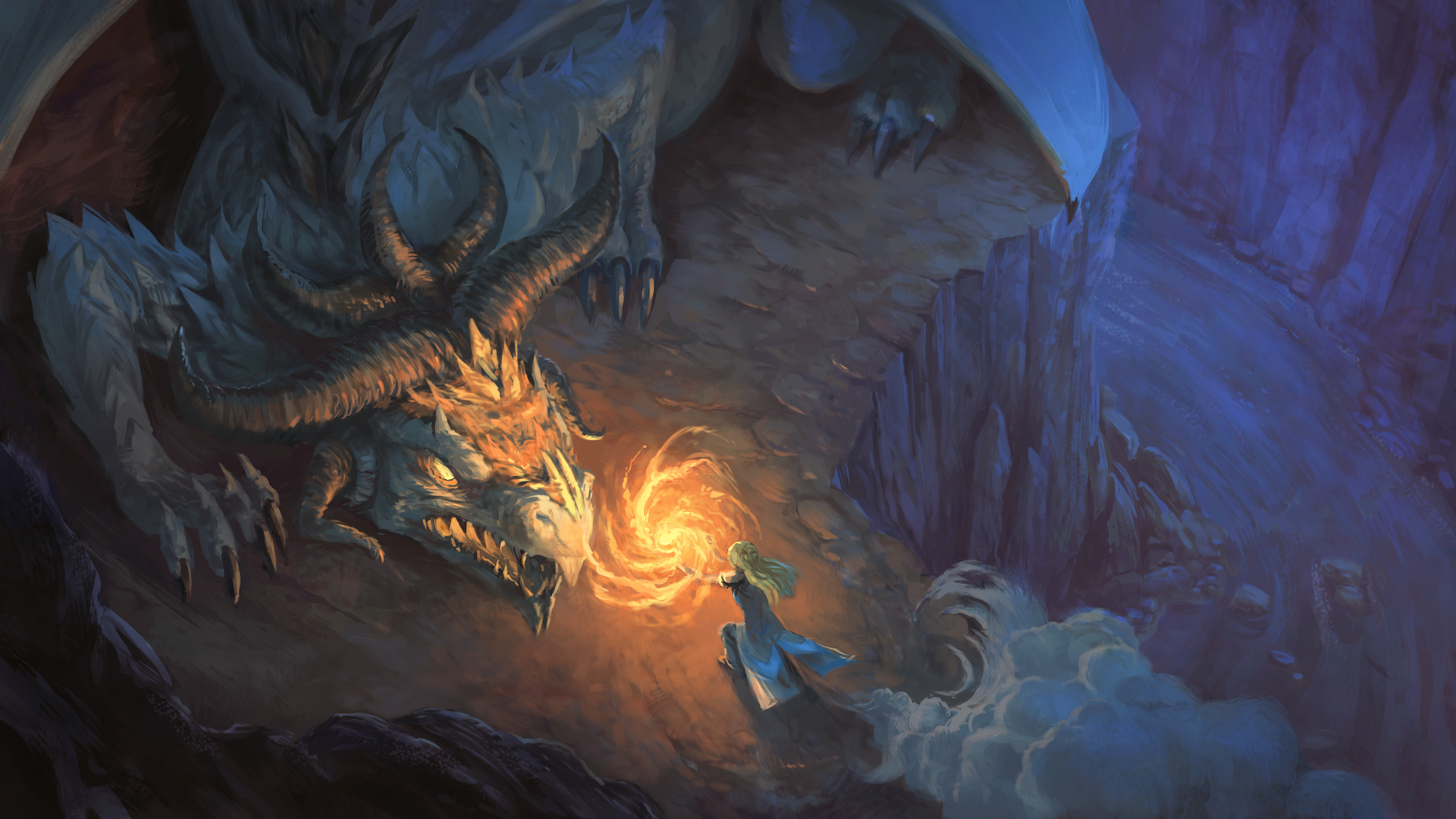
Confront the Dragon
I'm still continuing my research and I had to do a test to stress my new method even more.
My stress test: I had to paint visual effects (fire), night ambiance, fog, a foreground/middleground/background, a perspective system, etc... And because I'm doing all of that in a larger plan to solve many other bottleneck in my production, I decided to go for a theme of "Confront the Dragon". It has an opportunity to study many material at once.
Unfortunately for my test, it failed. I don't get exactly the rendering I wanted. I pushed the artwork anyway so I could post it and the file doesn't sleeps on my disk system.
I wish I had a better way to preserve the silhouette of the ground (foreground/middleground/background/dragon/character) and the layer stack of Krita did not help about that. The alpha inheritance workaround for clipping mask is not fluid to work with, except if you have only one or two group like that in your file.
I'll continue to explore.

6 comments
I'm still examining the final image, but I can't find any flaws, I guess I'll have to examine directly the layers in the Krita. The only thing I would change is left the idea of confront the dragon with force. It's proven that most of these creatures are invincible by strength, but it is very easy for them to fall for the tricks of seductive girls.
Hey, thanks.
About the flaw, it's more of a stylistic expectation I had: hard edges around my silhouette (without the need to do explicit brush strokes that add a thick rim light) and smoother volumes. The picture feels 'loaded' with heavy paint strokes, especially on parts like the head of the dragon. I expected to get another look out of it, and a better light too, but I fell again in my usual 'everything is too saturated' trap. I have a lot of progress to do. Thanks for the feedback!
Not sure whether it was a goal in this artwork, but the proportions of the witch (if compared to regular women) seem off. The small bit of left knee you get to see suggest that the hips are so low that the back should be incredibly long. But I can imagine this is a very difficult angle to draw a person from. That said, the angle does add drama to the scene. With the cliff on the right hand side, this witch seems to be in a challenging situation. I wouldn't necessarily suggest to seduce, but maybe it would be better to just be friends ;).
Oh thanks! Oh yes, now I can only see it, it's very off. I probably pushed this proportion on the way, and my eye got used to the deformation. High view angle shots are still my nemesis. I'll need to work more on that and study this. (note: I'll see if I find time to fix the version on the blog and update the file.)
Yeah, I think there are two quick ways to fix it. One would be to pull the left knee a bit sideways, the other to taper the upper leg differently so that it appears as if she isn't squatting that deep. The latter is probably how you intended it to be. But yeah, this perspective is difficult. So difficult in fact that when I see a real picture from this perspective, it sometimes seems off too!
In fact, maybe this picture of this kind too: I tilted my head left and right, mind-tuned the backside leg a bit, and the picture glued up to a realistic, well-proportioned human. This piece of knee is not, really, decisive about the placement of thigh: it can be continued anatomy-friendly way as well.
Post a reply
The comments on this article are archived and unfortunately not yet connected to a dedicated post on Mastodon. Feel free to continue the discussion on the social media of your choice. Link to this post:You can also quote my account so I'll get a notification.
(eg. @davidrevoy@framapiaf.org on my Mastodon profile.)