


Episode 37 Production Report (part 1)
Table of Contents
- A new style research
- Aftermath of a realistic shading period
- Problem in production
- The style research
- Concept-art
- Comparison with previous renderings
- Analysis of a not so much reproducible workflow
- Reverse engineering my style
- Early results
- An upcoming refactoring
A new style research
Here is a stylisation research for "Pepper the traveler in incognito mode" for episode 37. But why a stylisation research now?
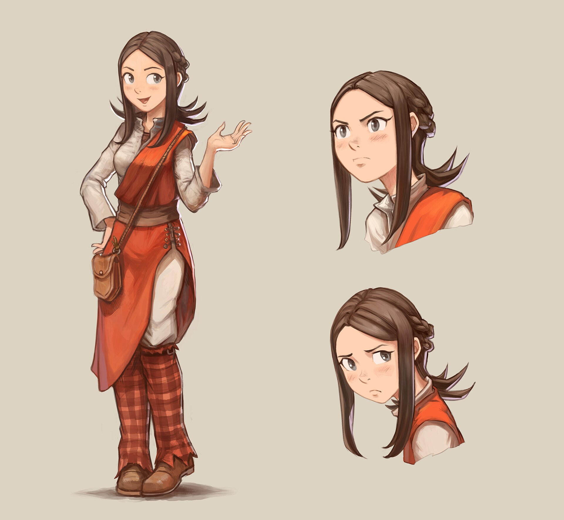
A model sheet, on left Pepper stands up, on right: two expression sheet.
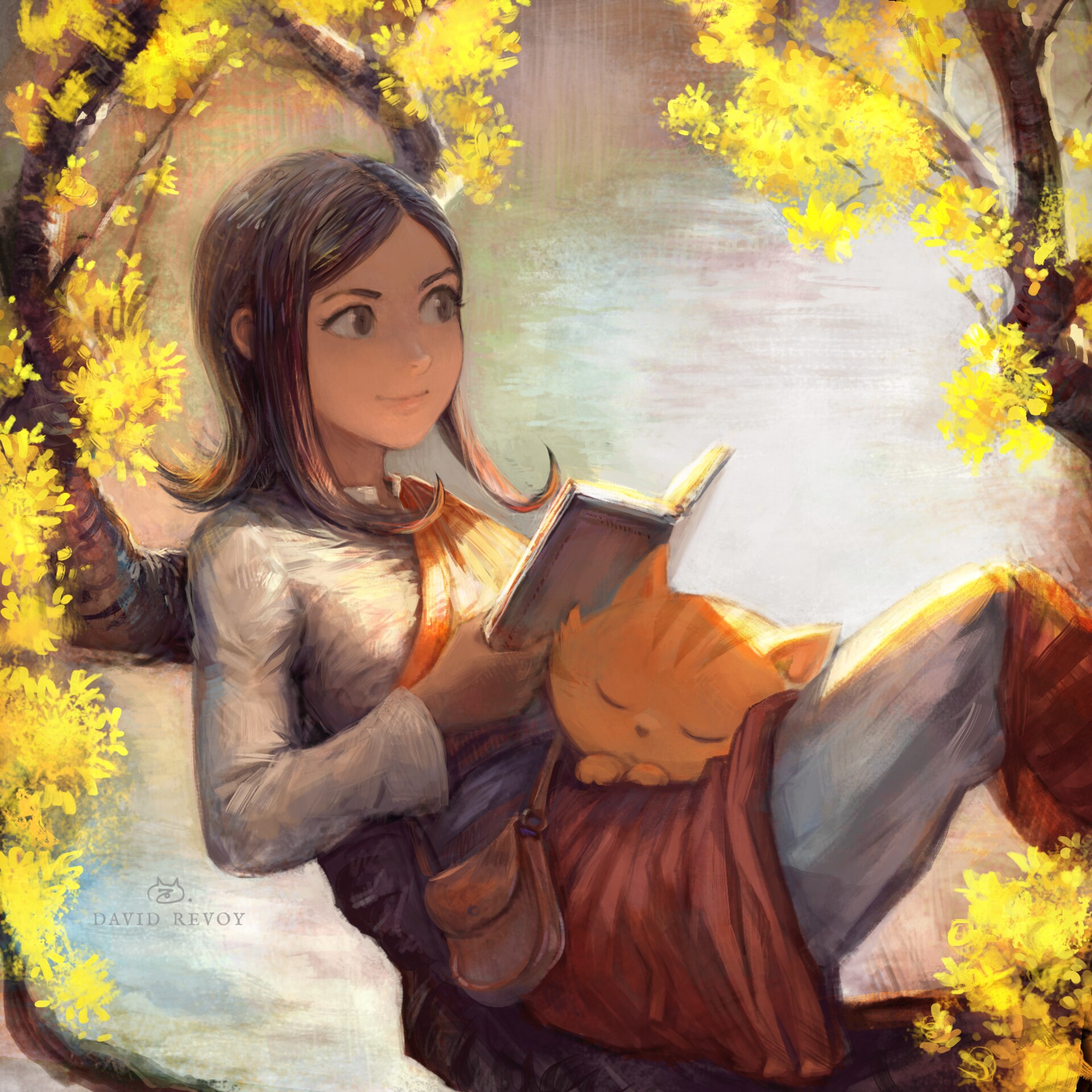
Aftermath of a realistic shading period
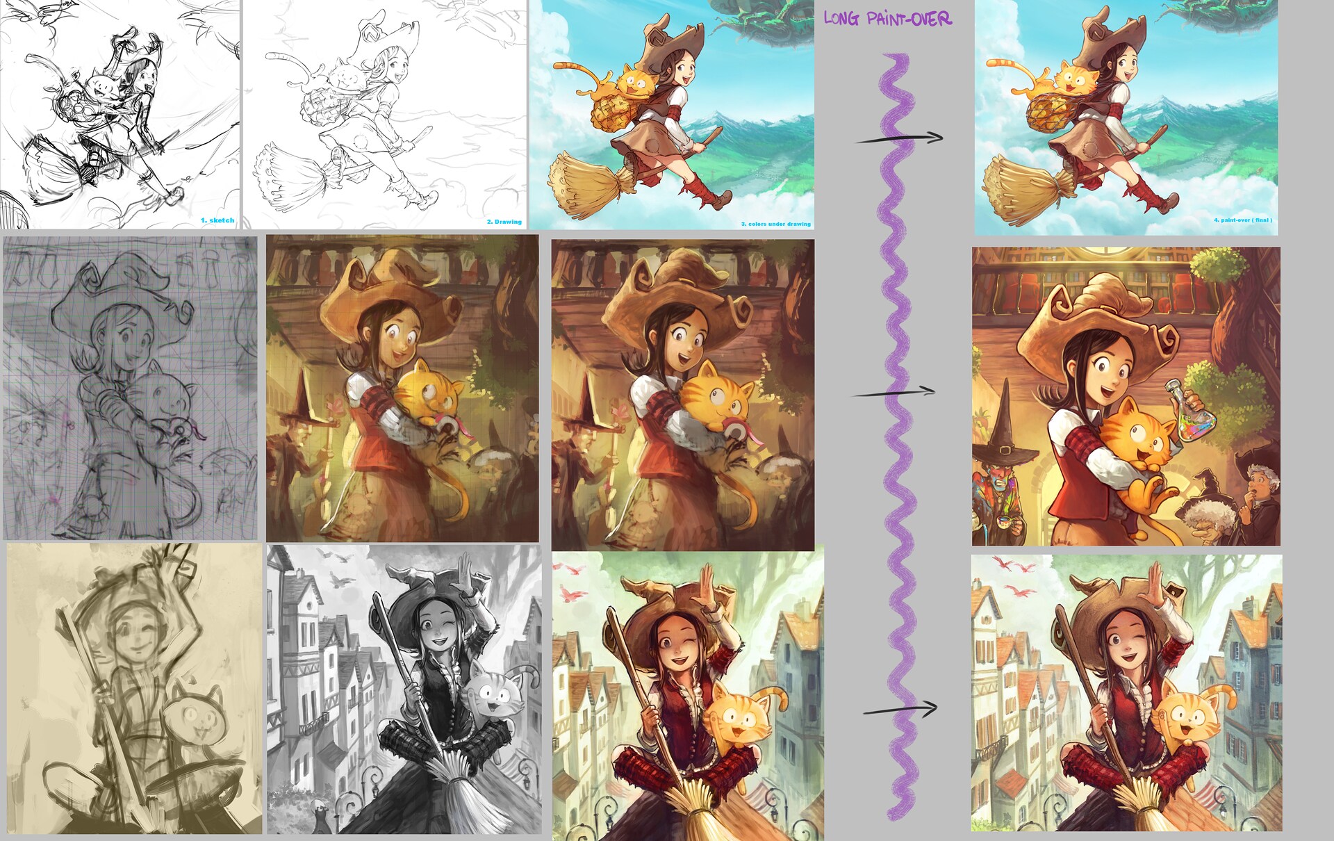
Recently, I was really into bringing more realism and advanced shading to my painting technique. You probably saw it already, but here is a reminder. (click to enlarge)
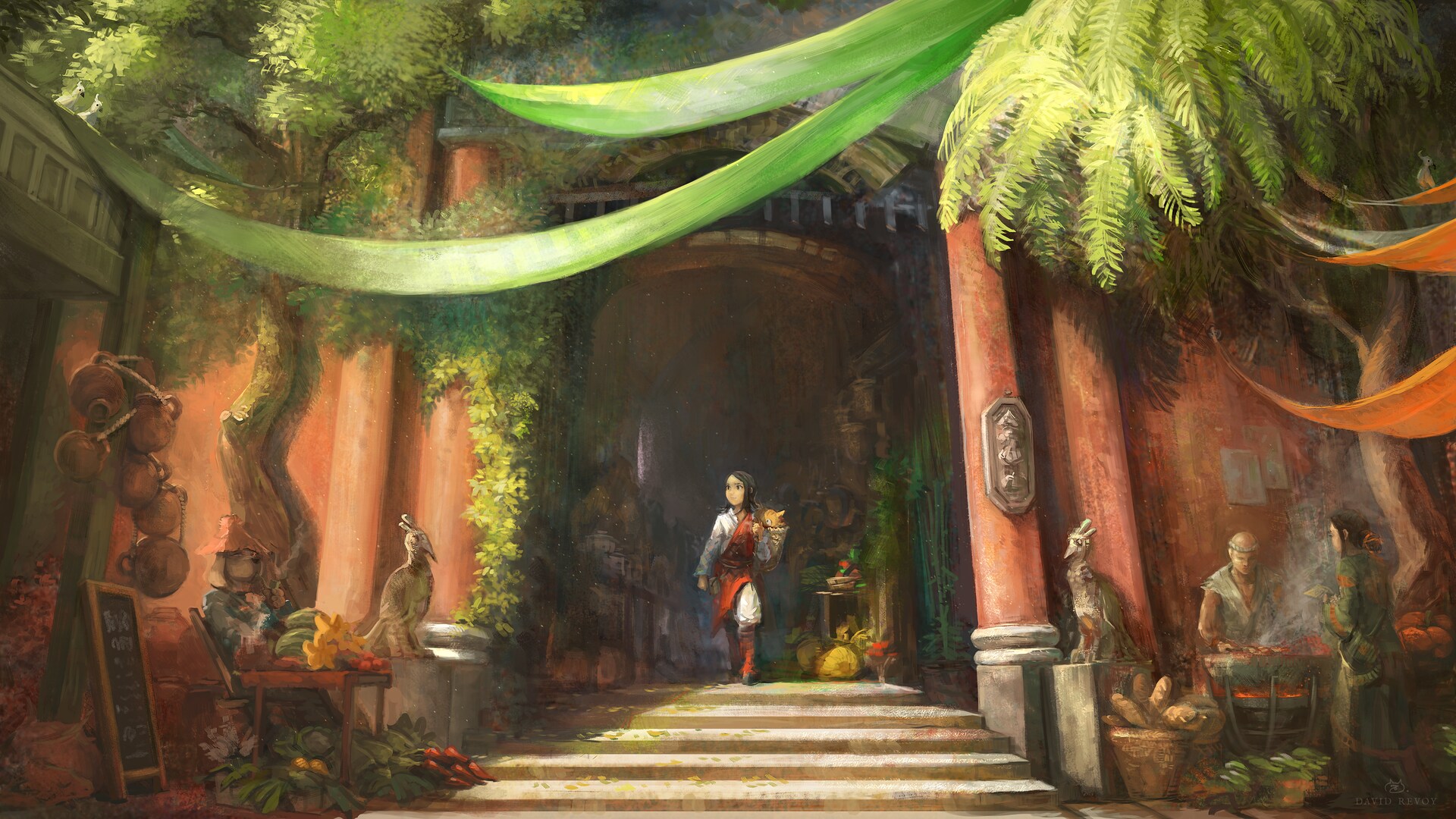

Problem in production
But when I started episode 37 production with this workflow...well... I disliked the early WIP result: bad and static facial expression and tons of slow paint-over process in prevision to fix all of that.
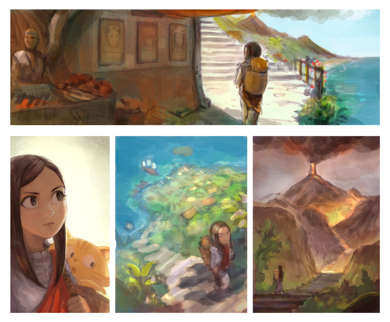
A sample from a page with (unfinished) 'blocky' direct painting workflow
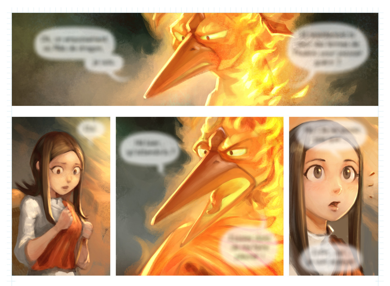
A sample from a page with (unfinished) 'blocky' direct painting workflow
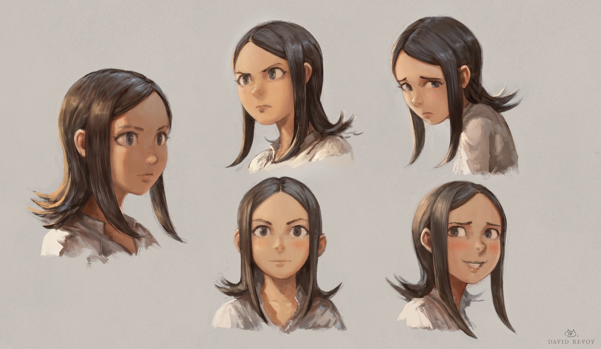
The style research
Concept-art
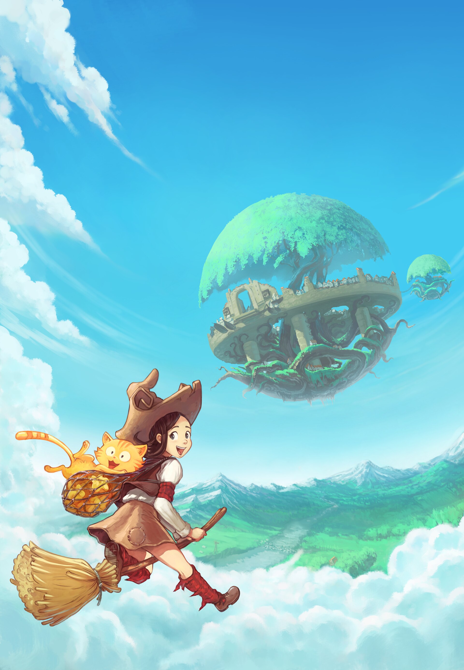
So, after a (long) review on what made Pepper&Carrot joyful, expressive and fun, I decided to discontinue realism and I came back to stylisation: simplier shapes, line-art, less advanced shading.
I painted this concept-art with a 'paint-over a sketch' technic, a slow one, but one very flexible to reach the rendering I had in mind first. And it resulted into this first proof of concept:

Comparison with previous renderings
After comparison with the 36 episodes and 250 pages, the result was close to the style I achieve on the covers for the books of the series. I then decided to make that my art-direction goal for the future comic style and rendering as well (click to enlarge).
book cover: Pepper&Carrot 1

book cover: Pepper&Carrot 2
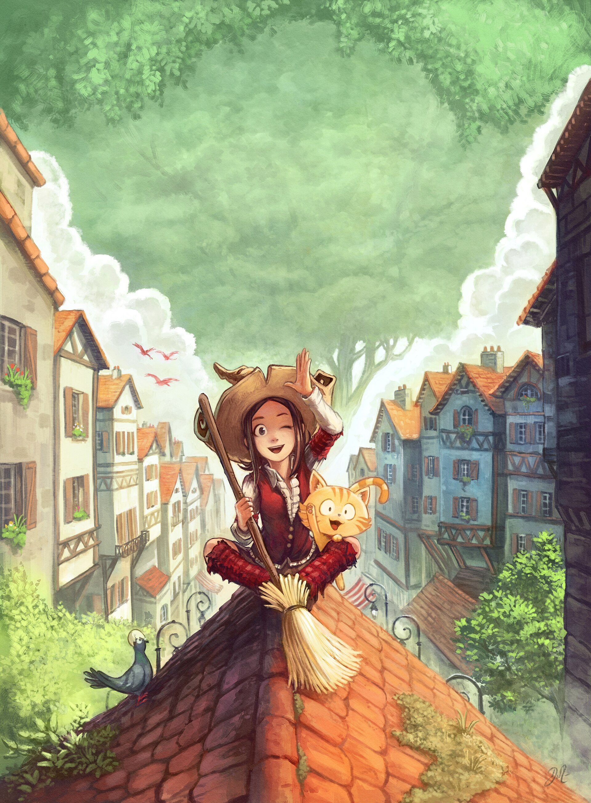
book cover: Pepper&Carrot 3

book cover: Pepper&Carrot 4
Analysis of a not so much reproducible workflow
Unfortunately, I never found an efficient process to reproduce this style with its painterly soft line-art. As you can see under; I always start 'meh' then later put a ton of make-up paint-over until it looks good.
A too long and uncontrollable process for painting a comic this way, and I have experience about it because I already tried to make episode this way...
Analysis of three book cover at various production steps
Reverse engineering my style
I then decided to 'reverse engineer' that style and find how to produce upfront the soft line-art of these covers. Something I could draw immediately well without having to paint over the line later: the right opacity, the right thickness, someting that would emulate the inking that appears on the four book covers.
The idea sounds simple, but finding the right brush preset and skill for making a line-art that look like that took me a lot of training, failures and researches. But I pushed it, because I was convinced this was the right path.
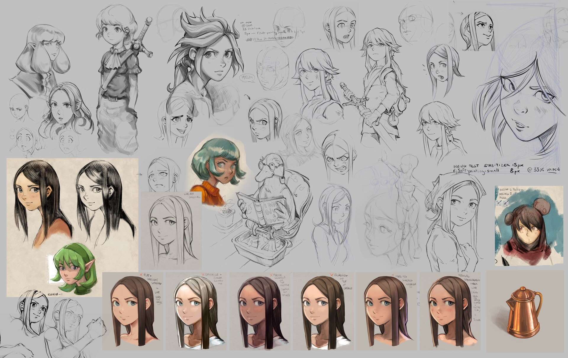
A compilation of sketches of research (click to enlarge)
Early results
But it paid off: after weeks, I found a close-enough combination that could emulate the rendering of the covers (and my concept-art) while using a simplier 'colored line-art workflow', easier to manage and time saving for a webcomic.
The main issue: will I be able to draw this way and maintain that? Will the rendering in comic panel will look as I expect and up to the quality of the paint-over?
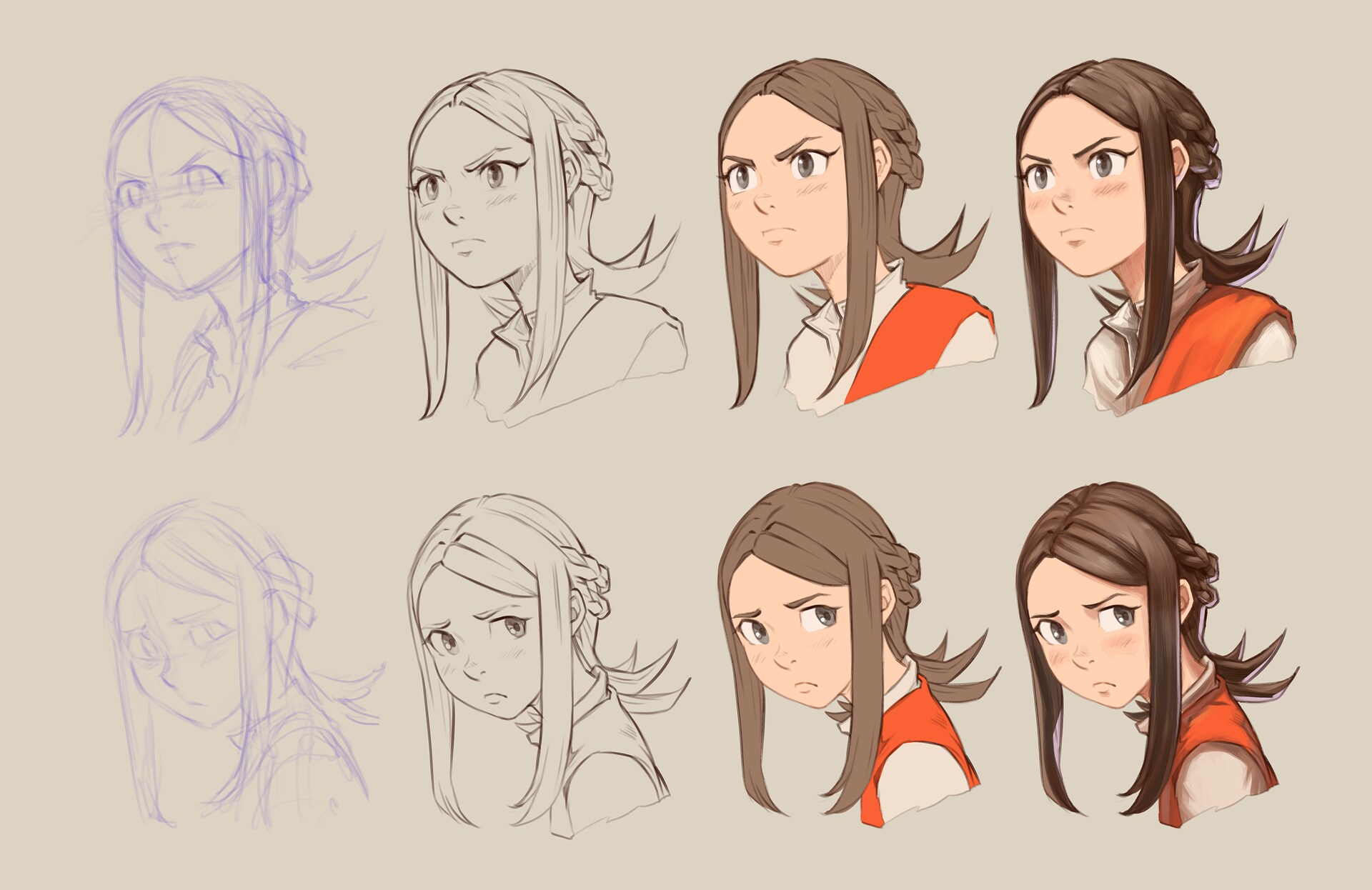
Two expression sheet: break down, from line-art to flat, to shading
An upcoming refactoring
So, I'll refactor episode 37 in this direction now. It will cost me time to redo what was already done, but it's still better than just restarting from scratch. At least, I can turn my direct painting into black&white, low opacity and trace my new line-art on the top of it.
I'm all motivated about it because the comparison with my direct painting rendering feels already rewarding to me and I want the best I can do for Pepper&Carrot.
Let me know if you like it.💛
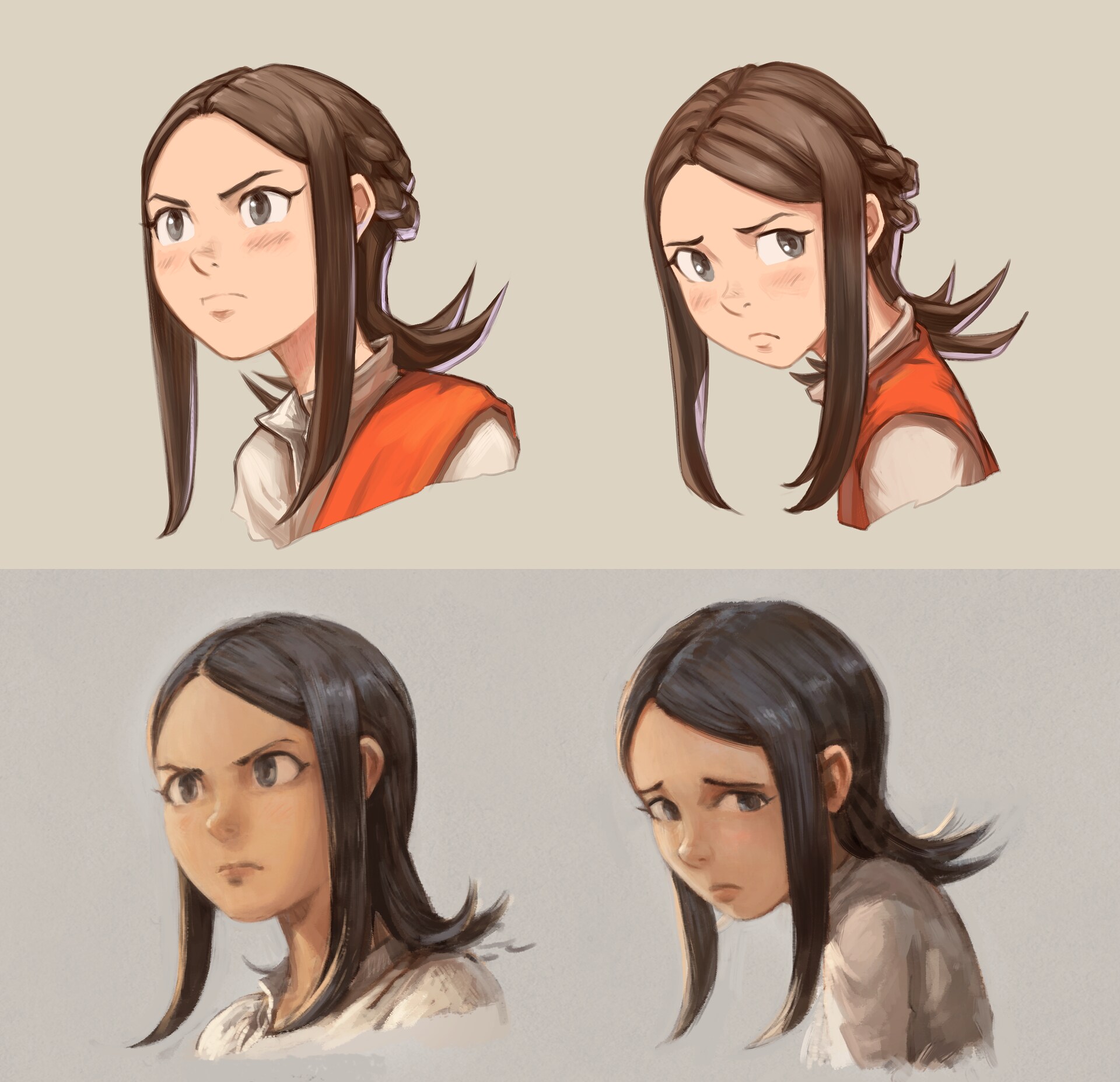 Top: the result of my stylistic research, bottom a previous direct painting stylistic research.

27 comments
I'm looking forward to it! The painterly version of course makes one go wow, so pretty, but the stylized versions are much easier to read, especially when it comes to expressions.
I'm impressed by the high quality of your concept art and studies.
We all agree here, at home. The "realistic" look is too dramatic and doesn't match the overall Pepper & Carrot tone as well as the stylized look, which is "lighter" and fun while remaining so gorgeous! It is also a lot better for anime adaptation ;)
You are really talented David. Your line-art is so impressive! I would love a tutorial on that if you ever get the time for it.
Well done!
Awesome! I like this style very much and happy that you made a choice on it!
Excellent analysis on the effects of these different styles and I think I agree. I love the more painterly style too but I agree these details probably won't work as well in a comic and could possibly be a nightmare to get to sparkle in the next book (in print).
Yet, the painterly style deserves a stage too. I was thinking, here in Amsterdam until recently there was this museum called the "Hermitage" which had close bonds with the State Hermitage Museum in St Petersburg. When the war begun, they broke all bonds, returned the artworks and are now called "Dutch Heritage Amsterdam". Not sure how long it will last like that because there are already other museums nearby (walking distance) with Dutch art on display. Dedicating a huge building like that to something for which is no demand would be pointless. One suggestion I read was to display physical representations of originally digital arts. I think that would be a great idea and prints of these more painterly Pepper and Carrot works would fit beautifully.
So yeah, maybe continue to do both styles as you're doing both at great. I agree on your vision of what works best in comic, would just be cool to find a place for the other style as well.
It is nice to hear that you found a way to develop your style! I really like the way Pepper&Carrot is drawn. It is very enjoyable to look at. I haven't seen many people using this style. Working with a lot of colours and shading definitely requires a lot of mastery.
But I hope you will not fall into using line-art style only, like it is with The Simpsons or Family guy (that is boring). In Disenchantment, there are line-art characters only -- surroundings are pleasure to look at as well, like in Pepper&Carrot. :)
How is this style called actually? It is not pure line-art, right?
BTW, what do you think about this lineart style? - https://community.morevnaproject.org/uploads/default/original/1X/23cc98999556035ecb13be2a0ec07d749d026d33.mp4
Is it looks somewhat close to yours results?
Do you have a link to a community.morevnaproject.org post for that? My video player says it is 'corrupted'.
https://en.wikipedia.org/wiki/ligne_claire sometimes uses watercolour or gouache backgrounds with shading. I don't know if there's an overall term, though.
Love the direction you're taking the stylization, David! It feels very expressive and narrative-driven. Obviously, painterly stuff is very pretty, but this is much stronger for storytelling, and that's the whole idea, at the end of the day.
I'm kinda split, on the one hand I really like the realistic style, way better than stylized but on the other hand I undstand, that it's a matter of time and effort and a quicker workflow might mean sooner new comics.
So I'm looking forward to the next comic, no matter what it will be...
Thank you! Yes, it will be easier to depict some expression "over the top" of Pepper. I tested them with realistic shading, and it felt like the style suddently fell in the uncanny valley. :-)
Thank you 😻
Thank you for the feedback!
Oh yes, you are totally right about how a visual style call for a comic-genre; more dramatic with more realism.
I hope with the style I'm developping right now I'll build a better harmony between the story content, genre of the series and visual style.
@hawk: It was reposted on social media recenly: https://mastodon.social/@morevnaproject/108158647026340756 , it might be easier to play here.
@Konstantin : I'll try to post soon a video tutorial because I'm applying a set of rules for the line-art; and this is mostly what was missing in my previous test. I'll need before that to build up a bit more skill with it, because obviously I'll need a hundred of drawing before having the pretention to know exactly what I'm doing. But in short; I do shading and weight the line (thickness and opacity) depending the light direction. It's nothing revolutionary; many author do it, but in the past I spent more time outlining the volumes than trying to shade them at the same time with the thickness. Then I also try to get the large shape a bit thicker (the 2D shapes) to silhouette a bit things; and I use a big range of opacity in the line (more than think and thick; I use transparant to opaque). I'm not sure a line-art like that would be productive for an animation in all the cases; so, keep doing good work with your technique at the studio, you are doing great!
Oh I have fond memories about the Hermitage museum in Amsterdam; it reminds me production of Sintel 10 years ago :-) Thanks for that.
Yes, I'll probably keep the painterly style for in-between episode; single illustrations, or for landscape shot on the comic ( a bit more painterly).
Thank you for your encouragements!
Thanks! I have no idea about the name of the style. For sure a grand grand child of "ligne claire" (usually without much size or variations, as on Tintin), but mixed with digital painting influence.
"Style" for sure have multi-dimensions:
For the design: the anime part of Pepper that I mix with Franco/Belgium inspiration (and probably a little bit of US comics), in France on the 80s during my childhood I was exposed to all this styles on animation on TV. This mix was sometime refered as "Manfra" (mix of Manga and Français) but the term never took of a lot.
About the rendering; I think the soft line I'm looking for has something to do with the line-art of animation on the 80s that was low resolution and then rendered on CRTs Tvs: the line got blury, smoothed (accidentally). I'm probably unconsciously trying to emulate that with painterly line , so I can keep the aesthetic while having higher definition and not blury. I also saw I have something to do with the color palette of 16bit consoles and way of outlining the pixel-art so their readibility was increased on CRT rendering.
Well, I'm still investigating what I'm trying to achieve and where my taste is; but it is probably coming from my childhood.
Exactly, thank you for understanding!
Oh, I totally understand. Be sure I was number one to have this internal split big time too ^__^`
Bringing more stylisation than the realistic direction will allow me to keep exagerated expression and also drive the visual genre to something explicitly humoristic.
I'm more and more convinced Pepper&Carrot is the unconscious mix of my love for the humor of the Discworld, comic strip, tech/internet meme, a mix of Anime from the 80s, JRPG design and Ghibli mood. When I think to this big bag; I'm not imagining a realistic style for the art at all. The realistic technique is probably a remain of my ego trying to show "impressive technique" to attempt to exist on Internet. My deep style is probably way more simplier than what I'm ready to admit; I'll see that in 10 year if I'm on the good road. xD
merci de partager en détails les changements que tu opère dans ta technique..! c'est vraiment une source précieuse :).
Je me range du cotés plus stylisé.. J'aime beaucoup!
I think the realistic style looked better.
Thank you for the feedback, it certainly depends the context of usage of the style: on my side; for an humoristic and parody fantasy webcomic; I more and more think the realistic style is not adapted at all.
At Software-Development we say: "Keep it simple"
I appreciate the simple style, though the painterly version shows Your enhanced/professional skills and looks really great.
But I think, that especially younger readers would prefer the more simple style.
Great work David
now thats satisfying art right there
man, the old one is very signature of Pepper&Carrot.
I just like the way colors gradually merge into each other without very hard boundaries.
but i also understand the sheer amount of time it takes. i also like that you're brave enough to go for a total change.
maybe after a couple of episodes, I'll get accustomed to this new style.
Hey, thank you for the feedback. I'm doing right now the coloring of the new episode; and it takes time to adjust the rendering; you are right: there is something with advanced shading and modeling of the shape that is signature of Pepper&Carrot and my style. I'll try to preserve that. Let me know when the new episode will be out!
I think the realistic style is great for concept art for your projects but indeed the stylized version is overall better.
More clear and easy to follow. And usually there is always some element lost in between styles. I noticed for myself, when I was practicing drawing with colors with your techniques from a video. I made some rough sketches and when I painted over them, I realized, the fun, comic-y essence was not there. So I had really shape that style to recover what was lost. Turned into a somewhat different look that what I had imagined originally but all that work rewarded me with a new art style. One that keeps the feeling of my imagination.
Post a reply
The comments on this article are archived and unfortunately not yet connected to a dedicated post on Mastodon. Feel free to continue the discussion on the social media of your choice. Link to this post:You can also quote my account so I'll get a notification.
(eg. @davidrevoy@framapiaf.org on my Mastodon profile.)