


Episode 36 Production Report
Table of Contents
Note: I was so busy during the production of episode 36 that I never published really a production report. This one was published long time after, collecting all materials I still had on my disk.
Production planning
Episode 36 was a daunting task from the start, with its massive 15-page length and complex storyline featuring a war. The sheer scope of the episode, with its numerous locations, multiple characters, and dynamic camera work that follows multiple points of view, was overwhelming. Additionally, the dialogue-heavy script added to the already considerable workload, making it a challenging production to undertake.
For this episode, I attempted to apply the lessons I learned from episode 33. I chose to draw inspiration from episode 33 because I felt that the workflow for episode 34 had become too constrained and multilayered, making it inflexible. In contrast, the workflow for episode 35 had swung too far in the opposite direction, with sketches that were too loose and coloring that was applied underneath without sufficient structure. With episode 33, I aimed to strike a balance between these two approaches, finding a middle ground that would allow for greater flexibility and creativity.
Additionally, I was working under a tight deadline, as I needed to deliver this episode by a specific date. To stay on track and manage my time effectively, I implemented a organizational system where I would gray out small squares on a piece of paper with a pencil each time I completed a step. This visual tracking method helped me stay focused and motivated, allowing me to make steady progress and meet my deadline.
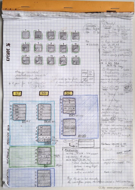
The A4 sheet I used during the production.
Hardware
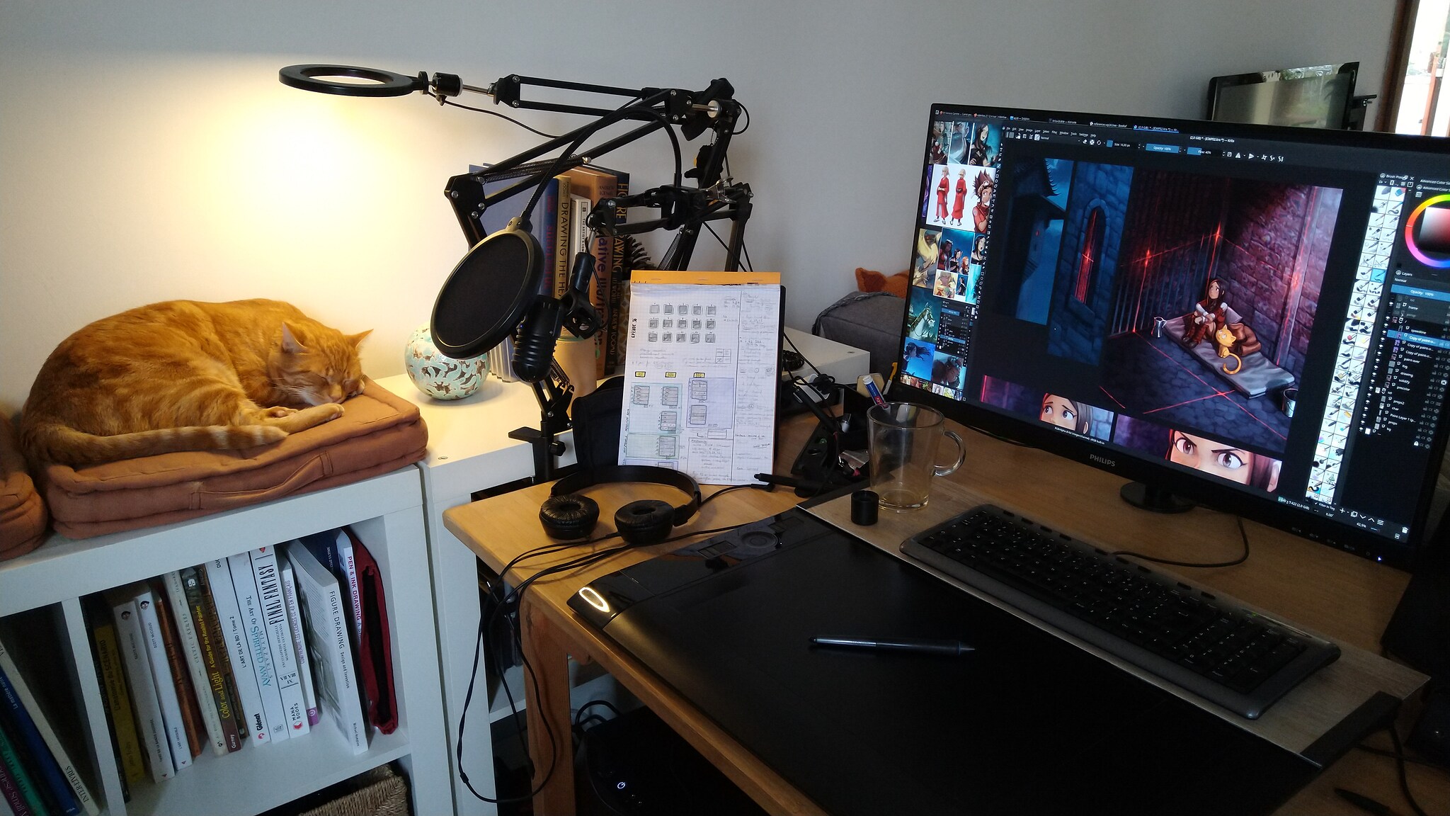
I produced this entire episode using the Wacom Intuos 4 XL tablet. Although I'm not utilizing the full active area of the surface, I am using a large portion of it, proportionally.
The overlay sheet is actually from a Huion WH1409 tablet (I bought extra of them on the Huion eshop) − and not just one, but two, as a single sheet isn't large enough to cover my active area. The gap between the two overlays happens to align perfectly with the position of my dock on the screen, so I never accidentally paint on this boundary.
Why did I resort to this DIY solution? It's the only way I found to get a large-format tablet that meets my needs, and by "large", I mean something larger than the largest screenless tablet in the market right now: the Intuos Pro Large (2017), which measures 12.1 x 8.4 inches (311 x 216 mm). With a width of only 31cm, it's a bit too small for my comfort. In contrast, my DIY setup allows me to work with a 40cm-wide active area, which is my sweet spot for working on my 24-inch quad HD monitor.
Workflow
In practice, the workflow was solid, allowing me to track my progress on a daily basis. However, I also took several unnecessary detours, which ultimately wasted time.
For instance, I attempted to segment all the characters using flat color areas (separating characters, background, and foreground) with the Colorize-Mask tool, but this step proved to be useless. I also spent too much time trying to preserve my original line art and painting underneath it, but the lines ended up getting in the way.
It wasn't until I decided to flatten everything and paint over it that I finally felt a sense of freedom, but unfortunately, this realization came late in the process. As a result, I experienced a prolonged period of uncertainty during production, which could have been avoided if I had adopted this approach earlier.
The four main production steps of episode 36
The scenario
For writing the scenario, I utilized LibreOffice Writer and created a long table with three columns: one for the panel number (which was automatically generated by LibreOffice), another for the visual description of each panel, and a third for the dialogue.
My approach was to focus solely on the narrative flow, ignoring page count and layout considerations, and instead concentrating on crafting a cinematic and smooth storyline that unfolded as a series of consecutive actions.
By doing so, I aimed to create a scenario that was easy to follow and visually engaging.
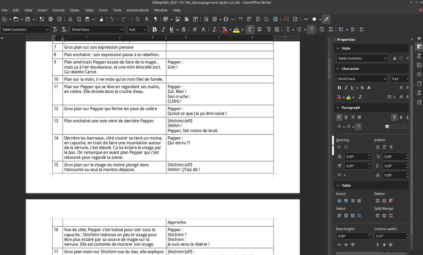
The scenario 'cut' in Libre Office Writer
The storyboard
When it came to the storyboard, I prioritized simplicity and focused solely on creating a basic plan. I didn't worry about the composition of each panel, nor did I consider techniques for proportions or view angles.
I also skipped grayscale values this time around even if it was effective on episode 35, as my primary goal was to quickly establish a straightforward narrative outline.
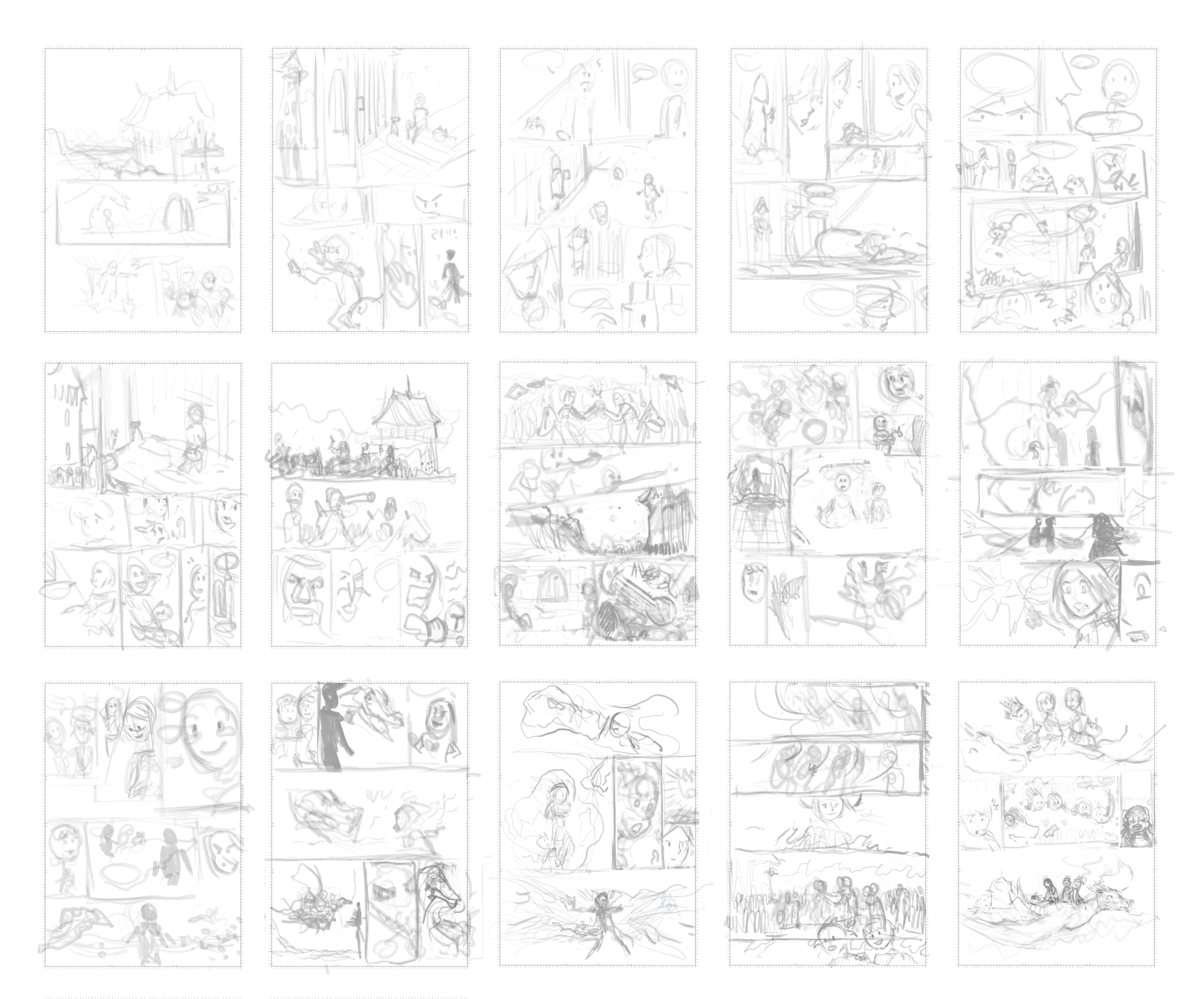
The 15 pages storyboard on a single 'grid' document
The sketch
I began by copying and pasting the storyboard thumbnails onto each page at full resolution (3840x5422px documents) and tinting them green. To create visual distinction, I maintained a warm grayish paper color to differentiate the borderless panel's white color from the inner panel area.
Next, I used a large brush with a deep dark blue color to sketch the panel, which proved to be a good decision as it allowed me to focus on the overall composition without getting bogged down in details.
I also added the text and onomatopoeia in red using Krita's text tool, which enabled me to adapt the dialogue in a 'what you see is what you get' manner as I drew. This approach was particularly useful for planning the translation system, as it allowed me to test the dialogue and speech bubbles before finalizing them in Inkscape later on.
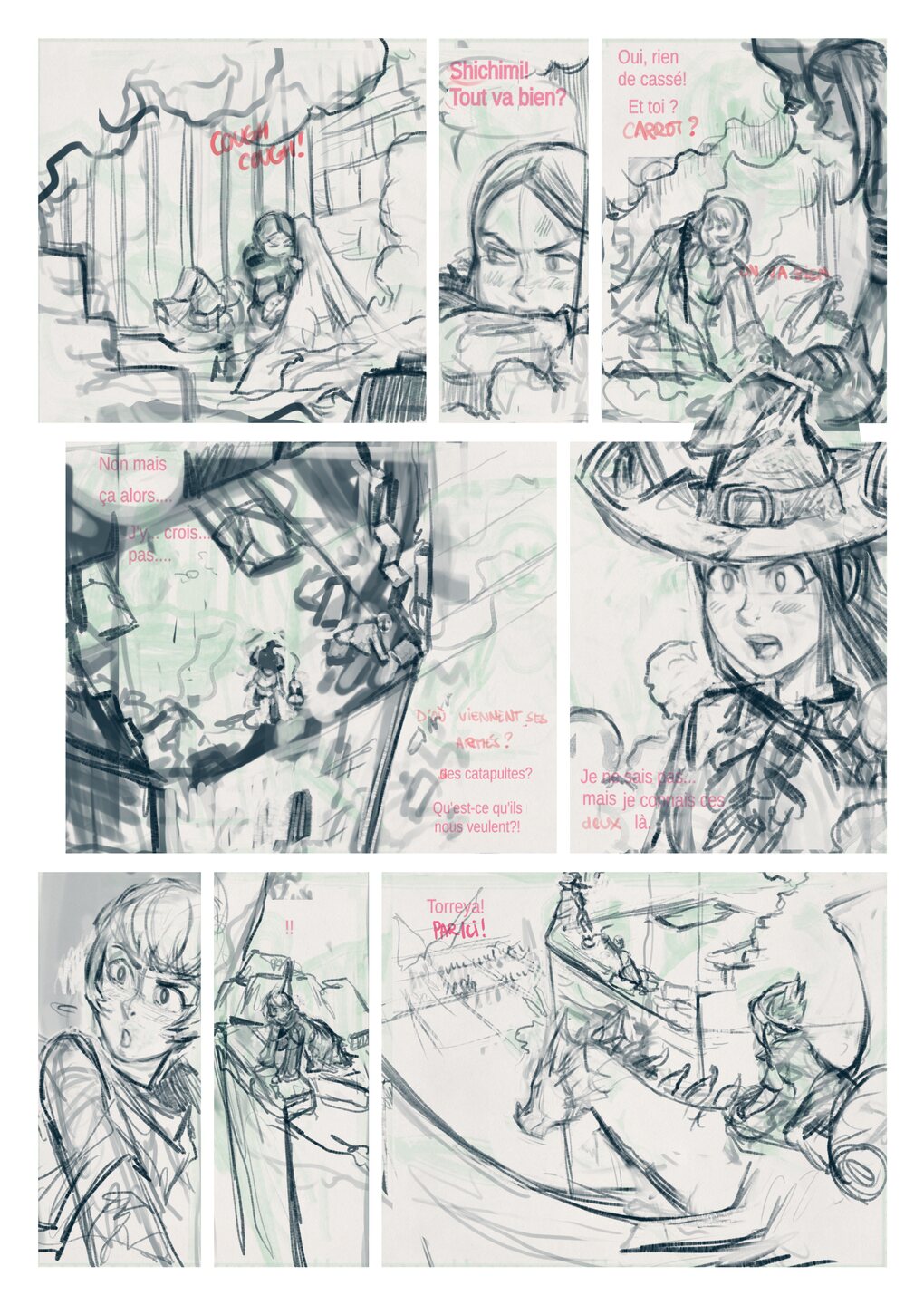
The page after the sketching process
The clean-up
I began by reducing the opacity of the sketch to a very low level, turning it into a faint blue outline. Then, I redraw everything on top of it using my 'c0) Sketch' brush, a version saved with a stronger opacity curve. I set the brush size to 30px, suitable for my 3840x5422px documents, and chose a #5F5F5F or rgb(95,95,95) gray color to discourage myself from getting too caught up in varying line weights. I also set a '42' stabilizer on my line. To avoid getting bogged down in details and to prevent perfectionism from slowing me down, I also made a conscious effort to keep the document zoomed out to 33% of the viewport, which helped me maintain a good balance between detail and overall composition.
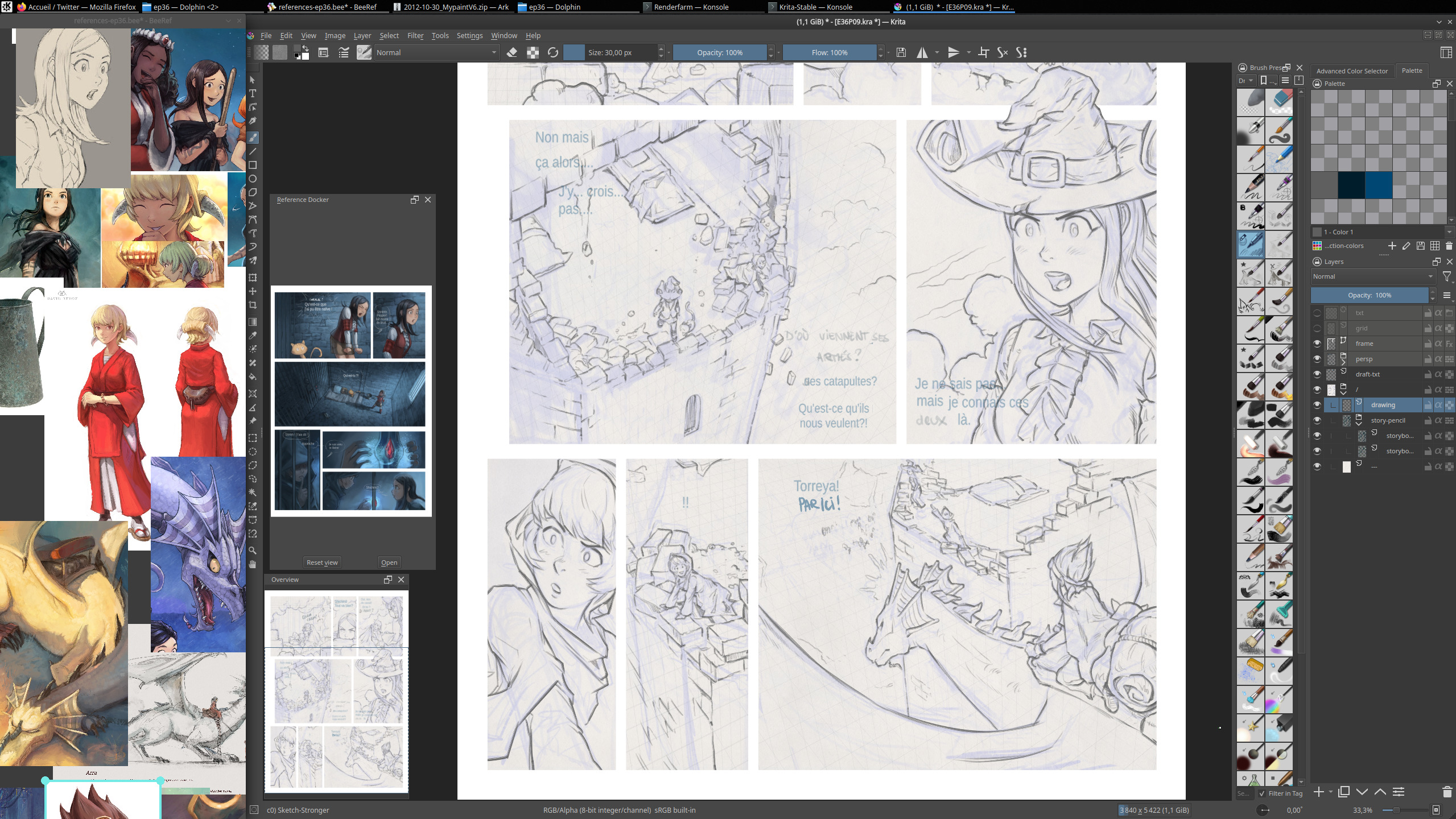
A screenshot during the cleaning process

A compilation of drawing after the clean-up step
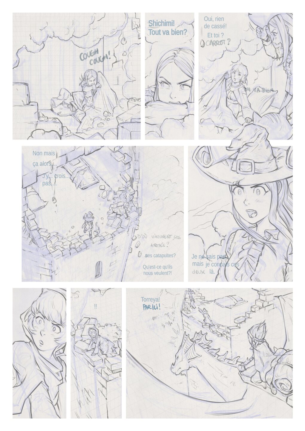
The page after the Clean-up step
The under-color
Before proceeding to the under-color step, I created a separate paint layer called 'sel' (short for selection), which contained the grounds of the picture. This layer serves as a mask, allowing me to quickly select specific areas of the image by right-clicking on it and choosing 'select opaque'. This enables me to easily decide whether to paint on the character or the background, streamlining my workflow and saving time.
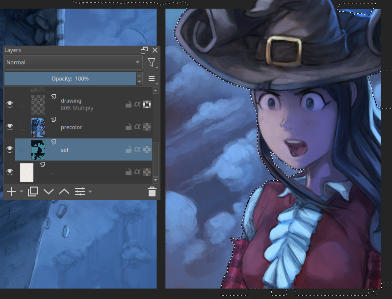
For the setup, I changed the blending mode of the cleaned drawing to 'Multiply' with 80% opacity and then painted underneath directly with a soft, rounded brush. At this stage, I focused on establishing the dominant colors and light sources, while also considering panel continuity and how the ambiance would evolve from page to page.
To maintain a broad perspective, I kept the page zoomed out to 25% of the viewport, allowing me to see the overall composition without getting bogged down in details. Initially, I didn't worry if the colors bled outside of the line art, as my primary goal was to avoid getting caught up in textures, small contact shadows, points of light, and other fine details. Instead, I concentrated on designing visually appealing shading that would maximize dynamism through contrast, color balance, and large, triangular shapes.
Before proceeding to the next step, I zoomed in slightly to clean up the silhouettes of the characters against their backgrounds, refining the separation between the two. The page example (under) is at an early stage, while under-painting, but I've kept this one to share here as it gives a good idea of the workflow. I later pushed it a bit closer to the final result colors.
The page at a early step of the under-color
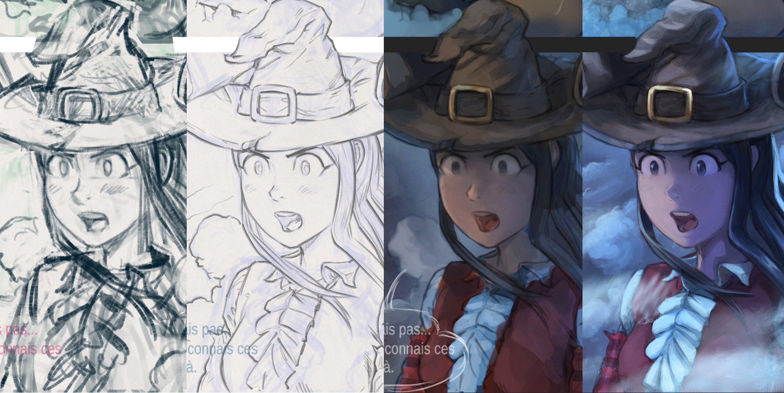
The paint-over
If the "lasagna" approach of the two previous steps is effective, there won't be much to "paint over", but this panel (gif animation under) is probably a bad example and an outlier in the process: I didn't have much to paint over or post-fix on this one.
A gif animation of the paint-over VS the color under
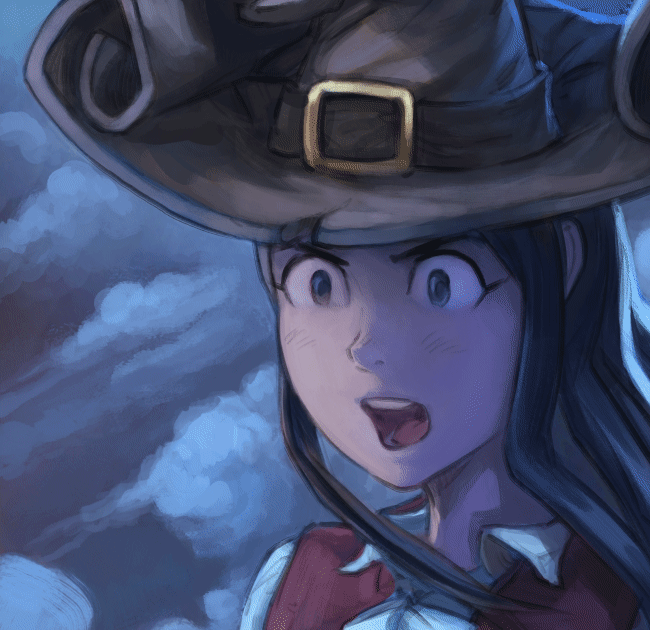
I mainly just added extra fog, dust, and increased the resolution on eyes and details. See also how I refactored her nose, and fine tuned her final expression to better match her dialogue line.
However, for some panels, the paint-over step was crucial in allowing me to re-contrast, liquify, and improve the panel to a whole new level. As for my method, I usually paint on top of my cleaned line-art and under-color. I paint on a merged fusion of these two layers, which allows me to get back to a single-layer simplicity, where I can edit everything freely.
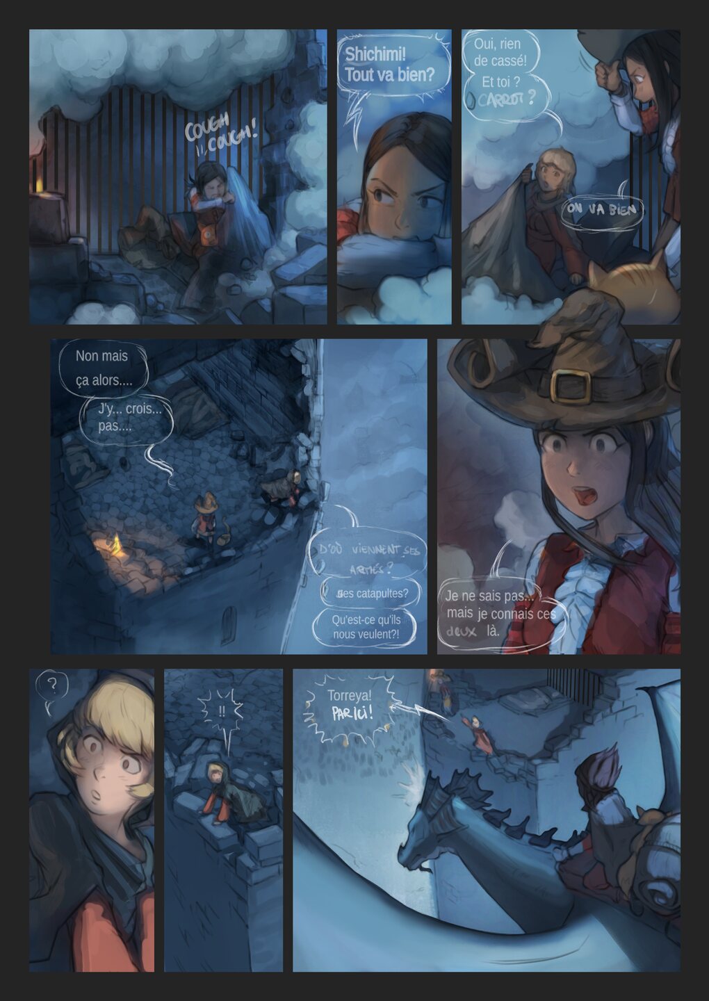
The final page without text, note how I have to paint even under the speechbubbles.
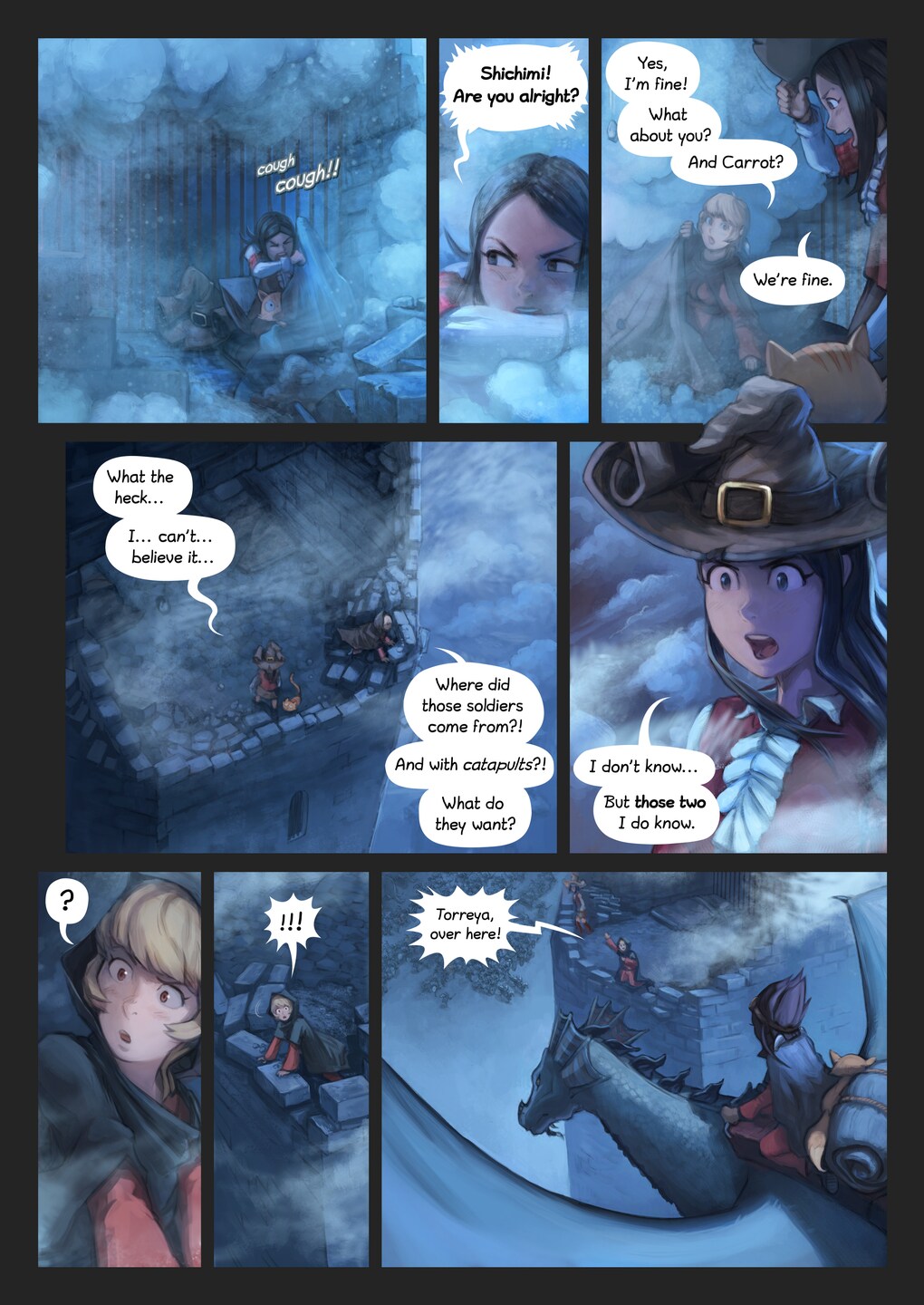
The final page, in English, with speechbubbles
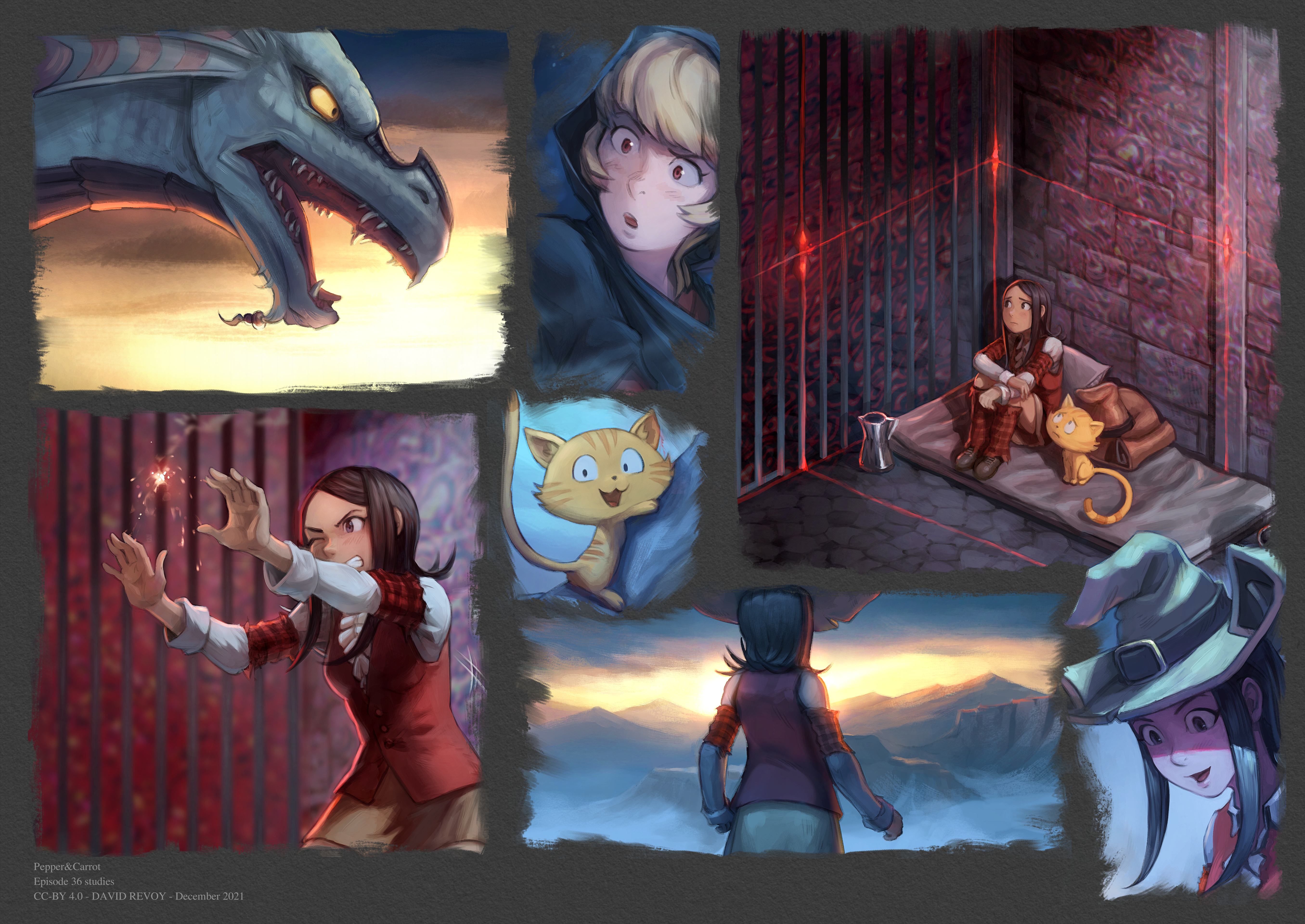
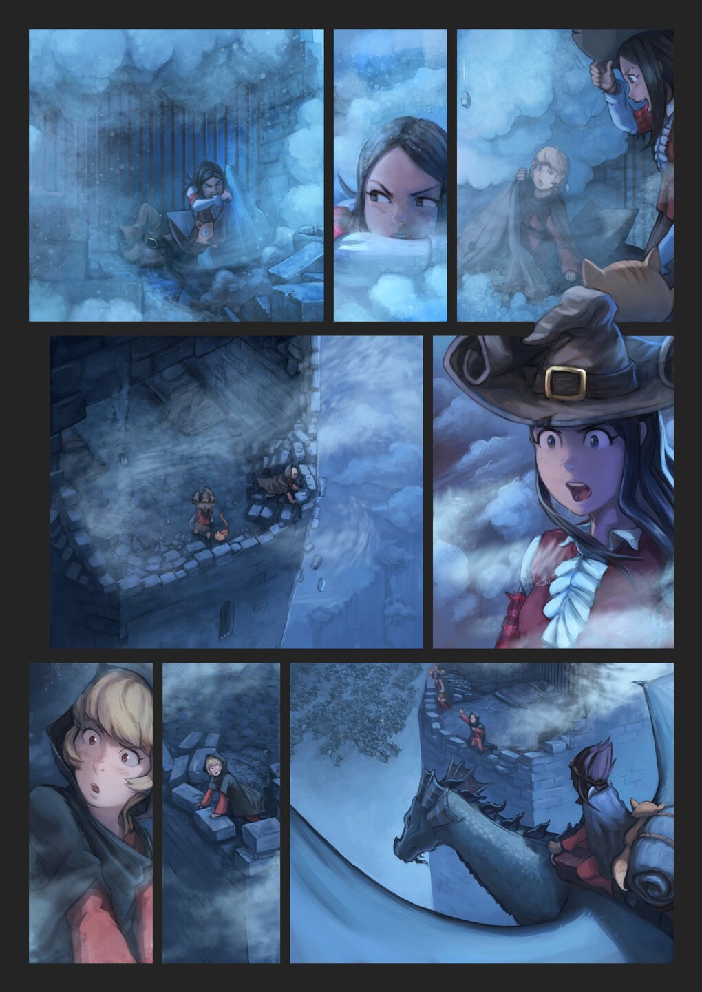
A compilation of panel ready after paint-over.
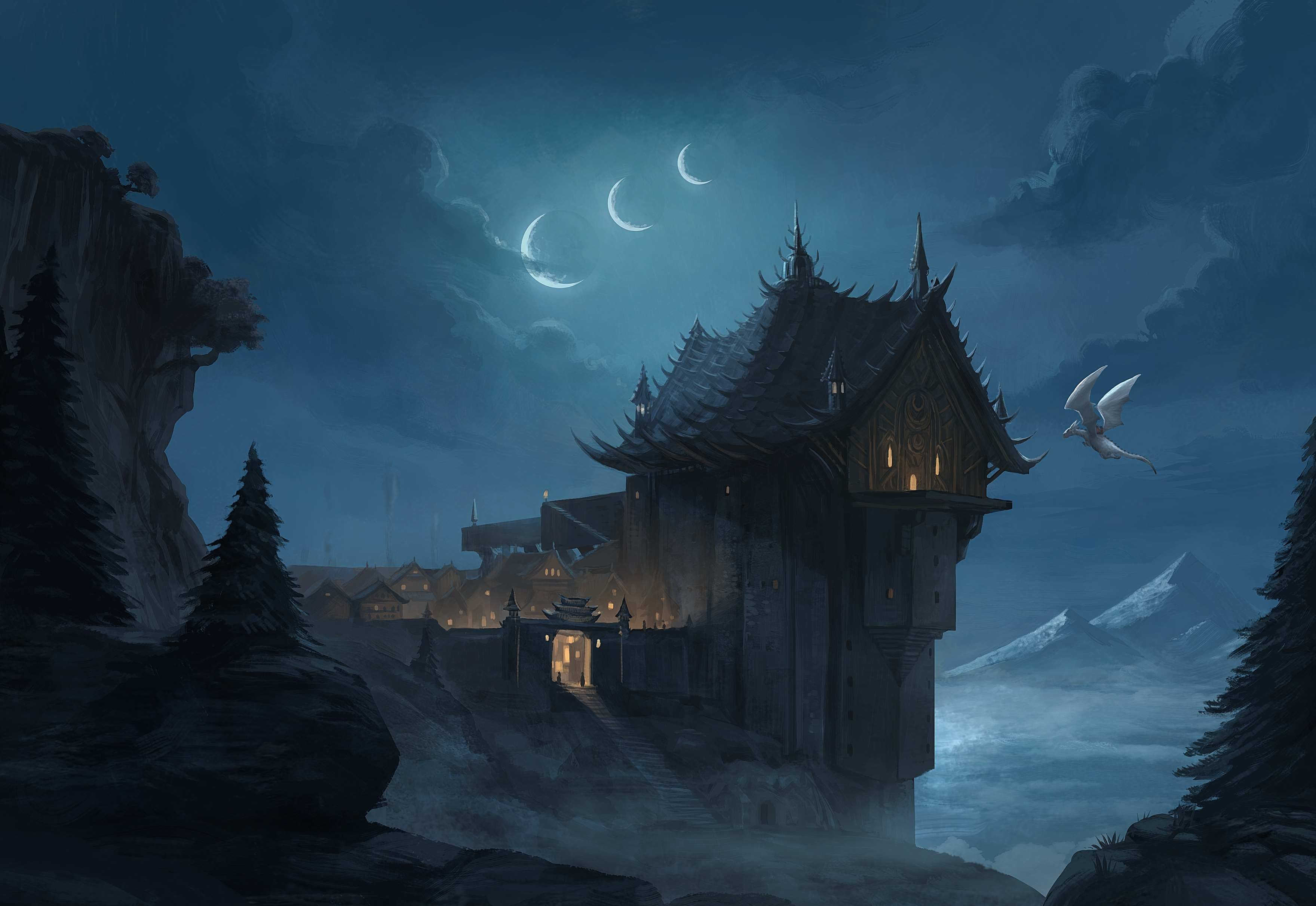 The landscape of the first panel, paint-over.

4 comments
Yes, thank you for the gift.
Can't wait your amazing work !
So coool ! Can't wait to see it :)
Cool picture, and add cat become super picture!
Post a reply
The comments on this article are archived and unfortunately not yet connected to a dedicated post on Mastodon. Feel free to continue the discussion on the social media of your choice. Link to this post:You can also quote my account so I'll get a notification.
(eg. @davidrevoy@framapiaf.org on my Mastodon profile.)