


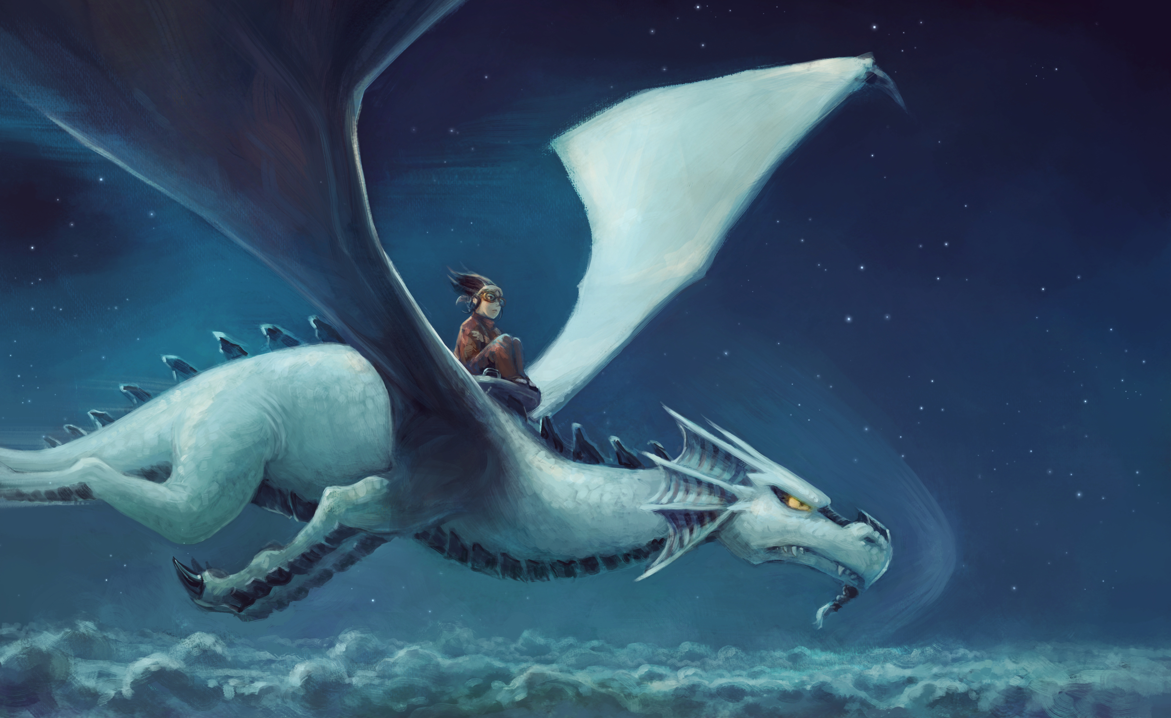
Flying Above the Clouds
A workflow test on first panel of future episode 35; it's based on a approach using the Grisaille to Color workflow (b&w recolorized) and I'm doing more test to better understand how to use blending modes; the various Color HSV/HSL/HSY option of Krita and make my values more accurate for the scene I want to depict. I'll share all this research on future videos; but sooner than that; I have to keep working on sharing what I learned about previous episode inking and usage of colorize-mask. So, it might take time until I do a video about my observations on Grisaille-to-Color workflow in Krita. I have now a full episode to render this way. First step: all page will be in black&white (or slightly colored) for the beta. I'll keep sharing artworks and cropped part of pages along producing the episode.

8 comments
Very cool picture. Thanks for sharing this picture. Looks very awesome.
Is it describeable what benefits a grisaille to color workflow have instead of black and white? At the moment iam learning rendering (B&W) but i notice some of my favourite artists using blue, what seems to called "closed grisaille", which i dont know before and only found out because you write about the grisaille to color workflow what i heard now for the first time also.
Thanks!
About the grisaille workflow; I realised (while doing skeches for episodes 35) I had ease to sketch directly with shaping forms and skipping lines. But as soon as I try to do that in color; I'm lost into too many informations: thinking about the color choice and saturation/hue quickly made me take not very good decision. Especially in regards of the gray values of the picture. So, I gave a try again to paint in gray and get better values before thinking about cold/warm; texture and general ambiance; and it looks like I can benefit from a workflow like this to get quicker to a result closer to what I have in mind. I guess future will tell if in 2 or 3 pages I start at screaming that this technique doesn't look as I want. I very often adopt and reject this technique: my main complain is often about difficulties to paint anatomy without a solid contruction and grayish colors.
About 'closed grisaille' it's first time I meet the expression.
Like this? https://i.pinimg.com/originals/7f/6c/9b/7f6c9b3b7a6c42b433450af3d4a0d3af.jpg
It looks like a technique I crossed for traditional media; to get deep bluish shadows in oil painting; and then glaze on the top layer of warm color. Oil, with the layers can totally recreate more than just the color of the skin; it can mimic the transparency and go further into subtle details (more than any print/photo/screen). I believe this technique is used for that. If it is something else; let me know, I'm very curious.
Thank you for this informations. And sorry for the confusing.
I think the naming of "closed grisaille" is just something i read in this blog article
https://janabouc.com/2012/09/22/from-grisaille-to-color-painting-a-colored-block-landscape-in-oils/
A example where i noticed this is in a video from Philip. A. Ulrich (@soma at krita-artists.org):
https://www.artstation.com/marketplace/p/MarL/landscape-painting-vod-1 (sorry its paid content) where he use blue to black for the "underpainting". I guessed as a a newby that this is the reason that give the pictures some kind of "color touch". I think most of the picutes i see in his gallery (https://www.artstation.com/somartist) have a tendency to blue or brown and i concluded that this comes from a grisaille workflow or a adaption of it. But maybe its some kind of color correction. I really dont know.
Thanks for the links. For environment; it might be beneficial to pre-tint the shadows in blue (using traditional) with digital, it's so quick to add blue to any grayscale picture; even non linear way with Gradient map and/Or Color balance that if it is painted like that from start; it's more a matter of taste and comfort while painting I imagine. In fact; looking at a pure grayscale picture on a well calibrated neutral screen is a bit boring; working with a couple of shade of colors might spice up the game a little bit. You are right speaking about it as an underpainting.
About seeing a dominance of a hue and tint on another artist; I guess its impossible to tell where it comes from; from the top of my head:
- A personal taste and consistency for this hue and color correction
- A bad (or not) color calibrated device xD
- Not a lot of time to save the color balance of a piece, and accepting the artisty result as it is.
- A workflow that produce this type of layer stack.
- A slight color vision deficiency; it can be subtle.
:)
¡Beautiful picture for poster! ¡Merci!
Thank you for the insights :) !
Nice picture. But there is a low level of oxygen above the clouds. If dragon pilot has a glasses, then he need a mask.
Hey, I appreciate the feedback ;)
But I'll not push the realism to this degree in Pepper&Carrot's world (sorry for the airplane and pilots audience). The physic laws in Pepper&Carrot are not really an exact replica of the one we know on earth (Pepper already traveled over the cloud in previous episodes, Flying city of Komona, etc...etc... ).
Post a reply
The comments on this article are archived and unfortunately not yet connected to a dedicated post on Mastodon. Feel free to continue the discussion on the social media of your choice. Link to this post:You can also quote my account so I'll get a notification.
(eg. @davidrevoy@framapiaf.org on my Mastodon profile.)