


Episode 33 Production Report
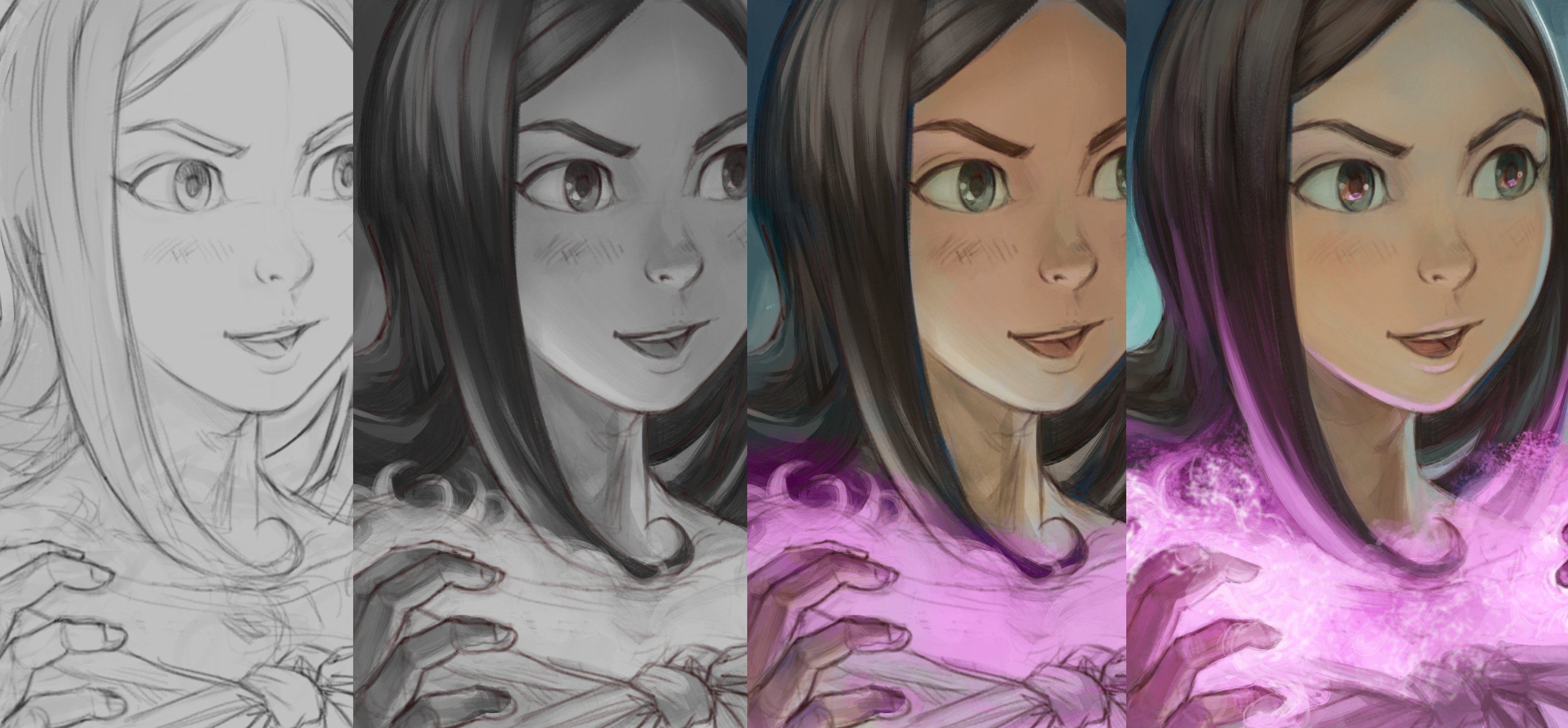
Table of Contents
- 1. Preproduction
- A. A specific color mood
- B. The problematic Orcs representation in Fantasy
- C. Workflow test and more design
- 2. Production
- To be continued...
In about ten days, I'll post the future episode 33 of Pepper&Carrot and while the English version is in its final validation step, I'm taking the time to show you what I have done so far on this adventure.
It took me a lot of time reach this step. First, the episode is slightly longer than usual (8 pages long against an average of 6,5 pages long). Then, I have a lot of shots with many soldiers, characters and army. And to finish; (cherry on top) I felt exhausted during the confinement and my attention was happy to flee into other tasks where I had more control and less frustration: Krita beta for 4.3, Inkscape 1.0 release, Peertube v3 Crowdfunding, Kubuntu 20.04, update for the translation system, continuation of the P&C book project, peppercarrot.com website update...etc...etc... Oh, I was very productive! ...just not very focused on my main quest.
On a artistic point of view; that wasn't a bad thing at all: all of this projects aside allowed me to take a bit of distance with the production of episode 33 and I could return to it with fresher eyes when I had enough brainpower. That's also why I haven't be really talkative about the process this time, this episode met a lot of mutations on the way. So, is here a recap:
1. Preproduction
A. A specific color mood
My starting point was this concept-art I made with Gimp and Blender in 2009 on the production of the open movie Sintel at the Blender Foundation. It was at a time before a total refactoring of the scenario, so it is normal if you don't recognize the main characters or background of Sintel in it. It was a totally different short movie scenario. But I rediscovered this artwork during a system backup in March and I wanted to renew a connection with this darker color palette of mine.
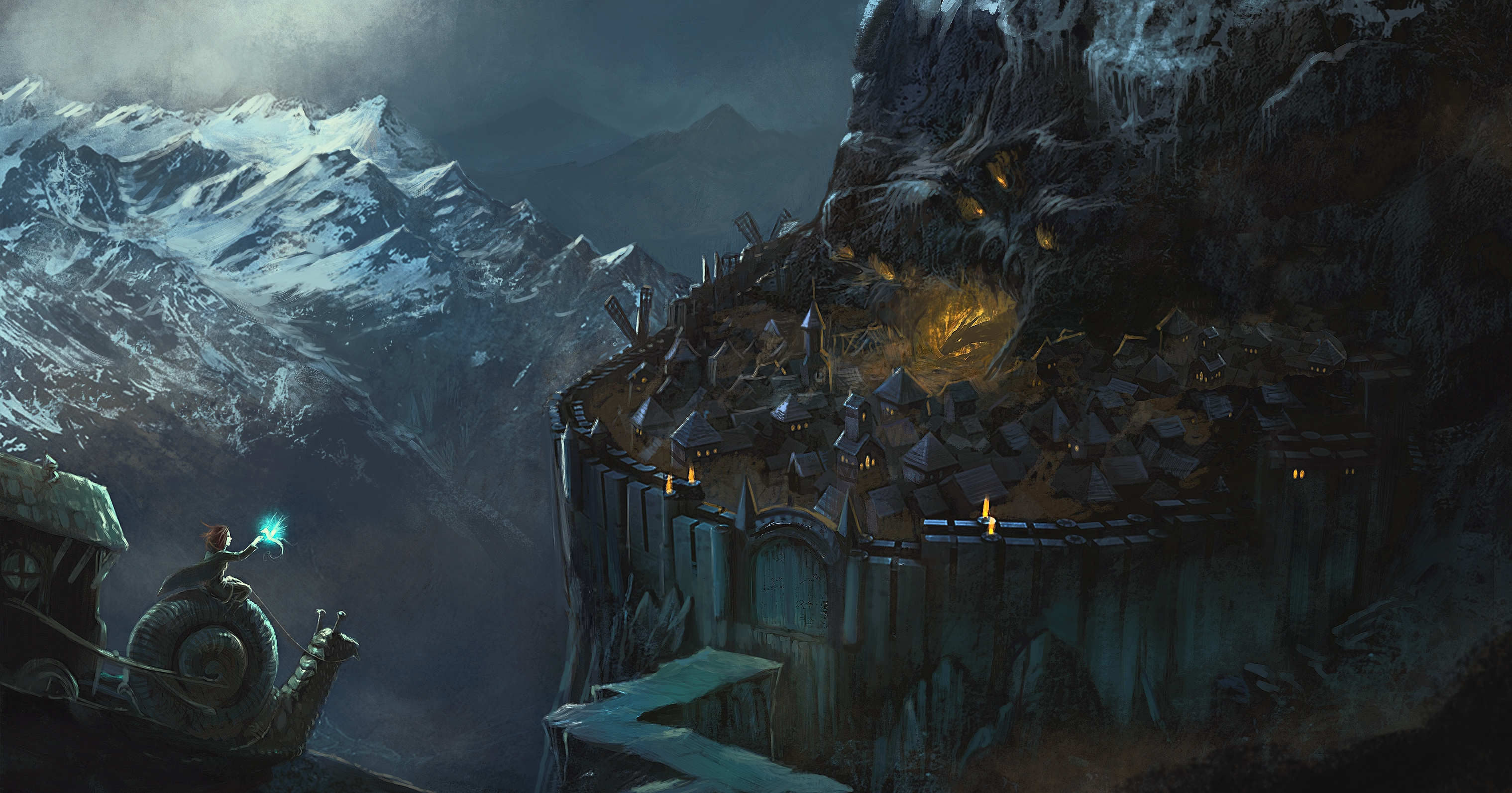
Concept-art for Sintel, 2009. CC-By Blender.org
B. The problematic Orcs representation in Fantasy
At start of April, I had to do a bit of concept-art to prepare character design for this episode; especially about the front line enemies in the battle: an army of Orcs in my scenario. That's when while reading the Wikipedia page about Orcs, I discovered the Alleged Racism chapter. I had no idea about this problem in Fantasy! That was really informative and I wish I knew it before.
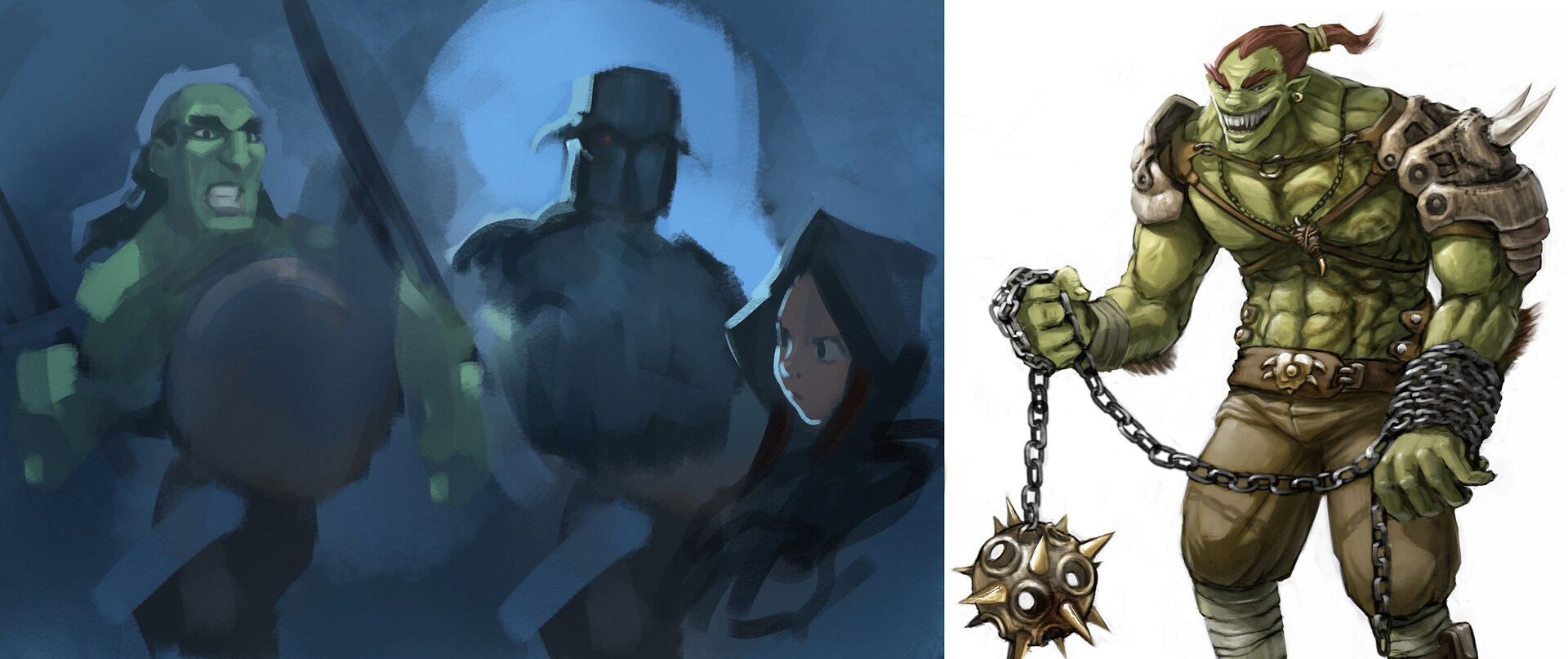
On left: quick painting test with Orcs. On right: concept-art for Chaos&Evolution DVD, 2009. CC-By Blender.org
So, after reading more literature and blog post about this topic using the network of references link on the footer of the article, depicting an army enemy of Orcs for Pepper&Carrot was a big "no go" for my vision of Hereva (the world of Pepper&Carrot). I then decided to change the army for another design: an army of humans, with just another cultural style in their decorations but still with the same level of technology. Thanks to an advice of Craig Maloney (Wiki maintainer and working on the Fate based RPG of Pepper&Carrot) while discussing it on our IRC channel, I centered the new design to be in the continuation of enemies already appearing on Pepper&Carrot.
Panels from episode 26 "Books are Great" (left), Panel from episode 13 "The pyjama party" (right).
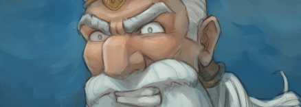
I then adopted the design of knights with glowing eyes masked under their helmets.
This overall process took me a while because it changed a lot my vision of the full episode and it took me time to re-imagine all the shot I already had in mind. In the light of recent events around the globe against racism, I'm now very comforted in my choice of having spent time on research for this change.

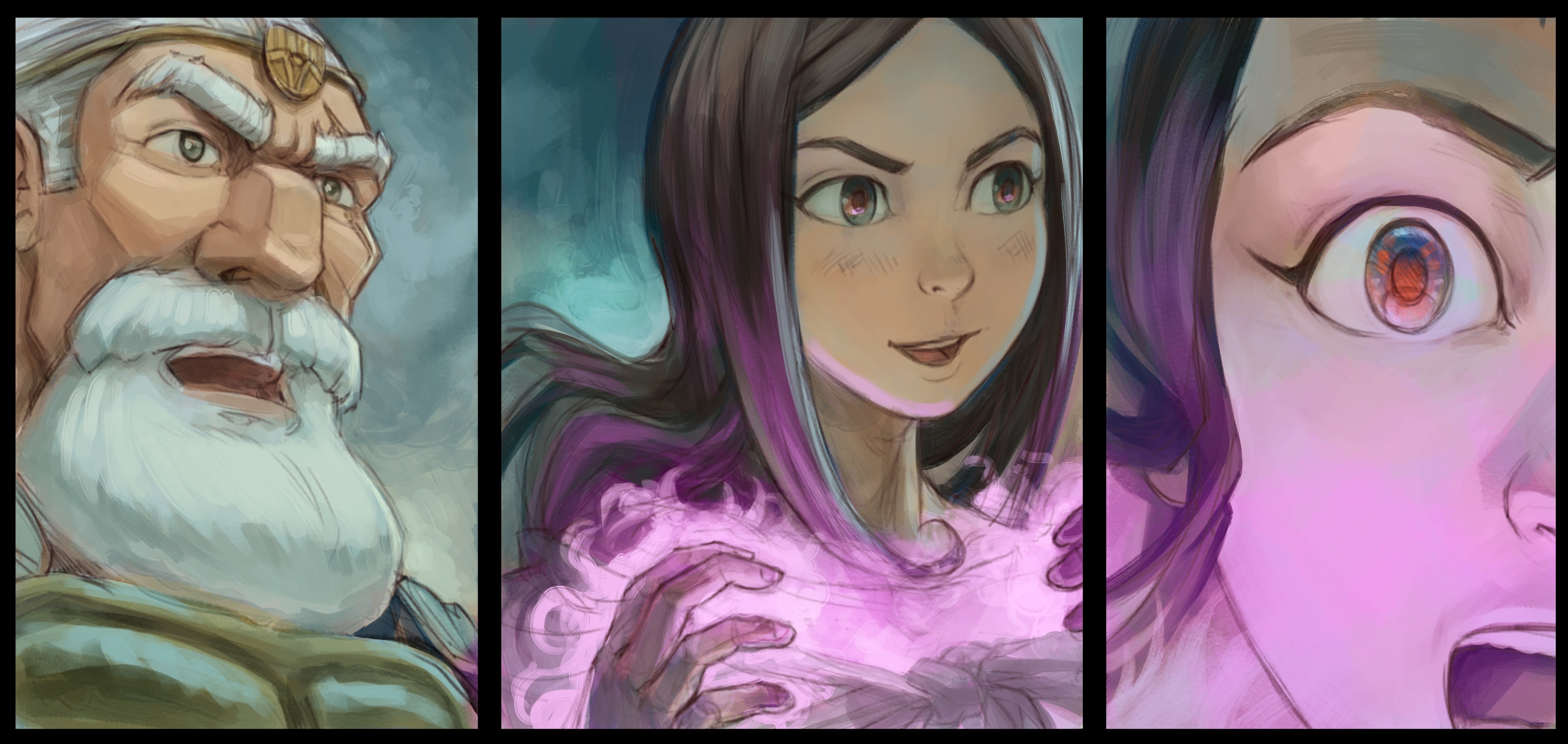
Concept-art and first panel for episode 33 depicting the new design for the enemies
C. Workflow test and more design
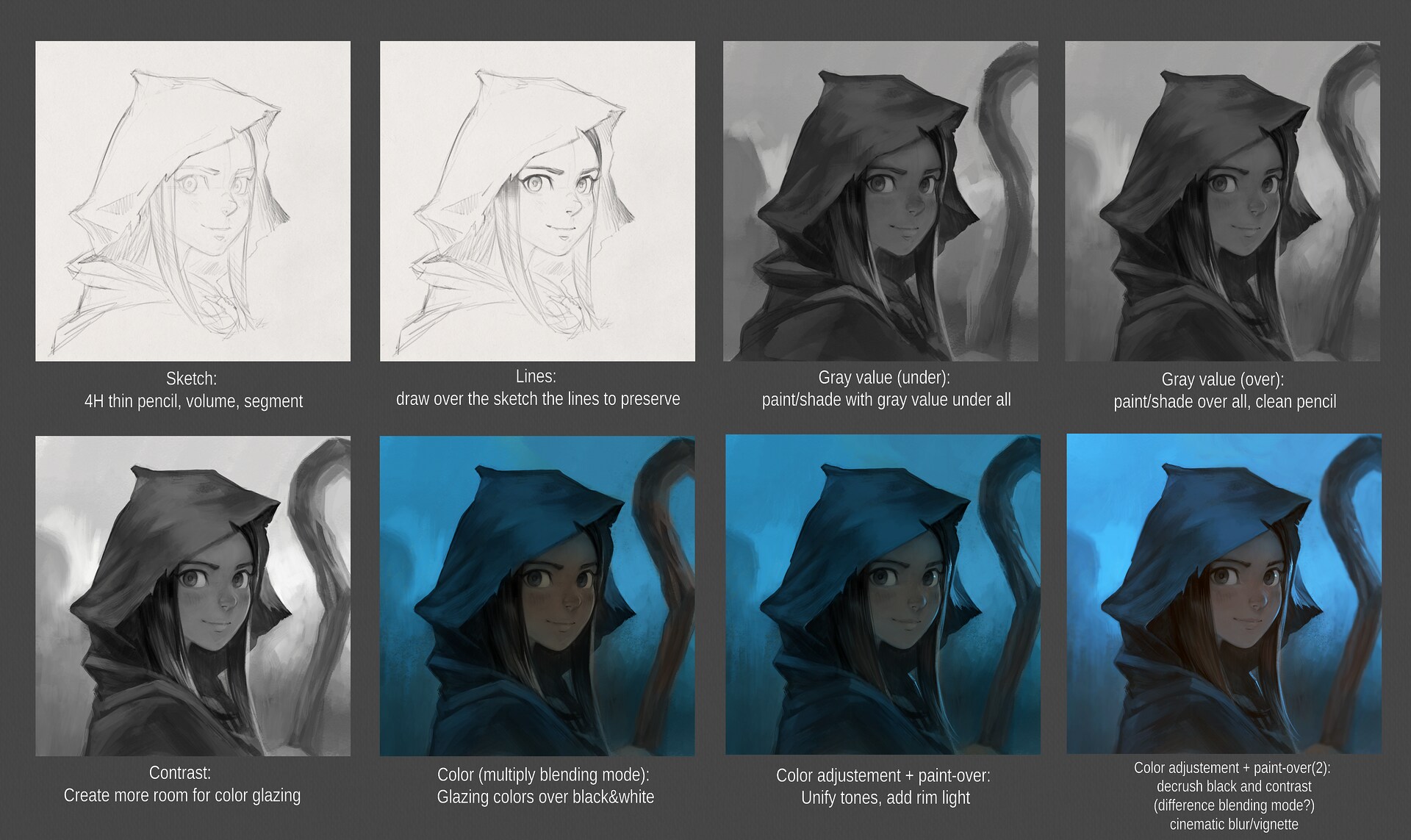
I really liked all the production steps on the previous episode 32; but I felt I could improve on two or three things: better colors, something more painterly (more visible it was crafted by a human and not a machine) and thinner line-art. I then made two illustrations test: Mysterious and another one with Saffron. Both mixed a thinner line-art and a sort of preshading with grayscale and reading my words about them I was like 200% confident I could apply it to comic.
Well, I started the grayscale to color on the three first pages of ep33 because I still kept a doubt about it and I was right: it was a real pain in the coconut to recolor them. The recolor in itself was pretty fast; but adjusting the resulting colors to match the art direction I had in mind was really hard.
So, I'll keep this grayscale-to-color workflow as "efficient" in the frame of a single illustration where you can experiment on color and welcome happy-accidents BUT NOT in the frame of keeping a consistent mood and lighting setup across multiple illustrations with a strong idea for a palette and mood. It is not really efficient in this mindset.
The "Mysterious" test was also a test about keeping the hoodie over the head of Pepper for her design.
All the (too many) steps of the Mysterious test artwork
But during the preproduction of episode 33, Nartance who wrote the derivative webcomic Pepper&Carrot MINI serie, posted this design of Pepper inspired by episode 32 and I totally liked the clothing style he drew for Pepper and I copied it for episode 33.
Last panel of Episode 26 "Deceptive" of Pepper&Carrot MINI by Nicolas "Nartance" Artance
2. Production
A. Sketch
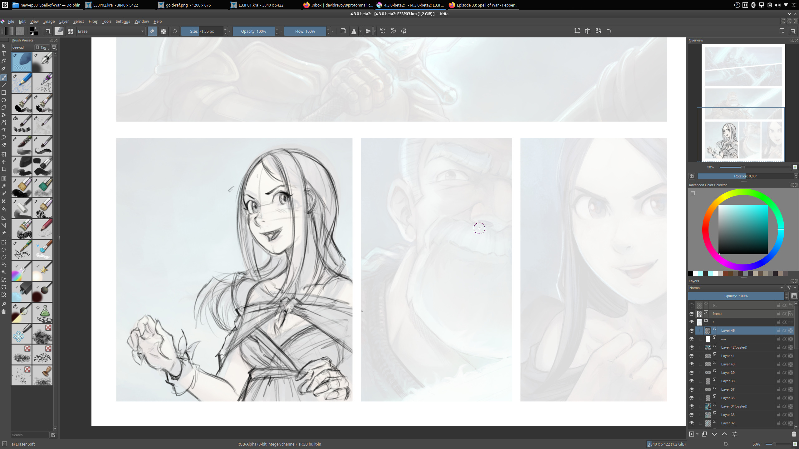
I started sketching directly over the eight Krita files page at full resolution (3840x5422px) after a very quick storyboard done with almost stick figures made while I was typing the scenario in markdown. I used a lot the Krita plugin Reference to keep a page side by side.
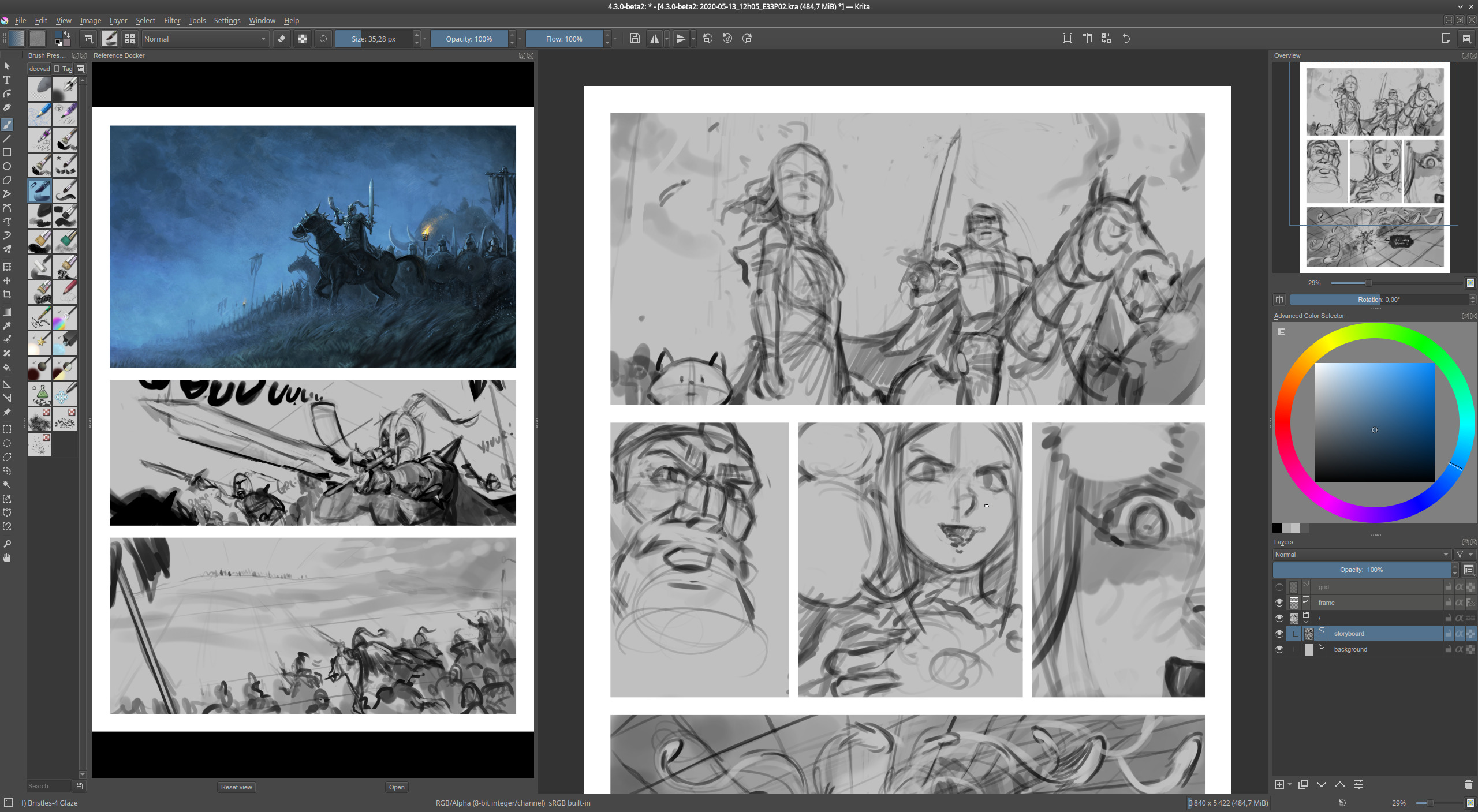
A screenshot of Krita when I started this first step with the reference docker plugin.
For this pass, I used a #C0C0C0 light gray background color (good to see the silhouette of my borderless white panel frame and borderless speechbubbles) and a simple rounded brush with black. This way, I was able to test more view angle, compositions and poses.
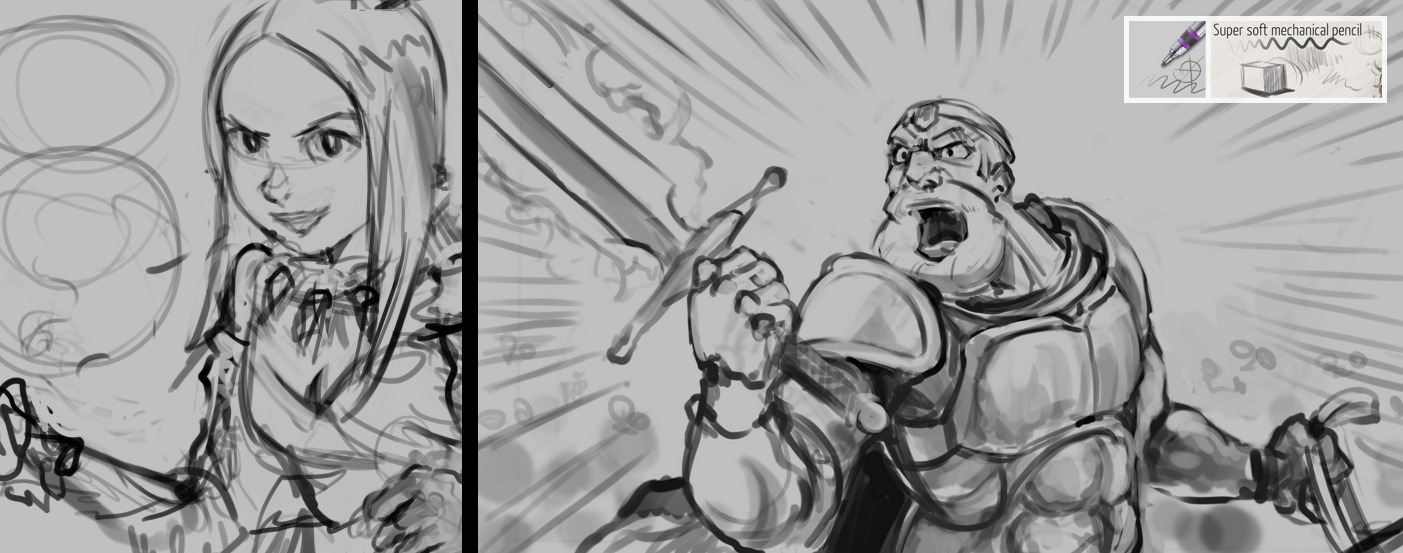
Quick and expressive pass, as usual a lot of fun in the first pass
B. Line-art: digital pencil
After experiencing the too long time to transform my sketches into detailed painting over the first pages, I decided to flat everything and draw over the sketches with a thin line-art with a single line pencil preset from my last brush pack. Giving to the thick sketches the time for a detailed redraw and review this way is a good way to improve many things: proportions, anatomy, perspective. Sometimes (unfortunately too often for this episode) I had to change everything.
A gif animation comparing sketch and final digital pencil artwork: perspective, volume, pose... everything was affected.
The goal of this step is to suffer less at detailing: by improving the base drawing now and not later, I hope I'll save time during final painting.
Screenshot while penciling a panel over the sketch pass (reduced at 10% opacity).
Drawing with a thinner line solved a problem I had since the start of this production: how to manage the large shot with army. I tried to do that in Blender, but finally an almost isometric bird shot with copy/paste and a bit of variation here and there worked pretty well.
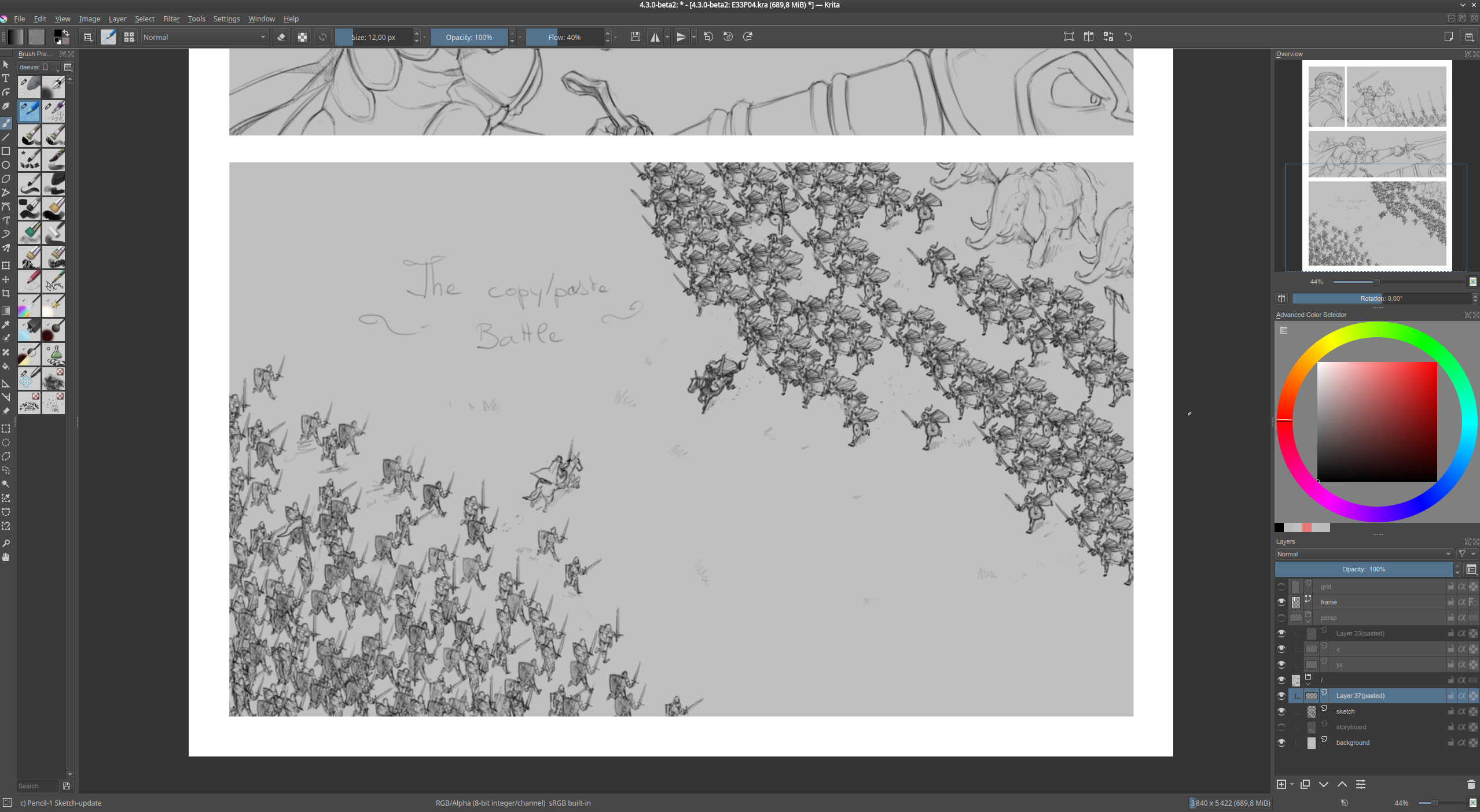
A complex shot solved mostly with simple copy/paste
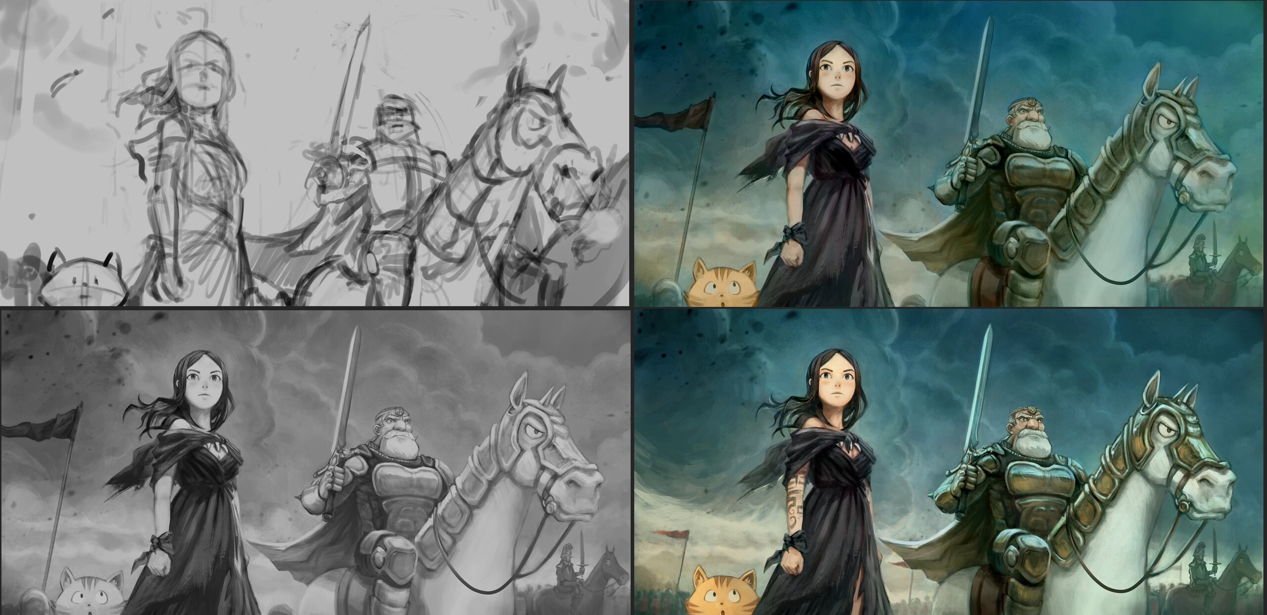
C. Pre-Color
I tried here to renew with a technique I had in the past (around 2014-2015) that consisted into speedpainting instinctively with color under the line-art at low opacity. This strategy is supposed to bring me something closer immediately of the art-direction and light design I have in mind. It also produce a lot work to do later: post-cleaning and paint-over; but my priority for this episode was now to go directly to the color I had in mind, and it did work.
To prepare the pencil lines before pre-coloring, I used the filter "Color Balance". I could give my black line a reddish tint that would merge better with the background color (setting the pencil layer as multiply blending mode).
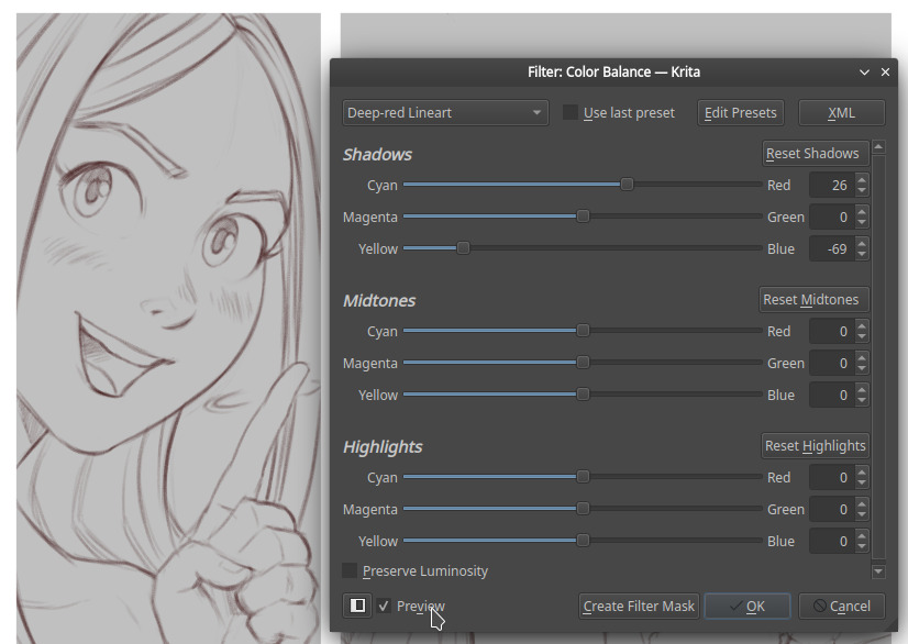
Details of the color balance filter to tint my line-art.
Precoloring was a fun step because I focused mainly on the mood, the cold VS warm areas, the design of the light sources, and while focusing on that I forgot the constrain of cleaning edges (not painting outside the line-art). I could use dozen of layers, or paint flat, quickly add any blending mode, use Gmic filters...etc... All in all, even if it is not ready-final-clean; the accuracy isn't that bad and it might not be too difficult to clean-up (I'll see, this is for next 10 days). For color consistency; using a color picker with previous panel was good enough.
Three panels pre-colored.
For sure I appreciate doing a pass of color this way more than the usual comic workflow I tested over last episodes (flatting colors, then shading each islands, then applying filters to do color corrections). But it was hard to resist filling the skin with a single color, or filling a sihouette first with a clean border. Directly painting mass of color and increasing resolution is what worked better for me; using a zoom where I could see the over page (25% of view port on a quadHD monitor for a 3840x5422px document.
Gif anim: comparing shading test between a soft light from top and then a stronger one just bellow it.
C. Lettering
Getting pre-color ready before lettering in Inkscape on SVG and before also opening the translation allowed me this time to merge better the vector text colors and deformation over the artwork. As you probably know, all texts needs to be editable objects so they can be translated by the Pepper&Carrot huge translation team. This is not something you'll see on the market; other authors usually draw there onomatopias for more expression and quicker workflow. It often creates a lot of problems at translation (eg. on manga, where the French translators usually just keep the Japanese onomatopias and translate in little in French under).
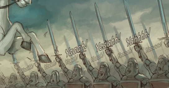
The army replying to their leader
Getting the precolor helped at finding the right color for the onomatopias for this episode. I usually do lettering at the pencil step and open translation earlier in the process; but this time having the color was a necessity because many texts really needs to be part of the artworks.
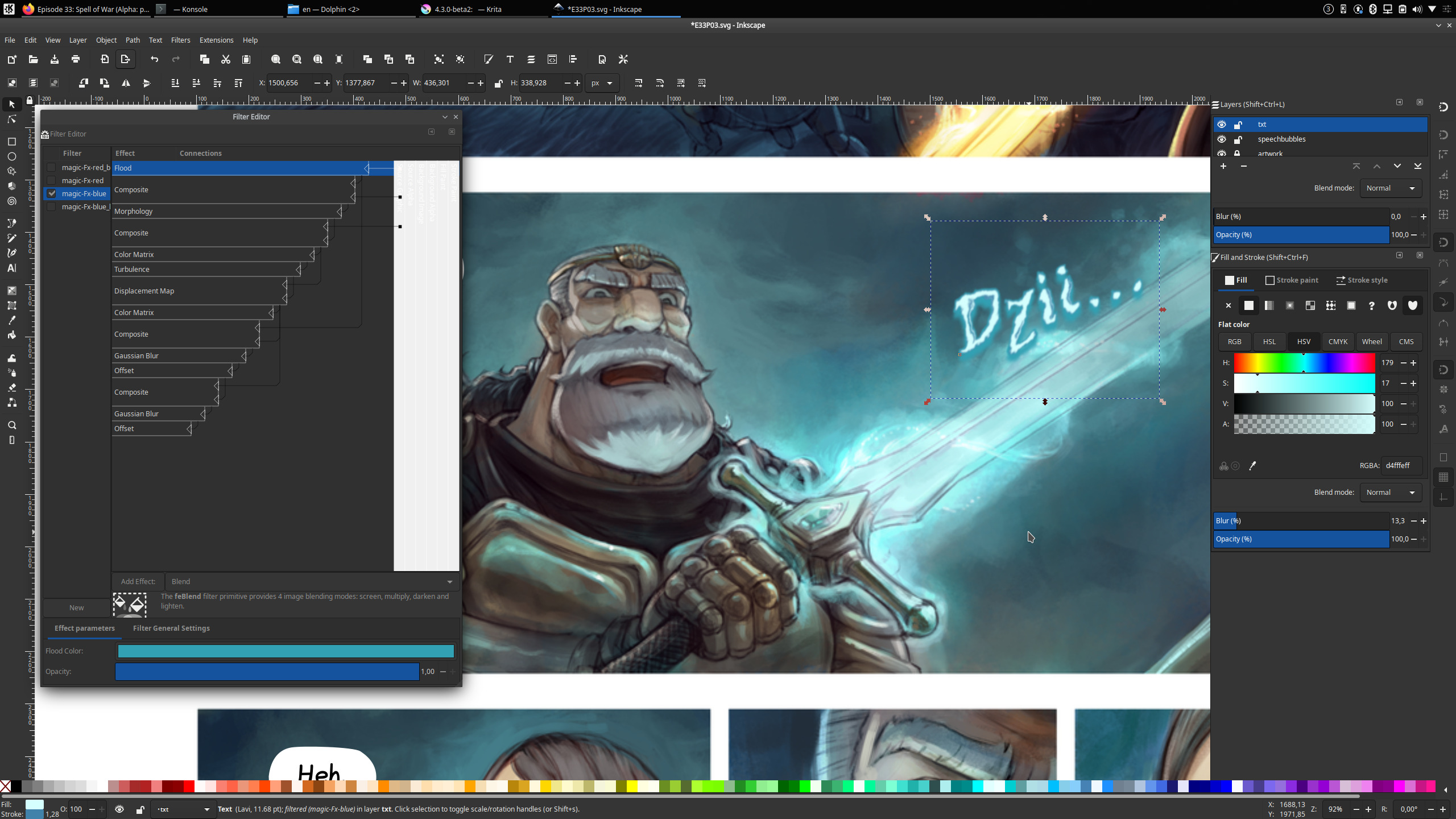
Inkscape filter editor to deform and decorate the "Dziii" fully editable text
D. Redo?
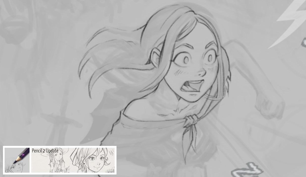
During pre-color, I also disliked three or four panels to the point I preferred to put a white overlay and redo them again. That's one thing about prototyping all the panels and getting a quick feedback: I could see the one that would render badly and couldn't be enhanced even with the best paint-over of the world. So... better to redo them.
Redoing a pose for Pepper from scratch, previous pose wasn't enough expressive.
E. Paint-over
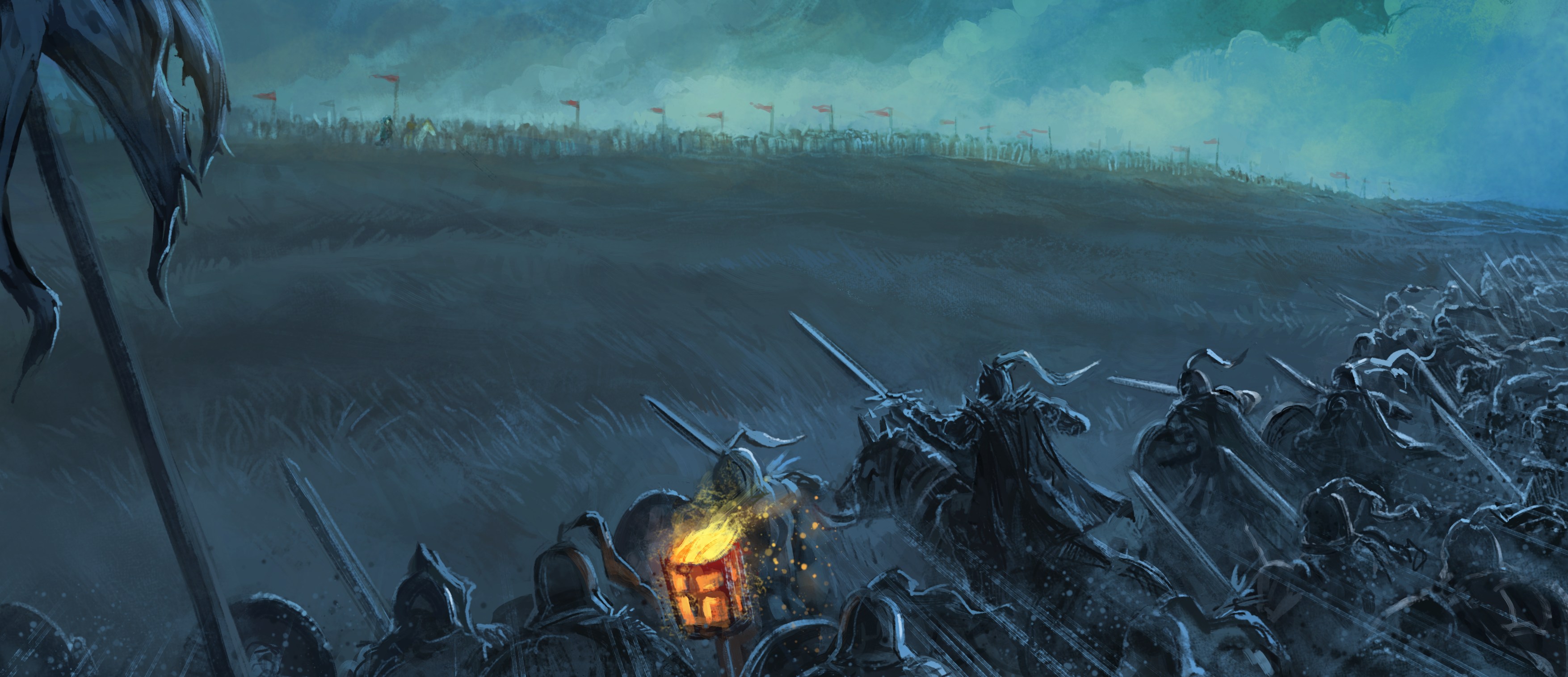
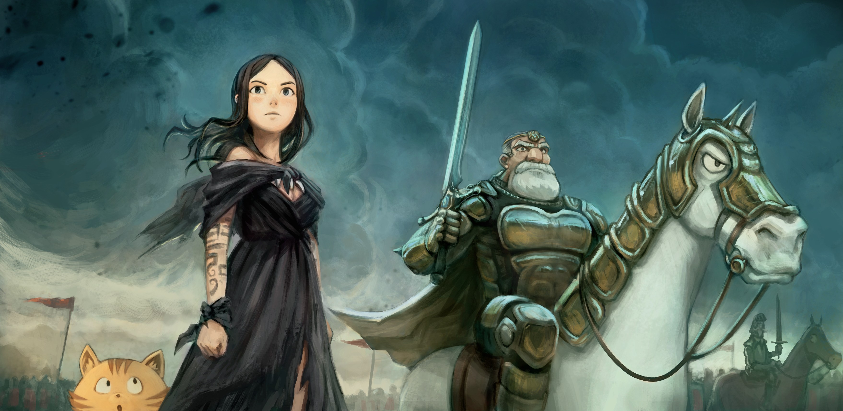
Paint-over, cleaning and detailing (final rendering) is the task that I still have to do now over all the pages. I'll try to keep the happy accident and brush strokes that appeared during the precolor while melting a bit the line-art when it is not necessary. I try to adjust the rendering to a sweet spot between not too smoothed or overly detailed and expressive lines with brush strokes. I already have a sample to show with the start of episode 33 done; so here is a couple of one:
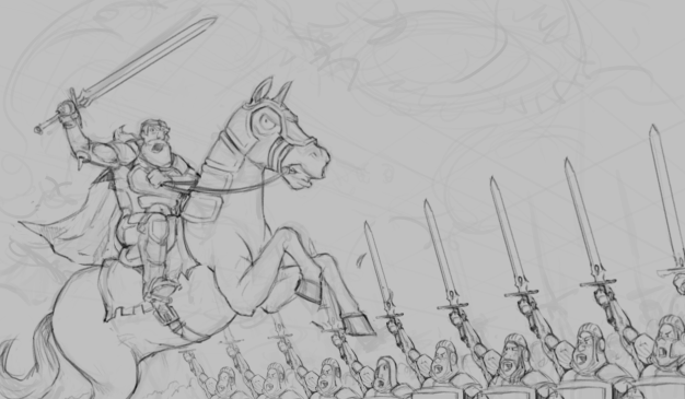
This perspective and pose was really hard to do.
This one still needs a bit of detailing, imo.
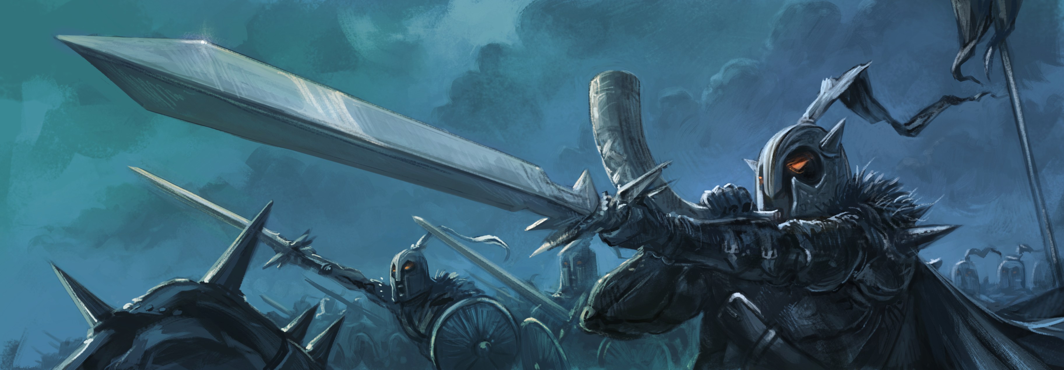
This one is my reference and will also be the cover of the episode, I really struggled to get the gold armor reflecting the dark blue sky!
A workflow overview
To be continued...
That's all for this report about episode 33. Thank you for reading this production journal. Rendez-vous in around 10 days for the release when all the panels will receive their final rendering! And after that, I'll finalize (finally) the long quest for self-publishing book project. Summer promise to be fun.

19 comments
Great article David. I love seeing how much thought and care you put into the whole process. You are revealing how you do your magic.
This episode is looking very, very good! You put so much care! 😍 It's wonderful seeing the process and how you go around stuff :D
There's a story from the Orcs' point of view that you might enjoy for a different perspective on them:
https://en.wikipedia.org/wiki/Orcs:_First_Blood
Thank you for the detailed report! I'm very excited for the next episode. And it's awesome it's going to be longer!
I have a question: do you think you're going to stick with the darker palate? That would make me a little sad, because one of the things I love about P&C is the wonderful brightness and liveliness and cheerfulness of all the colours, so it'd make me a little sad to see it go away...
> This perspective and pose was really hard to do.
I think the issue with the rider in the foreground is that it would really hard for a rider to stay balanced when in such a pose, especially since he can't use any of his hands to rest on the horse. And since both hands are occupied, he also won't be able to direct his horse.
Regarding the alleged racism of the orcs, it really depends on each depictions and charges of alleged racism can be directed at most other fantasy races as well.
Not familiar with Orcs but your new enemy here looks pretty unfriendly too. Luckily Pepper has read her books and knows she needs to pick up a feather along the way. And her friends from Ep8 and Ep9 seem like a good match. Plenty strong and once the massacre is done, they'll stay for tea too.
why not make the baddies white and the goodies black? would solve racism issue. blm
I like see rock creature from episode 9. May be extra support for Pepper.
Thanks! I queue it to my TO-READ list; the Wikipedia page was a perfect teaser.
Hi Pit! Don't worry, approaching 40 y/o, I now know colorful and cute is my "hardcoded default setting" :-D Sometime, for special episode, I'll jump outside comfort zone. But natural always comeback stronger. Also, this production report only show sample from the first two pages. I finished yesterday two pages near the ending and even with this setting, I was able to input a lot of colors without even noticing it.
Thanks, the pose is out of balance on purpose, this is not a statue; just a frame from an instable position, the horse being ready to go back on four leg after that. One hand is on the bridle, so no worry.
Also true for alleged racism, it's valid for any confrontation of two armies/poeple groups based on ethnicity. The case with orcs (and goblins) being here just the most obvious one.
Will... No -that's not how it works- but I'll assume this is just a comment to troll, or a form of humor with (very) bad taste.
If you are really convinced by what you wrote, your ideas are not welcome here.
@Vinay: You'll see :) Don't worry about "massacre"; after 32 episodes, I'll not suddently go bersek and introduce this level of violence :D Proofreader would prevent me to do this (and that's great to have this morale security belt right at the root; right after I post the scenario as markdown on Git).
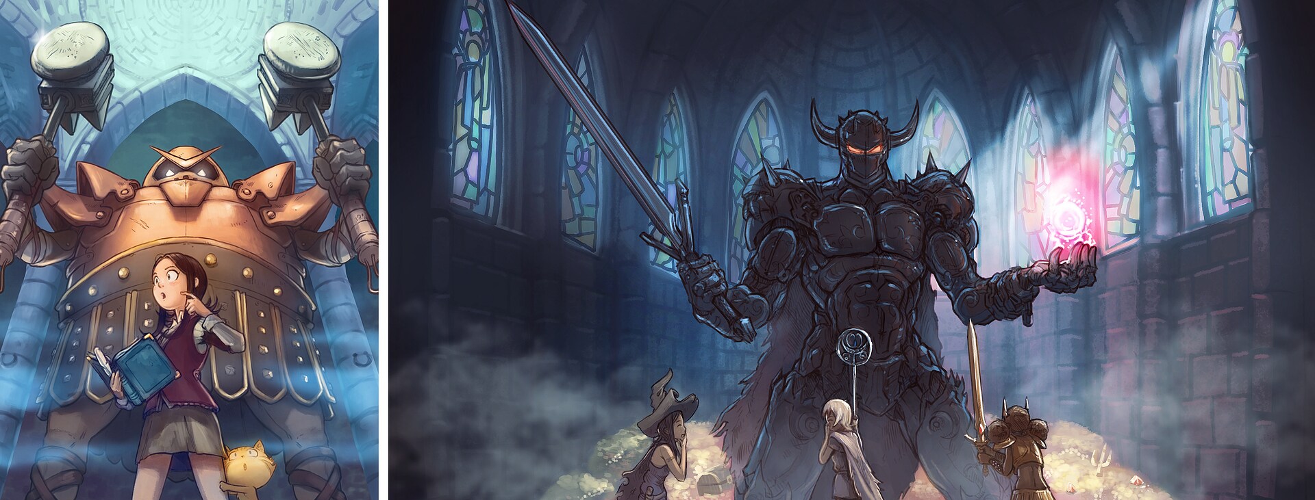
@Châu: Right! the Golem. I really need to re-use this big friendly creature one day, the security system of Pepper.
Ah, I see! This does relax me :] And I think it's very cool that you're trying out different things. In fact, I think you're very good at this mode too! The styles of your latest drawings, which are more realistic-looking (and feature an older Pepper), are really superb. Just (naturally) less cute ;)
I think it could be fun though to reverse the Western movie trope of white hat vs. black hat.
Of course, in reality everybody's shades of grey in that sense.
Are you talking about skin color or just general color scheme? In the first case - reversed racism is still racism. In the second - colors of clothes and armor are frequently used to set the mood and doesn't have anything to do with races.
> One hand is on the bridle
His two hands are occupied by the sword and the horn, so I guess with his third arm? ;)
Also that episode was really funny, good job.
Oh! Now I see you spoke about the first page and two first panels. My bad, I thought you were talking about the horse position on page 04 - panel 02 (with the king having the sword above his head). Now I understand the confusion and I can better understand the critic of your first message. True, I see. Difficult to stand like that. I'll try to think more about balance next time. Thanks for the feedback.
Great article!
I always enjoy coming back once in a while for the update, can't wait for the next episode!
Post a reply
The comments on this article are archived and unfortunately not yet connected to a dedicated post on Mastodon. Feel free to continue the discussion on the social media of your choice. Link to this post:You can also quote my account so I'll get a notification.
(eg. @davidrevoy@framapiaf.org on my Mastodon profile.)