


The English book printed project: production report 3

Introduction:
Whoooohooooo! I ran a long experimentation and I finally have good colors! But it took a lot of time and I learned many things on the way. I have now a printed proof and the next blog-post about this adventure will come certainly with the definitive link to purchase the book on the e-Shop!
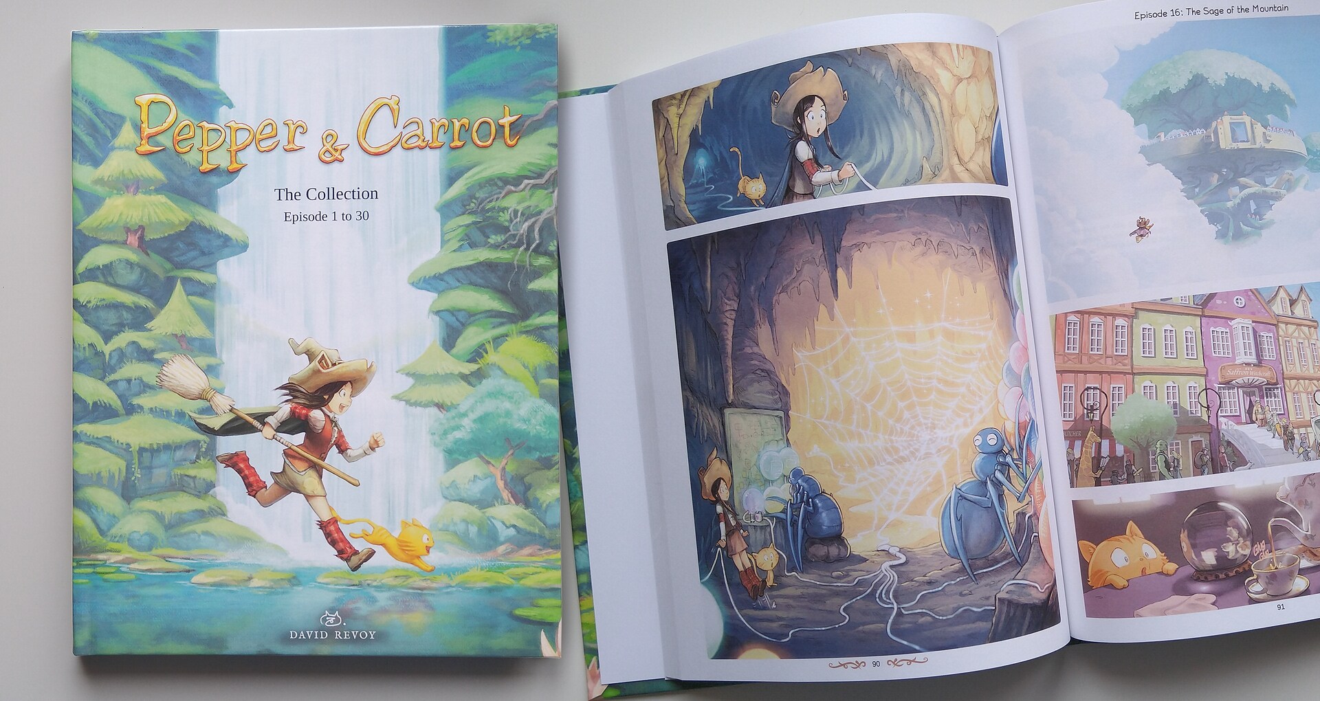
But waiting for that to happen, I'm writing here a third part with my full research and what happened all along January and February. If you missed the first two blog-posts; this book project is a totally Free Libre and Open-Source print of my webcomic Pepper&Carrot, a large format with 200 pages, full colors premium printing, glossy hardcover and using the one of the larger print on demand (POD) services worldwide: OneBookShelf (known to manage DriveThruComics, DriveThruRPG and more companies; having multiple factories around the world and delivering everywhere).
The first part was about my tests and questions before starting, the second part was a shorter blog-post to report my fails on the two first books and this third part is the full explanation of what happen thanks to an experiment I ran during months. It was necessary to approach this problem with methodology because after the second blog-post I couldn't even tell what part of the process was broken! Now, I think I understand the roots of the issue: a mix of mistake in documentations, an ICC profile with an old standard and software bugs on the top that transformed the full process in a very sketchy experience.
Reminder of the challenge
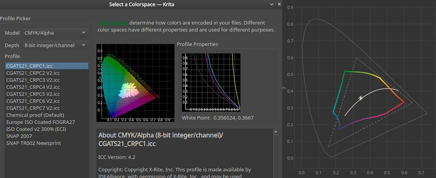
I would like to remind here the constrains I have: I need to provide a PDF file that is compliant with my printer with very precise specifications: PDF/X-1a or PDF/X-3, CMYK using the mandatory CGATS21_CRPC1.icc printing color ICC profile and the respect of the size/gutter/bleeds/page counts.
I'm using only Free/Libre and Open-Source software on a GNU/Linux operating system. The book pages are hosted on a Git repository and the pages are generated from the sources of my webcomic Pepper&Carrot dynamically: Krita files for artworks and SVG files for texts and speech balloons. A renderfarm Bash script tracks the changes from the webcomic and backport them into the book. That's because I keep fixing Pepper&Carrot in background all the time (you can read our bug report for more infos about them). To keeping this flexibility, I have to work with this system that will be necessary when I'll decide to print other languages from the 50 translations available on the webcomic.
To deliver my PDF file to the printer, I do it after connecting to their website where an interface gives me some type of automatic feedback each time a file is successfully upload. Then —if the file is not rejected— I have to order a printed proof. A couple of weeks later, I receive the book printed in my mailbox. In my case, they comes from Lightning Source in United Kingdom, but OneBookShelf also has a factory in the USA. That's how this POD books are done. So, I don't have a human operator in between me and the printing machine: the file goes directly to the machine and if it is a fail, this is my issue and I see it roughly two weeks later in my mailbox.
About the Mini-books experiments
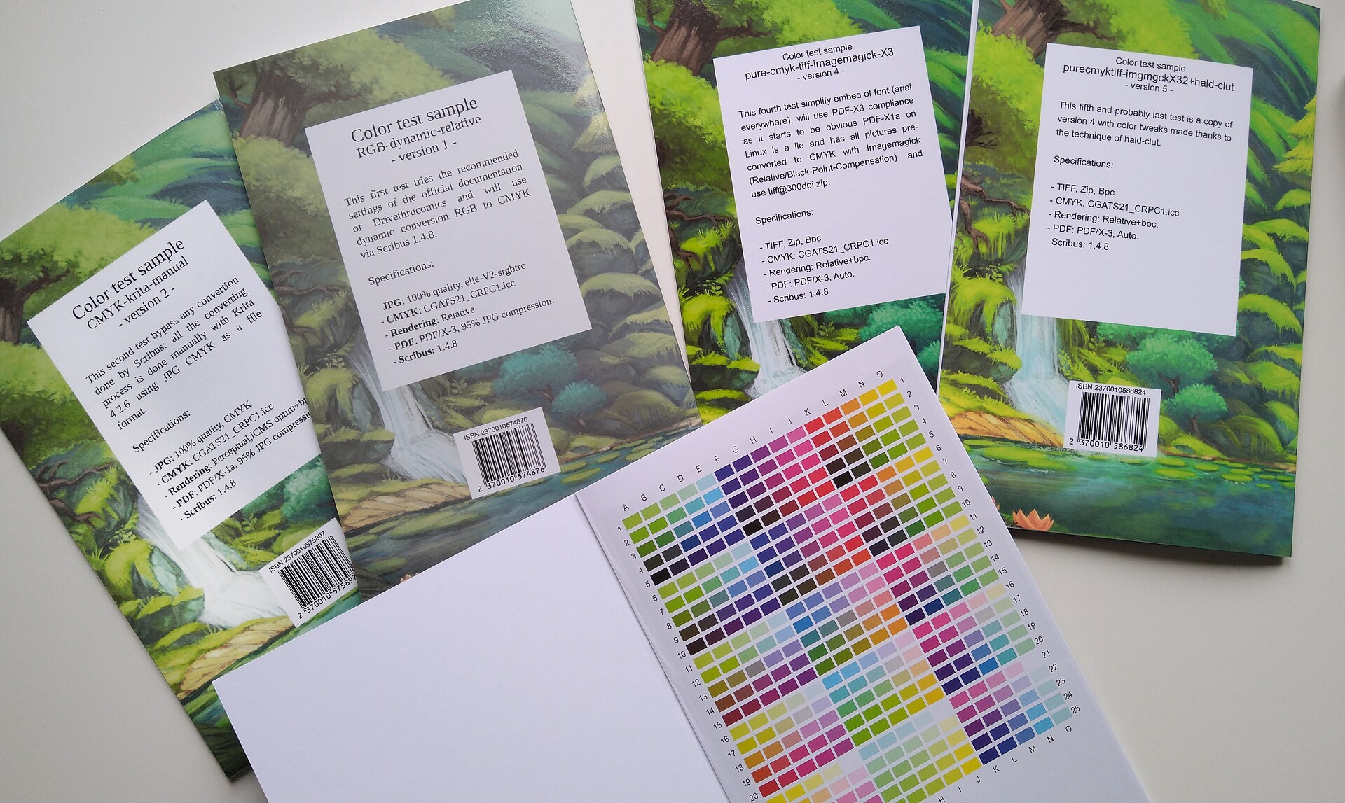
All Minibooks have specification written on their back and includes a color target
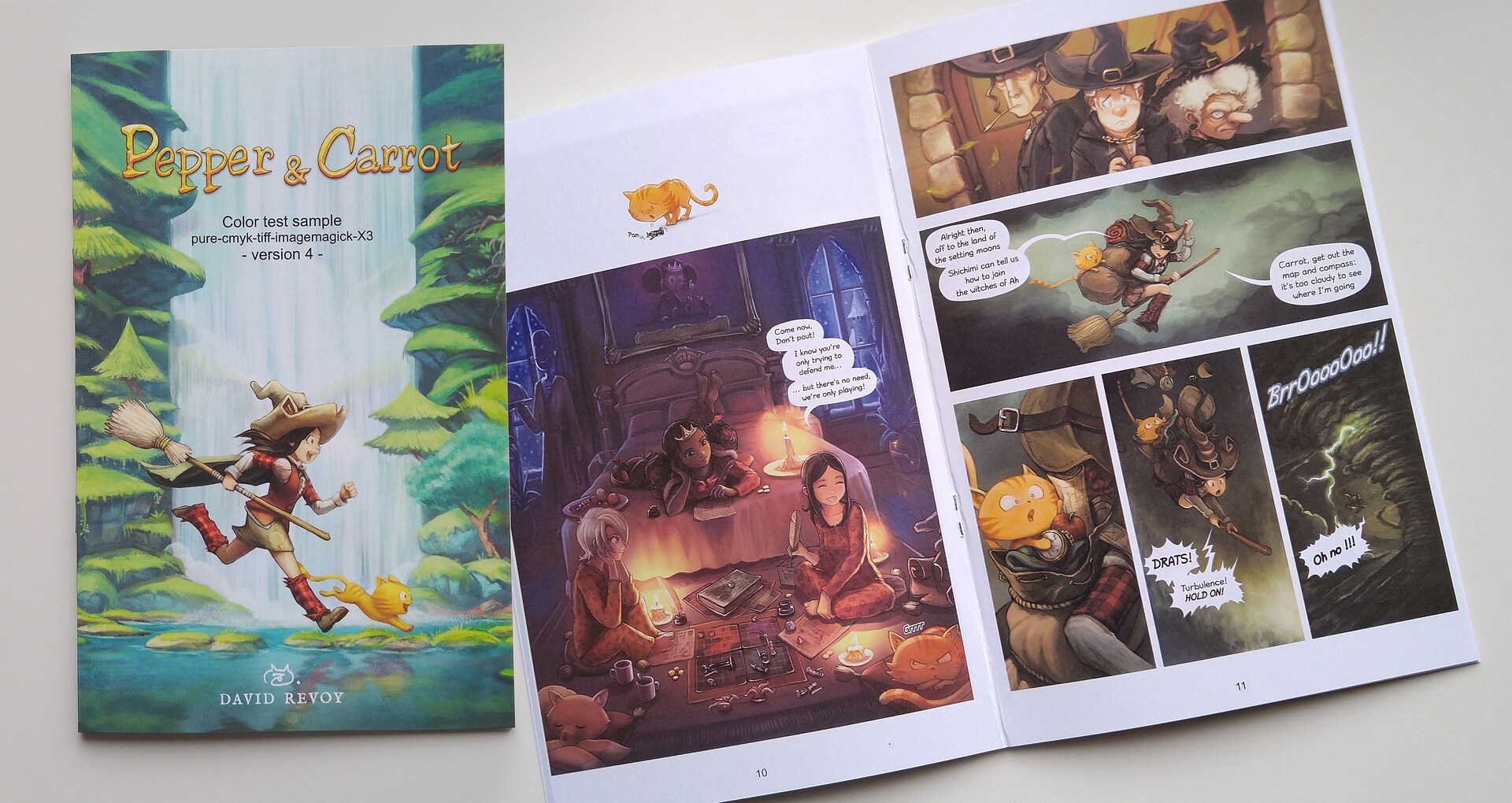
After failing on two first 200 pages books; I decided to refactor the project to a smaller format and so I used the smallest format and page count available at my POD service: 18 pages at 5.50 x 8.50 inch format (216mm x 140mm). I kept the quality to the highest setting: glossy cover and premium paper/printing as for the big book project. The purpose of this refactor was to reduce the cost of my trial and errors when I launched the print of a new proof. This new format decreased the cost by approximately four time and I could launch this way more tests without worrying too much on their impact on my budget (by the way, I want to thanks here my supporters for this budget!).
Within the 18 pages printable, the mini book contains 16 comic pages. I took the 16 most challenging pages to print (dark pages, bright pages, page using particular saturation). These pages were designed for an optimal rendering on sRGB monitors and for the webcomic. I often used colors not available for printing and made artistic choice to favor the webcomic experience first. These are the pages in question:
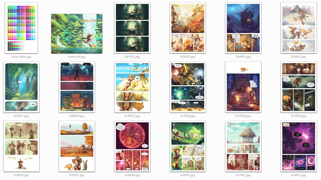
A selection of pages known to easily spot printing issues
I also included a color target, a contribution sent by Hồ Châu under public domain, a gift for this project (Thank you!). The last page is reserved by the printer for a bar-code and identifier of the product.
I used the cover to embed a bloc of text on the back about each mini-books specifications. Due to the low page count, the website firstly rejected all my PDF files. I understood a bit thanks to this rejections (and an error message about the wrong geometry of the project) I had to remove the gutter and the thickness of the cover: the pages and cover being linked together with staples this time.
To be sure to test all of this in the best conditions I upgraded and reinstalled my computer:
- I have a new monitor that can display up to 104% of sRGB colorspace, display quadHD (so I can see the pages of the big book at 1:1 on screen) and color calibrated using a Pantone Huey Pro.
- I upgraded my Kubuntu GNU/Linux system to 19.10 (install guide coming soon on the blog).
- I calibrated my scanner thanks to a IT8. 7/2 1993 color target from www.coloraid.de
Test 1: Big-Book 1
Before speaking about the Mini-Books, the first experience I had was in November 2019 with the first big book. This book followed to the letter the Scribus documentation of the printer itself. I picked this POD service because of this documentation. I felt so confident with it! But after the first upload I had my first issue: the size of my PDF files was rejected! In fact, the uploader on the website authorized maximum 800MB files while mine was 2.4GB!
"Error with file en_inside_8.5x11.pdf: File is too big (2823.61MiB). Max filesize: 800MiB." ~ Drivethrucomics upload interface.
What ⋅ a ⋅ surprise! This limitation wasn't written anywhere on the documentation and doing a 200 pages full colored and large book with a 800MB budget did sounds like an horrible challenge. Fortunately, I could re-compress the PDF with Ghostscript and I found in the Scribus official Wiki it was a common practise to reduce the abnormally large PDF filesize out of Scribus...
gs -sDEVICE=pdfwrite -dPDFX -dCompatibilityLevel=1.3 -sOutputFile=output.pdf -dNOPAUSE -dBATCH -sDEVICE=pdfwrite -dPDFSETTINGS=/prepress -c ".setpdfwrite << /ColorACSImageDict << /VSamples [ 1 1 1 1 ] /HSamples [ 1 1 1 1 ] /QFactor 0.13 /Blend 1 >> /ColorImageDownsampleType /Bicubic /ColorConversionStrategy /LeaveColorUnchanged >> setdistillerparams" -f input.pdf
With that one-liner from hell inspired by this thread on Stack-Overflow, I could reduce my file under the threshold at the price of reducing the quality and adding another possible weak link in the chain. Controlling the JPG compression of the files during the export in Scribus could probably be a better idea. But this options is hardcoded to 95% quality, a setting that still produce too large file for the budget of the upload inteface. I reported it as a bug here and Ale already added a proof of concept in a branch (thanks!).
So anyway, after the upload being finally successful, I had my second issue: the server complained the file wasn't PDF/X compatible. I was worried about that. But at that time, I was attending Capitole du Libre and tweaking the upload had to wait for later. This non-action payed itself: the file status changed to be approved for print after a couple of day. And I so ordered the proof.
- Input artworks files: PNG, 8bit, RGB elle-V2-srgbtrc.icc.
- Output settings:: (Scribus 1.4.8~ppa)
- PDF standard: PDF/X-1a
- Compression: 95% JPG compression
- Profile: CGATS21_CRPC1.icc, CMYK.
- Rendering: Perceptual, with black point compensation.
Result:
Washed and too bright colors; some background elements of the bright panels even disappears inducing issues to read the panels (and so, the story) correctly.
Test 2: Big-Book 2

After posting my first fail on social medias and collecting a lot of feedback, I decided to immediately follow a popular (bad) advice: export the book to a sRGB "regular PDF". The idea behind this type of logic was to test that in case the machine had a built-in ready made color converting algorythm (built-in from the engineers of the printer) or if an operator could do the color conversion. I did it and the server complained here also that the file wasn't PDF/X compatible —but that was on purpose this time because I used PDF 1.3 spec— but was approved a couple of day later.
- Input artworks files: PNG, 8bit, RGB elle-V2-srgbtrc.icc.
- Output settings: (Scribus 1.4.8~ppa)
- PDF standard: "PDF 1.3 (Acrobat 4)" preset of Scribus
- Compression: 95% JPG compression
- Profile: none; default sRGB built-in.
- Rendering: (none sRGB)
Result:
Oh that epic fail. So GRAYISH! All the tones and colors appeared grayish and very very unappealing.
Test 3: Mini-Book 1

That's where the Mini-Book adventure started, and for the first mini-book; I decided to blame my usage of PNG in Scribus after have found about this bug where Scribus skip the profile from the incoming PNG: something embarrassing for doing color management from a point A to B if Scribus starts the process without point A!
I then switched all my sources picture to JPG at 100% quality, elle-V2-srgbtrc.icc and decided to also test the second option of the printer PDF/X-3. PDF/X-3 has an edge over PDF/X-1a: the two formats can't still manage transparency correctly (transparent PNG returns full black background) but the third revision allows each pictures embed in the document to get their own color profile while in PDF/X-1a a single meta-data 'color profile for all' is informed on the PDF header.
I also wanted to test another rendering intent: "Relative" instead of "Perceptual". But then even here the server complained the file wasn't PDF/X compatible! I saw then that I couldn't produce any files that satisfy this warning from the server... (It will be like that for all later experiments, I'll now skip adding this detail as it is a constant).
- Input artworks files: JPG, 8bit, RGB elle-V2-srgbtrc.icc, 100% quality.
- Output settings: (Scribus 1.4.8~ppa)
- PDF standard: PDF/X-3
- Compression: 95% JPG compression
- Profile: CGATS21_CRPC1.icc, CMYK.
- Rendering: Relative, with black point compensation.
Result:
GRAYISH: All the tones and colors appeared grayish and unappealing in the same exact way of Big-Book 2.
Scribus forgot to convert on the fly all the JPG input to the target CMYK mode and did embed the JPG as they were. It's a Scribus bug reported since 2016. That's probably why the machine gave me the same grayish result than big book 2: the picture in this PDF were all sRGB! Now I understand better why the colors were looking so accurate when previewing the PDF in Okular.
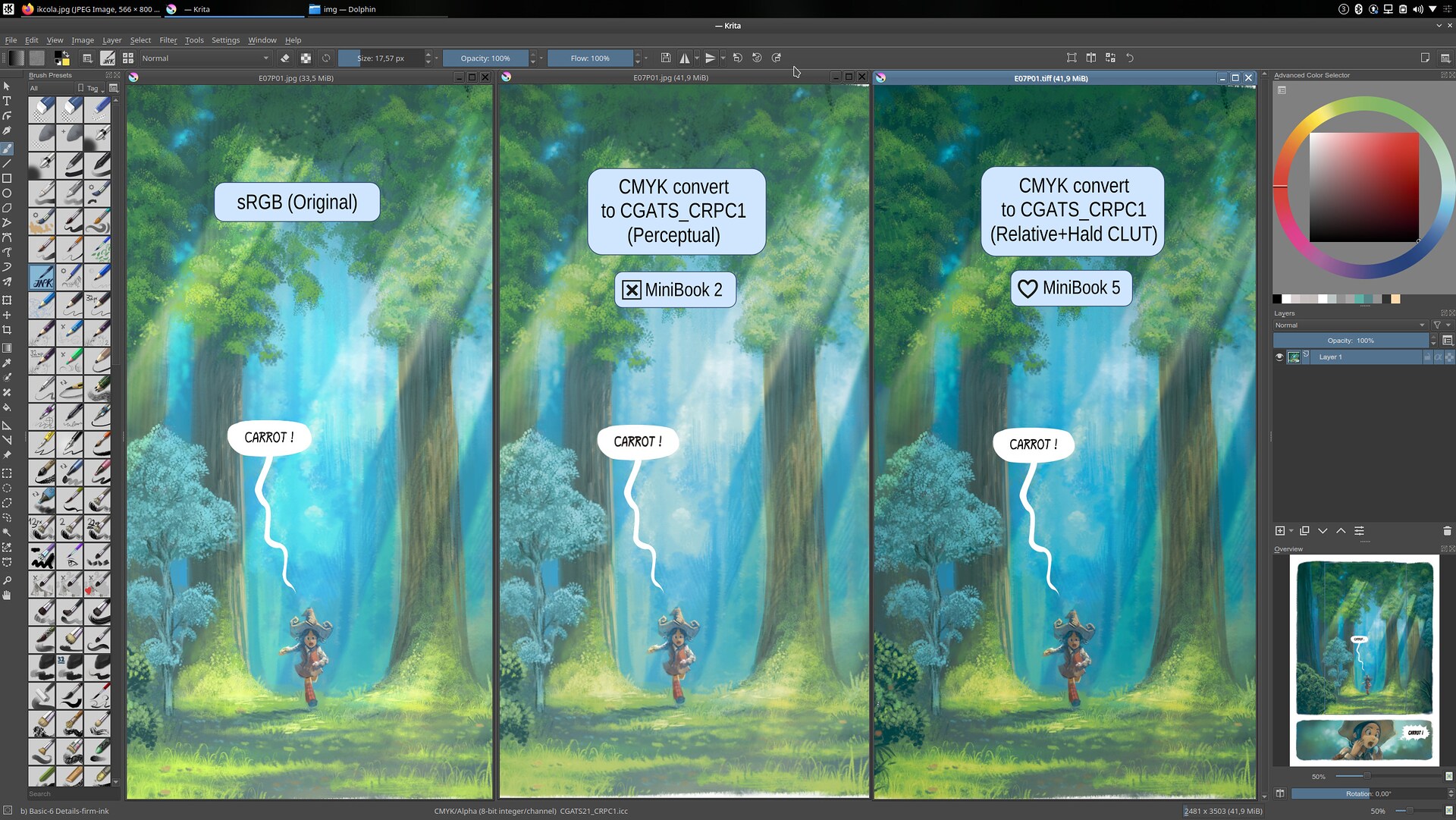
Test 4: Mini-Book 2
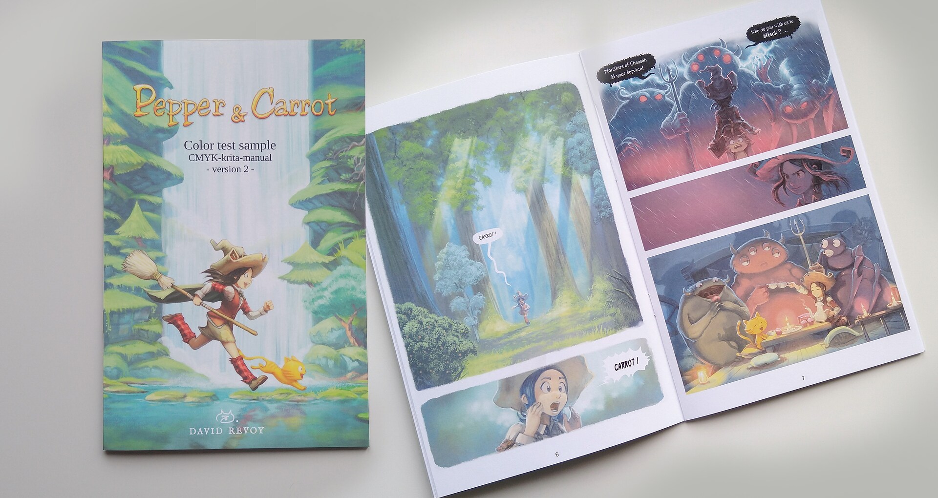
For the second mini-book I was decided to this time bypass totally the Scribus internal color conversion services. I thought it was better to control it myself. I then turned myself to the best CMYK conversion result I could preview in the viewport with the most successful appearance: the one does by Krita.
I could test this way the inefficiency of the Python script that comes bundled with Krita to do mass convert. The script is not really useful as one needs to open all documents side by side in Krita, runs it (the dialog miss some options: black point compensation, LCMS optimisations) and then save-as manually all the documents under a new name. All in all, I was a bit worry this method could work and produce a good Mini-Book because making 16 files this way manually was already a burden and took long... I can't imagine for 200 pages! It would also break all the dynamism of the book creation for backport and translation switches. But at this point, I was looking at first for a solution and I had to follow the few ideas of test that made sens I had in mind.
For the file output, I decided to keep JPG because of a bug with TIFF between Scribus and Krita where the ppi metadata is lost and so you get a very huge picture badly scaled in Scribus after being exported from Krita. With this JPG CMYK output, I kept the 100% quality and exported the PDF back to PDF/X-1a with Perceptual rendering.
- Input artworks files: JPG, 8bit, CMYK CGATS21_CRPC1.icc (Perceptual, BPC, optim.), 100% quality.
- Output settings: (Scribus 1.4.8~ppa)
- PDF standard: PDF/X-1a
- Compression: 95% JPG compression
- Profile: CGATS21_CRPC1.icc, CMYK.
- Rendering: Perceptual, with black point compensation.
Result:
WASHED: Washed too bright colors same as for big-book one...
This test told me at least a bunch of precious information: Krita conversion and Scribus conversion does exactly the same thing and have the same usage of LittleCMS (their common library under the hood for the color management). Also, it was good to know the printer on the other side had consistency in the broken results with the Perceptual rendering intent.
It also meant my Ghostscript command-line in the first book wasn't the cause, and also the PNG non color managed from Scribus finally not so influential on the result. So, I knew Perceptual mode —even if it gives satisfying preview on monitor— was definitely broken at printing.
All of that was contradicting the recommendations on the official Scribus documentation of the printing service. This doc was the main reason why I decided to use their service and I felt bad to understand it contains such a big mistake. In fact, the documentation advises "Perceptual" for the best result in a screenshot in part 3, Color Management.
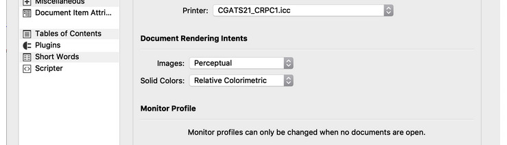
The faulty screenshot of the Color Management recommendation from OneBookShelf documentation
I discovered later if you also look at the InDesign documentation of the same printer, they'll advice to use the "Relative Colorimetric" this time.
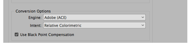
Indesign users have another better recommendation
That's an epic way to troll Scribus users, OneBookShelf!.. I tried then to report the issue to their service writting a detailed email to the address on the footer of their page inviting for feedback and modification. My email fell in the void and returned an error of no existing recipient. That's so typical...
Test 5: Mini-Book 3
The third mini-book was my first success. For this test, I decided to use Scribus compiled from sources; I wanted to use this patch about the huge file size and JPG compression I received in the bug tracker from Ale (Thanks again! It works by the way); it was also good to see if recent 1.5x series was behaving better for the PDF/X* standard (the server still warned with the same signal each time I uploaded the previous books). Fat chance, the website still sent the same warning in any condition (I tried to upload more than once, without ordering proof).
The concept of this new test was similar in everything with Mini-Book 2 but this time with another twist: I would use the 'Relative rendering' of CGATS21_CRPC1.icc, even if it was looking very bad on monitor, too dark and very burnt. But if the printer always interpreted my 'Perceptual' rendering as something way too bright while they were looking good on my monitor; using this dark 'relative' mode could be the solution. "Elementary, my dear Watson".
Difference on my monitor between a Perceptual convert and a Relative convert, anyone would pick Perceptual because it looks closer to the original, right?
- Input artworks files: JPG, 8bit, RGB elle-V2-srgbtrc.icc, 100% quality.
- Output settings: (Scribus 1.5x, Nightly built from source):
- PDF standard: PDF/X-1a
- Compression: 95% JPG compression
- Profile: CGATS21_CRPC1.icc, CMYK.
- Rendering: Relative, with black point compensation.
Result:
Finally! Good and deep colors.
So it means the color table of the "Perceptual" mode of CGATS21_CRPC1.icc doesn't work at all and the "Relative" mode works.
Then I had another deeper look at the CGATS21_CRPC1 official page and I suddenly understood many things.
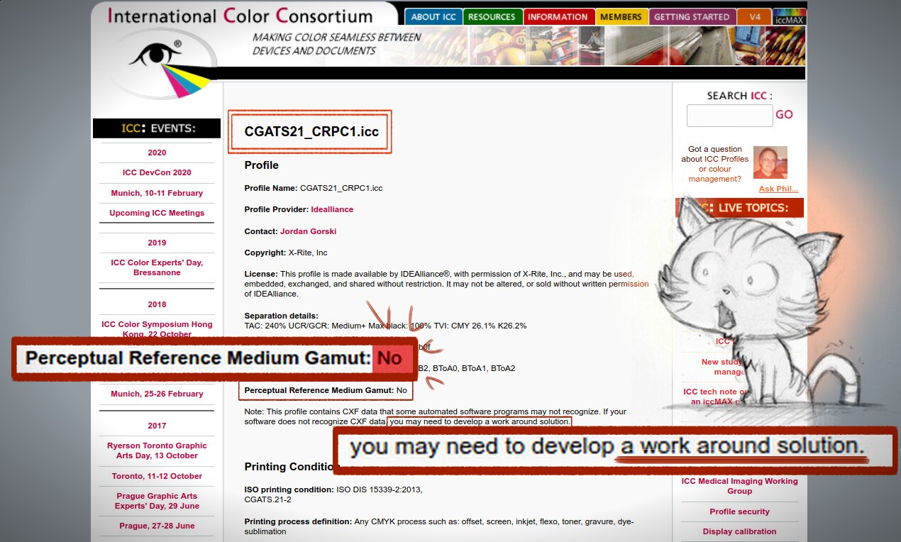
A real shock when I read that
Was this information here all along? Even during the discussion with Krita team? the bug report resolved as WONTFIX upstream about CGATS21_CRPC1? the discussion with the LittleCMS maintainer on the mailing-list? A search into the Wayback Machine confirms the information I needed were always written here.
No perceptual mode.
... and a warning about data the software might not recognise, needing work around solution.
Work Around...
Test 6: Mini-Book 4
So, —yes— I felt deeply both dumb and trolled at this point (a mix that is not good for my confidence with impact on my diet and sleep cycle I can tell you) but I was starting to get the big picture. It was as simple as: CGATS21_CRPC1.icc = Relative mode only = + needs officially work around for soft proofing = don't trust to what appears on my calibrated monitor.
But while re-reading my old test, I was curious with another idea. How could perform Imagemagick for the "Relative Intent"? This one always had a slightly different rendering for the colors in my test, and I mean in better. If I could trust the C,M,Y,K values, reading them with a color picker; the result had deeper contrast. A bit illogical because it uses the same LCMS library under the hood than Krita and Scribus, but Imagemagick probably uses another transitional color space or strategy to convert from a point A to a point B.
I obtained better colors, deeper black and bright colors with more readability. The correct command line to convert to CMYK correctly with Imagemagick required a good afternoon of trial and errors as all the example from the Imagemagick manual or the 39 CMYK threads on Askubuntu, Stackoverflows or other website usually advised terrible things and command lines...
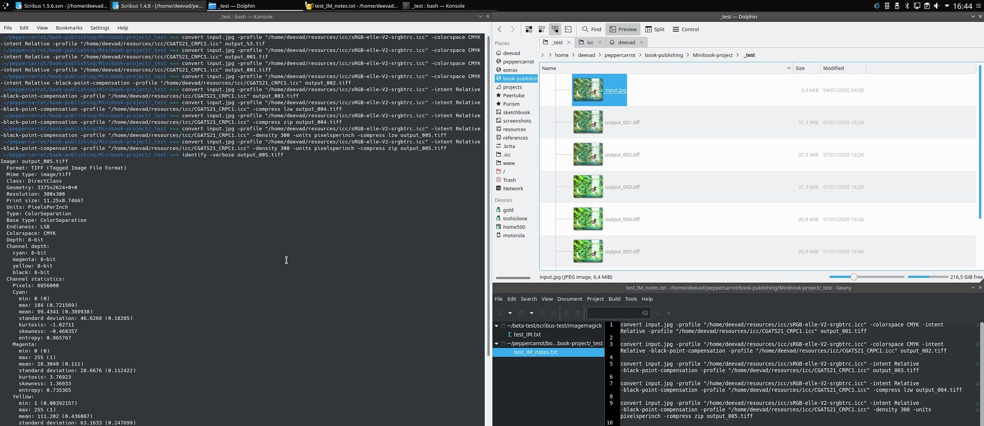
Trial and error workflow in action with Imagemagick
For a correct result, you need to feed manually Imagemagick with the incoming profile even if this one should be already in the input picture itself. Also, all flags position in this line can highly influence the result (or sometime no for specific options). The final command-line looks like this one:
convert input.jpg -profile "path/to/sRGB-elle-V2-srgbtrc.icc -intent Relative -black-point-compensation -profile "path/to/CGATS21_CRPC1.icc -density 300 -units pixelsperinch -compress zip output.tiff- Input artworks files: TIFF, 8bit, CMYK CGATS21_CRPC1.icc (Realtive, BPC), zip compression lossless, 300ppi. (Scribus 1.4.8~ppa):
- PDF standard: PDF/X-1a
- Compression: 95% JPG compression
- Profile: CGATS21_CRPC1.icc, CMYK.
- Rendering: Relative, with black point compensation.
Result:
Slightly better and deeper colors than on Mini-Book 3, subtle, but it was noticeable enough to tell the print was better. At this point it matched the quality of other previous printing I already saw on other Pepper&Carrot books made by third party: Glénat, Tokyo Pop and other samples. I was in the right process.
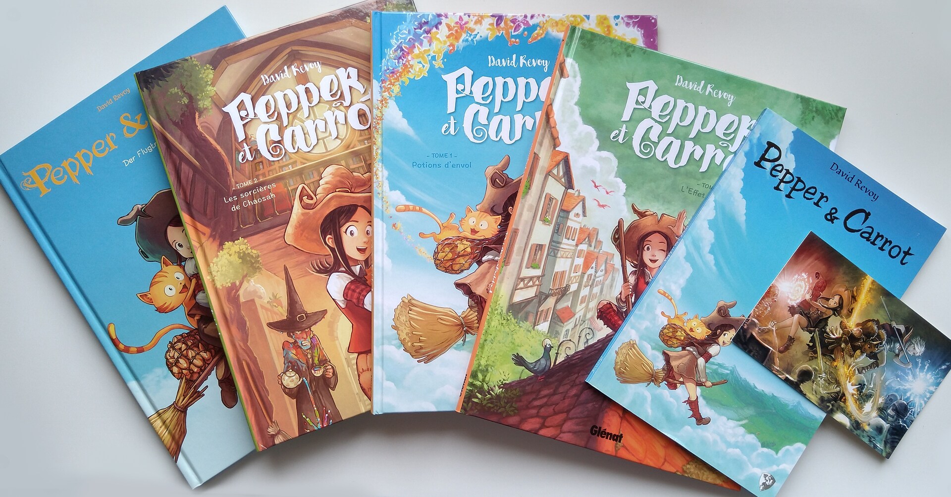
Printed version of Pepper&Carrot I use to compare
Test 7: Mini-Book 5

Vibrant colors!
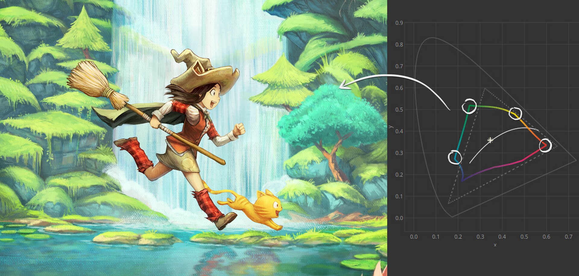
Now that I had a method and a sort of control of what the print machine could do; I started to work on possible enhancements. Having the same result than the other derivation is good but was not enough in my opinion. CGATS21_CRPC1.icc is one of the smallest CMYK color space I ever saw.
CGATS_CRPC1 is a small CMYK color space
The premium matte satin paper limits a bit the deepness of the dark colors compared to a glossy postcard with a large CMYK color space. But I knew I could take advantage of all of that, if I designed a color recipe specifically for this product. With the previous Mini-Book, the bright details were not great, colors could pop a bit more in the saturation and the dark details were a bit lost in a CMY+K soup of micro point produced by the laser machine.
I refactored the color of the cover artwork to take advantage of the color-space boundaries
I often use subtle dark or bright values for the webcomic, so no surprise it doesn't translate well into the printing world where you need to caricature a bit more the contrast if you want an effect to be visible. Because now I managed my rendering via Imagemagick command line; I could add a couple of color corrections nodes in the process to darken slightly the bright part and brighten slightly the dark part while boosting a bit the saturation.
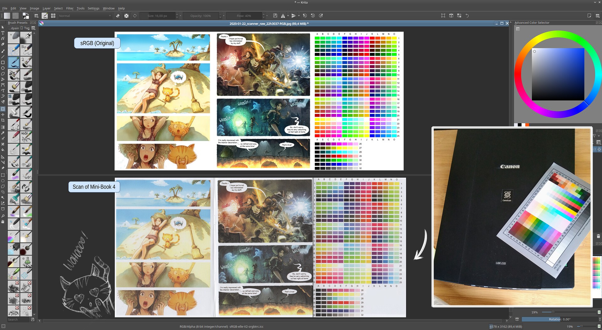
Original vs MiniBook4 (scan).
The best way I found to do all this color corrections was to collect thumbnails of the most problematic pages in Krita; and build a stack of filter-layers with dynamic color adjustment. Once I had a pleasing result; I generated with Imagemagick a HALD CLUT 16: this is in short a square picture where each pixels is a single color and all together they cover all the possible hue on the three RGB channels going from 0 to 255. Imagemagick can generate a PNG of this type of imagery quickly. Over this default Hald Clut, I applied my stack of color adjustment layers in Krita, then I saved the result as PNG. This way, I converted my color adjustment into offset information for each RGB input pixels.
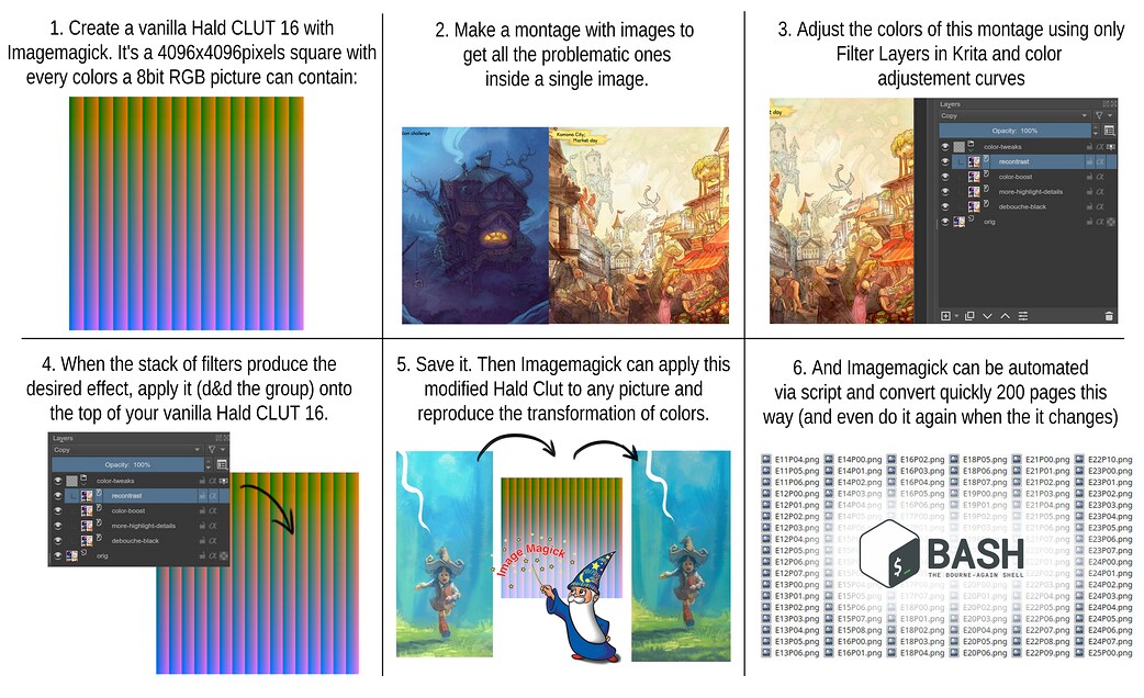
An attempt to explain Hald CLUT
To generate a default Hald CLUT:
convert hald:16 hald-clut16.pngTo apply a (modified) Hald CLUT
convert input.png hald-clut16.png -hald-clut output.pngHere a link to my modified hald clut 16. I then applied my modified hald clut to every pages of Pepper&Carrot just before the RGB to CMYK transform. Because it is a command-line, I could script the transformation and it takes now just a couple of minutes to compute the 200 pages of a translation.
I improved again this method when I started to make myself a poor's man Softproofing system using a dynamic Filter Layer on the top of my layer stack. It's just a pack of curves that reproduce a caricature of the issue of a print as for the Mini Book 5. I could optimize the artwork of my book cover this way and regenerate a better Hald CLUT that could balance the issues I could see.
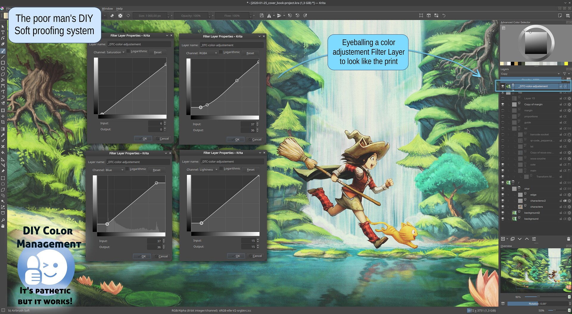
Poor's man Soft Proofing method FTW
- Input artworks files: TIFF, 8bit, CMYK CGATS21_CRPC1.icc (Realtive, BPC), zip compression lossless, 300ppi modified with a custom Hald CLUT. (Scribus 1.4.8~ppa):
- PDF standard: PDF/X-1a
- Compression: 95% JPG compression
- Profile: CGATS21_CRPC1.icc, CMYK.
- Rendering: Relative, with black point compensation.
Result:
This is it! The best I can probably obtain with this CGATS21_CRPC1.icc profile, the premium matte paper and this printer. The colors are vibrant, the details in bright part are easy to read, the details in dark part too. DIY Soft proofing system can works really well at predicting and patching artworks. I think I'll optimize now in the Krita comic pages a couple of situation that could look better without affecting the look of the webcomic online. I'll also keep this dynamic Filter Layer presets of curve while I'll create future episodes.
Conclusion:
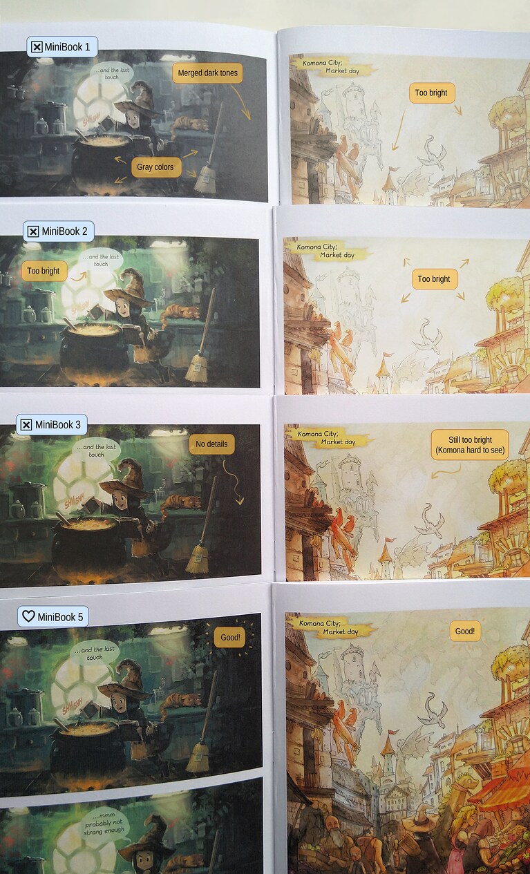
Comparison of all MiniBooks inside
Now I have a MiniBook that looks good, I'll launch a proof in the next days for the codenamed "Big Book 3" with my best recipe and another pass of polish over the webcomic. I'll wait for the printed proof, I'll build a product page and I'll try to turn this long and painful process and story into a success! It will come as soon as possible; I'm almost sure the next blog-post about the book will have a link to purchase it.
Thanks to all this experiments and my notes; I could visit bugs, evaluate projects, understand deeper another aspect of the print industry and DIY a correct workaround to now use a 100% Free Libre with Open Source Software workflow for my future Pepper&Carrot Self Publishing project. The PDF/X compliance is still problematic, but it's only a warning message at this point that doesn't affect the rendering: I'll live with it.
I also crossed online many comments and forum post about creators falling into the same issues as I did. That's hard to digest this big picture, I often was exhausted during this process. I hope they'll find my page now on their sleepless night thanks to a search engine and read how simple it can be when one has all the good information.
How to prevent this situation later? Could Free Libre and Open Source software starts to apply custom exceptions to identified ICC if they officially requires work around? Could the option of "Perceptual Rendering" could be grayed out? Could the Soft Proofing system could give a feedback about the profile being unable to do that? With OneBookShelf and DriveThruComics (largest indie webcomic printing services, prints many Kickstarter too), DriveThruRPG (largest RPG bookstore world wide and POD service) and more services being centralised around CGATS21_CRPC1.icc, it's probably thousands of indie creators that falls into this traps. And none of them might take the time to investigate how I did. I know myself; I'm so stubborn for FLOSS I'd rather write during one year my own desktop publishing software in Bash and Ghostscript than subscribes to Adobe's proprietary software.
The main misleading point of the process was the official documentation. Here again, note how the documentation is proprietary and not a community wiki I could edit, ask question and improves as I do on FLOSS projects...
Sources:
This ZIP contains the necessary files to compile MiniBook5 and if you tweak the settings and follow this article, you'll have no trouble to build all other setup. https://www.peppercarrot.com/extras/resources/Minibook_project5_sources.zip
Things I learned:

A screenshot during my long hours testing
-
Before starting a big project; always start on a small sample (as the MiniBook 18pages here) to test the pipeline from A to Z with reduced cost.
-
Don't work with a deadline until the pipeline is fully visited. My project to get this book for the start of December 2019 (for Xmas) was ruined because of that and caused me many stress and a feeling of finishing the year on a personal big failure.
-
With CGATS21_CRPC1.icc, use the "Relative Intent" mode only.
-
PDF/X-1a and PDF/X-3 compliance with Scribus doesn't work according to my printer. PDF/X-3 is even more dangerous (and buggy too since long time) because even if you tell Scribus to do the conversion of your input RGB document to CMYK and specify it is a document for Print, this one will be embed as RGB picture in the final result. I know it's part of the PDF/X-3 to support that but the GUI of Scribus comforted me to believe It would convert to CMYK everything.
-
libPoppler; a Library used to display PDF at the root of Okular and Evince managed well the preview of PDF output of Scribus compared to what I get in the mailbox. From all the broken "perceptual preview" to the "too dark relative" and grayish output, It was almost guessing the right tendency of the result. It was far to be accurate, but was reliable. A performance I wanted to praise here.
-
Don't use PNGs for importing in Scribus. Because of a bug, PNGs cannot be correctly managed and you'll get a shift in color in case your source profile is not 8bit sRGB built-in. By extension to this rule, don't use also Krita *.kra files into Scribus, because Scribus use the PNG preview mergedimage.png inside the *.kra files so the bugs propagate here too.
-
Be careful about Tiff and their resolution: Krita and Scribus 1.4 don't understand each other on the topic. Fortunately, it was fixed by JGhali (Thanks!) on the bug report.
-
After export, you can use Ghostscript via the command-line to reduce the size of your PDF. It cannot break an already sketchy PDF/X compliance anyway.
That's all! Thank you for reaching the bottom of the page and sorry for my limited English skill on such a big text. I hope my method will inspire you. Comments and reactions are welcome, I'll be around.

33 comments
I'm really happy to see that you finally succeed with the printing!
And thank you for this great article!
I cannot believe you managed to hold on to your sanity throughout that gruelling process. But seeing the effort that went into it, I already know this is going to be one of the best purchases I'll ever make.
Wow, thanks a lot to keep pushing and investigating. This blog series will be a VERY valuable resource for everyone who wants to print books the floss way.
Also, looks very hard to do to the untrained eye. Hope the process get's smoothed out with all the bugs you reported and we see a solid and user friendly way to print in the future.
Wow, that was a hell of a read! I can't believe it took so much work to get the colours looking right.
Do you think it would have been more straightforward if you could use a printer with an ICC profile with perceptual mode?
And I wonder, given you have a calibrated scanner, would it be possible for you to send a test chart for printing, scan the result and automatically build an ICC profile from it?
And small correction: you use the word "mate" a few times in reference to paper but I think this is a misspelling. I think the adjective you're looking for, which means "without lustre, dull; unpolished", is "matt" or "matte". "Mate", in English, is a different word which has a few different meanings but it's a noun or verb rather than an adjective.
While looking for the definition, I saw that "matt" is borrowed from French. When it was first borrowed in the 16th century it was spelled "mat" and today it's spelled "mate" (which I suppose is why you spelled it that way). The modern English spelling seems to come from between the 17th and 18th centuries, when it was spelled "matte" in French.
Fascinating. Thanks for writing this! I have a lot to learn about color calibration, and I'm going to need this.
One question: how do you know that the books printed in the UK will be the same as the ones printed in (say) the USA? Are you simply relying on the company to ensure the calibration between printers? I assume all your tests came from the UK printer?
this is an amazing blogpost. i follow your adventure with the printing and it was very interesting to read in details about the process.
i didn't know that you have such a literary workflow, you can be proud by that. being able to export webcomic automatically to a book is an amazing idea and implementation.
it's a pity many programs have bugs, but the way you worked helped them and us to be aware of those bugs and also fixed some bugs during the process.
so thank you for all of work you have done, i am so inspired by you, and waiting for the book to buy as well.
Hi Terry,
Thank you, that's a very good question. I think I just assumed the UK and US machine would be the same, calibrated the same way but now I'm thinking about it I'm not so sure. I'll take care to test it before launching the book.
Oh thank you about s/Mate/Matt/.True, I use it in French. That's probably a reason why I wrote it this way. (I'll fix it asap)
About printing with a correct ICC: yes, that would have been a success. I already made many project on GNU/Linux printed with ISOCoatedV2_300 or Fogra27, two modern profile wildly used in Europe and I never had a single problem. Even while working on full board games. What I had on my calibrated monitor had a very predictable conversion and preview. This CGATS_CRPC1 is really an old ICC with many issues and peculiarities.
About creating a better ICC from the color chart (the one I already have on the MiniBook) that's a very good idea. I'll certainly dive into the creation of ICC soon; I'm new to it but with the data I already have I probably can make a synthetic CGATS_CRPC profile with modern standards to ease softproofing or preview (a workspace only icc).
Thank you for the feedback and for your nice words!
Thank you. I hope too!
:-) Thank you!
(to be honnest, I lost my sanity a couple of time on the way)
:-)
In theory LCMS can give feedback on whether perceptual intent is possible, and I sort of semi-implemented that into the color browser description field (as I was uncertain of it's exact workings, so might as well start with diagnostics before trying to disable anything...), but the problem is that the profile itself seems to tell lcms that it CAN do perceptual intent(though, there's multiple perceptual tags in a profile, so maybe I am not checking the correct ones). Even weirder, LCMS should fallback onto relative colorimetric when perceptual isn't available... which I am afraid means that the profile is telling LCMS that it has a perceptual intent tag, but what is in that tag is gobbledygook.
Marti says it ought to be possible to generate an icc profile from the 'target data' on that website, but I have to admit I have no idea how to do that properly, and I don't know anyone who would...
Thank you for having a look! Your Color Space Browser built-in Krita was a big help by the way (I just wish the graphical preview could be bigger because it looks good). It was also the only one that could display a graph of CGATS_CRPC. The other graph you see in the article comes from the DisplayCal package ICC. It's not CGATS_CRPC1! (because it can't load in other graphical preview software) but probably SNAP 2007 or SNAP TR002 that are color space "close enough". Unfortunately, even if they load, I haven't got this one to SoftProof correctly either. I'm really interested into synthetic ICC creation and since I want to enjoy the next years with the same printing service this looks like a tool I'll need. So, I think I'll have enough curiosity and energy to push it myself into this direction. Developping a mini indi publishing company for my Future Comics, Artbooks, Sketchbook and even a Drawing Manual is also a good motivator :-)
Hello, David, and thank you very much for sharing the deep research you have done for your book project in English. I wanted to comment on the conversion of the color space of a file in Krita, which I don't know if you've observed, and that produces very different results in the case of the CGATS21_CRPC1.icc profile.
It is true that if the color space of an image is converted using the previous profile, with relative intent and black point compensation, the image becomes too dark, but this only happens if in the configuration of Krita, in the management section of color, the purpose of perceptual representation is chosen. If you change from perceptual to relative (that is, it matches that of the assigned color space), the image is no longer too dark.
Anyway, the conversion of the color space in Krita, at least in the version I am using, seems to have some problem, since it does not preserve the options selected in the configuration menu. And the softproof, with this profile, is useless. As you said, it looks bleached (I can do softproofing with CGATS21_CRPC1.icc in Photoshop, although some options, such as simulating the color of paper or black ink, do not work well).
Thank you for the reply, the feedback and the tips; I'll play with that. I toyed a lot with the settings of Krita in part 1; but that was before I realised the Relative mode was working better. I'll give it another try. I'm surprised to know Photoshop has a hotfix for this ICC, and at the time it makes sens. For sure in Krita, there is plenty of situation that would require a serious beta-testing for ICC profiles and need bug-report. As I said on a previous comment, I'll try to get my hand on the creation of synthetic CMYK ICC profile, and create a broken one for testing purpose (eg. one that have flat curve for black and only use C/M/Y; something very easy to see in action over a picture with a color chart containing black square.). If you have access to test with PS; I would be curious to know what type of TIFF CMYK you can get with this picture: https://www.peppercarrot.com/0_sources/ep07_The-Wish/hi-res/gfx-only/gfx_Pepper-and-Carrot_by-David-Revoy_E07P01.jpg (so I can see the CMYK value and evaluate what does Ps color Engine).
With the nature of Print-on-Demand, I would expect less consistency than with long-run printing.
Glad my test-strip suggestion helped!
Hello, David, I just sent you to your e-mail an image file, converted to the color profile CGATS21_CRPC1.icc, and TIFF format, from Ps. If you need any more proof, just ask me!
I'll be more than happy to do a test-print in the USA if you want. LMK.
Well received Francisco! Thank you. I made two test with it:
1. I put it layered on the top of the a Krita-CMYK-Relative-CGATS of the same page, then I put the top layer in the "Difference" blending mode and I added a filter layer "Level" to increase the details. I could see this way the value that were different. The good surprise; they are not so different.
2. The second test was to simply sample pixels and extract their C,M,Y and K value and compare. Like this setup: https://www.peppercarrot.com/extras/temp/2020-03-01_screenshot_200110_net.jpg . I found difference here and there, but really subtle and they couldn't be mesured in percent. It was 1/255 shift up or down. Sometime one point of Cyan more for Ps, while LittleCMS/Krita will prefer one point of black more. For another brown; Krita had 1 point of Magenta more. etc... When I put the two image side by side, it's impossible to spot any difference. When I layer them and blink them, impossible too. That's comforting me into the test I made. Thank you for taking the time to send me this!
👍 Yep, that was a very good idea!
Well done!
Happy I can help! You have great script fu.
where can one get this?
It's not ready yet, Valtasar. Thank you for your patience, when it will be ready, the link will appear on the E-Shop of both www.peppercarrot.com and www.davidrevoy.com. I'm planning this for April/May, my current priorities is to release a new episode of Pepper&Carrot.
that's actually much sooner than i expected, can there be an announcement on Deviant-art aswel if possible? thanks in advance
I'm impressed as hell that you battled your way through this frustrating mess.
I would've lost my patience a thousand times trying to do this.
You're doing incredible work both in the original art and clearly also in translating it to paper.
I can't wait to hold the final product. I've been hoping for this for a long long time.
Squeeeee!!!!! So happy to see that this worked!!! Can you provide a timeline for when you might be able to have a set of books for sale? Would you be willing to do pre-orders for them? :D
Hey!
Thank you for sharing your excitement about this project!
The confinement and feeling of uncertainty related to this period made me pause a bit the project.
I also started to study the price, the taxes, the amount of work I still have to do to get this done... I get discouraged at the math that I would need to sell over 2000 books to only get back on investment of time spent so far on it (and I'm not done). So, a part of me is really putting a knee down right now. I'm recovering a bit my breath, community, budget (new episodes, tutorial) before taking another shot to finalize the project.
I also did brainstorming with people around me; I'll break down the big book into three books because:
1. technical: it solve the too big PDF export/upload limit.
2. My friends and fans told me they would prefer multiple book cover artworks, and thin books in their shelves.
3. I'll be able to follow the release of Glénat, French publisher; and so publish a book four by myself in 2021. (If I do a big 200 page collector; I'll have to wait 5 years until I made another 200 pages big book...)
4. With this thickness, that give me access to also propose a softcover variation; cheaper (shipping and production).
So, all the planets aligned to invite me to reconsider and refactor a bit my project, and I'm right now trying to process this 2h here, 2h there.
Progress I did:
- I refactored the Bash script of the renderfarm to use the method I found on the minibook5
- I studied the pricing and page layout for 3 books of 70pages, I have title, I have illustrations ready for the covers.
To-do:
- Desktop publishing of the pages + cover for the three book
- Testing/Print proof
- Build a dedicated page/article and video for the release
Estimated release time: as soon as I can, and I feel the world also is not ready because of the pandemy. Right now, buying a comic book from postal is probably the last move I would do personnaly (I don't want to make the delivery platform busy with my books; priority should be about delivering food, medical supply, etc...). So, it will need time. Sorry for long reply and to ask for patience *again*, but now you know all in the most honest way I could write.
Thank you very very much for this explanation. I am trying to find an all-FOSS workout for submissions to IngramSpark and there is limited information online. Your work will help me immensely.
Thank you so much for sharing this article.Quickbooks error code 3371 occurs when your Quickbooks registration file gets damaged or lost. You can fix this issue by removing ECML file or install Quickbooks Tool Hub.
https://quickbookstoolhub.com/quickbooks-error-3371-status-code-11118/
It seems you got lots of patience with this. I gave up number of times so far, and switched back to Windows. But I stopped using Adobe few years back and switched to Affinity. Affinity is great. But, unfortunately, it's not working on Linux.
These days I got some free time and started checking things out on Linux again, so I ended up here. I will try to use ICC profiles and see if I get anything useful for pre-press. It would be so cool to be Windows free :)
Thank you for sharing your experience!
Post a reply
The comments on this article are archived and unfortunately not yet connected to a dedicated post on Mastodon. Feel free to continue the discussion on the social media of your choice. Link to this post:You can also quote my account so I'll get a notification.
(eg. @davidrevoy@framapiaf.org on my Mastodon profile.)