


The English book printed project: production report 2
TL:DR; Almost perfect if colors weren't way too bright.
To give a bit more context, since the first article published two month ago, I continued to work very hard on the book project. What started as a: "it will take just two weeks of works!"
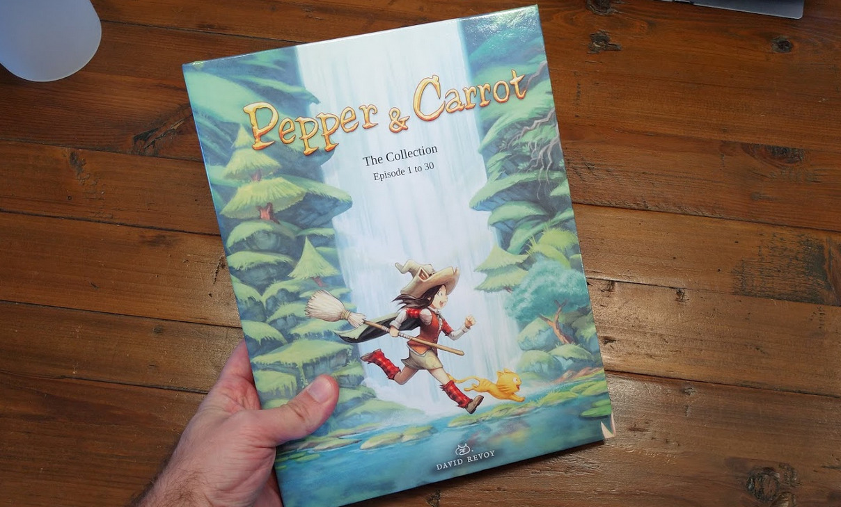
...It took me months and I'm still on it. For a reminder, it is my self-published comic book project, 200 pages high quality color, big size hardcover and produced from scratch with 100% FLOSS software and released under a permissive CC-By license. To give you an idea, the book weight 1.3Kg, PDF file-weight of the page inside 2.8Gb and the cover is a 6K pixels large CMYK files combining vector and raster elements. It's probably one of the most challenging book Scribus saw and opening the file takes 6min on a 8 core machine and rendering takes almost 30min.
I have today the first book in my hand but the colors are wrong. So wrong my plan to sell it on the e-Shop for Xmas is now ruined. This rendering will never get my approval for being pushed into production and I must say, I felt very bad about all of this work for this result because I followed all the specifications to the letter to specifically avoid that situation. Here is a video of my hand browsing the first printed proof so you can get an idea of the object:
a 5.4MB self-hosted video illustration in MP4 formatThe color issue can't be really seen on the video but the comic pages are like 10% too bright; this even sometime merges bright colors togethers. Here is a comparison, look at the cloud or the city in background:
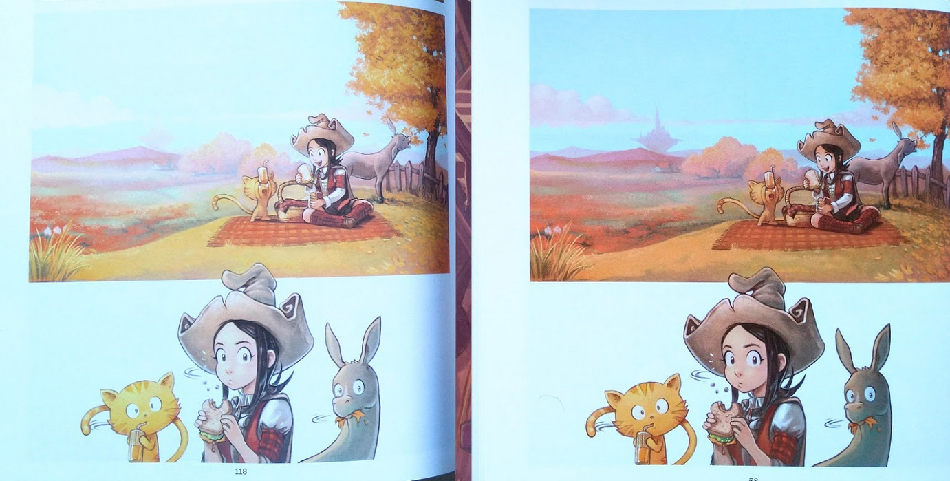
left: my book, right: Glénat version
As you can imagine, these colors does not justice to Pepper&Carrot as I painted it. The cause? It could be a lot of things, but the gamma/brightness rings a bell to a bug I found with a suspicious gamma issue. It was declared "resolved upstream" when the main dev of LittleCMS put the blame into the color profile of my printer. Really? accusing one of the only 23 official CMYK profiles of the ICC International Color Consortium produced by X-Rite while I have other books from my printer made with the same profile and Adobe InDesign that manage gorgeous colors with it? So, I come to doubt the profile is borked especially given how big my printer is ( www.onebookshelf.com). I also discovered later on the process of making the book way more bugs, workflow bottleneck, crashes and other things that I'll gently skip here because they belong to bug-trackers...

left: Breton version by Ar Gripi publishing, right: my book
Fortunately, this first printed proof also has revealed plenty of positive aspects. The fonts in intro are good, deep black and at the right size. The composition of the pages are really good with very good respect of bleeds and large comic page that fill the area. The thickness of the book and the glossy hardcover is ideal. The thin grained smooth paper is non-glossy and gives a traditional aspect to the artworks. Also, this is the most hi-resolution printed version of Pepper&Carrot I saw to the date. So, I have hopes, once I fix this color issue it will be perfect. I'm sure the color profile in itself has this tendency to be bright; but not probably as bright as that.

"Books are great!"... :-D Oh the irony.
Unfortunately, I can't ask my printer to solve the color issues for me, this is not like the little printer enterprise of a local city but a large service of POD with -I assume- machine operators that just put the file into the printers and have too big volumes to daily print (and pack books) to care about my non Adobe InDesign PDF files. So, I'll have to experiment and learn with more trial and errors: I'll keep sending on their server more files with various color strategy and wait for new printed proof until I can validate one. When I'll find the best workflow, I'll publish how I did. This project cost me already four time more than what I expected. Benefits of the books will never cover the months I did put into it, and the printed proof will make just increase the cost to a point where making this book with FLOSS already cost me more than buying a random Windows 10 laptop and pay a one month subscription for InDesign. But I'm doing it full FLOSS to reveal those issues, report them and aiming for quality always had a high price.
So that's all, expect new updates for the book project on 2020 when I'll receive the new printed proof that require around 20 days to be generated. Waiting for that, I'll focus with the Pepper&Carrot team of contributors on the next Pepper&Carrot episode!

40 comments
Yay, another production report.
I can't wait for the finished book :)
Keep up the good work, deevad
Thank you for the effort you put into this!
Very sorry to hear about these issues. Considering it would have been cheaper and easier on your nerves to just go with proprietary software, I very much appreciate that you're taking the hard route and make it easier for the people coming after you.
I'm very much looking forward to the book!
Thank you @Vulphere!
:-)
Thanks!
Yes, it is hard to keep the hard route but what keeps me walking it is when I remember how things also were for painting around 2010 (my Alchemy+Gimp-painter+Mypaint workflow, with low canvas size, half working open raster file sharing between the apps, and Krita wasn't smoothly painting a 500x500px) and how things are now. I haven't coded anything (I can't) but I can help other.
I think it can be interesting to see if a similar effect can be achieved with desktop publishing. It only need a single user who make it work from A to Z with a high quality commercial product and document it for offering to the other the same possibility all the research, pitfall and errors.
If I continue my self-publishing over the next years (I have project of sketchbook, coloring book with Carrot, publishing the work of contributors around RPG/Wiki) it might even thicken the Scribus community of new users and start to form a group that care about it (the project is in bad health as far as I can see, even if it is a great one). And that's my ultimate goal here; Getting a solid GNU/Linux "creative suite" ;) of software. At least document the path in the jungle for newcomers with similar project as I try to do :)
"But I'm doing it full FLOSS to reveal those issues, report them and aiming for quality always had a high price."
And that's why I sponsor you via Liberapay. (Btw. Liberapay is not that grate, I think I'll switch back to patreon.)
And did ICC consortium responded to your question, back in october? Im curious about whose fault it might have been....
No reply. This issue was only about the "soft-proofing" part of the ICC. But if I met bugs on the soft-proofing (the preview) of it, I have a lot of possibility to have bugs also on the real convert. And because I can't preview the PDF at the output...
But all in all, this bug was interesting; but I don't want to put all the blame on it. The ICC might be even not at all the source of the wrong color I have. So many things might be.
Thank you Tobias! I tried last week to add the "Stripe" things Liberapay advocate. (So far I had only Paypal option on it). I have no idea if it might help.
Hi David.
Personally I already published some books using Krita and Scribus and never had any problem. My printer uses the Fogra39 color profile as output intent.
I don't know for a big POD printers, but when I was printing some illustrations at the local printshop he told me that he prefer to have the files in RGB and will manage them. I took this as an advice for my big book printer.
My workflow is now like that:
- Do all the painting in sRGB in krita, export in sRGB, using png files with embeded color profile.
- Import the images in scribus, it should see what the embedded color profile is.
- Export as PDF/X4 with rendering intend for images as perceptual and for solid colors as absolute colorimetric.
And I do have very good results
Question: Why not ask the Glenat/other publisher that had published your book about technical thingie? Since all of them is derived from the same .kra files... :P
Bravo for all of the effort you put in improving creative gloss!
I understand it might be difficult sometimes, as you're probably one of the pioneers.. I can into give you a heads up and wist you a lot of succes with this endavour.
Hi Mark,
Thanks for the question. But it is probably way more complex than what you imagine. I wish it was as simple. I'll quickly explain.
First, you can't print Krita *.kra file. You need to export them. And in second, Pepper&Carrot pages are the composition of a SVG from Inkscape (with text, translations, etc) and the Kra file for the artworks. But all in all it is easy to get a JPG or PNG with a bit of Imagemagick and scripting. That's what I call the 'renderfarm'. Glénat actually uses this files I provide already for publisher on the website (in Sources/Download; or in Sources/Episodes ...).
Also, Glénat then mount the artwork on a desktop publishing app; this is necessary to get the page-right, page-left, trim/bleed, and a format that can be sent to a printer(device). They use for this Adobe Indesign on Mac (I assume, 99.99% now of the industry uses that) a proprietary software that produce a PDF designed for the print factory. They also have a specific page count and format in height or width not compatible with my project. Their PDF file is calibrated to get colors adapted to their standard (in Europe, I would assume CMYK ISO Coated V2 or Fogra27) so their software can simulate on their calibrated monitors a simulation of the colors they would get on this specific device.
Now, on my side, I'm not working with Adobe Indesign but Scribus, a Free Libre and Open Source software, and the print on demand service I want to use works with another standard; the CGATS[...]v1 CMYK standard because it is another machine designed by another company. They documented about it.
That's why it would be useless for me to get the files of Glénat even if they released it open-source.
Thank you Narayan for taking the time to send courage! That much needed when I take a path clearly not at my advantage in short-term. But I hope it will help at funding the proper basis for a long-term future where I can run my independant publishing mini eShop with only FLOSS.
I'm sorry to hear that the first print turned out badly. This is exactly what I've experienced over the years using FLOSS art applications as well. Every book I participated with mutiple authors, my pages were always printed horribly wrong. I thought it was either me doing color management incorrectly, or it was the amateurish local Chinese printing shop doing a sloppy job.
However, the more I suffered and researched, the more it seemed to be a defacto standard compliance issue. How FLOSS treated the color profile differently, that we thought to be "more correct than Microsoft and Adobe", and the fact that we cannot use the exact same name for industry standard working spaces, all contributed to the confusion.
In case you didn't already know, I investigated the Issue of Krita vs PNG vs sRGB vs Alpha here that you might find somewhat useful: https://bugs.kde.org/show_bug.cgi?id=367832
Honestly, being an hobbyist myself, I have very little incentive to stir the mud any further -- nor am I intellect enough to participate in the related discussion. So I'm counting on you! All the best luck!
Hey!
Yes, I launched exactly this second test yesterday. I decided to force a RGB PDF file in the pipe and see if it get accepted to produce a proof. I used the AdobeAcrobat1.3 PDF standard, Rendering for monitor, no convert and kept raw sRGB 8bit embed of all PNG of source. Scribus converted all of them in JPG-Lossy in "Maximum" (so around 95% equivalent of Imagemagick quality; palette of color is preserved and a slight JPG noise is added but shouldn't be perceptual). Resulting PDF was lightweight: 300MB (against 800MB for my JPG-Lossy CMYK, and 2.8GB for my Lossless-ZIP one ; rejected because the hardware of my printer don't allow file bigger than 800MB; probably old file system of embeded device that doesn't support crossing the single GigaByte of weight).
The files immediately triggered an error in the pipe, and a automessage said the file will be converted by the operator and color risk to not be as intended. But that's a good feedback. I prefer their convert (even If I think it will be run by a Adobe Acrobat Pro queue on the printer/operator side). All in all, I'm curious of the result and I might end if it works with similar advice than what your printer told you. Something that's not a solution but a workaround, but if it works...
But we are in the holliday season so I'm not expecting receiving a proof before 2020. I'll post a third part, that's sure and focus on episode 31 or my bank will start to run after me with a pitchfork xD
Oh! Thank you for your feedback here! You are so far from being just a hobbyist ;)
I'll read the long thread on the bug tracker because I had this bugging me too and I just stopped around 2014/2015 to use JPG or PNG output in Krita and I save all as *.kra then extract the mergedimage.png with script (from the kra, with unzip, it's a zip) and convert later this picture I save in /tmp/ with imagemagick... So, yes...
I also know FLOSS is full of color-gurus that often dominate arguments in discussions and often concludes "industry is wrong, we do right". I crossed that many times and I can't reply to that myself even after working in this industry since two decades. That's not lies, and that's certainly true.. Certainly industry is full of bugs, dirty exploits, workarounds on their standards (only looking at the PSD or TIFF specifications can get you an idea) BUT --by the end of the day-- if a 'right code' doesn't help the final usage, then FLOSS will need to adopt the bugs, dirty exploits, workarounds... At least, if the projects wants having happy user over having good looking and easier code. We are still far from a real GNU/Linux Creative Suite ;) But not so far at the same time.
I am doubting LCMS is at issue here, because Marti actually tested with Photoshop as well, didn't he? And there the profile was broken as well.
https://sourceforge.net/p/lcms/mailman/message/36780449/
I mean, I am still confused why what is happening is happening, maybe the profile bundled with adobe Indesign is a different file that is not broken (that's the nasty thing about icc profiles, it isn't obvious from the name what is inside, but it does get treated that way) ?
I am sorry this is ending up so expensive for you, either way.
Hi, Thank you Wolthera for the nice words! As I wrote; so many things could have broke on the way; but by the volumes of books DriveThruRPG and DriveThruComics prints I doubt the issue of softproofing also happens in Indesign (the samples I ordered on my desk right now have good colors). Their official documentation on InDesign : https://onebookshelfpublisherservice.zendesk.com/hc/en-us/articles/360022160073-Preparing-Your-Book-For-Print-with-InDesign doesn't tell "the preview on the viewport will be bleached, the profile is borked" ; the screenshot of InDesign (I assume color managed) looks to have vivid colors also. So, it might be that, it might be something else. But That's suspicious according to the size of the company, the book I have and the screenshot I saw from the documentation.
Ok, so indesign has different results with the exact same icc profile. Alright, then I'll go and link this article to Marti and see what he makes of it.
Thanks! The only way this screenshot could lies (not excluded) would be if the user of Indesign turned of color management (softproofing) while doing the project. But they don't write anywhere about "turn off the color management preview; the profile is borked; the export colors will be fine" at least, I imagine in this case a line would be documented about it.
Also on other aspect that could have break: the way the PDF-X1 is encoded. If not recognised as a PDF-X1 the operator could force another full convert. And converting twice a file assuming the bad color-profile from the start could lead to color disaster. I'm also inspecting that. Thanks again for the help in this situation that look very linked to a specific color profile.
Is it worth creating some 'test strips' and uploading it the pod service for color calibration?
Hey TappedOut; that's actually a very good suggestion and I feel ashame of not getting the idea myself yesterday when I realised I'll have to do more test: start a smaller book project (eg, limited to 20 pages or the minimum the POD system can support) make it small size, softcover to get something faster to print by the operator, faster to send, and cheaper. I'll defintely think about that. Thanks.
Hello, David, Thanks for the article and the good work, although I regret the time you have invested and the unwanted result. I have Photoshop cs2, installed with Wine in Manjaro, and I've been testing the profile that has given you so many problems (real conversion). Indeed, Photoshop gives a result washed with this profile, which is not seen in Krita. In a Windows 10 installation, with Ps and Krita, I observe the same.
Speaking now of soft proofing, in Krita there is always a difference between real profile conversion and softproof. Softproof is always clearer, as if it were a gamma problem. The results resemble those that Photoshop is obtained by marking the paper or black ink simulation options.
Thank you Francisco for the nice words and for confirming the issue as well in Photoshop as Marti Maria from LittleCMS on the mailing-list reported too.
Could the fault be that the mergedimage.png isn't colour managed or is different from the what a PNG export would give?
When I treat this file from the *.kra, I don't copy it just as it is; I also convert it with imagemagick and apply a profile. Also, Scribus has option to keep the embeded profile of such files or override it with a RGB ICC. I have that set too.
Hi, David, I wanted to comment on the problematic profile CGATS21_CRPC1.
Out of curiosity, I have done more tests, and I have observed that the results obtained using the "perceptual" and "relative" representation intents are strange. In Ps, the relative intent gives "normal" results, while the perceptual intent gives that whashed appearance. In Krita, the perceptual intent offers a similar result to the relative one in Ps, and the relative intent gives a strange very dark result. Maybe part of the problem is here?
I see that in the tutorial of your printing press for InDesign, they have used the relative colorimetric intent. Would a whashed print be obtained with perceptual intent and problematic profile?
Hi! Thank you very much for this feedback and tests. I really appreciate! My printer also has a Scribus documentation:
https://onebookshelfpublisherservice.zendesk.com/hc/en-us/articles/360022742353-Preparing-Your-Book-For-Print-with-Scribus
On one of the picture:
https://onebookshelfpublisherservice.zendesk.com/hc/article_attachments/360036499174/Screen_Shot_2019-05-30_at_10.13.07_AM.png
(a bit weird, a Scribus 1.5unreleased screenshot on Mac)
I can see the rendering intent for images are setup into "Perceptual". On my Scribus project; I let scribus do the CMYK convertion at the PDF export; the comic page (exported, flat) are PNG lossless with a sRGB classic ICC; and under the hood of the convertion of Scribus the engine is perfectly the same (LittleCMS) than in Krita so I saw no advantage to pre-convert them in Krita and then have to deal with exporting as Tiff to Scribus (while I found bugs for Tiff on Krita side and on Scribus side, reported; so a no go). I just checked my project; and I follow the recommendation to the letter; https://www.peppercarrot.com/extras/temp/2019-12-07_screenshot_205357_net.jpg , the only things I did not a little differently is to use instead of a regular sRGB icc; one of the new from the ICC website ( sRGB v4 Appearance : http://www.color.org/profiles/srgb_appearance.xalter , I tested it with Krita ; converting my sRGB-Built-in PNG to that; then the result to the CGATS21_CRPC1 CMYK one; I saw I had a tiny bit deeper teal, violet and orange and I was happy with this subtle gain enough to mimic this setup in Scribus. (I'm using version 1.4.8 to be as near as I can of the recommendation from the tutorial mentioned at first).
For sure, I'll lauch a mini booklet project side this big book to test all of this. It might even be a very thin book with color target printed on it ; very cheap to order the proof and i'll anotate the booklet with the export used; I'll quickly see what best setting works this way with pure trial and errors and randomisation of test. xD That's what I would do anyway if the printer device was at home by pure curiosity. :P
Hi, that's Marti Maria, the LittleCMS author. I have further investigated this profile, and found the source of problems is the B2A1 table, that is, the relative colorimetric proofing direction. It is broken in this profile. It seems to me that it is implementing some sort of absolute colorimetric, which would be emulating the paper white. Some products of Adobe "hot fixes" this profile, when used as softproof, but this is just hidding the profile error, which is something that lcms does not.
Is there a way to emulate the hot-fixes that Adobe puts into place to correct the profile? I'm thinking this is something like Wine, where compatibility with brokenness is more desirable than correctness.
I think, that hotfix can be optional on user side. Like warn user about broken profile and offer to apply hotfix. Just that.
Hi Marti Maria, thank you for the reply here and also on the mailing-list (replying to Boud and Wolthera of Krita team). I'm slowly realising how LittleCMS is at the heart of almost everything I use: Krita, Gimp, Scribus, Imagemagick, etc... So a big thanks for that and all the work and maintainance on it.
Do you think CGATS21_CRPC1.icc ( http://www.color.org/registry/CGATS21_CRPC1.xalter ) is also broken for the real convert?
Could it be a reason why I have a bleached printed book?
The bad softproofing rendering is one thing and this part is easy to workaround because I can switch off/on the colormanagement on the viewport of Scribus and assume things will be alright at PDF export. But the book I printed reveals also a color convertion issue at PDF export.
I sincerly wish I could change the ICC profile and adopt something without errors and more compatible with LittleCMS, but my printer is really big (at an industrial scale) and their machines accept only this *.icc file...
What would you do or test if you would meet the same situation as mine?
Oof! Hope you resolve these issues and can get an English book out. Great steps to advance FLOSS software to be even better. I can't wait to own a pbysical copy of Pepper & Carrot.
Yep, but I would stick to PDF/X, else color profile information might be lost in the PDF.
I'm pretty sure that if you insert RGB images in scribus then export as PDF/X images are kept in RGB (because I tried once to work with CMYK images and the resulting PDF/X looked a bit greyish in Okular, compared to the same PDF/X but with RGB image, I didn't tried to extract the image from the pdf afterward thus, because I'm not sure how the different tools I use would convert images), the thing that change, is that Scribus add rende3ring intent information.
On my investigation this week, I saw that Scribus actually never managed color profile for PNGs. ( bug report: https://bugs.scribus.net/view.php?id=15957 ) So for raster, JPG/TIFF or PSD can have a color profile of origin before being converted. I have no idea what is assumed as a base color profile for PNGs when converted to CMYK and that might be a part of my problem as well here.
You probably speak about PDF/X-3 the standard with transparency support and possiblity to embed various color-profile and color space inside the PDF. The one I have to use, PDF/X-1 has more constrains; a single profile and colorspace for all (referenced in the header of the document).
My printer accepted a RGB PDF done with the AcrobatPDF1.3 format; and LOSSY "maximum" 95% JPG. I'm waiting for the printed proof in two weeks. Thank you for sharing your solution!
How is your project coming along nowadays? Looking forward tot an update!
Hey! Thank you for coming to the news. Yes, I should write an update about it. It is still a long TODO but weekly I do progress on it.
I decided to cut the big book into three 70/80 pages hardcover books; the price wasn't really affected and I had the cover-art ready.
But this cut takes time and now priority is on episode 33 (a very complex one). I hope I'll have something before September. :-)
Just in case you didn't see it from gnome planet someone else is trying to understand pdf to have super printing https://nibblestew.blogspot.com/2023/04/the-unbearable-tightness-of-printing.html
Post a reply
The comments on this article are archived and unfortunately not yet connected to a dedicated post on Mastodon. Feel free to continue the discussion on the social media of your choice. Link to this post:You can also quote my account so I'll get a notification.
(eg. @davidrevoy@framapiaf.org on my Mastodon profile.)