


Episode 22 Production Report
Table of Contents
- 1. Storyboard
- 2. Blue rough
- 3. Penciling
- 4. Scan and cleaning
- 5. Merging page in the translation system
- 6. Preparing coloring
- 7. Color flatting
- 8. Color shading
- 9. Color adjustment, post effect.
- Conclusion
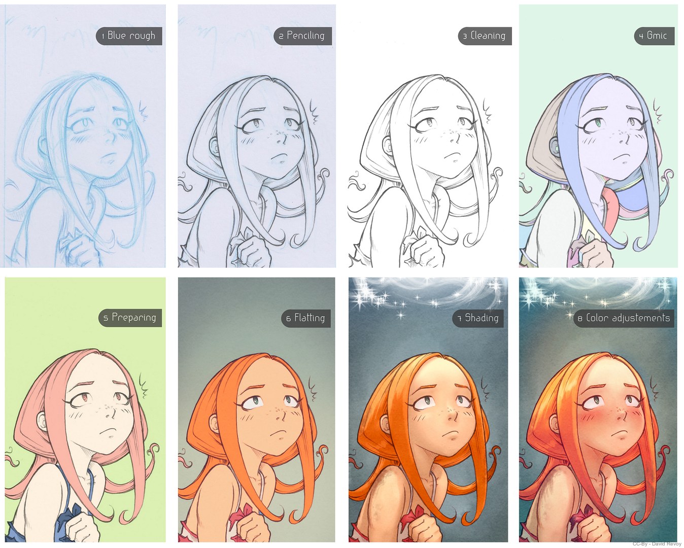
The workflow in a single picture, click to enlarge
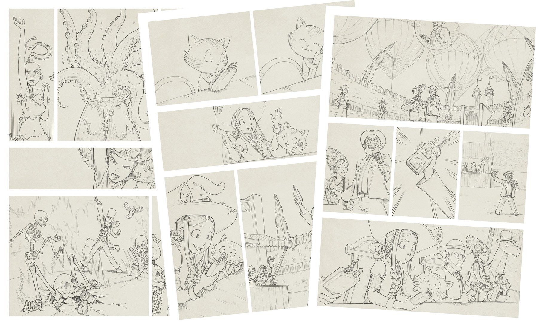
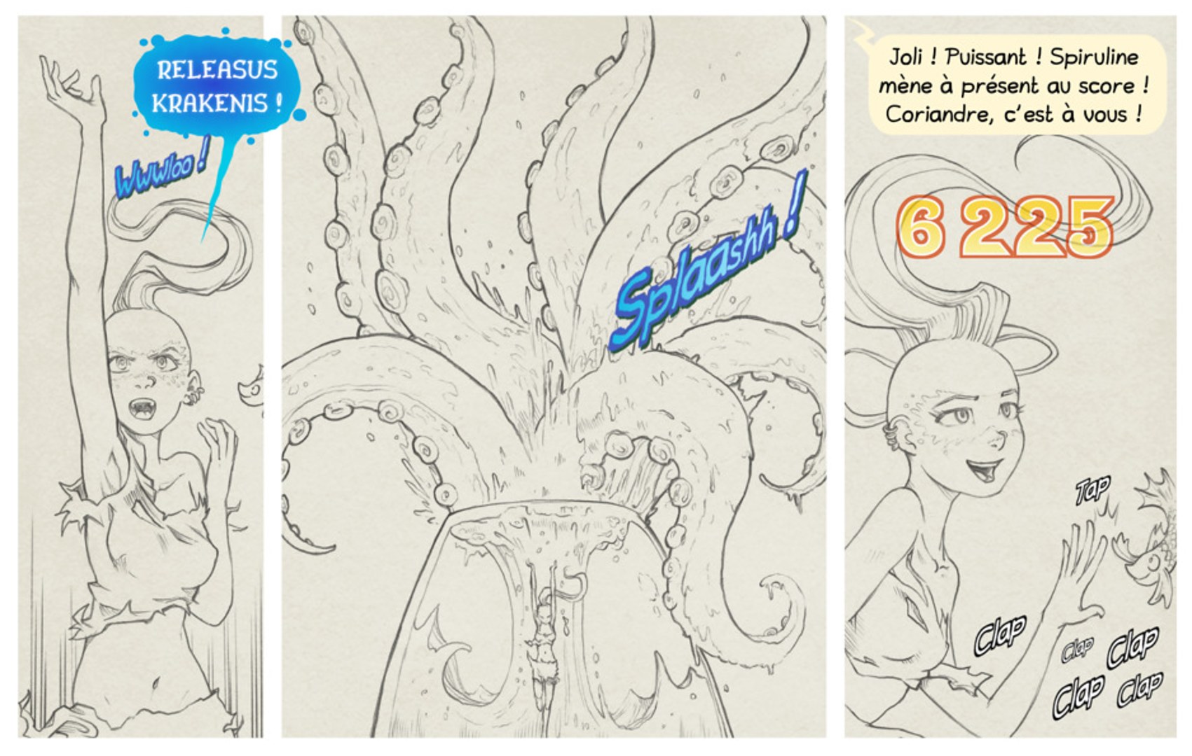
Here is an article about the full steps I used to draw the episode 22 of Pepper&Carrot "The Voting System". I describe on it what worked, what did not and what I learned. It was a production with a heavy focus around traditional penciling and the first time I used the colorize[smart-coloring] Gmic filter far all an episode. This article contains a lot of visual and notes already communicated as extras to my patron during the production of episode 22. Now the episode is released, the article, visual and link can be public.
1. Storyboard
On thin and cheap 80gr/m² A4 (21x29,7cm or 8.3x11.7inches) paper; I pre-printed with my inkjet printer a thin black frame at the same proportion than my digital comic pages, and at the real scale of the printed comic book. I wanted to compose my panels in a WYSIWYG fashion. My tool, a simple soft pencil (2B) with a rounded tip and not a lot of pressure.
I used a lot the eraser for moving parts and sometime full panel or character expression. Having a physical version of my storyboard with this flexibility to easily do quick changes was great to re-read often and modify the story. It was also convenient to get feedback from friends visiting home without going in front of the computer and correct it on the fly directly until we could read smoothly the storyboard.
But it wasn't easy to share it with the online collaborators of Pepper&Carrot and I designed sometime long vertical panel that make sens for the printed version but made the on-screen reading a bit more difficult. Next episode, I'll try to revisit my approach with digital storyboarding and keep the best of both world.
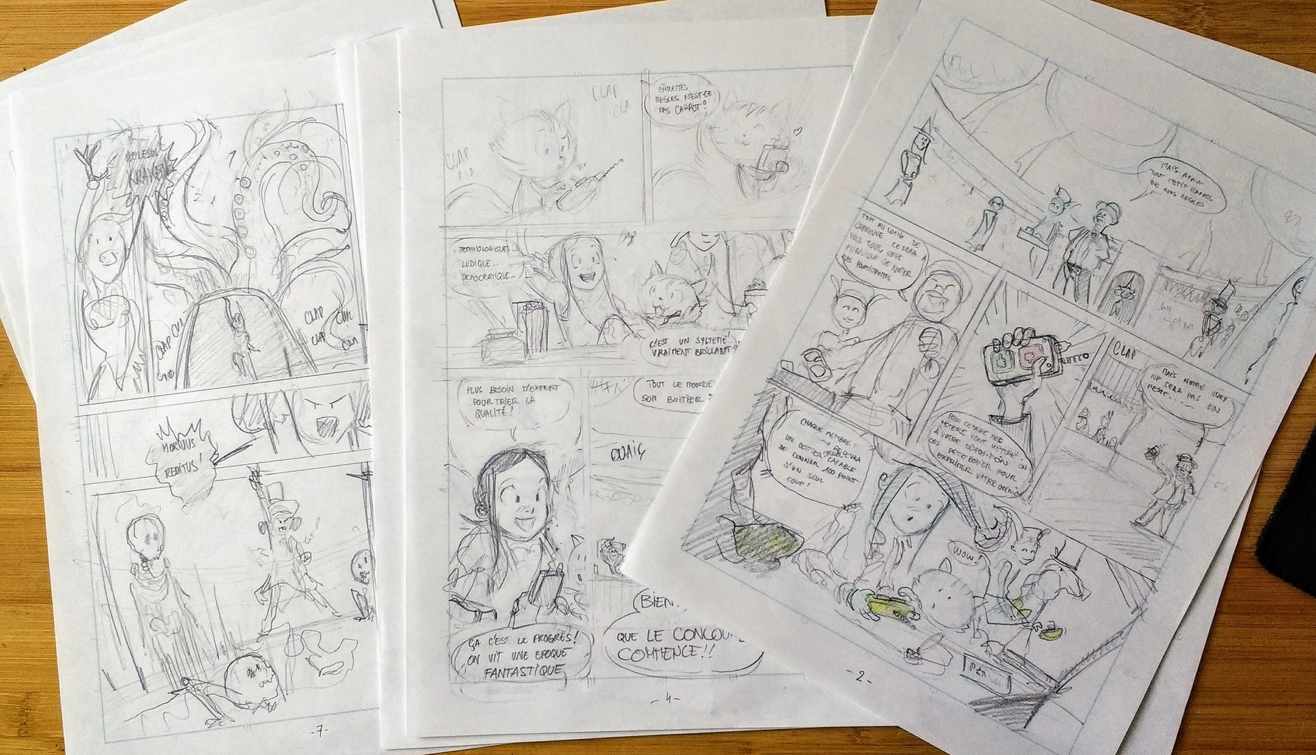
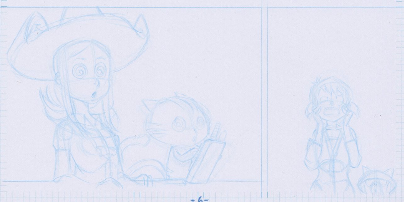
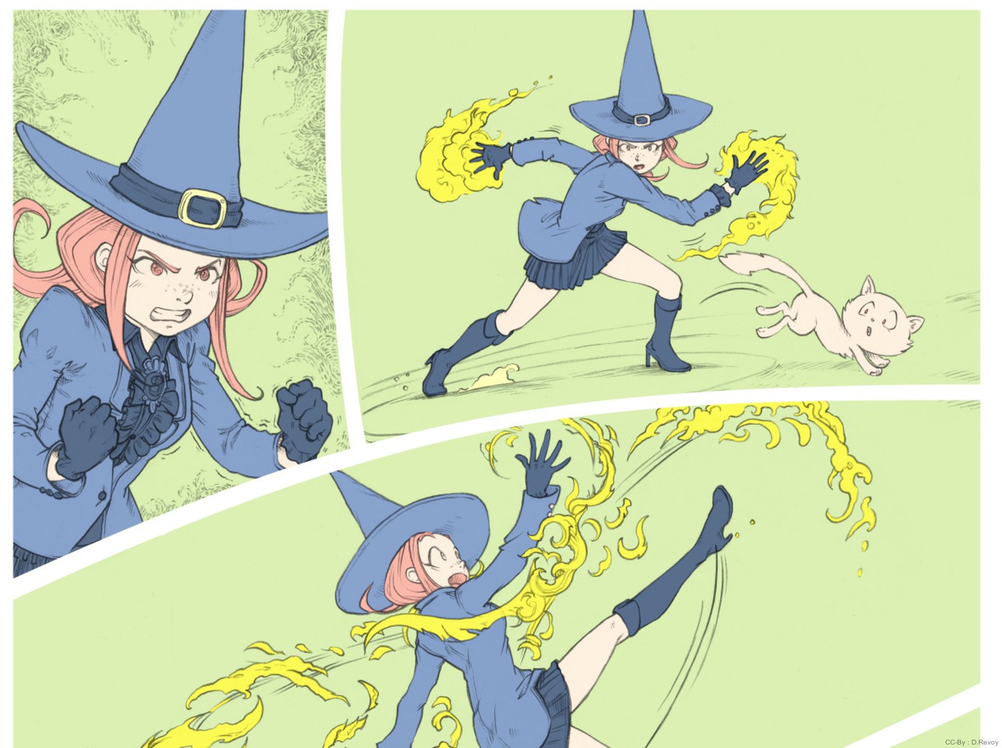
Storyboard of page 7, page 4 and page 2.
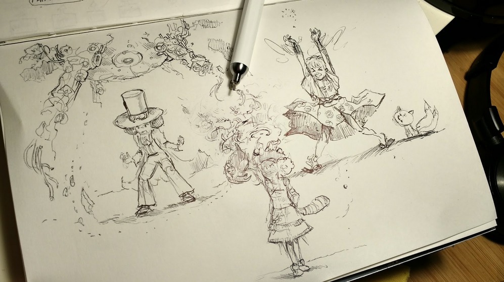
Ball-pen sketch aside the storyboard to brainstorm visually panels:
from left to right: Coriander, Camomille and Shichimi.
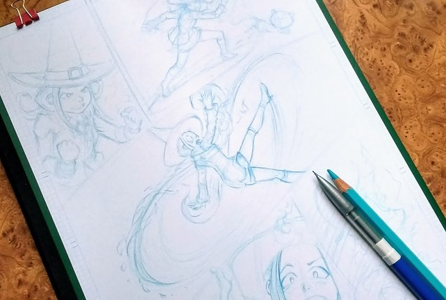
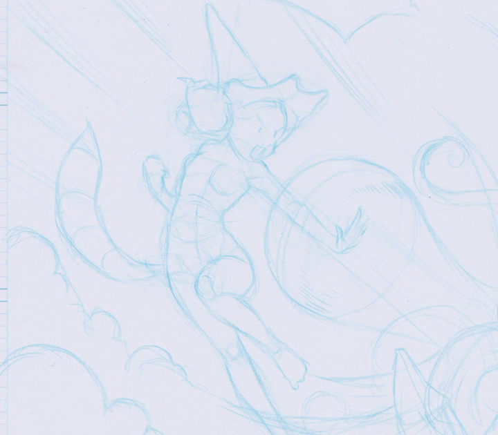
2. Blue rough
On a new smooth cardboard paper (Clairefontaine 205g/m² "Fiches Bristol" A4) also preprinted with a light blue grid maximised to use all the size of the A4, I sketched my panels with a first pass of a large blue pencil (Faber-Castell Polychromos, light Phthalo Blue) with a lot of gesture and focusing on the composition, the main lines.
Then I added a pass with more details using a mechanical-pencil filled with Pentel 0.5mm blue lids. This blue pencils are harder to erase than normal graphite gray pencils. When the drawing was ready, I used a kneaded eraser over all the drawing to fade-out the line, making them very bright but still visible. This step worked perfectly and I was happy with the results and productivity of this pass.
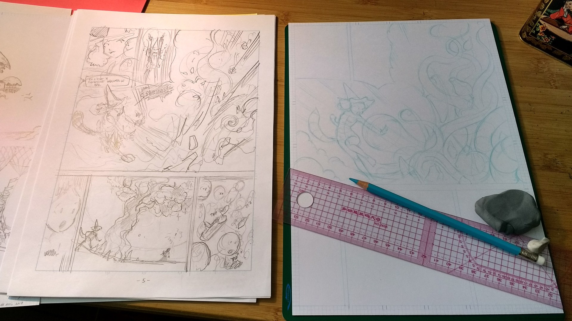
page 5, storyboard (left) and blue rought (right)
Scan of the blue sketch (first pass).
While drawing the two pass of blue over page 8
3. Penciling
I cleaned my bright blue drawings with graphite pencils ; I used mid-hard tip from a range of 3H to HB (Staedler, Mars Lumograph. The blue drawings were unfortunately maybe already too detailed and I had the feeling to just clean-up artwork. I started to focus a lot on the quality of the line itself and unconsciously made a result almost "inked".
I wanted to obtain this sharp line and I applied a lot of pressure on the paper. It wasn't a good idea; I feel like it made my drawing a bit too rigid and also it was painful for my hand at the end of the cleaning and I probably spent more than ten days cleaning this pencil step. In the end, I used mainly a lot the H sharpened a lot to obtain a very thin and precise line.
I used a special sharpener for this, the "Kum long point" and it was perfect for the result of long pointy pencil but also it increased my consumption of pencils because I was sharpening almost ten time a day. I used four H pencils but the pencils are not totally finished and are still long enough to be used with a pencil extender.
During the production I bought a black one in metal of the brand Derwent to try to reuse the last centimeters of my pencils but I couldn't: the grip part of this extender is made of small metal spikes hurting the fingers more than really helping. I'll try to find another extension-technique to reuse my small used pencils.
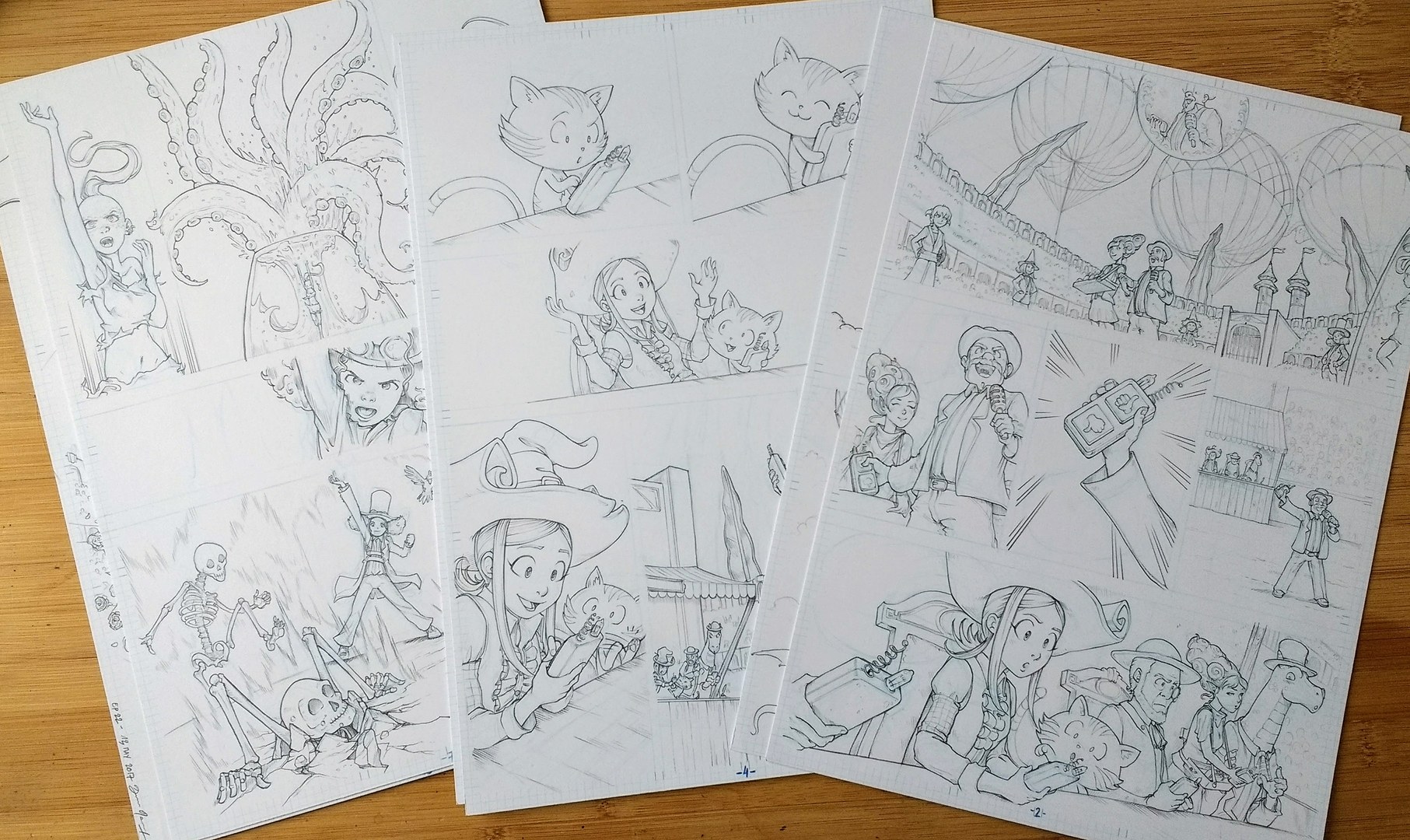
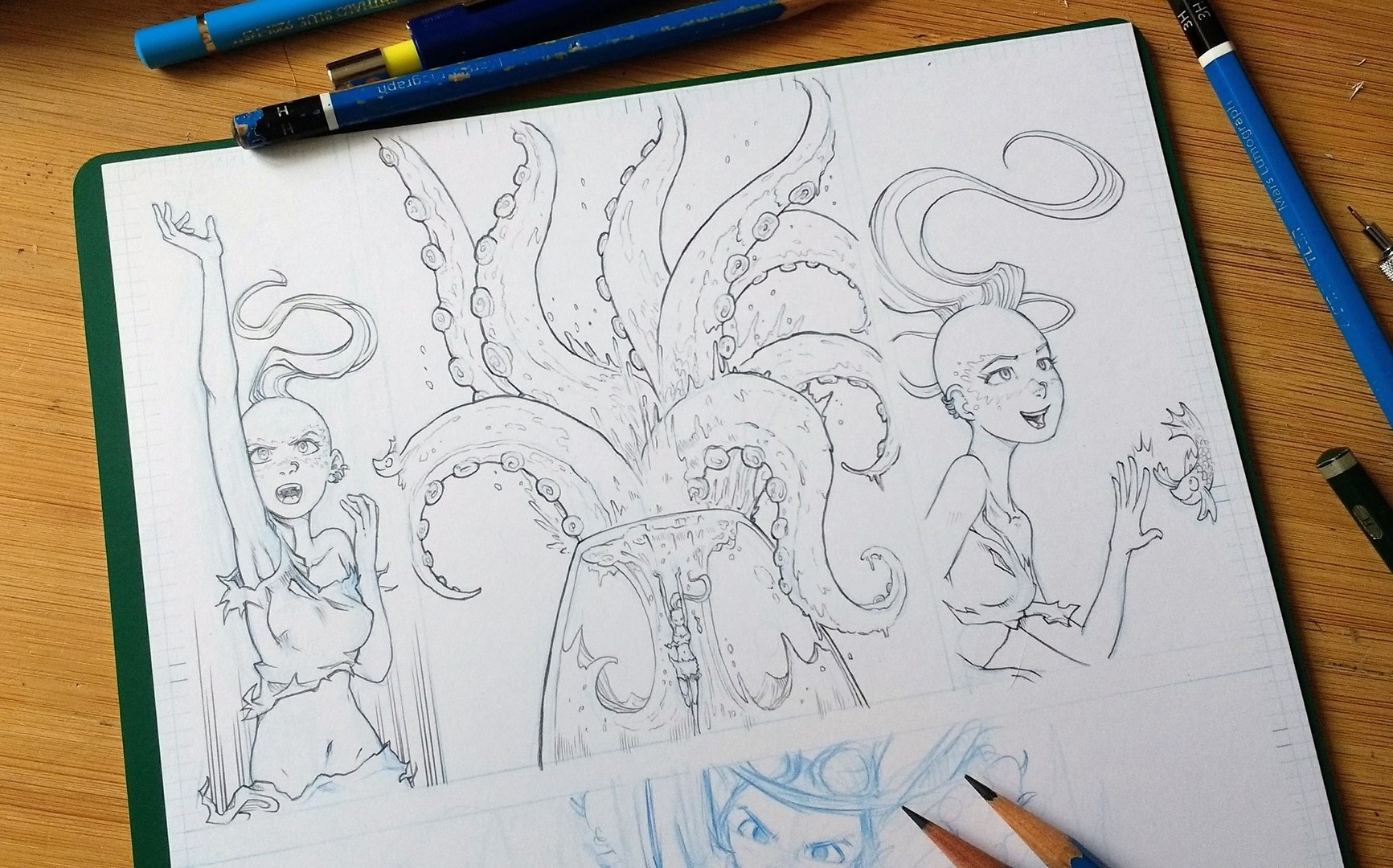
while penciling page 7

Penciling first page
- blue rough: mannequin
- drawing
- second pass for line width corrections
- background and environment
4. Scan and cleaning
I scanned my pages at 600dpi, sRGB using my new CanonScan Lide220 bought in March. I color corrected it with ArgyllCMS and a R110112 color target from Coloraid.de . I scanned the page using a a small bash command-line script I made because all the scanner app with a GUI had issue with getting the color-profiling right.
Once the page scanned, I cleaned them with Krita using the technique of removing the bright blue lines I show in this old tutorial here. I also transformed and deformed sometime the artwork when it was necessary and removed small dots and dust. I obtained a cleaned grayscale image with white background and clean lines.
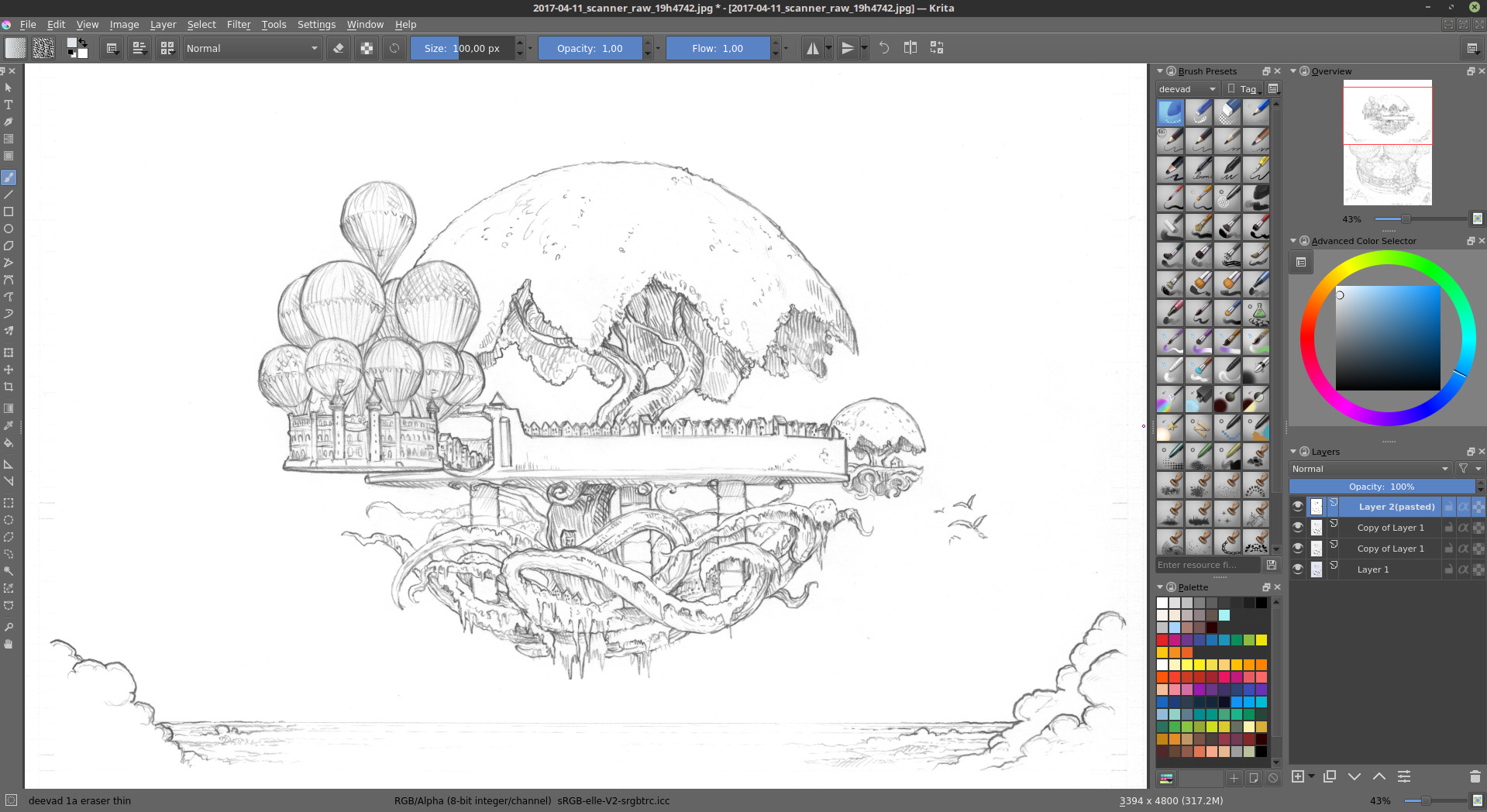
First panel cleaned in Krita. I have a new scanner and it was long to find the right setting.
A set of cleaned pages with warm gray texture to see the border-less white frame panels.
5. Merging page in the translation system
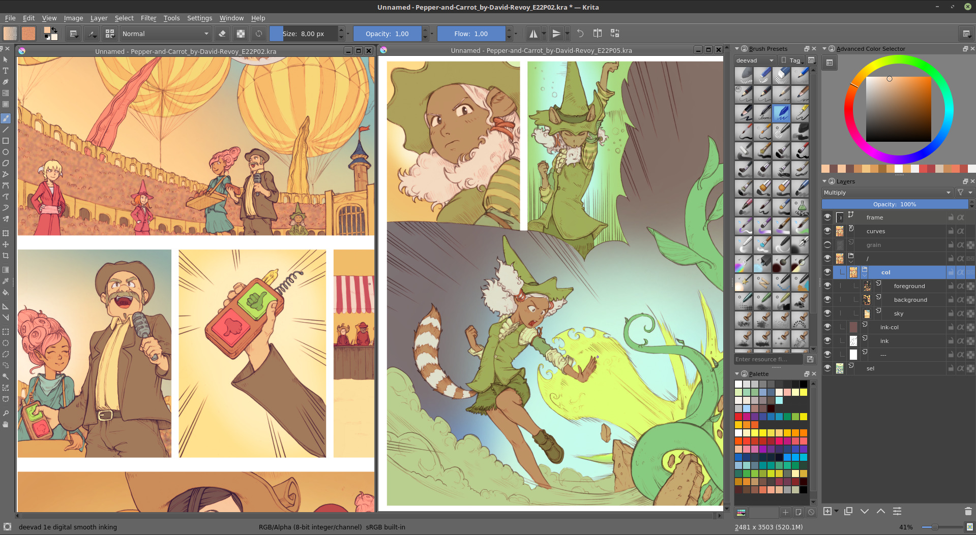
Pepper&Carrot runs a complex setup and pages needs to be setup with very precise standards and format to be compatible with the translation system. I scaled down the page to insert them in the final page template Krita file and started to create the vector white square around artworks draw the white panel's frame around.
Working with white borderless panel and speech-bubbles over white background is impossible, so I added on the top of the artwork a layer in "multiply blending mode" with a warm gray texture, to better see the positioning of the borderless white elements. Then I linked all external SVG files to make the text layer and started to do the lettering thanks to the notes on my storyboard, doing a lot of way and back between Krita and Inkscape for positioning, rescaling and make the two pass working together as if they were done in the same software.
This is a tedious step I really hope I'll be able to skip in the future when Krita will get the vector and text layer compatible with SVG; it will be then possible for me to compose the text over the artwork and then only export the layer to SVG to be integrated in the translation system. Anyway, the pages joined on the first Git commit for the correctors and translators with this black and white textured aspect. During many weeks, we all get used to work on this version of the episode 22.
 Texts and sounds effects are done with Inkscape: all string of text must be vectors objects to be dynamically changed later.
This way the comic can be translated.
6. Preparing coloring
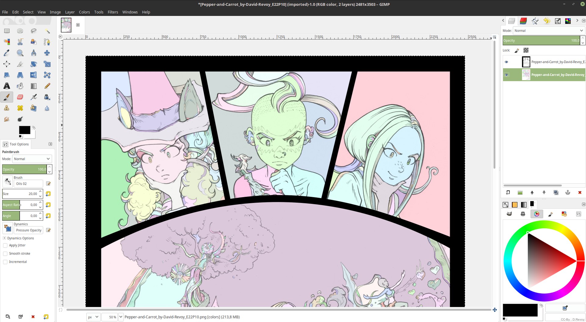
While the translation and correction community effort was starting in background, I kept production for coloring the artwork. I inverted the panel's frame color to get black frames, I removed the gray warm texture, and copied the merged result to GIMP. Gimp has a more recent GMIC plugin than Krita, and it was necessary for me to get a very recent version to use the "Colorize (Smart coloring)" filter.
Fortunately it's easy to select-all in Krita, copy the line-art, and paste it as a new document in GIMP. Gmic "Colorize (Smart coloring)" filter tries to auto-detect the area and auto-fill them with a random color, trying also to close small gap in when the shapes are not well closed. I applied the filter and this one output the result with two layers: the line-art not modified and under it an aliased color map. I only had to select the colored map layer and copy it from GIMP back to Krita.
Then, with the help of an aliased tools ( brush presets in my kit ) and the fill tools ( and selection tools with tool option in 'anti-aliasing turned off') I started to clean the map and replace the color area. I decided to limit myself to 9 shades and a simple palette. ( skin in bright peach color, hair in a watermelon pink, to blues for props and clothes, 3 greens for backgrounds, and 2 yellows for special effects ). Nine shades to be able to perform selection quicker later 'by color', and getting "all hair", "all clothes" or all background selected with a magic wand selection tool click. The "Colorize (Smart coloring)" filter did help a lot to accelerate this step but don't expect it to solve everything; there is still a lot of manual cleaning to do but probably far less work than doing all from scratch.
When the color-map work was over, I selected the one of the characters, background, Fx, and sky and split them on separate layers. I took probably to much time to do this 9 color map, and not used it a lot at the end. Maybe a better idea could be to directly replace the GMIC random color with the flatting and skip this extra step.
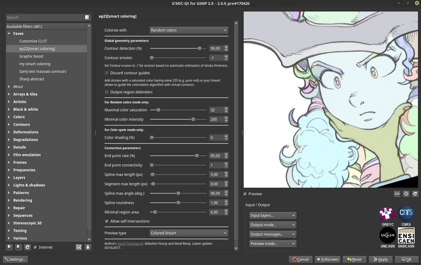
GMIC 2.0 loading my favorite settings for smart-coloring filter and preview on viewport.
The result applied and rendered into GIMP, two layers output.
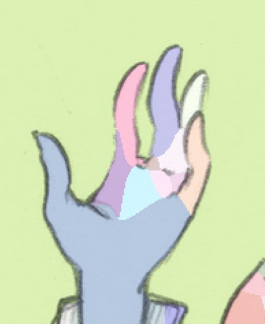
A successful result output of the GMIC filter.
It almost draws the volume of the palm of the hand out of nothing.
--black-magic-- ;-)
The random color map generated imported back in Krita: ready to be colored with the fill tool.
The nine colors used to cleanup all the pages
A prepared page: using only nine colors to split artwork ( skin, hair, two for clothes, background..etc...)
An overview of Krita files with the large thumbnail proposed by PCManFM
while preparing my comic pages.
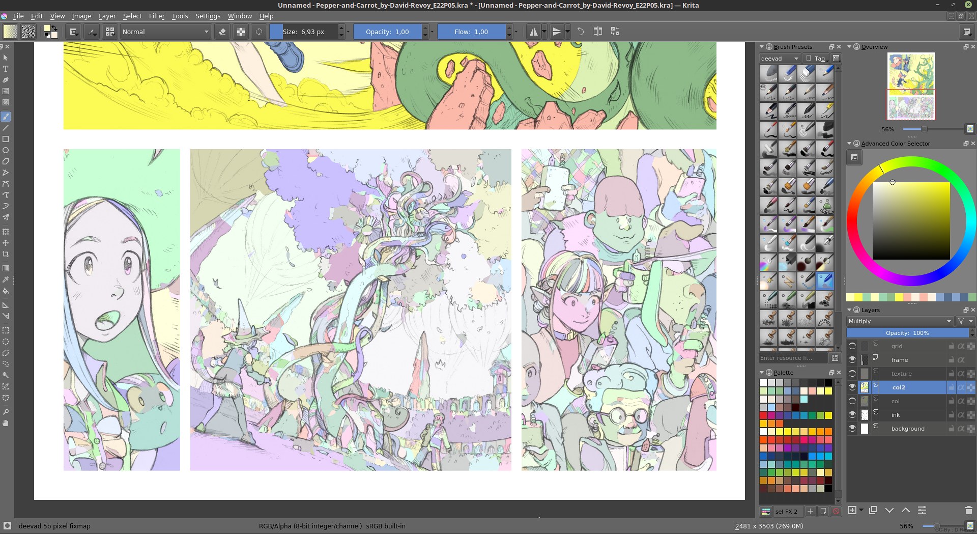
7. Color flatting
I decided to keep my colored layers over the line-art (and not under as usual). I grouped them all and put the whole group named "col" to a multiply blending. This way I was still able to pick the proper ground or color with the "R layer picker" shortcut key in Krita. ( This is hard to do if the line are above the color zones because the "R layer picker" can pick often the line-art layer itself). I was happy with this small improvement.
Then I started to complexity the color-map with a real color palette. I colored as I would color a comic with Old-School flat area only. I kept the color bright and not too saturated to let breath the drawing. I also colored a bit my pencil line-art to be a bit warmer and also I blurred them a tiny bit with the GMIC Smooth[Nlmean] filter.
Doing this step after the color preparing was boring. I was just spending mode time with the fill-bucket tool than with a brush, it's days of being trapped into a "coloring-book" process, keeping the area clean and sharp. It's hard to express any artistic personality in this step.
Replacing prepared area with flat colors in Krita.
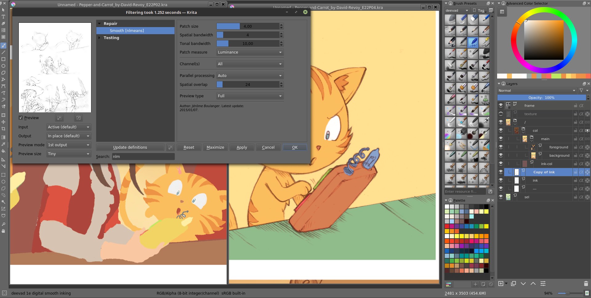
Colored pencil and smoothed grain thanks to the GMIC Smoothing[nlmeans] filter
( default setting on a duplicated layer with 50% opacity, then merged down )
Zoom on a panel: not all is flat ; I used also a gradient for all backgrounds.
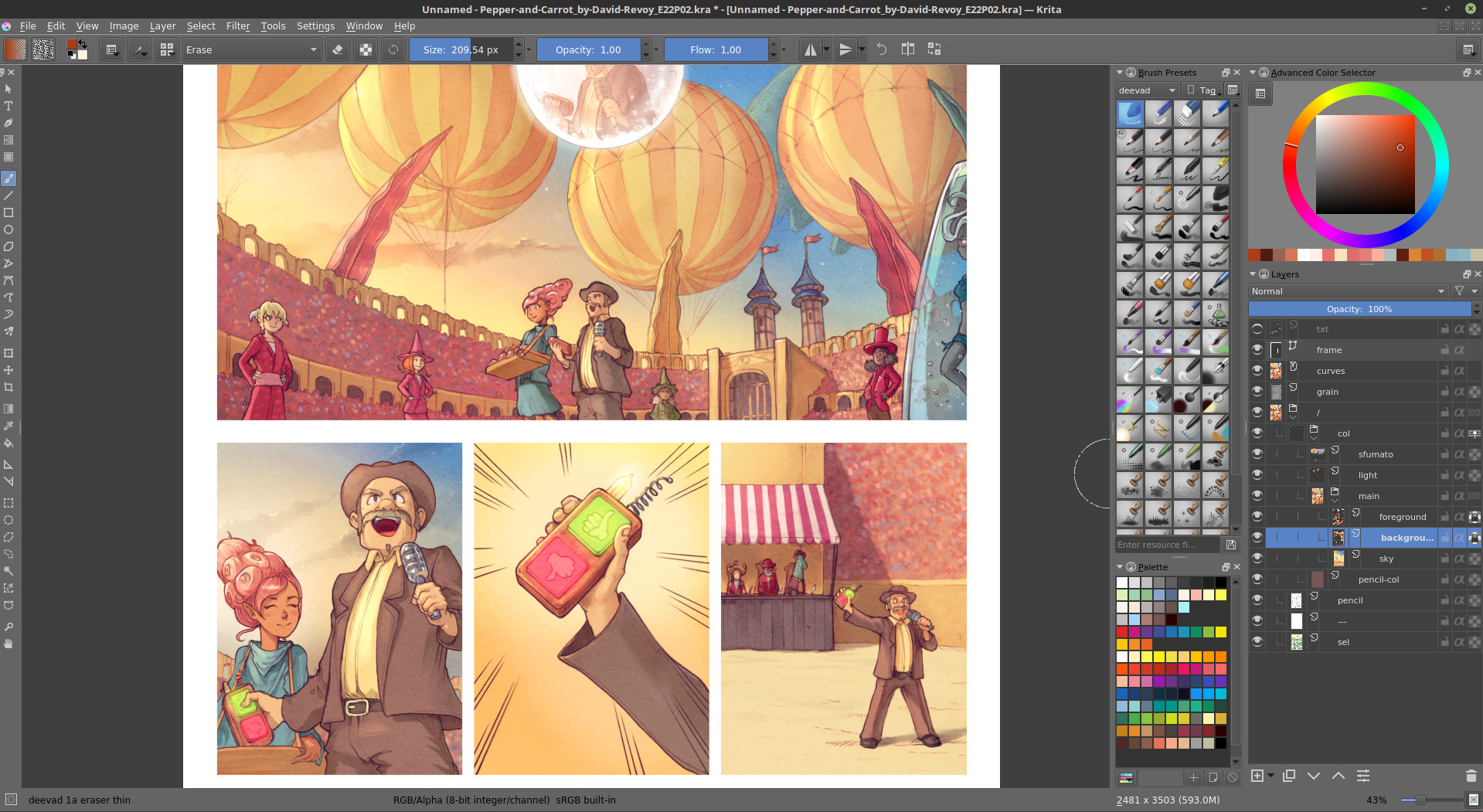
An overview of all the pages with flat colors (with page1 already shaded).
8. Color shading
All my grounds of colors (fg/bg/sky) get quickly sub-grouped with Ctrl+G ; and I added a layer with the "grain merge blending mode" on the top, alpha inherited and filled with a 127/127/127 RGB pure middle gray ( pure transparent for grain merge ). Then I shaded on this layer; warm bright gray for lights, dark cold grays for shading. "Grain-merge" can shade and brighten, and also introduce a color influence, but it also increase quickly the feeling of 'burnt' shadows and overexposed/saturated lights.
My shading method: First pass general with large airbrush; then smudging the shadow with an expressive bristle brush ; then go to the details with a thin brush and create new details expressed only by the shading and not the line of the artwork. Thanks to the area of color cleaned and with alpha protected, it was surprisingly hyper fast to shade this episode.
Maybe one of the rare time in my production where I meet my deadline before my estimation. I understand better why artist in French/Belgium comic studio often use this type of workflow: managing the pencil/ink them-self, get a colorist for the scan/clean/prepare/flatting and only take care them-self of the shading. It's fast and visually quickly rewarding to sculpt the shapes when the flat color area are already clean under and all edges of the lines and shape protected. Even with a dirty shading pass, the result still looks really clean.
Making the shading pass expressive and not clean is even mandatory to break a bit of the too digital and smooth steps before this one.
Shading page 2 with layer stack growing.
shading one page 4: using a "glob" layer over my stack in grain merge
to manage the global mood of warm and cold colors.
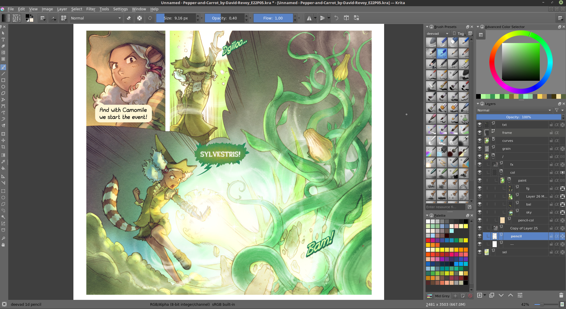
Shading special effects.
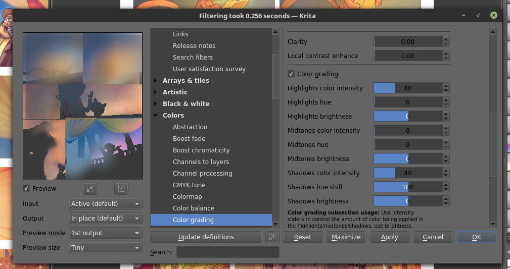
Color grading with GMIC each ground one by one. A bit hard:
The GMIC plugin of Krita can't save "favorite/bookmark" system and can't "apply again" last filter.
Applying color grading on 4 layers x 10 pages quickly grow as a full afternoon of work.
9. Color adjustment, post effect.
I'm flatting my subgroups (fg/bg/sky) to be able to do color correction on each of them. It is still impossible to use a filter on group with Krita, and so it's hard to manage color filter on all the stack without flatting them back together. It's always hard to crunch flexibility of editing and data carefully split into different layers to get the advantage of using other features, but necessary.
I used the GMIC filter color>color grading on all grounds to fix the burn of saturation caused by my usage of the "grain-merge blending mode" as a shading layer. I also adjusted the general color mood with Color balance and adjustment curves. Each layer are also corrected with direct paint-over when necessary and with a normal brush at low opacity to fix the shading edges.
The Final touch was three new layers on the top of my stack: dof ( lighten blending mode, for depth of field, sfumato, smoke, color of the air ), fx ( addition blending mode, for hight lights, glows, special effect and direct source light ) and glob ( grain merge blending mode, just big gradient over the image to unify the colors, and give a cinematic mood to each panels : vignette darken border, corona of source light).
Before publishing, I also added two adjustment layers on the very top of my stack: a classic one to sharpen my details at low opacity, and another one to prevent the crushed black by raising the value and blue channel in the very dark tones of the artworks; it brighten a bit the color pass and give more room for the penciled line-art to express itself with bluish cold tones.
This step was really frustrating because it was hard to perform good color correction with Krita, especially handling the replacement of an unwanted color. Krita has an HSV/HSY/Chroma adjuster, but this one only apply to all the pixels, and can't target a range of pixels ( eg. A certain range of hue to replace a green-yellow to a golden one, or to a range of value to desaturate shadows a bit too burnt by excessive red saturation).
Also, applying this color correction layers by layers in a long stack is far to be WYSIWYG at a part of the workflow where every change for the mood and atmosphere needs subtleties and measurement. Applying color adjustment filters on groups and get a recursive effect on all sublayer would be very useful for this type of workflow.
Also, I wanted to add more post-effect dynamically on top of my artwork (color/chromatic aberration , shifting the channel a bit to benefit a subtle vibration in the bright parts of the magic effect) but this type of filter exist only in GMIC and would require to flat down all the layer stack to use them. This give me ideas of feature request for a distant future.
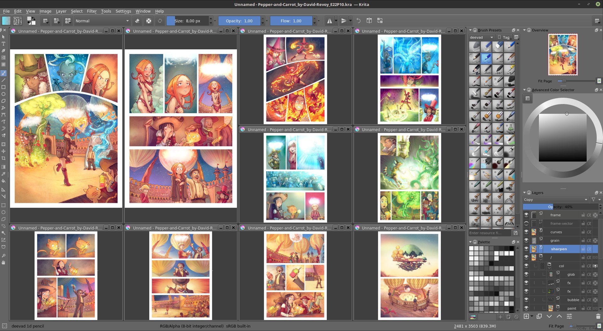
Drag'n'Dropping a sharpen filter layer at 40% opacity over the ten pages. 10GB of RAM memory are necessary to tile the page side by side in Krita like that.
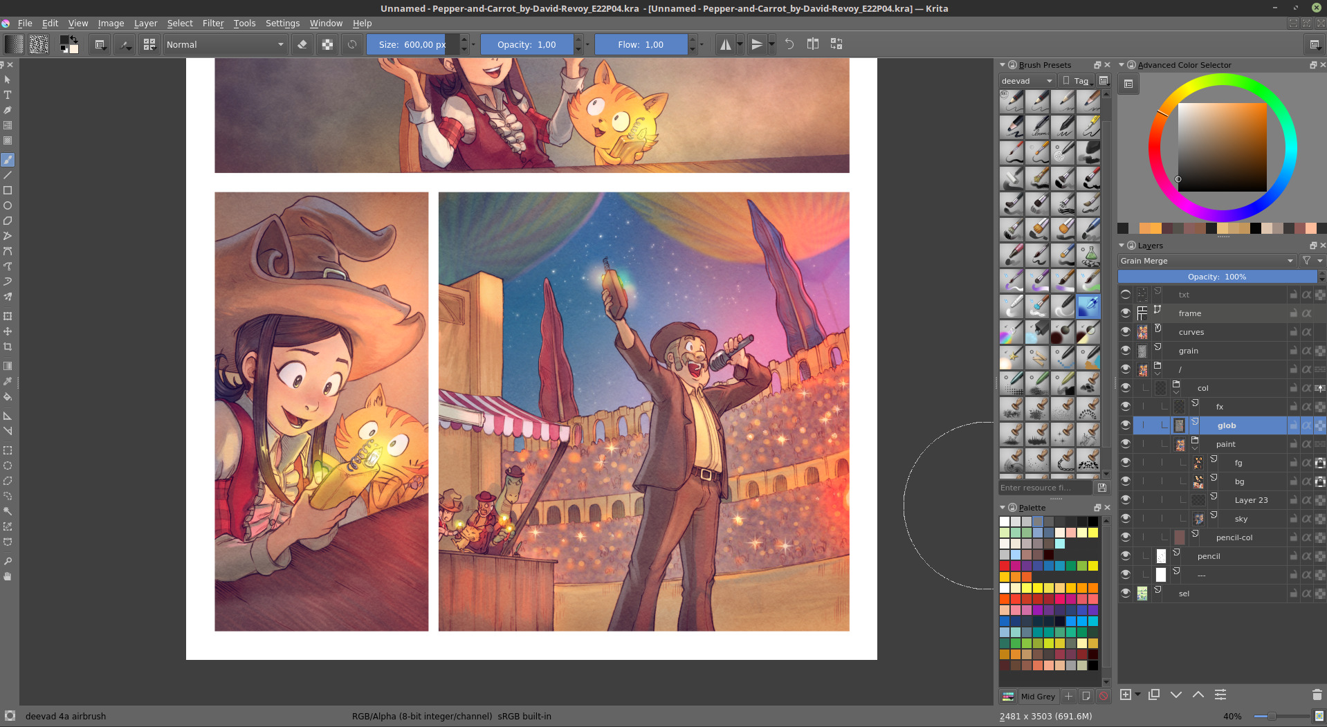
Page 8 , final, with all the stack of shading, effect, sharpening and text.
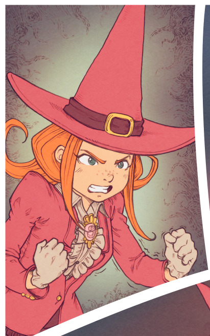
For more visual of the final version just visit the final episode 22 on www.peppercarrot.com here .
Conclusion
Using a "logical workflow" was a rich experience and a good teacher: I learned to keep the discipline of applying logical steps over the 10 pages, trusting the next step to bring something 'better' over the previous step. This workflow is clearly an industrial approach, the research of something I can reproduce at 100% and even split into a set of task within a small team. I wanted to experiment with this idea of a small webcomic studio. It works.
But making a comic this way alone was also really boring and most step were like 'cleaning pixels here or there' : robotic and full of constrains. This way to handle things is not really related or in sync with my core passion for drawing or digital-painting. However, the logical steps did help me to get a cleaner (and sometime faster) workflow than what I'm doing usually. For this long story of ten pages, it was probably the best choice.
To use a metaphor: this technique is a bit similar to the step necessary to build a pyramid adding a cube step by step on each other waiting to get final "Tadaaa♬ ♪ ♩" effect at the end when adding the last cube at the top. If the base of the pyramid is weak (the pencil artwork, preparation of color map) there is no way to save the stack at the end and the last cubes will fall. It's probably something totally inverted compare to my speedpainting in grayscale, coloring, and detailing at the end.
For the next episode (23) , I'll try to not over-react to this experience and not go to a fully organic workflow, sketchy, speedpainterly and chaotic. I'll try to keep the same steps with a bit of more room for creative freedom and I have already an idea how... But that's another story on my quest for the next episode 23.
Thank you for reading!
