@tsadiq The glitch-soc fork of Mastodon does this, the server I'm on runs it. It was introduced back when vanilla mastodon was cropping thumbnails to 16:9 rather than showing the whole picture, so it was an improvement then, but a regression now…
@tsadiq Hey, I have to agree, why pillar, or postbox content to get it to the right aspect ratio. I *think* you can set the crop, but I don't usually bother.
I can read it from the mastodon thumbnail, but it is all small enough that I'd like to click in on it for full size in order to not need to spend quite as much cognitive effort in reading.
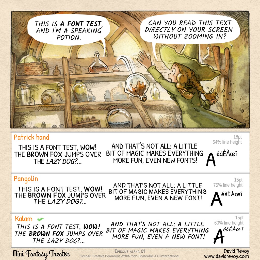
For differences, not that much. Most difference in the bold part. Kalam is significantly less readable in bold to me.
For the rest I have a very slight preference for Pangolin.
Yes. Sized your comic down to 360px (67% zoom on Mastodon web) and I can still see text legibly.
Liking Kalam over Pangolin any day of the week: it bears no raggedness and cursive looks fancy. If thickness was a priority, I would pick "Patrick hand", though.
@vintprox Thank you! Yes, Kalam has more personality. You are right: maybe a little bit thicker would only help. I'll try to see if I can fork it and automatize a slight offset outside to get it thicker with Fontforge.
I'm using the app Tusky. In the feed, 1 and 2 are nicely readable, 3 is ok-ish, but not that good.
When I view the post, the image gets rendered a bit bigger. 3 is then a little bit better, but it still has worse readability than the first two.
When I then open the image, all 3 fonts are readable. Since the image becomes more clear on opening, I suspect that the scaling slightly blurs the image in the timeline/post view, which degrades the readability more for 3 than for the others
@elvith Thank you for the feedback! I like Kalam personnality (the 3rd), but it's true the two other are easier to read and Pangolin (2nd) is even more compact.
For sure, I'll can't use them ready-made and I'll have to fork to adapt them a bit.
Oooh, interesting. I think this font comparison has made me realise that slanting capital letters slightly helps me read all-caps font better. Kalam is much easier to read than either of the others. The clear difference between bold and light helps, as well. So does the use of both rounded and sharp forms and some serifs.
(I'm lightly dyslexic, I think? 100% dyscalculic, issues with letters mostly occurs if everything is all-caps. Very difficult to parse and keep my place.)
Hmm was trying to figure out what comics I read as a kid that had all-caps fonts, but checking back it actually looks like none of them used all-caps at all.
But I know with more modern comics the slight slant helps if they've decided to go for all-caps. More serif the better. There's also hand-inked ones I've seen that keep it all-caps and not much slanted or serif but have varied weight in each letter which also keeps it readable (the other two here have the same weight all throughout each letter which makes everything that much harder to parse) - comic I was thinking of that does this is In Security.
★
on akkoma FE, it looks slightly smaller and harder to read than mastodon because there’s a image height here is smaller than on mastodon i guess? i can read them, but i would be more comfortable opening the image. the lowercase letters are also hard to read as is, even though the size is probably comparable to the post font size.
as for the original size and the full width size for phone, they’re big enough, bigger than the font size i have for text, so it’s alright
@ivy@xarvos Thanks! TIL about Akkoma. Cool. It's not the first client I see in my feedback who takes 16:9 format as a standard and downscale all format into it. On the good news, I don't see many feedback about client who are 'cropping to 16:9' anymore. So, with this type of client, if you follow a webcomic, you always have to click to view page? You can't just read them in your TL, right?
yup, have to click the image to open it bigger on akkoma's mobile webui :neocat_happy_blep: (although ivy can make out the first font there on it without leaving the timeline, but of course, some others may think differently)
★
Yes, I can read this text, but I have a hard time deciding what’s better. Kalam most interesting, but harder to read, Patrick a bit dense, Pangolin least interesting, somewhat static …
@ArneBab Thank you! I feel like I should fork Kalam and make it a tiny bit thicker because I agree: this one has the most charm but its readability is not optimized. I probably also should bake the idea line-height as 100% to save time using it if I fork it. Oh yes, fonts are hard, and changing it later in the project is almost impossible, so I try to prepare well this part ahead.
forking Kalam sounds like a lot of work, too. I once added a few letters (äöüß) to a font I loved and even that took ages — though it just meant copying together stuff from other letters and tweaking it a bit.
Getting all that to fit together well seems like an art form.
@ArneBab 😺 After the work I did on Lavi (the base one for Pepper&Carrot) I'm not afraid of anything with font-forge! 😆 (missing accents, Latin extended, etc)
1 is the easiest to read, I had to open the image and zoom for the fonts in the bubbles, but not for font examples 1 and 2..! and I think 1 looks really cute!
@toffy Thank you for the feedback. My ideal would be a blend of (1) for readability and (3) for the charm and personality. I'm still not sure if I should fork Patrick Hand (1) or Kalam (3) as a starting point.
What do you think in 3 is the most difficult to read? - the character spacing? - the slight italic? - the font weight (to thin)? - A mix of all of this?
I think what makes it difficult is the italic, and something I don't think has been mentioned yet: many of the lines that make up letters overextend a lot, like in the middle line in the "A" and "H", which adds noise and makes it harder to read fast. Some of the letters are hard to parse at a smaller res too, like the "W" is especially difficult where it wraps back on itself
3 has more personality but is definitely less readable, and that's my best guess as to why!! It might not be right aha, it's more stylish but just way more noisy and less standard
I'd love the shape-correctness of 1 with a hint of the style in 3 while maintaining a familiar shape ahah
@davidrevoy@framapiaf.org I found Pangolin to be the most comfortable to read, but all are quite legible here. Tried it on a few different clients for comparison.
No alt text on images as they're screenshots of the previous post taken with my Android phone using various fediverse software (Moshidon, Sharkey's default PWA, Milktea, and Pixelfed).
@davidrevoy@framapiaf.org Readable on Firefox and Kaiteki (clearer on screen than the screenshot suggests). All three options are legible, license is the only part that I needed to actively focus to read. Did not need to zoom or open the image separately at any point.
Not much useful feedback here, sorry: I can read all three with no problems without zooming in! :neocat_thumbsup:
If I was forced to choose between those three... I think I'd go with the first one? I like the slanted letters a tiny bit less than the straight ones... :neocat_smol:★
@steffo Thank you for the feedback. It looks like Patrick Hand (1) champion the readability from the all feedback I receive.
I now wonder if it will be possible to fork Patrick Hand and add a little charm to it. Because that's something I like in Kalam: it has a personality and a stronger identity while PatrickHand is a bit more stereotypical. Maybe I'll improve them to get the best of each.
@efi Thank you Efi. I started with a list of 8 ! Yes, these three one with the correct line-height are really not that bad.
With the amount of feedback I already have, I see Patrick Hand is championing the readibility, and Kalam has charm. Pangolin is rarely mentioned. So, I'll probably work on getting the best of (1) and (3). :blobcat:
@Pandora Thank you for your feedback. I had the same feeling, but it's not really shared in my feedback. For PatrickHand (1) the FONTS has the F that touches the O almost while on Pangolin I find the letter spacing and integrity better respected.
@Pandora :neko_nyaan: Oh no, and well spotted and my mistake for quickly writing the sentence on the top of my head. I have to remember this brown fox is quick :)
I find the third one to be the most difficult to read, mostly because of being thinner. Both of the others are clear, and personally I prefer the first. But this is in multicolumn view where the width is 6.7cm. If I open in a single column, all are quite readable at 13 cm width. iMac 2560 x 1440 x old guy with early macular degeneration.
BUT I am most concerned about the Brown Fox. They are no longer Quick? I guess age comes for all of us.
Strange: I can read the font in the comic (Kalam) quite well and I like it, but in comparison with the other fonts Patrick hand is readable best. Perhaps I'm too used to "regular sans" fonts.
@AxelStieglbauer Thank you for the feedback! yes, I think I'll have to pick the best attribute here and there, probably building on the top of Patrick Hand(1), I start to have feedback this one is the easier to read (many scaling, screen size, jpg compression of various Fediverse clients, this is a cool indicator that author of PatrickHand made something effective.
@allpurposemat Thank you for the feedback and the screenshot; it's especially precious for me to see the rounded corners and the overlay of icons (the eyes/Alt position), this way I'll build safe guidelines on where to statistically not put important elements or future texts.👍
@norihiori Thank you for the feedback! Also, it's rare Kalam got supporters in the replies of this test, it feels problematic at multiple levels (even one technical with the slight italic built-in of the font making antialiasing issues when reduced at low size with heavy JPG compression.). PatrickHand got a larger consensus.
Kalam, I have trouble reading in the thumbnail. Pangolin isn't too bad, Patrick hand is better than almost any fonts in a thumbnail. I hope the names I typed are correct.
@jigmedatse The names are correct! And don't worry, even if you wrote them as kolim, Pingolan and PitrookHound 😆 I would have guessed about what the font were. Thank you for the feedback, what you experienced and reported is aligned to many observations I receive and I'll move forward to the next step; forking PatrickHand (it received a large consensus) and improve the font a bit (I dislike the Z, some kerning, and some letters could get a bit more charm or customisation). 😊
@albi Thank you for testing it and the size of the device. Yes, Kalam (3) with problematic to many. It definitely changed my mind about it, because in my tests, that was the one I selected (see the little green checkmark). Now I know I must probably fork PatrickHand (1) and fix some things in it: kerning of letters too near to each other, weird Z, lack of personality in general. I'll keep posting about my progress.
@davidrevoy@framapiaf.org Whilst Patrick Hand is the most readable, you lose the emphasised wording compared to Pangolin and Kalam. I prefer Pangolin for that reason. Perhaps if there was something that fit between PH and P just so readability, and emphasis's aren't lost
@amoonrabbit Oh, thank you for finding that and reporting it (the bold/emphasis). Indeed, that's something I need to fix on my future fork of PatrickHand (it got a lot of positive feedback so better to start with this base material for my fork). True, the emphasis is not dramatic or contrasted enough (probably a side effect of using the font in full caps). It's barely readable the 'Brown fox' is bold.
@lord_tacitus Thank you for the feedback! Yes, Fedilab and Tusky reported to be of very good quality on my replies about displaying the attached square picture large enough in the TL and without cropping them or showing it as a 16:9 thumbnail. It's cool for posting webcomics!
I could read the text on my laptop without zooming in. :taneŝima_gesto_bone: (But I still prefer viewing images at full size, since that’s just prettier and much more comfortable.) :gutkato_kontenta:
Out of the fonts showcased at the bottom, I find Pangolin the most legible. Out of the other two fonts, the left sample is more legible with Patrick hand, while the right sample is more legible with Kalam. :gutkato_pensas:
Everything is clear and readable. I've found Pangolin option to be most visually pleasable, but I don't think I would spot the difference (or care about it) in actual comic.
★
Je peux tous les lire facilement, mais je trouve Kalam légèrement moins lisible. Ça va pour des textes de cette taille, mais ça pourrait se compliquer si tu écrivais des pavés !
@loaExMachina Merci pour le retour ! Ha oui les pavés, c'est problématique. Hier, j'ai déterminé dans des tests que les bulles de 130 caractères prenaient 1/2 de la case. Va falloir que je reste concis en écriture de dialogues.
I could read all of them without zooming, but I'm on a Galaxy S22 Ultra...
I like the Patrick font the best, it's the only one of the three that looks to me like "comics lettering" and not "computer font doing comics lettering" (in particular it reminded me of the lettering from Garfield strips). I think what makes the other two look more computery is the kerning in the second one and the excessive letter-spacing in the third one.
How to use this? (click here to unfold) Open a new Mastodon account on the server of your choice. Then, Copy/Paste the adress above in your Mastodon 'Search' field. The post will appear and you'll be able to fully interact with it. You'll have full control of your posts: edit, remove, etc. After that, your message will appear here.
Just please note that it may take up to 12 hours for your changes to be reflected here.


 86 -
86 -  247
247
111 comments
ScribblersEmporium@mastodon.world
I find #1 Patrick's Hand example easier to read.
Good luck.
★castaras@tech.lgbt
when i click on the specific post it's readable, and I'd say Pangolin and the text on the comic itself is most readable.
on my timeline without clicking on the post it's a bit hard to see (picture is from the timeline)
🖼️ originallamecarlate@pouet.it
Do you need answers from us or is this a personal test :P ?
tsadiq@rivals.space
i can't and i can at the same time 😬
🖼️ originaldavidrevoy
@tsadiq Oh thanks for the two screenshots! 👍
What is the client that scale down the square on a 16/9 + gradient on side ?
(and who are the dev who made this atrocity and why they hate comic artists so much? 😺 )
3 ★tsadiq@rivals.space
hmm i think it's just the basic glitchsoc web interface ^^
kapellosaur@stctp.zone
@tsadiq The glitch-soc fork of Mastodon does this, the server I'm on runs it. It was introduced back when vanilla mastodon was cropping thumbnails to 16:9 rather than showing the whole picture, so it was an improvement then, but a regression now…
davidrevoy
@kapellosaur @tsadiq Ha right. For sure, it is better this way than experience cropping. Thank you for the feedback!
★tsadiq@rivals.space
yeah indeed i can change that in the options, not quite sure what i prefer tho 😅
🖼️ original ★@kapellosaur
jigmedatse@social.jigmedatse.com
@tsadiq Hey, I have to agree, why pillar, or postbox content to get it to the right aspect ratio. I *think* you can set the crop, but I don't usually bother.
★maswan@mastodon.acc.sunet.se
I can read it from the mastodon thumbnail, but it is all small enough that I'd like to click in on it for full size in order to not need to spend quite as much cognitive effort in reading.
For differences, not that much. Most difference in the bold part. Kalam is significantly less readable in bold to me.
For the rest I have a very slight preference for Pangolin.
vintprox@techhub.social
Yes. Sized your comic down to 360px (67% zoom on Mastodon web) and I can still see text legibly.
Liking Kalam over Pangolin any day of the week: it bears no raggedness and cursive looks fancy. If thickness was a priority, I would pick "Patrick hand", though.
davidrevoy
@vintprox Thank you! Yes, Kalam has more personality. You are right: maybe a little bit thicker would only help. I'll try to see if I can fork it and automatize a slight offset outside to get it thicker with Fontforge.
2 ★jaredwhite@indieweb.social
@vintprox Kalam but a little thicker would look dope!
★elvith@nerdculture.de
I'm using the app Tusky. In the feed, 1 and 2 are nicely readable, 3 is ok-ish, but not that good.
When I view the post, the image gets rendered a bit bigger. 3 is then a little bit better, but it still has worse readability than the first two.
When I then open the image, all 3 fonts are readable. Since the image becomes more clear on opening, I suspect that the scaling slightly blurs the image in the timeline/post view, which degrades the readability more for 3 than for the others
davidrevoy
@elvith Thank you for the feedback! I like Kalam personnality (the 3rd), but it's true the two other are easier to read and Pangolin (2nd) is even more compact.
For sure, I'll can't use them ready-made and I'll have to fork to adapt them a bit.
CalcProgrammer1@mastodon.social
I can easily read all the fonts on my phone running mobile Firefox with the web interface. No zooming required.
len@nyan.network
Oooh, interesting. I think this font comparison has made me realise that slanting capital letters slightly helps me read all-caps font better. Kalam is much easier to read than either of the others. The clear difference between bold and light helps, as well. So does the use of both rounded and sharp forms and some serifs.
(I'm lightly dyslexic, I think? 100% dyscalculic, issues with letters mostly occurs if everything is all-caps. Very difficult to parse and keep my place.)
davidrevoy
@len I experience the same ( ‘-’)人(゚_゚ ) (slightly dyslexia and also dysgraphia here https://en.wikipedia.org/wiki/Dysgraphia , diagnosed when I was a kid)
★len@nyan.network
Hmm was trying to figure out what comics I read as a kid that had all-caps fonts, but checking back it actually looks like none of them used all-caps at all.
But I know with more modern comics the slight slant helps if they've decided to go for all-caps. More serif the better. There's also hand-inked ones I've seen that keep it all-caps and not much slanted or serif but have varied weight in each letter which also keeps it readable (the other two here have the same weight all throughout each letter which makes everything that much harder to parse) - comic I was thinking of that does this is In Security. ★
xarvos@outerheaven.club
on akkoma FE, it looks slightly smaller and harder to read than mastodon because there’s a image height here is smaller than on mastodon i guess? i can read them, but i would be more comfortable opening the image. the lowercase letters are also hard to read as is, even though the size is probably comparable to the post font size.
as for the original size and the full width size for phone, they’re big enough, bigger than the font size i have for text, so it’s alright
xarvos@outerheaven.club
oh i should add that the preview is very small on mobile
🖼️ original ★davidrevoy
@xarvos Thank you for the screenshot! Indeed, I can imagine with this layout. It looks very small. What Fediverse client is it?
★ivy@labyrinth.zone
@xarvos
looks like the mobile akkoma web UI :neocat_happy: ★
davidrevoy
@ivy @xarvos Thanks! TIL about Akkoma. Cool. It's not the first client I see in my feedback who takes 16:9 format as a standard and downscale all format into it.
On the good news, I don't see many feedback about client who are 'cropping to 16:9' anymore.
So, with this type of client, if you follow a webcomic, you always have to click to view page? You can't just read them in your TL, right?
#akkoma
xarvos@outerheaven.club
@ivy yea, usually. though on computer i can read with your font size (screenshot below), it’s still more comfortable for me to open the image
🖼️ original ★ivy@labyrinth.zone
@xarvos
yup, have to click the image to open it bigger on akkoma's mobile webui :neocat_happy_blep: (although ivy can make out the first font there on it without leaving the timeline, but of course, some others may think differently) ★
xarvos@outerheaven.club
this is akkoma web (mobile)
★ArneBab@rollenspiel.social
Yes, I can read this text, but I have a hard time deciding what’s better. Kalam most interesting, but harder to read, Patrick a bit dense, Pangolin least interesting, somewhat static …
I recently did something similar with LaTeX fonts, and it’s just damn hard: https://www.draketo.de/anderes/latex-fonts
★davidrevoy
@ArneBab Thank you! I feel like I should fork Kalam and make it a tiny bit thicker because I agree: this one has the most charm but its readability is not optimized. I probably also should bake the idea line-height as 100% to save time using it if I fork it.
2 ★Oh yes, fonts are hard, and changing it later in the project is almost impossible, so I try to prepare well this part ahead.
ArneBab@rollenspiel.social
forking Kalam sounds like a lot of work, too. I once added a few letters (äöüß) to a font I loved and even that took ages — though it just meant copying together stuff from other letters and tweaking it a bit.
Getting all that to fit together well seems like an art form.
Though, well, art *is* what you’re doing.
★davidrevoy
@ArneBab 😺 After the work I did on Lavi (the base one for Pepper&Carrot) I'm not afraid of anything with font-forge! 😆 (missing accents, Latin extended, etc)
★toffy@raru.re
1 is the easiest to read, I had to open the image and zoom for the fonts in the bubbles, but not for font examples 1 and 2..! and I think 1 looks really cute!
★davidrevoy
@toffy Thank you for the feedback. My ideal would be a blend of (1) for readability and (3) for the charm and personality. I'm still not sure if I should fork Patrick Hand (1) or Kalam (3) as a starting point.
What do you think in 3 is the most difficult to read?
★- the character spacing?
- the slight italic?
- the font weight (to thin)?
- A mix of all of this?
toffy@raru.re
I think what makes it difficult is the italic, and something I don't think has been mentioned yet: many of the lines that make up letters overextend a lot, like in the middle line in the "A" and "H", which adds noise and makes it harder to read fast. Some of the letters are hard to parse at a smaller res too, like the "W" is especially difficult where it wraps back on itself
3 has more personality but is definitely less readable, and that's my best guess as to why!! It might not be right aha, it's more stylish but just way more noisy and less standard
I'd love the shape-correctness of 1 with a hint of the style in 3 while maintaining a familiar shape ahah
davidrevoy
@toffy Thank you very much. It helps me to collect feedback and get a larger overview and hints on where to improve these fonts.
★jacobscharmberg@mastodon.online
can read everything fine on my phone with vanilla mastodon client. Disclaimer: I have quite good eyes.
🖼️ originaldavidrevoy
@jacobscharmberg Thank you for the feedback and the screenshot :blobaww:
★andreasdotorg@infosec.exchange
Patrick hand is the most readable, Kalam is the cutest.
davidrevoy
@andreasdotorg Perfect! I had the same conclusion. If only I could find a way to merge the best of the two :blobowoevil:
SRAZKVT@tech.lgbt
1st and 2nd are easier to read than 3rd imo
★davidrevoy
@SRAZKVT Thank you for the feedback! 👍
Do you think it's because of the font-weight? the character spacing? or maybe it's the slight italic of Kalam who is distractive?
★SRAZKVT@tech.lgbt
mix of italic and font weight, character spacing is fine
★davidrevoy
@SRAZKVT Thanks!
★Andre_LA@mastodon.gamedev.place
Yes, on mobile, with a 1 meter of distance (it's my limit, far than that I can't read anymore).
However, it's increasingly difficult for each font in the image, the balloons are easy, Patric was ok, Pangolin was tricky, Kalam was hard.
dracoling@firetribe.org
@davidrevoy@framapiaf.org I found Pangolin to be the most comfortable to read, but all are quite legible here. Tried it on a few different clients for comparison.
🖼️ original 🖼️ original 🖼️ original 🖼️ originalNo alt text on images as they're screenshots of the previous post taken with my Android phone using various fediverse software (Moshidon, Sharkey's default PWA, Milktea, and Pixelfed).
davidrevoy
@dracoling Oh 😍 ! Thank you for all the screenshot, and I'm positively surprised to see 3 on 4 app who dsplay the square fully. Precious.
Also TIL about Moshidon, Sharkey's default PWA and Milktea. Good to read so many clients exists.
1or11@sakurajima.social
@davidrevoy@framapiaf.org Readable on Firefox and Kaiteki (clearer on screen than the screenshot suggests). All three options are legible, license is the only part that I needed to actively focus to read. Did not need to zoom or open the image separately at any point.
🖼️ d333ef081b4ea6e9.png 🖼️ 3ba4ccbd1f112ca2.png ★davidrevoy
@1or11 Perfect! Thank you for the screenshots!
For the license, it's ok. this is typically the type of info one should pinch&zoom or 'click to enlarge' to read.
★steffo@junimo.party
Not much useful feedback here, sorry: I can read all three with no problems without zooming in! :neocat_thumbsup:
If I was forced to choose between those three... I think I'd go with the first one? I like the slanted letters a tiny bit less than the straight ones... :neocat_smol: ★
davidrevoy
@steffo Thank you for the feedback. It looks like Patrick Hand (1) champion the readability from the all feedback I receive.
I now wonder if it will be possible to fork Patrick Hand and add a little charm to it. Because that's something I like in Kalam: it has a personality and a stronger identity while PatrickHand is a bit more stereotypical. Maybe I'll improve them to get the best of each.
★efi@chitter.xyz
these fonts are real good :o
the size is good on my regular screen
davidrevoy
@efi Thank you Efi. I started with a list of 8 ! Yes, these three one with the correct line-height are really not that bad.
With the amount of feedback I already have, I see Patrick Hand is championing the readibility, and Kalam has charm. Pangolin is rarely mentioned. So, I'll probably work on getting the best of (1) and (3). :blobcat:
★efi@chitter.xyz
I agree that Patrick Hand is the more readable one, but it's a tough choice =3
F4m3@rollenspiel.social
🖼️ original ★Totally fine on tusky
davidrevoy
@F4m3 Oh nice! Thank you for the screenshot and for testing. Good to see many clients who don't crop the square pictures to 16/9 nowadays.
KinkyKobolds@meow.social
★Yes, I can read that on my phone as easily as anything else on Mastodon.
davidrevoy
@KinkyKobolds Great! Thank you for the feedback! Are you using the Mastodon app or another client?
KinkyKobolds@meow.social
I'm using FediLab on a Pixel 8 Pro. The image automatically fills the screen when tapped, but I didn't need any additional zoom.
On desktop, I found it very easy to read once I clicked it to full screen. It's actually refreshingly easy to read.
★wilbr@glitch.social
Kalam is the least readable (with one blurry pre-coffee eye without clicking the image to expand beyond its preview)
davidrevoy
@wilbr Thank you! And that's perfect condition to do the beta testing of the font. Comic should be all pre-coffee certified 😺
★wilbr@glitch.social
it's ever so slightly thinner and then displays are gridlike so italics are just hard.
Somehow I can read the word balloons easier than the sample text?
★Pandora@eldritch.cafe
Pangolin looks better on my smartphone, but it's more a matter of letter spacing than anything else.
★davidrevoy
@Pandora Thank you for your feedback. I had the same feeling, but it's not really shared in my feedback. For PatrickHand (1) the FONTS has the F that touches the O almost while on Pangolin I find the letter spacing and integrity better respected.
★Pandora@eldritch.cafe
indeed
By the way, you skipped the "Quick" brown fox, so there is no Q to test ;-)
★davidrevoy
@Pandora :neko_nyaan: Oh no, and well spotted and my mistake for quickly writing the sentence on the top of my head. I have to remember this brown fox is quick :)
fell@ma.fellr.net
Yes, yes I can.
★BiggestBulb@mstdn.social
I can read all of the text, but Pangolin is the easiest (reading it from a Google Pixel 6 Pro)
I'm not a fan of the italics in the text bubbles, though, since that font is already slanted. It makes it a little difficult for my brain to process
★davidrevoy
@BiggestBulb Thank you for the feedback!
★BiggestBulb@mstdn.social
of course! I love the comics! 😊
★worr@mastodont.cat
They're conveniently already ordered by readability for me 😄 The first reads easiest, although the diacritics are harder in the thumbnail.
The third one is extra hard, I couldn't read "WOW" at first. The diacritics in the third are also impossible to distinguish without zooming in.
★brhfl@digipres.club
the letter spacing on karam as it’s presented makes it quite difficult to read, imo, but otherwise all seems legible
★bruce@darkmoon.social
🖼️ original 🖼️ originalLooks good in Tusky on a Samsung Galaxy S22
HauntedOwlbear@eldritch.cafe
I can read that text, and option one is the most comfortable font to read by far.
nina_kali_nina@tech.lgbt
I can read all of those options, but I think option 2 is the most readable, and option 3 is the least readable.
Packbat@indiepocalypse.social
Tusky on a cheap Android phone here, and it's very clear and easy to read for me.
HederaVulpes@expressional.social
Yes to image text, Patrick hand, and Pangolin. Kalam is not so good.
jetton@mastodon.online
I find the third one to be the most difficult to read, mostly because of being thinner. Both of the others are clear, and personally I prefer the first.
But this is in multicolumn view where the width is 6.7cm. If I open in a single column, all are quite readable at 13 cm width.
iMac 2560 x 1440 x old guy with early macular degeneration.
BUT I am most concerned about the Brown Fox. They are no longer Quick?
I guess age comes for all of us.
AxelStieglbauer@social.tchncs.de
Strange: I can read the font in the comic (Kalam) quite well and I like it, but in comparison with the other fonts Patrick hand is readable best. Perhaps I'm too used to "regular sans" fonts.
davidrevoy
@AxelStieglbauer Thank you for the feedback! yes, I think I'll have to pick the best attribute here and there, probably building on the top of Patrick Hand(1), I start to have feedback this one is the easier to read (many scaling, screen size, jpg compression of various Fediverse clients, this is a cool indicator that author of PatrickHand made something effective.
allpurposemat@mastodon.gamedev.place
unsure if you're asking for feedback, but Patrick Hand is the most readable for me (attached image from #Tusky).
🖼️ original ★davidrevoy
@allpurposemat Thank you for the feedback and the screenshot; it's especially precious for me to see the rounded corners and the overlay of icons (the eyes/Alt position), this way I'll build safe guidelines on where to statistically not put important elements or future texts.👍
★sparrows@calamity.world
I can easily read anything on the page except for the font information in the lower contrast colors.
★trillytrill@pixelfed.art
It's pretty legible on my mid cellphone. 👍 ★
davidrevoy
@trillytrill Thank you for your feedback! 👍
★norihiori@mastodon.social
For me, the Kalam is a little bit hard to read. But this is probably due to my dyslexia 😅
★davidrevoy
@norihiori Thank you for the feedback! Also, it's rare Kalam got supporters in the replies of this test, it feels problematic at multiple levels (even one technical with the slight italic built-in of the font making antialiasing issues when reduced at low size with heavy JPG compression.). PatrickHand got a larger consensus.
★jigmedatse@social.jigmedatse.com
Kalam, I have trouble reading in the thumbnail. Pangolin isn't too bad, Patrick hand is better than almost any fonts in a thumbnail. I hope the names I typed are correct.
davidrevoy
@jigmedatse The names are correct! And don't worry, even if you wrote them as kolim, Pingolan and PitrookHound 😆 I would have guessed about what the font were. Thank you for the feedback, what you experienced and reported is aligned to many observations I receive and I'll move forward to the next step; forking PatrickHand (it received a large consensus) and improve the font a bit (I dislike the Z, some kerning, and some letters could get a bit more charm or customisation). 😊
jigmedatse@social.jigmedatse.com
Good to hear.
albi@pixelfed.eu
all are readable just fine on my 3" phone without zooming
Kazam is slightly harder to read, especially in bold ★
davidrevoy
@albi Thank you for testing it and the size of the device. Yes, Kalam (3) with problematic to many. It definitely changed my mind about it, because in my tests, that was the one I selected (see the little green checkmark). Now I know I must probably fork PatrickHand (1) and fix some things in it: kerning of letters too near to each other, weird Z, lack of personality in general. I'll keep posting about my progress.
AAMfP@fosstodon.org
★Can read, with my reading glasses... but that's my eyes problem, not the size of the font. 🤷🏻♂️
davidrevoy
@AAMfP 🧐 🙂 Thank you for the feedback!
amoonrabbit@mk.udongein.reisen
@davidrevoy@framapiaf.org Whilst Patrick Hand is the most readable, you lose the emphasised wording compared to Pangolin and Kalam. I prefer Pangolin for that reason. Perhaps if there was something that fit between PH and P just so readability, and emphasis's aren't lost
★davidrevoy
@amoonrabbit Oh, thank you for finding that and reporting it (the bold/emphasis). Indeed, that's something I need to fix on my future fork of PatrickHand (it got a lot of positive feedback so better to start with this base material for my fork). True, the emphasis is not dramatic or contrasted enough (probably a side effect of using the font in full caps). It's barely readable the 'Brown fox' is bold.
lord_tacitus@mastodon.social
That's a funny thing to ask a talking potion.
Honestly though it's perfectly legible on my phone using fedilab.
★davidrevoy
@lord_tacitus Thank you for the feedback! Yes, Fedilab and Tusky reported to be of very good quality on my replies about displaying the attached square picture large enough in the TL and without cropping them or showing it as a 16:9 thumbnail. It's cool for posting webcomics!
greenCoder@functional.cafe
The kalam font makes it a bit harder to see the italic style, as it is already not straight by default.
tirifto@jam.xwx.moe
I could read the text on my laptop without zooming in. :taneŝima_gesto_bone: (But I still prefer viewing images at full size, since that’s just prettier and much more comfortable.) :gutkato_kontenta:
Out of the fonts showcased at the bottom, I find Pangolin the most legible. Out of the other two fonts, the left sample is more legible with Patrick hand, while the right sample is more legible with Kalam. :gutkato_pensas:
🖼️ originalSivar@pixelfed.social
Everything is clear and readable. I've found Pangolin option to be most visually pleasable, but I don't think I would spot the difference (or care about it) in actual comic. ★
davidrevoy
@Sivar Thank you for the feedback!
loaExMachina@jorts.horse
Je peux tous les lire facilement, mais je trouve Kalam légèrement moins lisible. Ça va pour des textes de cette taille, mais ça pourrait se compliquer si tu écrivais des pavés !
davidrevoy
@loaExMachina Merci pour le retour ! Ha oui les pavés, c'est problématique. Hier, j'ai déterminé dans des tests que les bulles de 130 caractères prenaient 1/2 de la case. Va falloir que je reste concis en écriture de dialogues.
nuxttux@mastodon.social
I was able to read the text without zooming in (Kalam). I can read the Pangolin more easily, especially the "special" characters.
★hisham_hm@mastodon.social
I could read all of them without zooming, but I'm on a Galaxy S22 Ultra...
I like the Patrick font the best, it's the only one of the three that looks to me like "comics lettering" and not "computer font doing comics lettering" (in particular it reminded me of the lettering from Garfield strips). I think what makes the other two look more computery is the kerning in the second one and the excessive letter-spacing in the third one.
★davidrevoy
@hisham_hm Thank you, I just posted a new version: I started a fork on the top of PatrickHand, it was really the one receiving the most attention.
★marius@e.co.za
fonts are my kryptonite… you monster!
davidrevoy
@marius haha, same here. And the last two days I spent on Fontforge were really horrific. :blob_sweat:
Chancerubbage@mastodon.social
@Hugo
On my phone not zoomed in found ‘Patrick Hand’ the most readable.
Chancerubbage@mastodon.social
Leading makes a difference, as does spacing The ballon’s are light and airy
The examples are all too cramped despite some fonts having better legibility.
There are other readability issues with the illustration staging and background for a hand held phone screen.
Post a reply
The comments are synchronised every 12h with the replies to this post on Mastodon:How to use this? (click here to unfold)
Open a new Mastodon account on the server of your choice. Then, Copy/Paste the adress above in your Mastodon 'Search' field. The post will appear and you'll be able to fully interact with it. You'll have full control of your posts: edit, remove, etc. After that, your message will appear here.
Just please note that it may take up to 12 hours for your changes to be reflected here.