


Mockup and feature design : textured brush
Originally published on 11 december 2011.
I'll try to describe in this article how I think a bitmap image could interact with the pressure of the stylus to create a texture. As a picture worth thousands words, I'll use this template under to describe possible scenarios:
Real medias research:
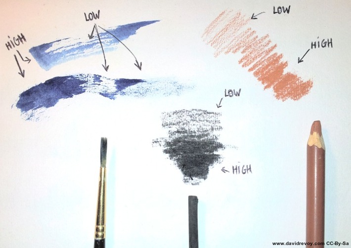 Figure A: A test with real media
The purpose of a textured brush engine is to give to the user the feeling of having a tool who affect the grain of a texture. For reference , I did test traditional medias and took a photo of the way they interact with the paper texture. Doing high pressure on the stylus should give the feeling to crush all the texture and deposit a lot of pigments on the canvas (eg. 'HIGH' on fig.a).
By opposition, the lower pressure should only affect the highest part of the texture to give the user the feeling to only touch delicately the texture, and deposit pigments only on the micro summits of the texture (eg. 'LOW' on fig.a)
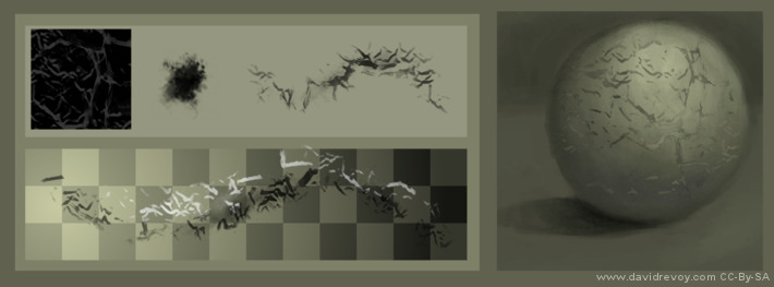
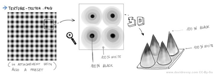 Figure B: A texture in black and white can be interpreted as a 3D surface
Using a texture of blury dots is a good test file: this dots going from pure black at center to full white in-between them can be interpreted as a paper with a very specific spiky texture. I attached such a texture example to this Krita bug-report. A 3D representation help also to understand how pressure can do a Cutoff on the grayscale informations in visual way.
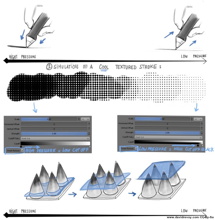 Figure C: A simulation of Texture on pressure with Krita 2.4 CutOff feature: moving the slider manually makes it work
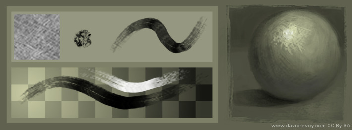
Visual example: template
In this second part, I'll try to show a list of visual example of how texture could be used. For that, I'll structure my example with the following template:
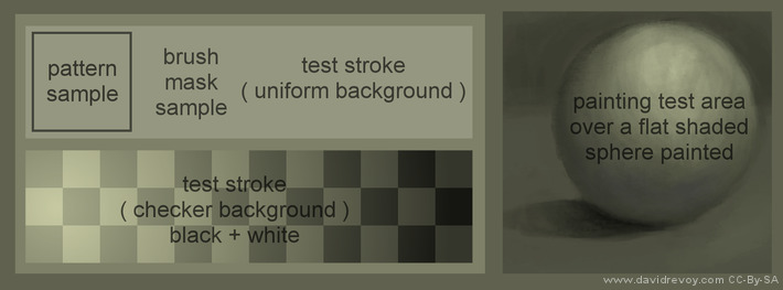
- Pattern sample: a little zone to display the pattern selected as a texture.
- Brush mask sample: the brush selected ( brushes belong to the brush kit GPS 1.5 with the fork Gimp-Painter).
- Test stroke: 2 areas to see how the texture behaves on various backgrounds.
- Painting test area: A speed painting example to show the rendering quality potential of this brushes.
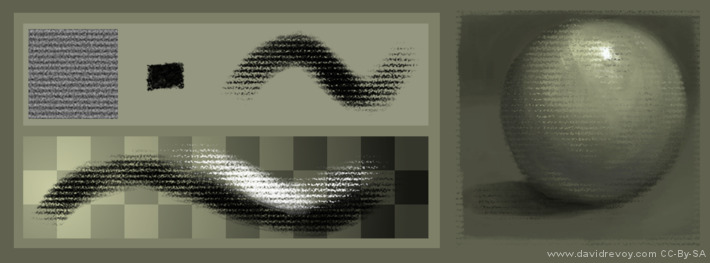
Traditional simulation
 Oil dry
A paper like texture pattern combined with this sort of brush can obtain a very expressive effect. The strokes get more life and tell more about the energy of the painter. We are also used to decrypt this sort of rendering with centuries of traditional painting imagery. On low pressure some hair rubs the canvas to reveal his texture , while on high pressure , the mix brush engine create a more consistent color, near to an impasto.
 Pastel
A pastel preset would use a continuous fiber-pressed paper like paper Ingres simulated by this kind of pattern, and a squary brush mask to simulate the foot print of a pastel block. Mix brush engine is inactivated to have a more dry technic result. If I would activate it, I would obtain a sort of crayon/oiled chalk/oiled pastel effect.
Speedpainting texturing
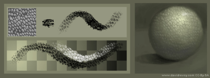 Reptilian sort of skin
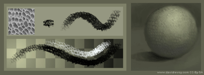 Reptilian sort of skin ( negative )
Speedpainters can takes a lot advantage to have efficient patterns : most shading part of the artworks can benefit in less than a minute to a big amount of details with only few brush strokes. Leather, trunks, scales, roof, bricks etc...etc... can be simulated this way. For this example above, I show also the same texture can produce another effect with itself negative.
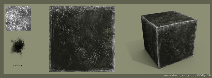
 Cracks on a surfaces
Most textures shouldn't be left 'as this' on the canvas, and need further little painting details to make them believable. Apart of that the textured brush does a wonderful job to got a prototype of the visual aspect before a final refinement.
For 3D artist
 A texture applied to a cube in Blender
Digital painters are not alone to benefit about textured brush strokes. 3D texture artist use them a lot. A large library of good tile-able patterns is a must have for them.On the example above here is a 1min textures done with a pattern and 2 brushes ( a cloudy one for texture variation , and a rake for scratches on the borders ) and applied to a cube in Blender.
A texture applied to a cube in Blender
Digital painters are not alone to benefit about textured brush strokes. 3D texture artist use them a lot. A large library of good tile-able patterns is a must have for them.On the example above here is a 1min textures done with a pattern and 2 brushes ( a cloudy one for texture variation , and a rake for scratches on the borders ) and applied to a cube in Blender.
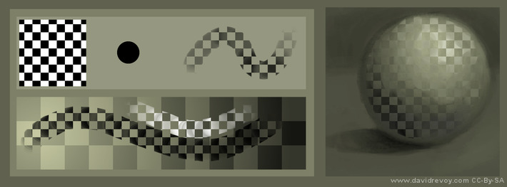 technical test with rounded brush and checker
Gimp-painter implementation:
As I write this lines, the best implementation of a textured brush engine is by far the one of the Japanese fork Gimp-Painter 2.6. The pattern position keeps aligned stroke after stroke. This is good, because it allows to brighten parts or darken parts of a textures, and be consistent in a shading. Also, with this behavior, the usage of pattern as textured paper is possible and keep consistent.
 The texturing as you can use it now in Gimp-painter 2.6
User interface:
The current GUI in Gimp-painter works, but don't offer many options. A checkbox 'Use texture' ( only available in mixbrush ) activate the feature. A slider 'Grain' under offer the possibility to have an additional alpha control on the pattern. Good to mute a to strong texture effect. The pattern choice depend of the Gimp internal panel for pattern selection. The preview are really bad, because they offer a little square centered cropped at 100% resolution; this is often not a useful to pick a texture.
Another issue will affect artists working at a high resolution for printing: the maximum texture size of 512x512px limits the experience. The thumbnails can't be sorted to place the favorite on top, so a good spatial memory is required on this automatic alphabetical sorted list.
Other majors disadvantages ; the scaling of the texture via a slider is not possible. For this you have to resize your pattern manually and create as many instance of the same pattern at each size you want. Same for a simple negative effect (inverting the grayscale is sometime desired to create or fix new textures). Also, the default resources of Gimp are low quality and needs to be deleted to not get into the way: they are all useless for this type of usage.
 Gimp-painter 2.7.2 new toolbar and texture drop-down (just before the project being abandoned)
Note for Krita:
The toolbar access to the texture as proposed in the version 2.7.2 of Gimp-painter was a brilliant idea from the developer of the fork: Sigetch. But it seams the main part of Gimp team not agree with his code according to the actual 2.7 development.
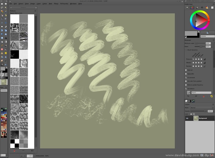
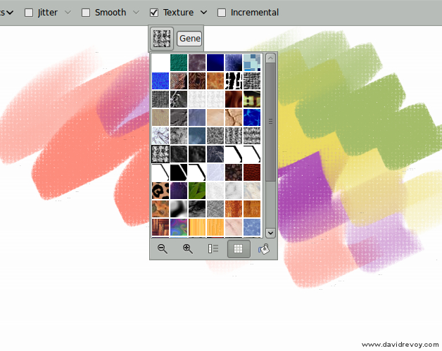
 Krita 2.4 beta Pattern on GUI toolbar
Krita also propose the same very good access to the pattern via the toolbar, with sharing of ressources via GHNS ( to share or download online patterns on the fly from within Krita ) , organisation via Tag. As a cons, the panel is not undockable nor re-sizable, the preview thumbnails are also fixed size and not offer a good visibility for high-res textures.
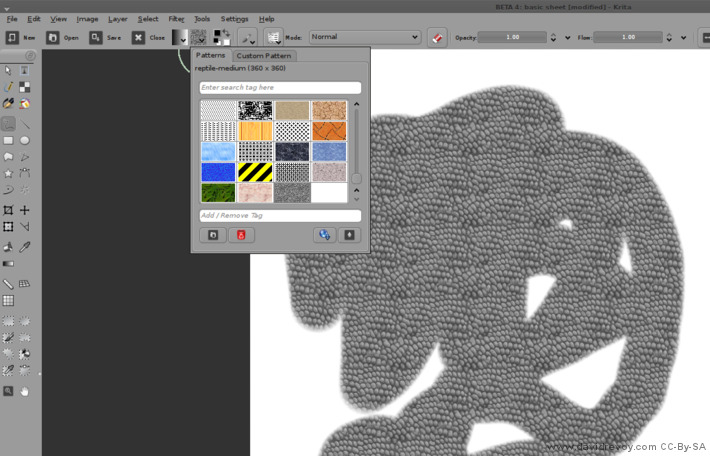
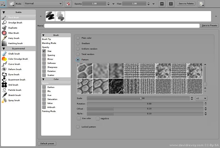
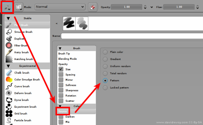 Krita 2.4 beta Actual textures feature
The actual 'Source->Pattern' features is not usable as a textured brush. The alignment is good, but the texture pattern don't behave yet as an alpha mask , but as the 'source' color of the brush strokes.
Mockup proposition:
 A visualization mock-up of a functional GUI for textured brush in Krita
This 'ideal' mock-up feature:
- a selection of the pattern ( thumbnails ) , because preset should ideally remember the associated pattern if in use.
- a 'Scale' silder , to upscale the texture or downscale it according to the need of the artwork.
- a 'Rotation' slider ( optional ) , to rotate the texture panel ; if impossible to do , simple mirroring on X or Y axis is also interresting
- an 'Offset' slider (optional ), to offset the alignment position of the texture on both X and Y axis.
- an 'Alpha' slider , to do as Gimp-painter propose , an additionnal alpha control on the texture itself.
- a checkbox 'Use color' ; to fall back on the actual 2.4 behavior where texture use color input
- a checkbox 'Negative' ( optional ) , to use an inverted version of the pattern too.
I made it to simply to communicate how it can looks, sorry if it's a non-sens coding wise. This is just a user proposition
Ending note :
I hope my article will help developers to make future FLOSS digital painting tools better.
Ressources : materials to do your test (patterns I use in this article , 3D files , template for my test zone) textured-brush-floss.zip ( Public domain textures, CC-0 ).
If you have additional thinking or question about feel free to use the comments.
Update after publication:
Inspired by this article, the Krita project leader and chairman of the Krita Foundation Boudewijn Rempt implemented the textured brush sensors in Krita 2.5 (thanks again about it). Better options (with a major usability improvement on Krita 2.7) were added later on the way.
The first ever speed-painting using a texture in Krita 2.5 development, the version was still buggy and many dynamics here were simulated by moving sliders manually, but it was a good proof of concept
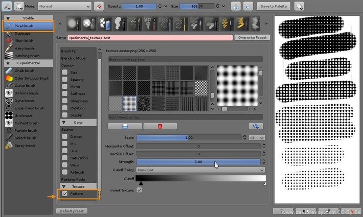
A screenshot of the 'texture feature' in Krita since 2.5 release
