


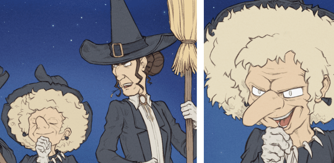
Production report ep29, part 3: coloring and shading

Thank you very much for all the feedback after the release of Pepper&Carrot episode 29 last week. Here is the third and last part of the making-of episode 29. It's a sort of production diary with my notes (it help myself to re-read them years later) and also adressed to the one who want to take the same way than me or for the curious wanting to see how the things are done in backstage. On the previous part 2 of the making of episode 29, I explained my workflow for the line-art but nothing about coloring the episode. So, this third and final part will be about coloring and shading.
Colored thumbnails saves time
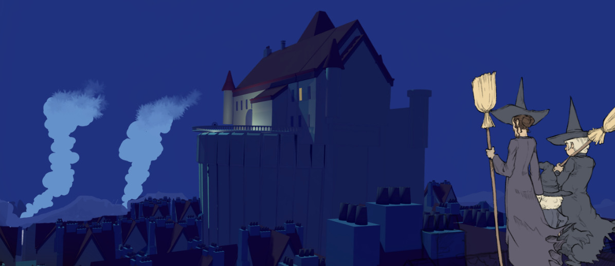
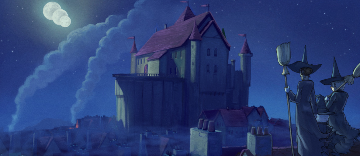
I had no idea where to start coloring the episode. What would be the color of the monster? what would be the color of his dimension? So, I opted for painting a quick thumbnails like you can see under and test variations on the first panel. That process is something I usually did when art-directing a game or short movie. I always thought this was unecessary extra-work for coloring a comic. But having this tiny thumbnails really helped later to color very quickly with confidence the final page. I had a art-direction for the color of the full-scene. So this colored thumbnails workflow saved time and provided me a very satisfying experience, I'll repeat doing this for sure on future episodes.

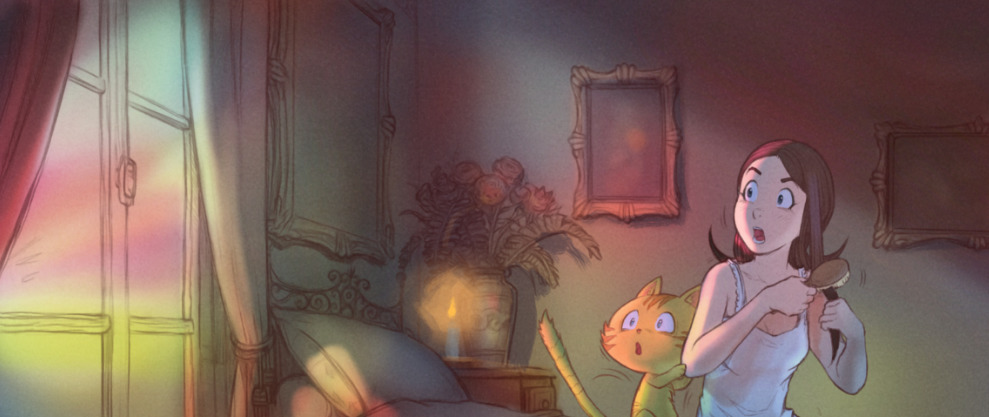
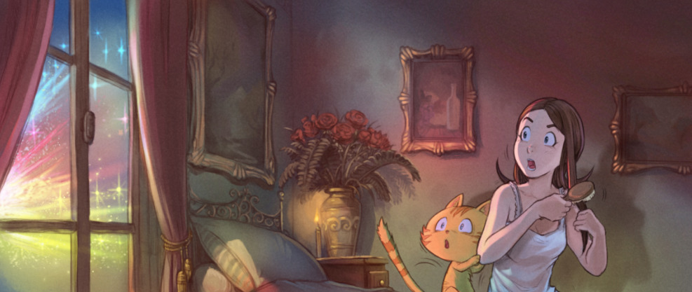
Color research for the other world
Screenshot while applying the color research
Colorize mask: mini palette ref and green screen
To prepare my pages (flat colors), I used the Colorize Mask feature of Krita (I published a video tutorial last month about it). Everything went fine but after the two first pages; I saw it was necessary to use a system to keep a consistency between the colors of all the characters accross all the pages. So I decided to paint on a tiny PNG a color reference and insert it in all my pages as a Image Reference using the Reference Tool. So I could pick from this tiny picture the color and apply my markers on the picture. It was a bit hard to move the reference palette while being zooming in panel after panel. For sure, it would have been better if the Reference Images could have been 'pinned' at an absolute position on my canvas (a corner). I'll try to report that feature request soon.
For the transparency color, I used a pure RGB green in the same spirit of 'green screen' in video production. It worked as expected and flatting the color took me a couple of days for 8 pages this way.
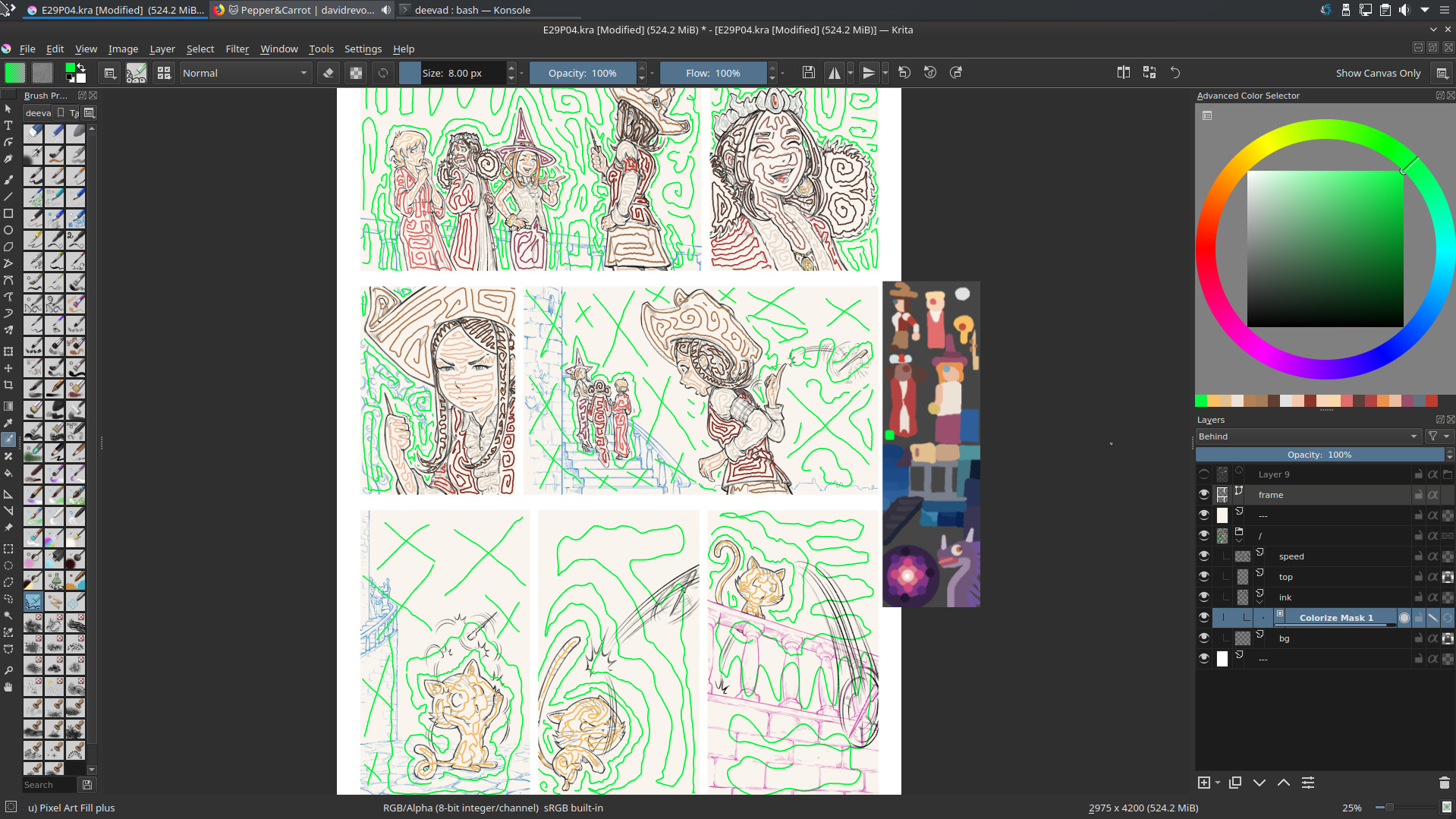
Colorize mask 'markers'
Colorize mask 'markers'
Colorize mask rendered
A better layer stack
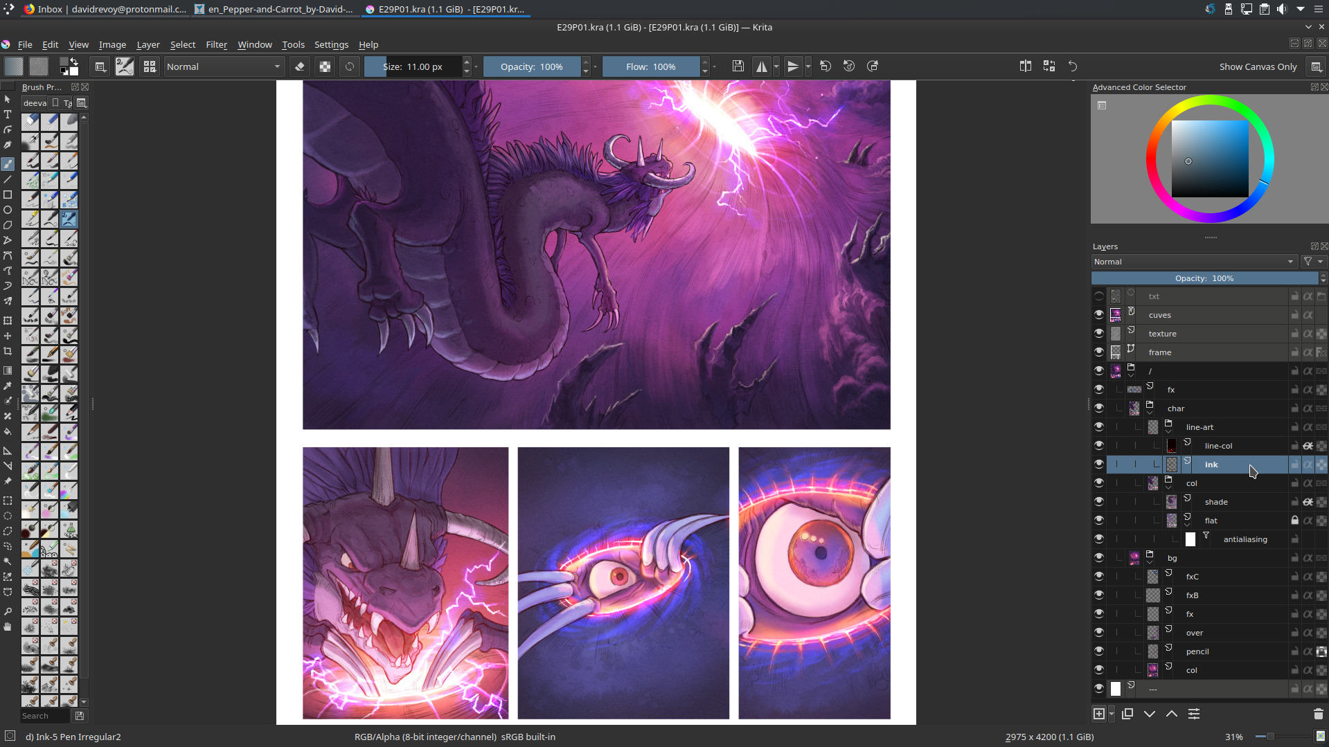
For episode 29, I decided to use a non-destructive workflow and keep a clean layer stack all along the process. So, as I started to get quickly dozens of layers in my way during the process, I had to organize them and give them names easy and quick to type and re-read. I came up with this:
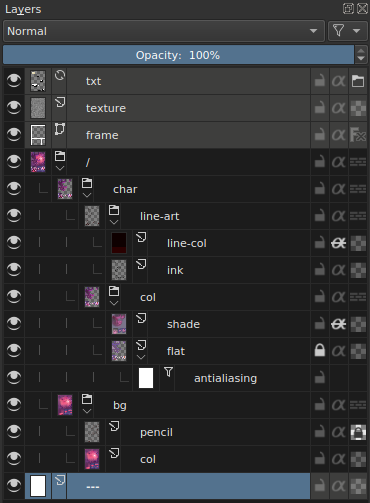
A typical layer stack
The top layers (colored in grey with a right click on them) are the helpers:
- txt: A file layer of the inkscape texts, to see the content of speechbubbles
- texture: one of my subtle texture in SoftLight(SVG) blending mode.
- frame: a vector layer with white border-less squares to draw my panels layout
Under them, I have the artwork fully grouped under a layer name / (the symbol of the root of the system) and a consistent white background at the bottom named ---. The artworks are split into two subgroups: char (characters) and bg (backgrounds). Character group has a line-art subgroup with in it the ink (inking) and a layer line-col to colorize the inking when necessary. Another subgroup is col (coloring) with the flat island of color dynamically anti-aliased with a filter layer 'Blur' of 1x1px named antialiasing and a shading layer as in my tutorial about shading.
Was it necessary? Yes, the flexibility of this stack once in production was lovely but I admit it was a bit overkill. I probably wanted to test the full non-destructive workflow too much. For future episode I'll probably keep something similar but with less layers. For example, I think I'll keep the backgrounds (bg) flat and not as a group. Also, the colored flat islands for characters doesn't really need a dynamic antialiasing; I thought it would help at replacing a color or selecting an area later; but once the color flatting is done I rarely came back to edit it. So, keeping this as non-destructive was actually more 'in my way' than helping. I could also probably colorize my inking directly (protecting the alpha of a single 'ink' layer on top) without needing a nested (line-art(line-col+ink)) because once the inking was done; I rarely came back also to redraw it... So, all in all I'll keep same structure, naming but I'll also try to simplify it next time quite a lot.
You can download the sources pages (471MB) and spy the structure. This episode is certainly one of my cleanest Pepper&Carrot episode in term of layer stack.
Painting over 3D mockup for backgrounds
Well, no surprise this part worked perfectly. As you probably know, I'm a specialist of that since decades (I even published a Dvd tutorial about it in 2011, "Blend&Paint" for the Blender Institute) but nowadays with Blender 2.8 and Eevee the work on the 3D part became even quicker and also funnier.
I have to note few things that worked pretty well. For example; rendering the 'world' (sky) with a flat color directly out of Blender was easier to select them later in Krita and split to another layer to paint skies separately. Also, I don't regret to have not textured the 3D buildings, painting the textures of stones and tiles of the roof in Krita is what 'broke' the artificial 3D aspect of the Eevee rendering and made the artwork look a bit more like a painting. I'll keep that for future episodes. It even gives me ideas of more complex and detailed environments.
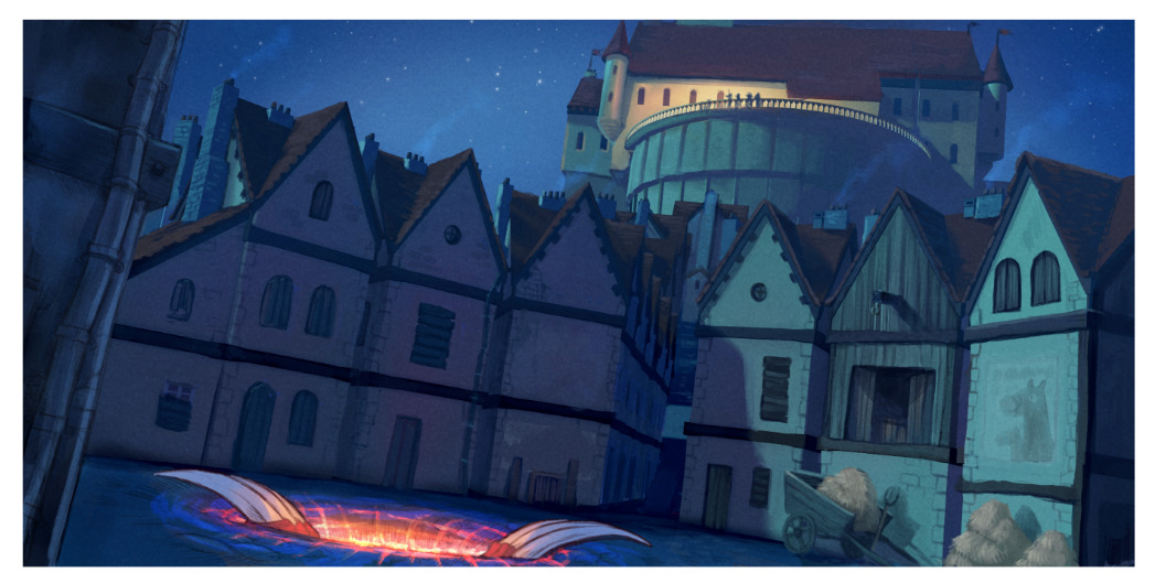
The final panel
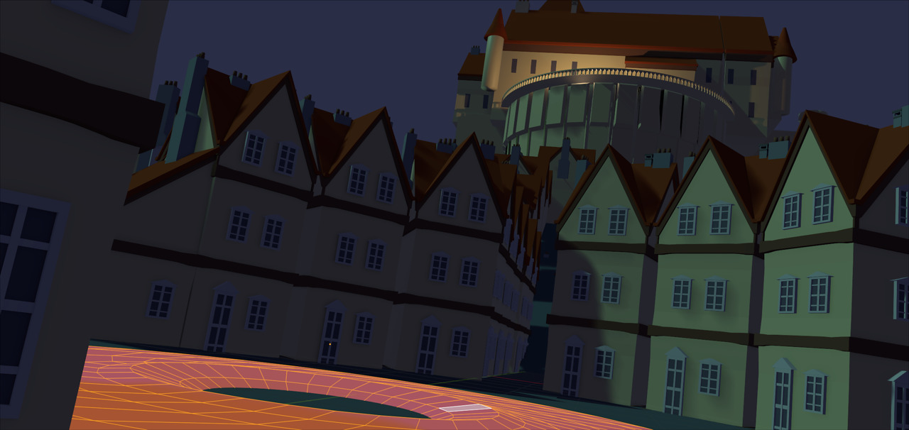
The 3D rendered (Blender 3D, Eevee)
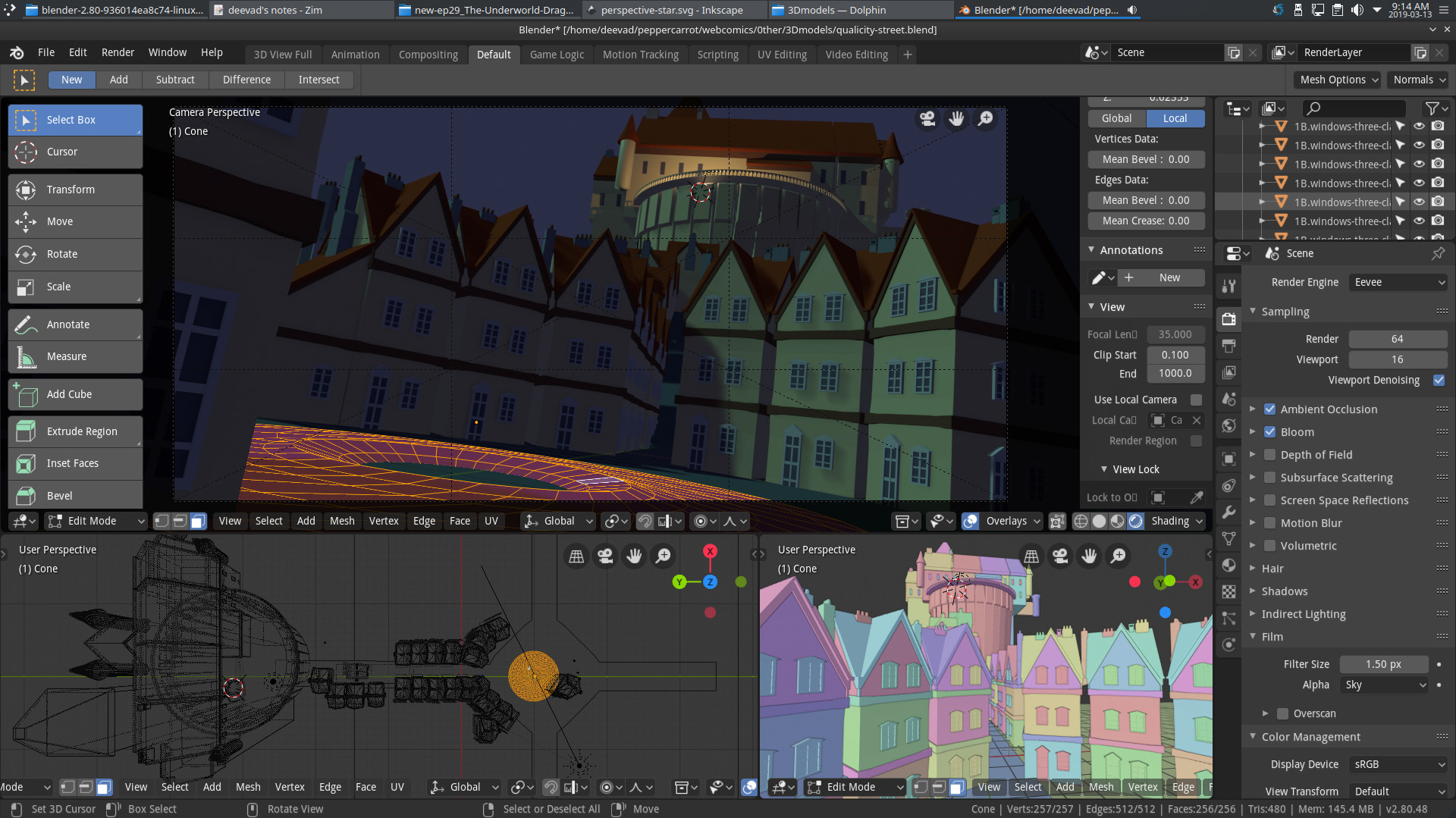
Blender 2.8 in action
The 3D in background with quick notes (smoke) with the flat non-shaded characters
Same panel with paint-over for the 3D, and shading for characters
2D background painting
I also had many panels with background totally hand-drawn. The good idea I had was to split them directly at the line-art step, while drawing. I drew all of them in blue with a soft edge brush while the character had line-art in black. Then I airbrushed all of them under the line (line recolored into a half transparent brown), and added two more pass: one to block the color under; one to paint over to add hightlight and details. You can also note how it followed the steps for the workflow on the character (line-art, flat color, large shading, detail shading).
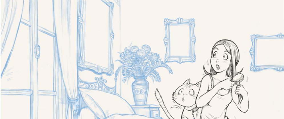
Step 1, line-art: backgrounds are penciled separately with blue.
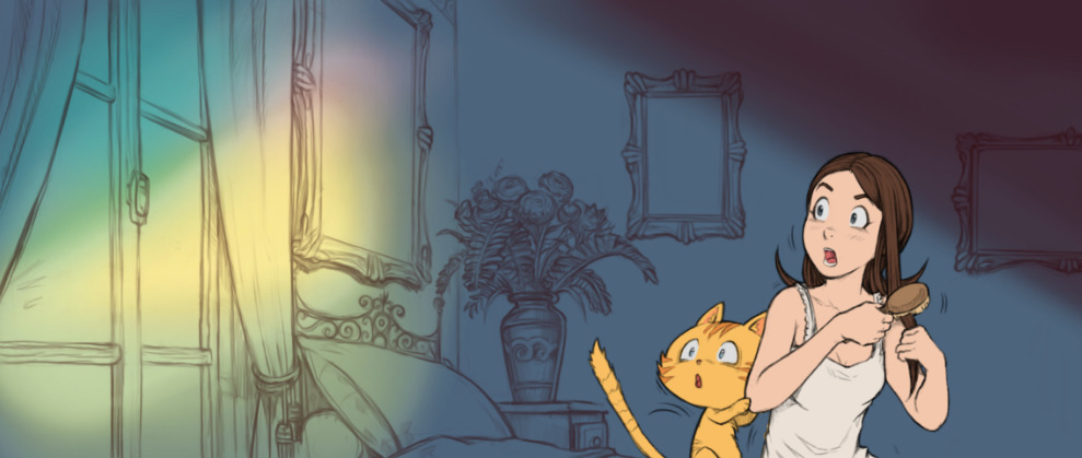
Step 2, airbrush: adding the main color palette and light source.
Step 3, paint-under the line with a large brush.
Step 4, paint-over the lasagna stack of layers for the highlight and details.
Shading
The shading was a hyper-quick step and super flexible. Ideal when approaching the deadline. My hard-light blending mode single shading layer method revealed to be super effective even with the complex light of fireworks, fire, blue moon and pink dimension. I could really color flat my characters with their same base 'albedo' color for the flatting part and really influence later the color with the shading layer, even when changing a dark base color to a bright yellow. This method proofed to be rock-solid and it was easy for me to airbrush the big ideas and art-direction and then do a longer step of cleaning-up and adding edges and other minor sources of lights to detail the characters and their texture even more.
(animation) Shading on/off: extreme light setup.
(animation) Shading on/off: consistency on characters during dialogues.
(animation) Shading on/off: consistency on characters during dialogues.
Conclusion
All in all, a lot of research have been done on the way to produce episode 29 but I think all this time was really well invested: it was one of the rare production cycle where I didn't had to skip sleeping during a couple of night before the release to find "the missing 80 hours". The management of my time on the production was constant, linear and predictable. I could say: "by tomorrow I'll finish this pages" and it was done. This linearity really change my way to manage my stress during production. I can't say this is a quick workflow; it is probably not, but the result was up to my expectation and it improved my daily life because I could predict production time and this aspect is golden.
What's next? Optimisation, compression; for episode 30 I'll try to remove what was unecessary while keeping the best part of this workflow. I want: more 'life' in my inking and more painterly background. The result of episode 29 was a bit too industrial for my taste. I feel it's a necessity that creators like me move away as far as possible of all style that can be easily emulated in (a near?) future by computer graphics, deep learning and IA. I'm thinking about 3D and modern anime style. I have feelings that "sketchy and painterly" will be even more precious in the future industry; and even more if they reveal a solid experience of fundamentals underneath: anatomy, proportion, perspective, composition, color, etc... I must follow that intuition and learn to be a little bit less scholar and clean. This will be interesting. ;-)
Thank you for reading!
