


The chaotic making of episode 21
Episode 21... An episode of my webcomic Pepper&Carrot with probably the most chaotic making-of I ever experienced. It was a big trial and error and things went wrong more than one time. But isn't it funny to show also making-of of non-linear production?
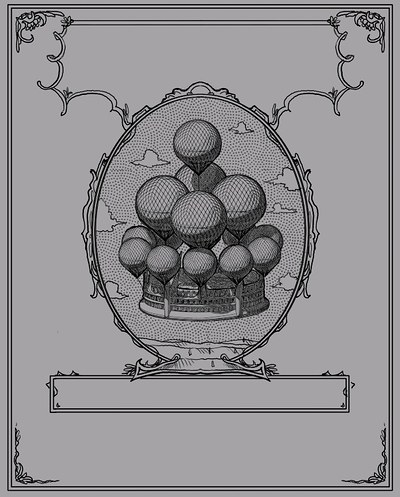
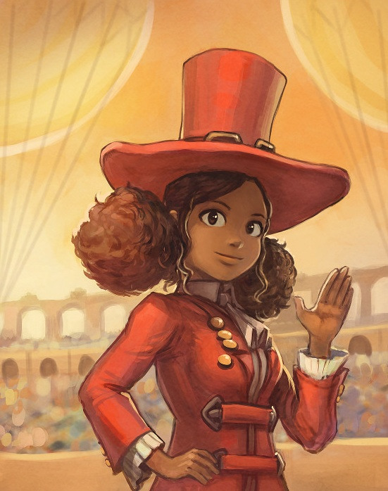
Episode 21 was supposed to open new arc: a season of new episodes around an important event in the life of our little Hereva fantasy world: The Magic Contest. For our Pepper, it's her second contest, and this time, the proportion are epic because the mayor of the Komona city invested into a new arena and six witches are in competition.
I. Preproduction
a. Collaborative writing with brainstorming on IRC and Framapad
The first ideas were written around October 2016. I experimented a new way to write the story; I setup a collaborative online pad to collect all the ideas sent by contributors over Pepper&Carrot IRC channel. We quickly collected this way a very large amount of ideas, not only for episode 21, but also for 22 and 23. This content is rich, but too rich: good concepts but never cut as panels or cut for comic layout and rarely with ends. The most difficult part for the group was to propose a backbone structure for the episode: an ending, a tiny moral or a message. That was a problem because my process starts mainly with this backbone and then I wrap all the background element around it as a skin; because it is flexible and easy to do once a good structure for a story is setup.
Anyway: starting with all this richness is fun, but also confusing. I decided after this episode I'll not renew the experience because I had to trash too many ideas and that was frustrating for me and also for the contributors. Thanks again to the contributions of Nartance, Cmaloney, Valvin, Quiralta and Talime for this experimentation.
The peppercarrot-brainstorm Framapad, a fork of Etherpad hosted by the community Framasoft.
b. Concept-art
After the release of the episode 20 (the one with the donkey and unicorns) on 17 December 2016, I started to do sketches during Christmas holidays. Here is a sample of sketches :
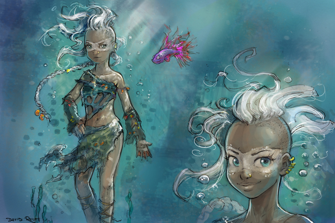
design of Spirulina: one of the new witch of the magic Aquah.
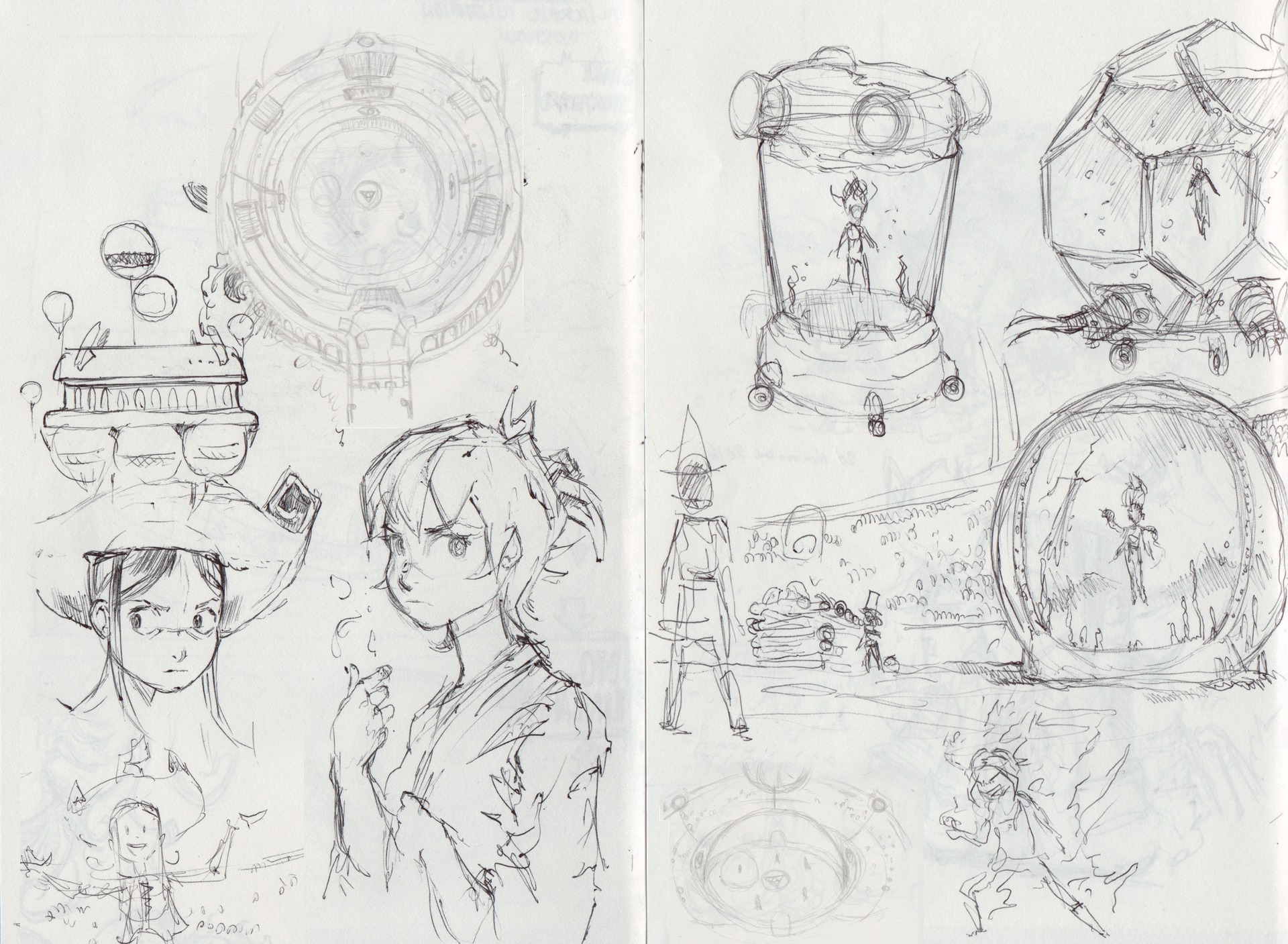
Various ballpen sketches from my sketchbook: shape of the arena and aquarium for Spirulina.
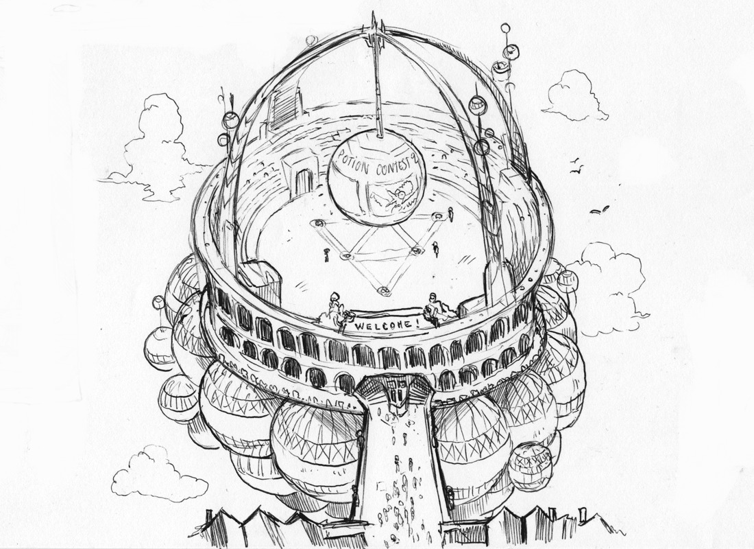
A first version of the arena (ballpen sketch) , with balloons under.
c. Scenario:
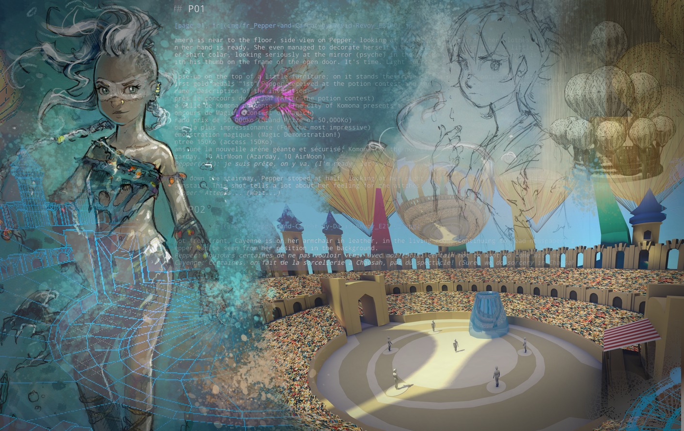
I started to write the scenario of episode 21 in Ghostwriter, using markdown and sync over our git repository to keep in interaction with the contributors on the IRC channel. The backbone of this episode is simple: I'm building up a classic start of a heros journey, we expect Pepper will shine in front of all audience and the twist here is everything goes wrong for her and the final twist is she even can't compete to the tournament.
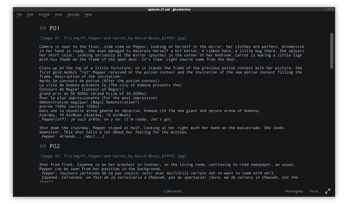
Ghostwriter markdown editor in action
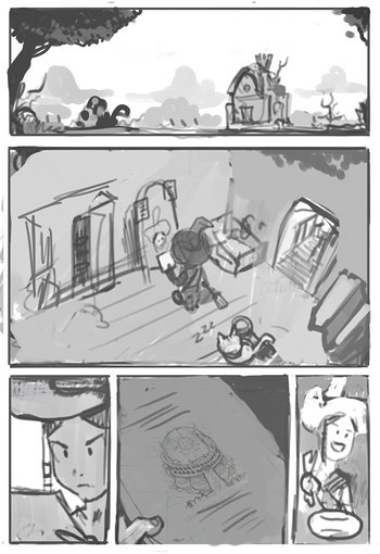
d. Storyboard
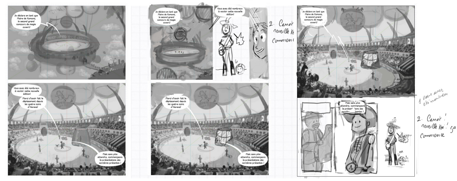
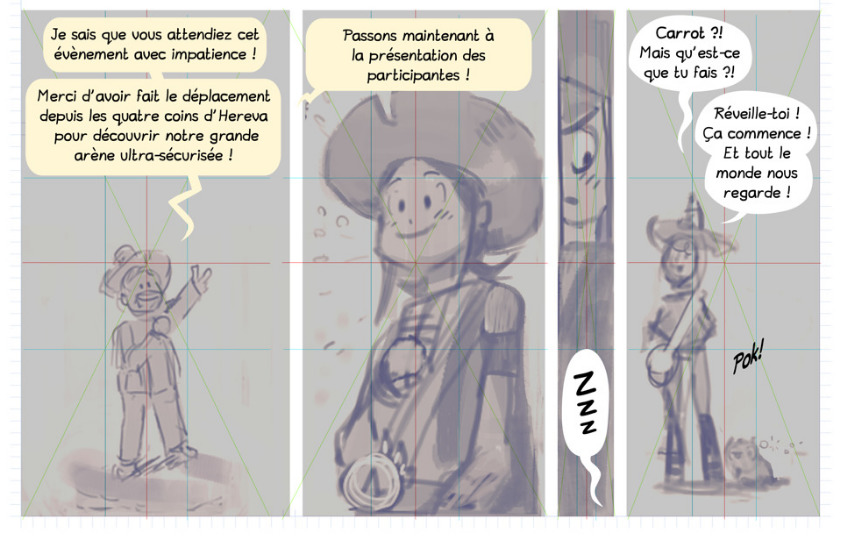
I then started to draw the storyboard in Krita. With this visual feedback, the story kept evolving and grew to over 30 panels and 7 pages. Its a lot! The pages were all refactored over 3 to 5 time for each one of them. Sometime to compact or make the storytelling more fluid. Sometime just to keep a good variety of shot and pleasant overall composition. Here is a sample of three revisions done over the page three.
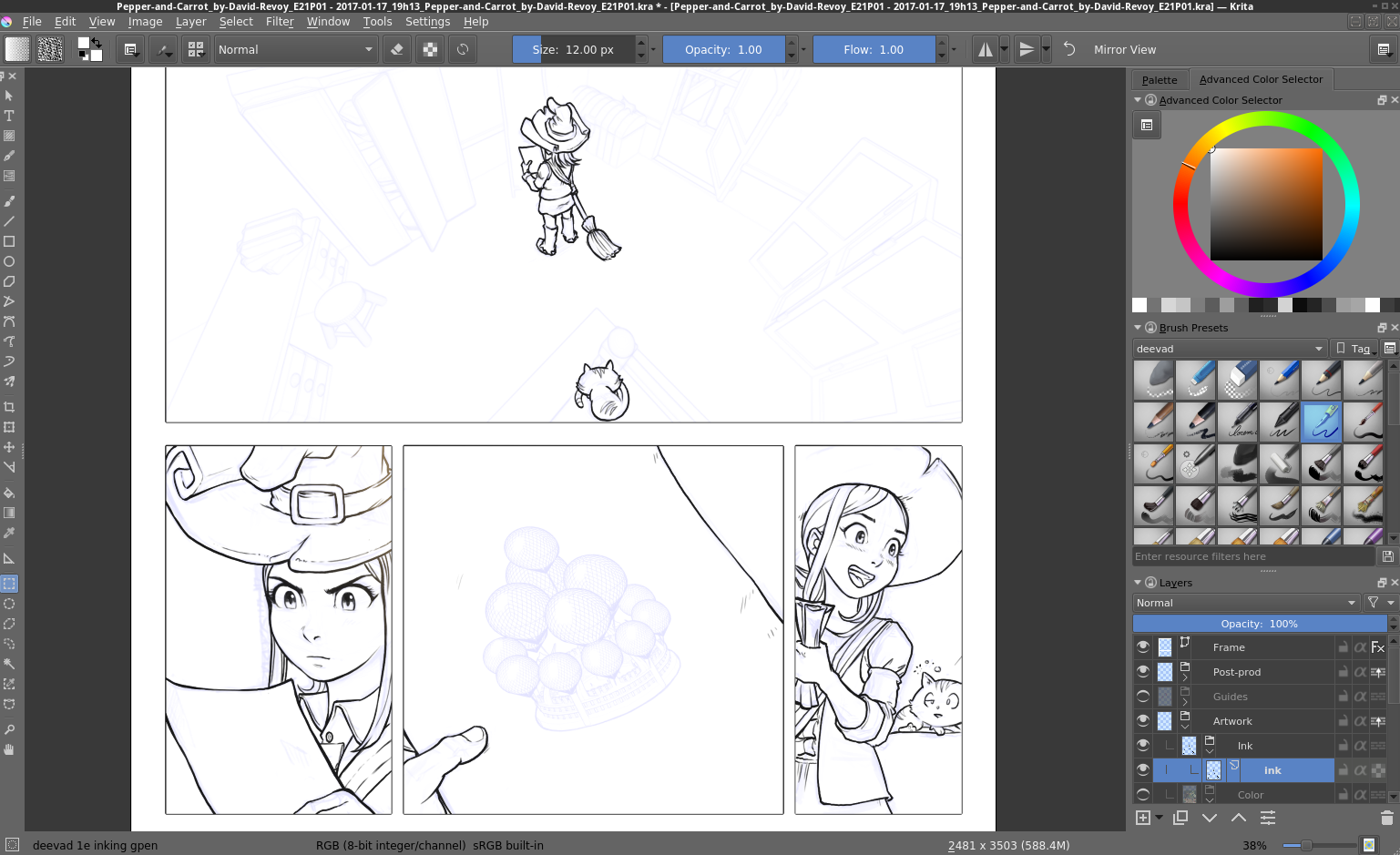
e. Cleaning and lettering
When the storyboard was final, I moved to format all the pages into two differents files: a SVG vector file ( using Inkscape ) for the speechbubbles and the dialogs, sound FX ; and a raster layered KRA file ( using Krita ) for the artworks. This will allow Pepper&Carrot to be translated, and with 38 languages available, it's a really important step.
That's why I need a solid storyboard on Pepper&Carrot, because after this step I'm not working anymore with a WYSIWYG feedback. And that's where the renderfarm script start to 'compile' for me the vector layer and the graphics. All needs to be carefully planed. This cleaning step took me long: this episode as a lot of text and soundFX. pushed in french on a dedicated repository on Github. Then Nartance and Valvin joined me to refactor the dialogs and Nartance pushed the change to the repository. Now the production can start.
The bottom of the page three, with vector panels and speechballoon.
Graphism are still the crappy storyboard sketches.
II. Production
a. 3D models
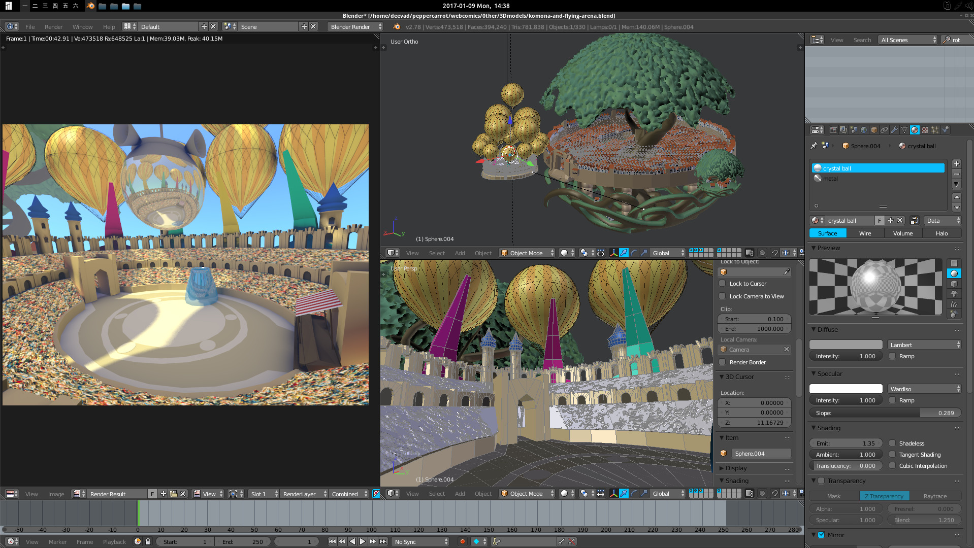
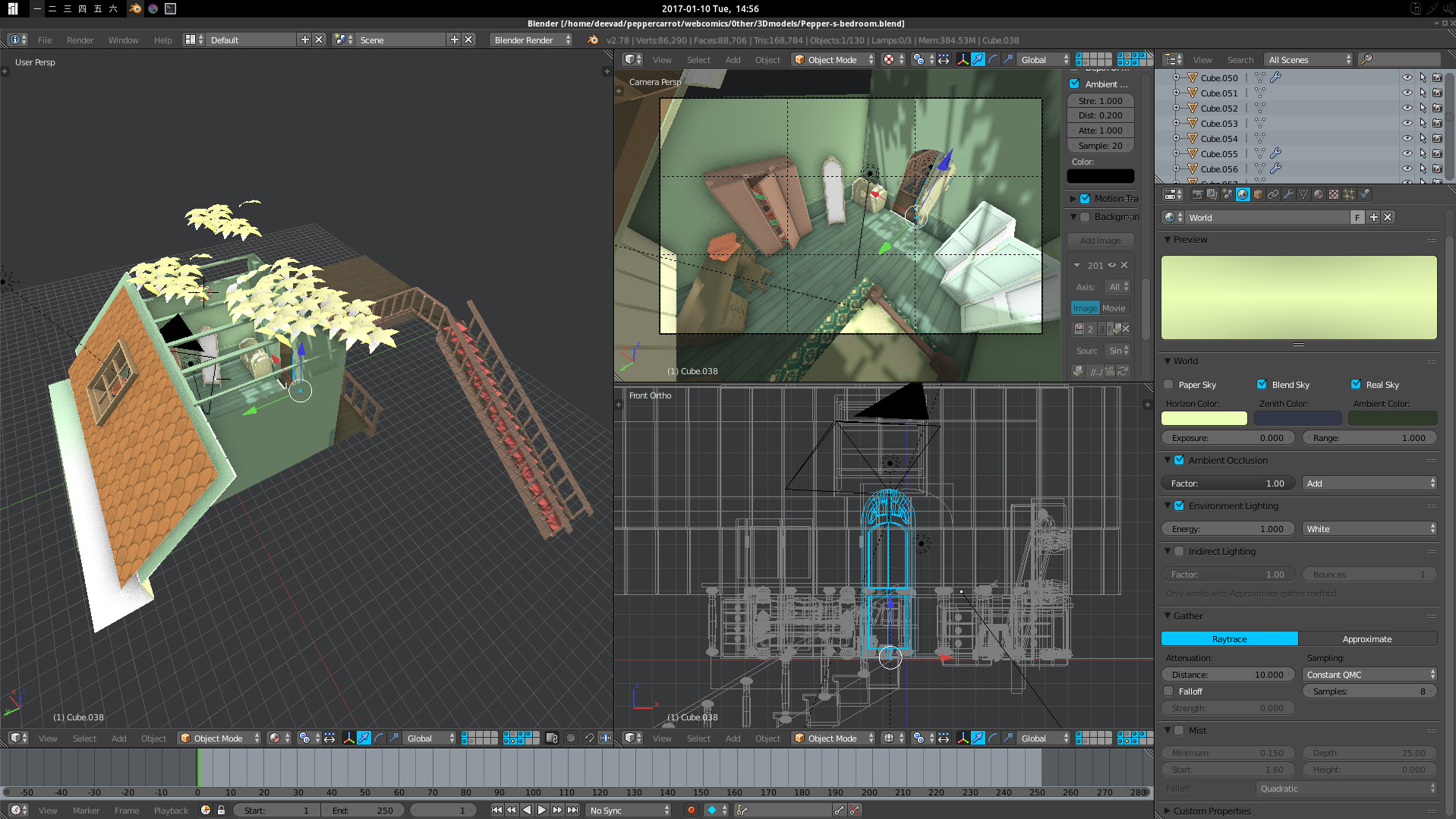
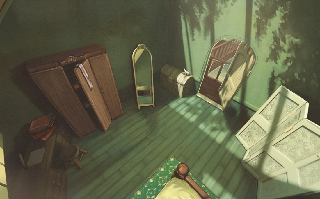
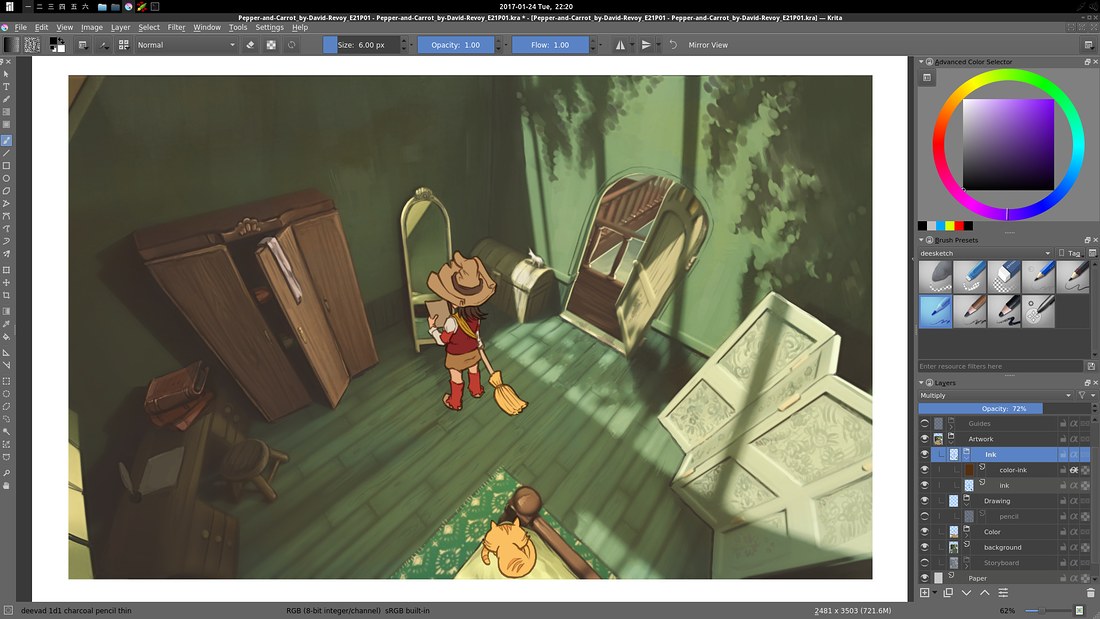
While drawing the storyboard I quickly saw the main challenge of this episode will be to paint the background of the panel. A giant arena; many witches, a crowd, Komona city in background too... So I started to design a low quality model of the arena in Blender 3D, a speedmodeling done in less than a day production. 3D models helps to solve spatial issue with shot, and also helps to keep lighting consistent. While I was also enjoying time with Blender, I decided to do the bedroom of Pepper too, to solve a complex shot on the page 1. You can find all the *.blend files on the sources already. I used the plugin BLAM to setup the camera angle to be as close as possible to my sketches in the storyboard.
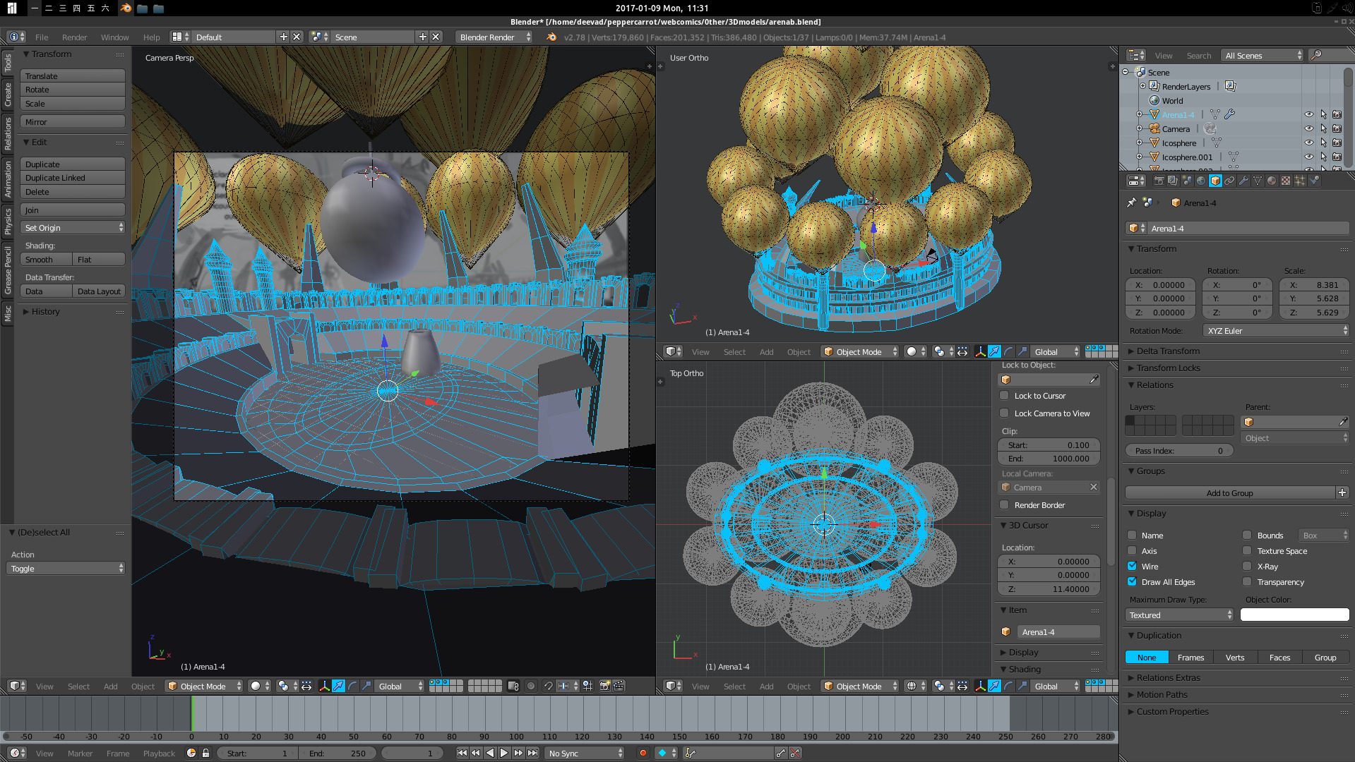 Thanks to Blender, I could realize the oval shape for the arena was better to create epic shot.
A rendering test: a lot of paint over will be necessary ; but I can't imagine painting this type of shot from scratch on all the backgrounds.
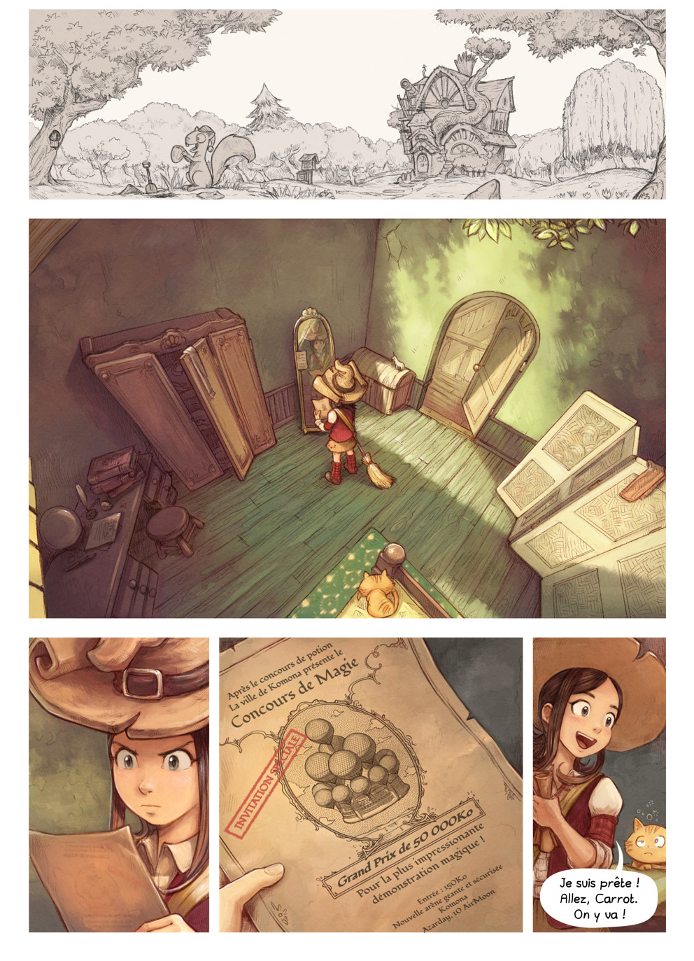
Pepper's bedroom with a little part of roof and stairway.
b. Style research
Before starting the production of the pages, I thought it was a good idea to do research for the style. With the new filter GMIC 'Smart-Coloring' , I was really tempted to switch to pure black-and-white inking, so I started to test a workflows. This test was the one I felt confident with ; you can find scribbled around the pictures all my recipe notes and steps to reproduce this style.
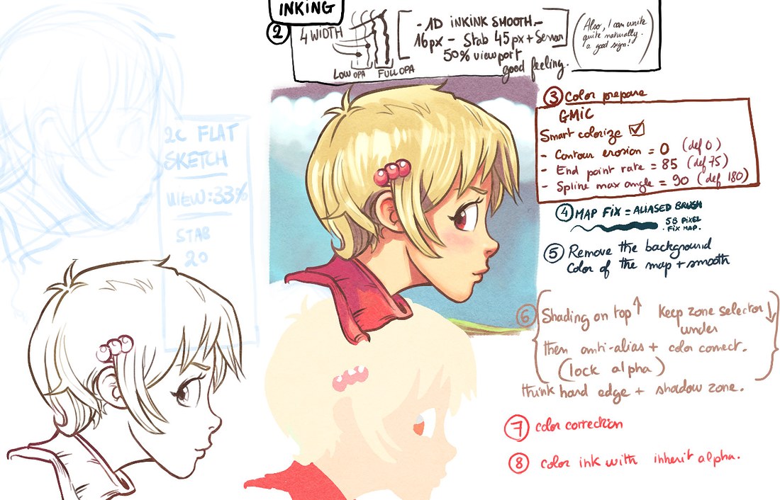
click to enlarge
c. testing full process over the first page
But this technique was new to me and I wasn't 100% sure. So I decided to be wise and do test over the page one only. This way, I can have a real feedback about this new style, without starting the first steps over all the seven pages, week after week, without really knowing where I'm going. Here is the storyboard of the page one:
Here is a light pass of pencil , just the necessary to get landmarks and guides to ink with clean lines over it.

click to enlarge
... And here is the inking in itself. I was pretty happy about the brush preset I found to make good line variation while keeping clean edges. Inking this way ( over the pencil turned to blue ) is fast: the amount of lines is minimal.
click to enlarge
... And a close-up at 100% of the viewport ( real pixel size ) :

The workflow was quick and felt logical, almost industrial: (from top-left to bottom-right) blue pencil, inking , GMIC smart coloring-filter, replacing color areas, shading areas, post-production glow on top.
click to enlarge
For the 3D rendering done in Blender ; I made a simple rendering of the panel.

click to enlarge
To break the 3D aspect and turn it into a painting, I painted directly over the image. It's long, especially to smooth all the edges and adding painterly effect.
click to enlarge ...But ... As soon I started to composite every layer ; the 3D , the cellshaded/inked character (even unfinished, only flat color zone) ; I started to not like the result. Maybe it felts a bit too much as a result of those anime studios, or animation in general ( too industrial? ) and I couldn't find my 'style' in it anymore.
click to enlarge
d. Fail and a second style research over the first page
It was hard to admit all this work was a fail, but less difficult because it was only affecting the page one. It was wise to start on the page one alone, and not pencil+ink all the pages this way. So, time to start over, and this time I decided to just pencil everything with my new presets 'charcoal pencils'. This way, I'm using the 3D only as a guideline and I can do cross-hatching modeling. It's a way to draw I feel very comfortable to do, and I like the rendering ; but it's always difficult to color it.

click to enlarge
After the first pass of colors, I could compare. I understand the two looks good ; but the one on right feel a bit more warm, and made by a 'human'. It add life in it.
 The workflow this time is even simplier and in three major steps:
- Pencil work detailed with background and start of shading with crosshatching, charcoal style.
- Flatting color with a brush, because all algorithm are just lost with this 'noise' and texture. That's really unfortunate for all my work and involvement on all the method I tested and gave feedback for auto-coloring on computer.
- Shading the colors, but not so much to let the lines 'breath' and have them still convey the information. I also add little stroke of white on the top.
click to enlarge
At real pixel size, the texture is really good. I also started research for brushes in Krita to simulate water stain of watercolors. You can see a bit the effect on Pepper's hat and on the background of this close-up :
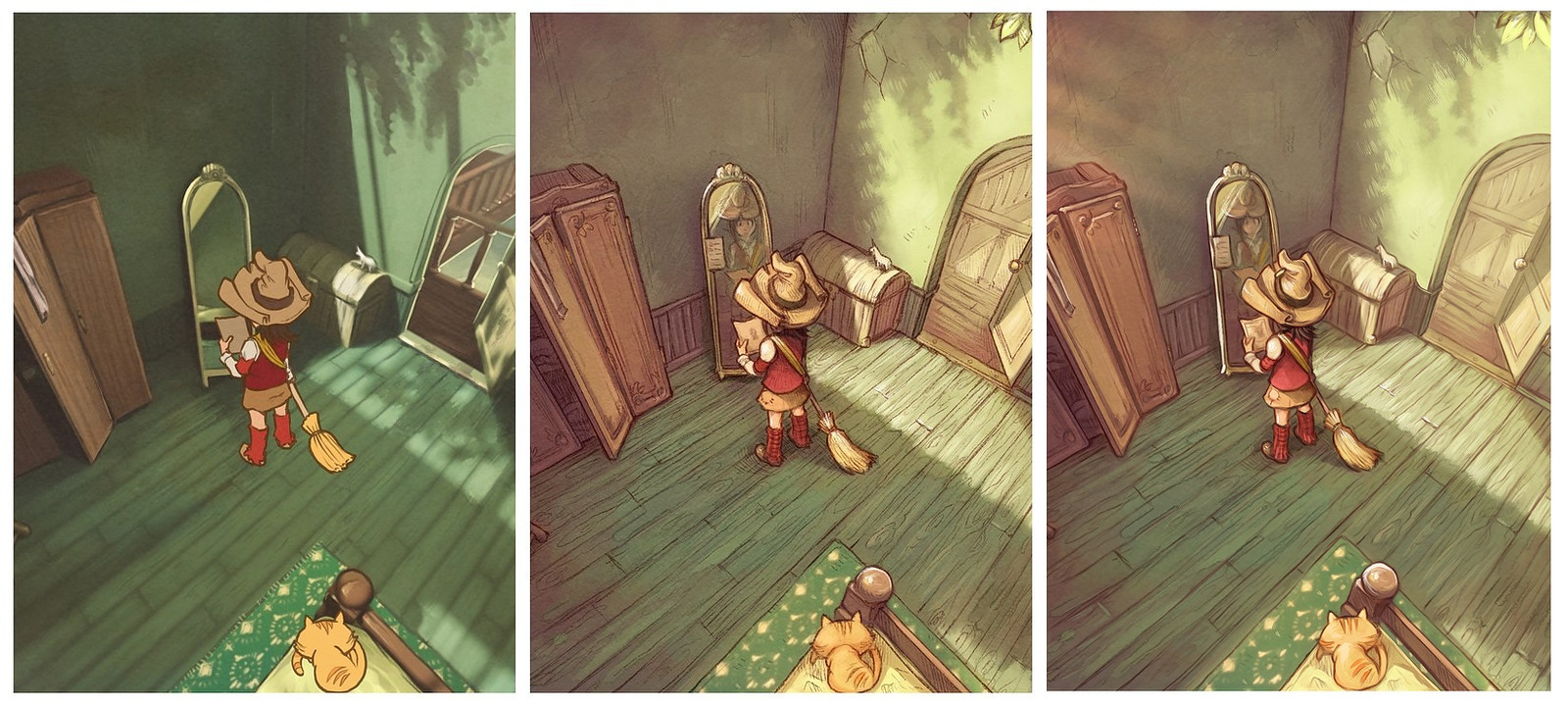
I was confident enough with this style to try something else: blending another artwork in my artwork. 3D into 2D and 2D into 2D, this is the geek part in me liking recursive things. The poster represents the new floating arena of Komona for an invitation. I used the interactive mirror in Krita and my 'ink' brush preset for it ; a way to use this 'inking' research I made and not feel it's 100% time lost... :-)
And here is the page one; after my test and with the Inkscape text ( in French ) on top.
( Note: the top panel is not colored, it's work-in-progress! )
click to enlarge
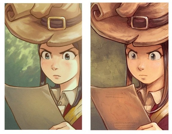
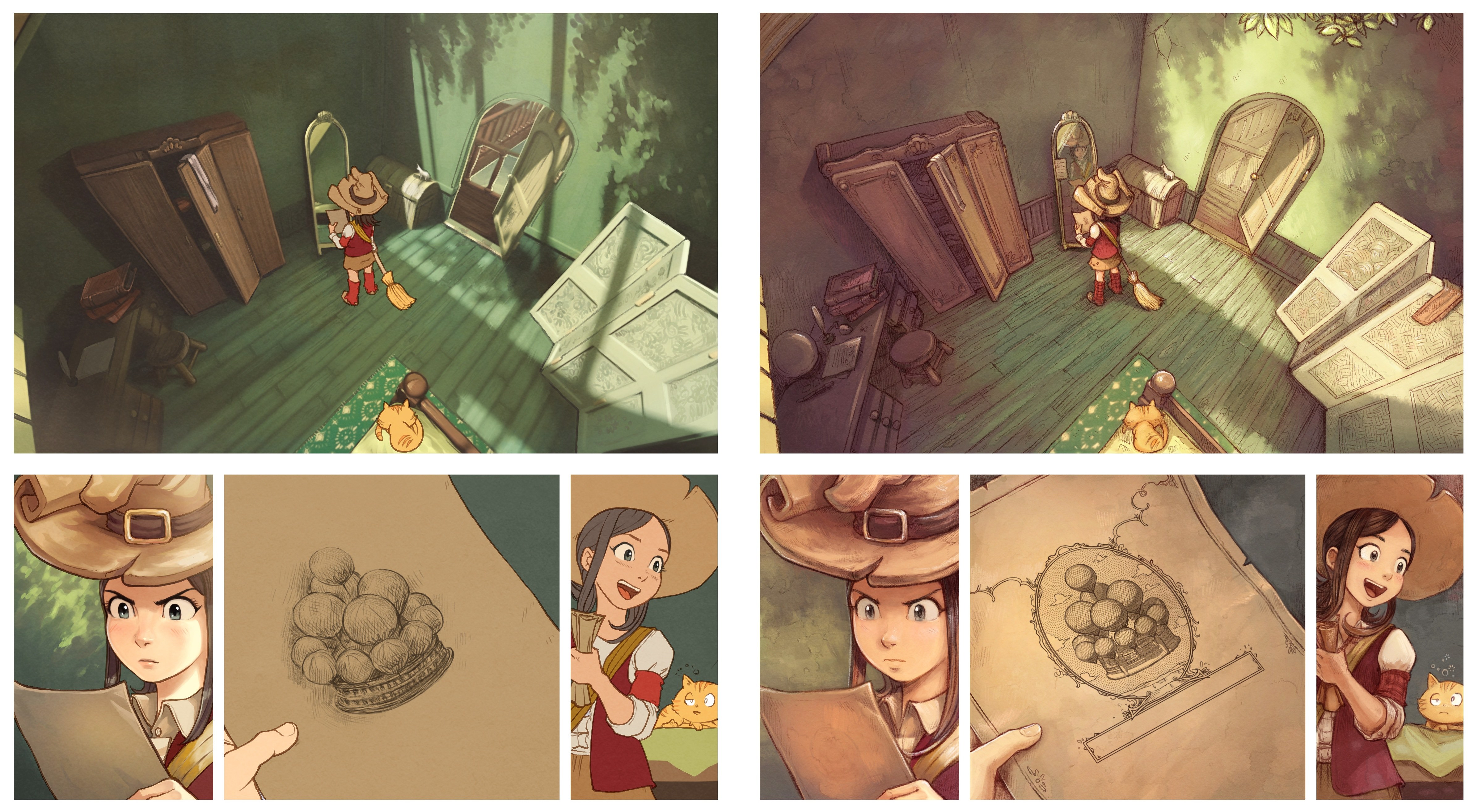
Here is a large image version to do comparison: with the first test with on left ; and newer on right.
( Note; on the first one, I stopped halfway as soon as I started to feel uncomfortable with it; that's why mirror has no reflection, not a lot of shading and many 'flat zone', etc... ).
click to enlarge
... and a close-up to compare the texture:

click to enlarge
e. Test passed: on the way of production to 'pencil' all!
So, I thought I knew the way and I'll draw all the story. And I started to pencil all.
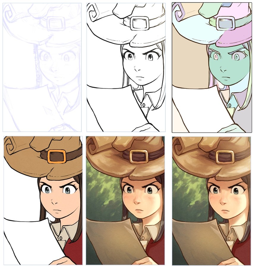
f) Another Fail? A third style rendering.
I was pretty exited about my pencil rendering but after a couple of day of penciling I started to hit a problem: I didn't really liked the result of the test ; they felt a bit too grainy, noisy and the coloring being trapped "under the drawing" layer. So, I tested how I could paint-over. And I felt better about this third style research.
First 'flat' test on left, second 'penciled' on center, and third with paint-over on right.
The purpose of this change is not done for the sake of changing for changing ; but to find a style where I can have a good balance of being productive and keep an appealing rendering. I always want to find way to speed-up the slow production of the episode because this is the major issue on the project and also an issue that affect my lifestyle. Unfortunately, it's a bit impossible to get good rendering and get quicker: I started to prefer the painted rendering and sure it takes time. Let's accept it, and move on!
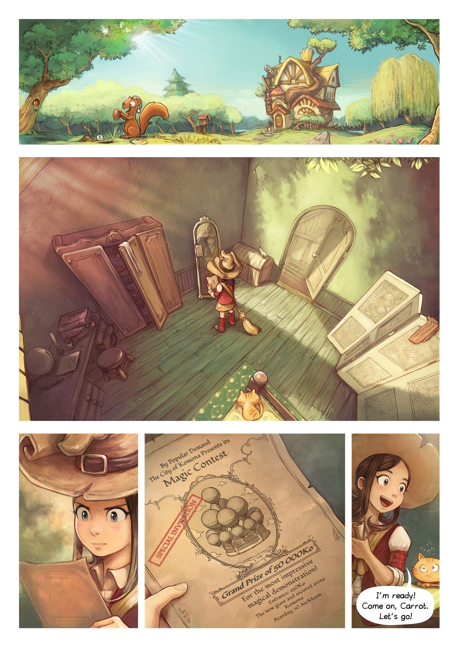
First page of Pepper&Carrot in final mode, translation by Alex Gryson.
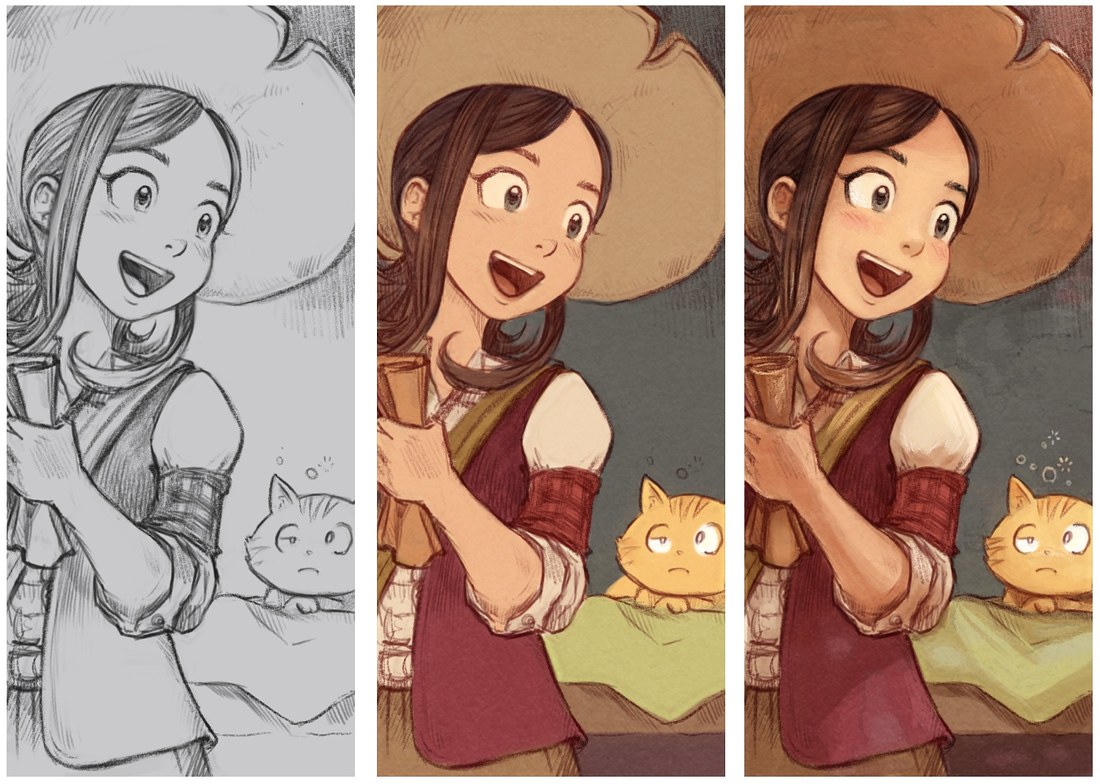
The workflow I'm using now on all the other panels is long and complex to paint. Here is a breakdown:
1. Grey violet (left on the illustration under)
I paint with a grey-violet brush directly on a white background. This grey-violet bright color ; #b8a2a6 is just a personal preference to keep working with compressed bright value. This way, I'm not really tempted to do complex gradient ( not a lot of 'room' in the value for this ), and the panels were all sufficiently detailed to make a first rendering of all the episode this way. Certainly not ideal, but it was working in practice and took not so long to complete all the episode this way and get something I feel good for the facial expression, poses and design. I also appreciated to can shade a bit, and add values here and there.
2. Pre-color (center on the illustration under)
With the violet artwork in multiply blending mode on the top, I'm adding the color under. I build up the palette this way. I like to keep this top-layer in low contrast. It helps me to focus on the contrast done by the color. When it's done, I contrast progressively the grey-violet top lines ; to retrieve the expression the lines, and a bit more contrast.
3. Final details ( right on the illustration under)
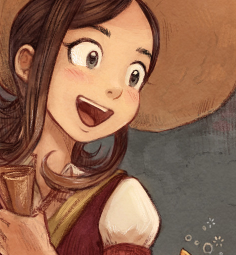
I flatten all the layers of lines and colors to a single layer, and I paint over details: textures, little rim lights, sharp edges. After hours of detailing this way, I start to feel that new painting strokes starts to destroy the result ; that's my only indicator to know when I should stop to add more details. So, detailing is a long process, but for sure one who ensure a certain level of quality. This level of rendering always make me more happy and I feel better about my work this way. So, when I was looking for a productive style, I was missing the true target : I probably should start targeting an artistic style that make me more happy, without consideration of time and production cost. Speed will come with time, experience and mastery ... or not! :-)

Camomile is back and will represent Hippiah on the magic contest.
(click to enlarge)
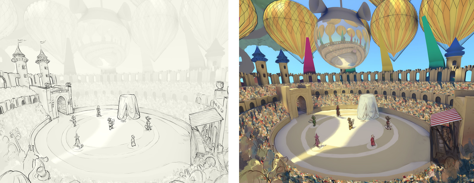
Hesitations on the making-of the shot of the arena, started pencil ; finished paint-over
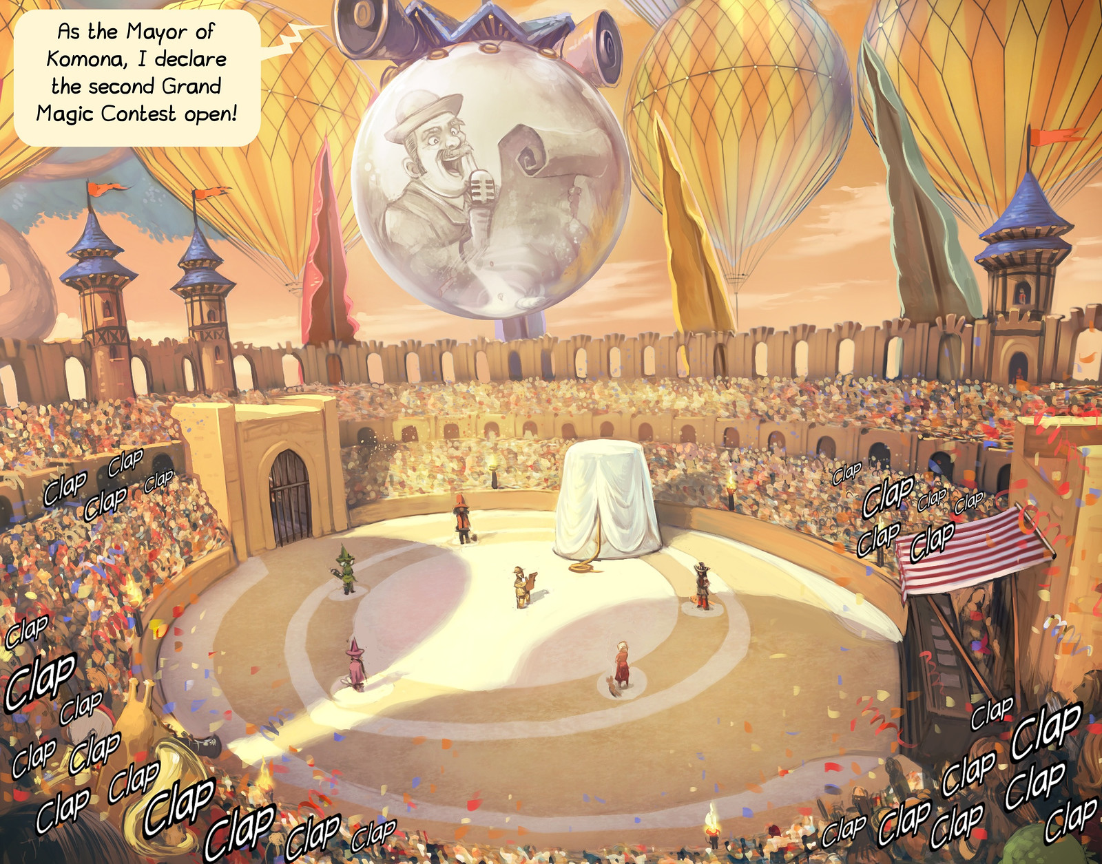
And final result. One of the most complex shot of episode 21 (Translation: Alex Gryson.)

3 steps on the landcape; painted lines; color under; paint-over.
( click to enlarge )
That's all! Thank you for reading the making of episode 21: The magic Contest !
Coriander is back on the contest
