


Krita alternate themes
Seven years ago I distributed a set of theme for Krita that became the defaults. You can switch between a dark, a darker, a bright and a neutral already by just going into the top menu of your Krita, Settings → Themes.
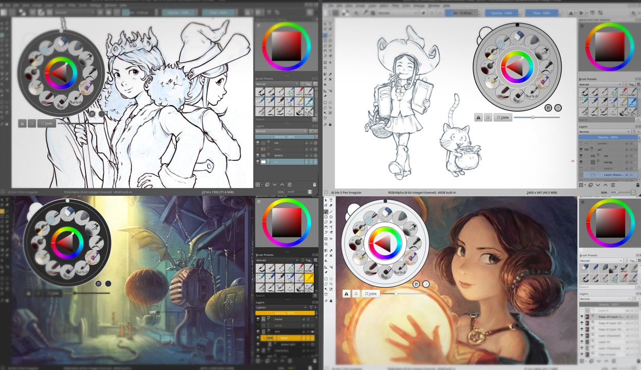
But today, I share a new set of alternates themes I created for various reasons. I kept them so far on my install but today I made cleanup and kept five that merit to be shared. You'll find them under along with a description and a screenshot. The install and download instruction are at the bottom of this post.
Krita bright neutral
A theme a bit brighter than the Krita bright default and with a neutral gray selection color.
That's a color theme I use system wide on my Plasma desktop, but more rarely with Krita itself.
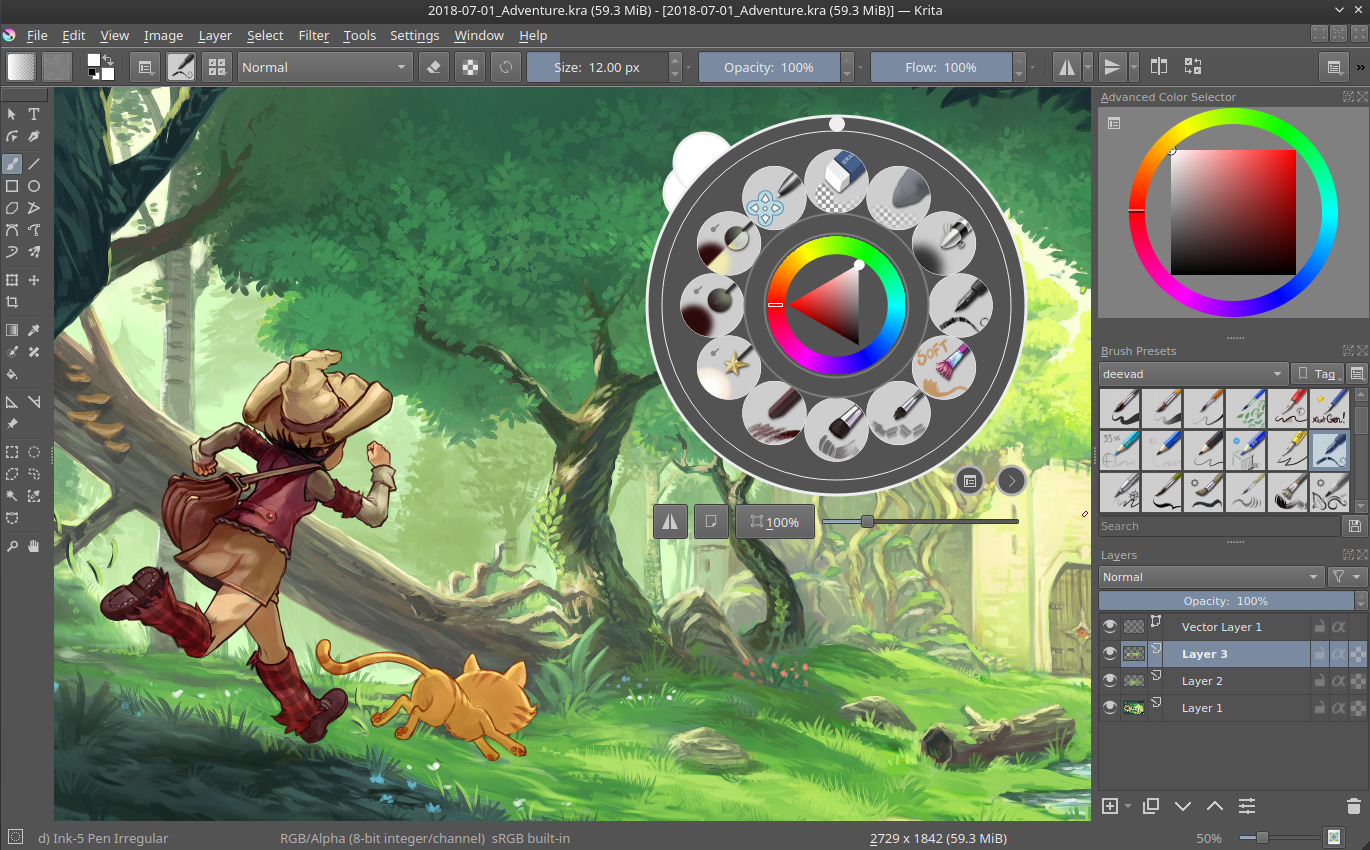
Krita midgray bright ice
This is a derivation over the default "Krita bright" theme. Slightly darker, this theme blend the background of the preset icons into the background of the user interface. I find this theme very convenient to draw my sketches or to do line-art, when working over white or bright gray backgrounds.
Krita midgray focus teal
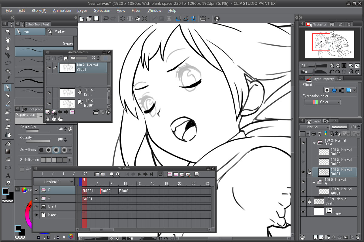
A theme I created for a friend who liked a lot the default dark theme with teal highlight of the software "Clip Paint Studio" (eg: clip paint screenshot ). The colors differs a bit, because the user interface elements of Krita are really different but I think I did a correct work "eye-balling" the general mood.
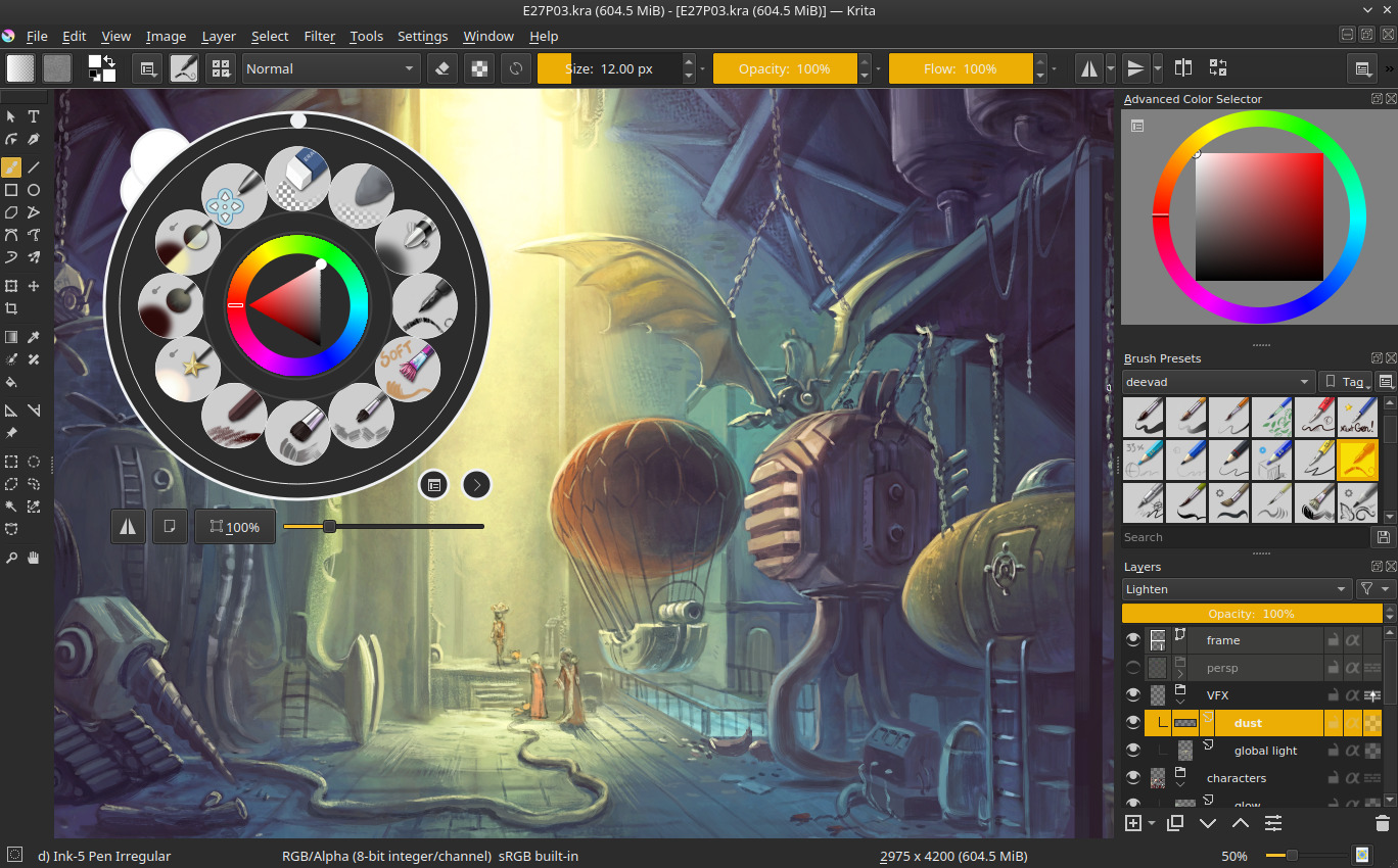
Krita midgray focus blue
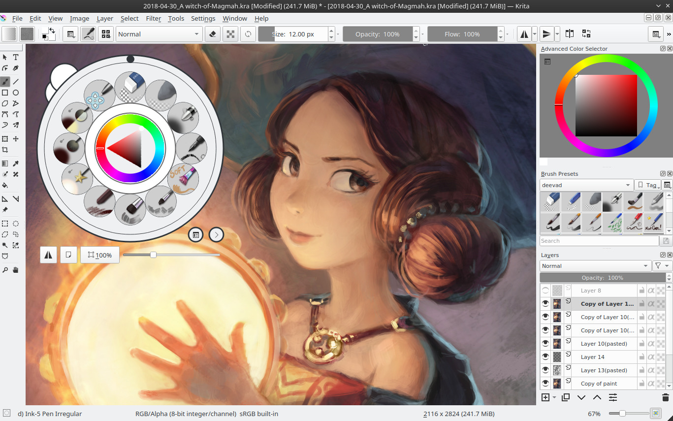
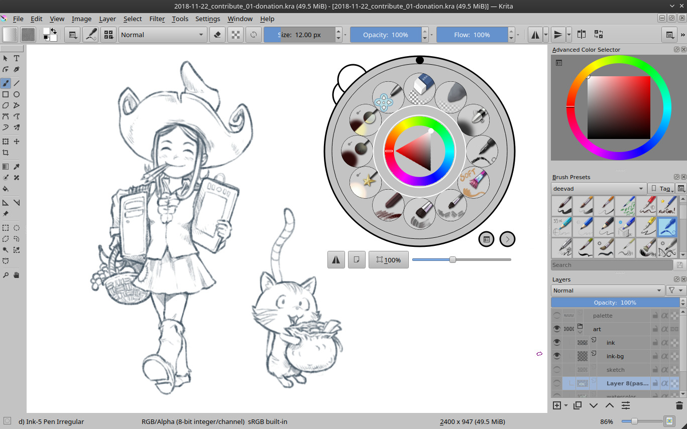
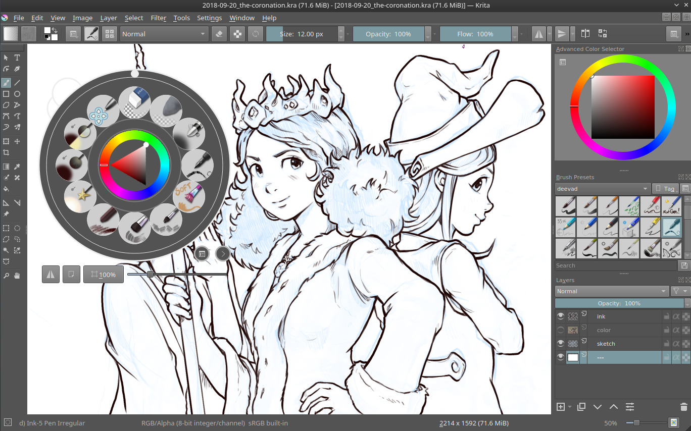
A derivation of the previous theme I did for myself but this time using blue as a color for highlight. I finally adopted it on long term. You probably saw this one since monthes on the screenshot I share on social network. The value is slightly darker than a pure midgray and it gives a "dark room ambiant" to create shiny color effect. Perfect for the colors I work on Pepper&Carrot.
Krita dark high contrast gold
This one was a request I get two weeks ago on the Krita IRC channel: a dark theme with strong gold color highlight on the selected elements to help in case of visual impairment with a strong contrast while keeping a dark user interface. After discussions with the requester of the theme to get an idea of what type of theme was efficient; we found an example and I took inspiration to the Yellow theme made by Mrtz found on this wonderfull thread the Blender Community made with many theme.
Install
- Download the zip containing the five themes here: 2019-01-04_krita4-alternate-color-schemes.zip, 4KB
2. Open Krita, go to the top menu: Settings → Manage Resources and click the Open Resource Folder button.
3. Your file explorer now should open at the location of where Krita store your preferences
(eg. Dolphin opens /home/deevad/.local/share/krita for me, deevad on GNU/Linux).
4. In this folder create a new folder named: color-schemes 5. Extract the five *.colors files you found on the zip inside the color-schemes directory. Like that:
 That's all. When you are done, close Krita and re-open it. Now you can switch to the new theme going to the top menu Settings → Themes (tested on GNU/Linux and a Krita 4.1.x, I can't test on Windows or Mac).
I hope you'll like them!
Licence: the zip and *.color files are CC-0 ressources, public domain.
